Wednesday, December 31, 2003
"Dreams of Art: A Creative Exploration of Sleep-Time Images” - Indianapolis Art Center, Ruth Lilly Library – Dec. 31, 2003 – 2 stars
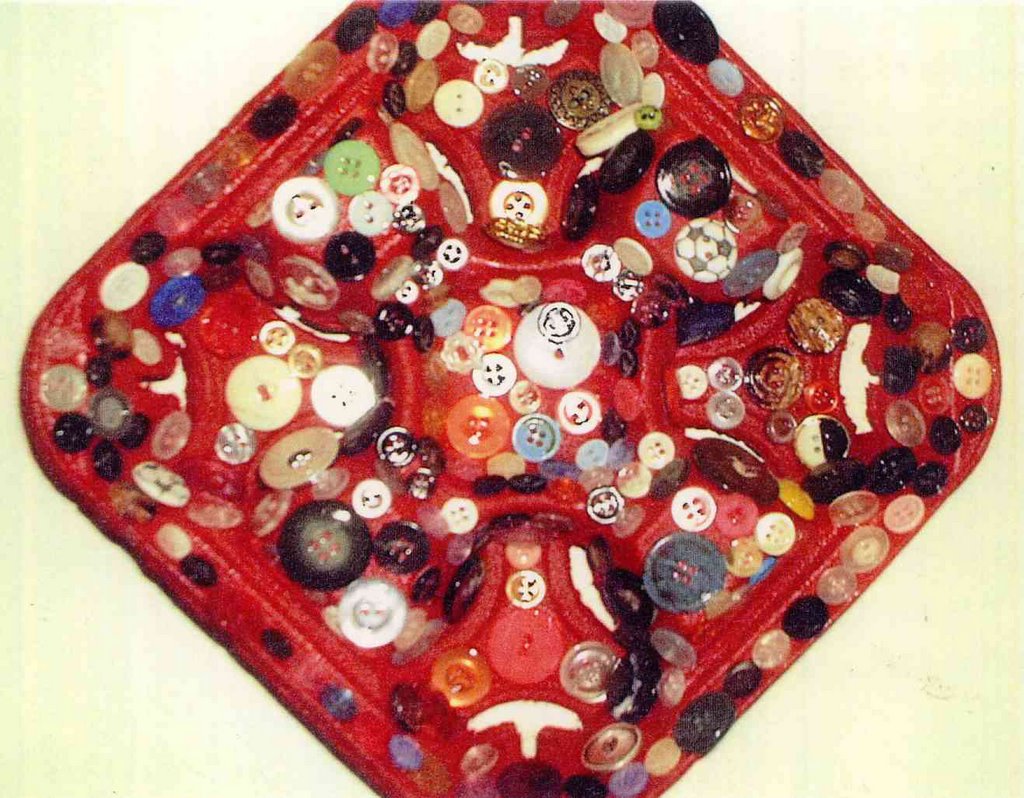
Art can be used to find meaning in the emotions and the confounding visual elements experienced in dreams. Art is a release, a therapy. The images seen in this exhibit are of personal growth on paper and canvas by five people who have long studied their dreams. As a didact explains, the art on view "Mediates between the dreamer and the unconscious." The accompanying dream explanations and reflections allow viewers to tap into the self-realizations of the artist/dreamer. "Monarch Jewels," a simple fabric sculpture by Janet Fox, is the visual embodiment and an extension of a poignant dream. "Family Portrait" by Barbara Koons is a cut and paste collage composite of many dream emotions while "In a Pink House" captures the tactile pink colors and sensations of a happy dream she experienced. Collage is used as a primary means of exploration in this show. Self-exploration takes precedence over visual aesthetics seen in the work, but that's not to say it isn't extremely fascinating and very valid. Through Jan. 11, 2004; 317-255-2464. – Mary Lee Pappas
Carol Boarman – Mavris Cultural Center – Dec. 31, 2003

Boarman's golden-hued images, both abstract and angel, recall myth and fantasy. One angel's face is delicately pink and rutty with detail, while the body and wings are formed in raised chunks of pearlized paint. There is a feminine storybook quality to the ethereal manner in which the characters in Boarman's works hold their gaze and grace. A sense of abandonment and satisfaction is relayed here albeit in the framework of these soft, comforting pieces. The overt expression of freedom in her painting is quite a release from the formality and structure of her Eastern Orthodox icons currently on view at the Indianapolis Art Center. Through Jan. 31, 2004; 317-917-9999. - Mary Lee Pappas
Wednesday, December 24, 2003
Cheryl Paswater – Vencino’s Café – Dec. 24, 2003 – 2 stars
It's said that the sincerest form of flattery is to copy. In art, there is a certain creative validity to this visual mimicry. Creative growth happens when techniques and manners of expression are tinkered with and taken through a certain trial and error. A truly unique personal vision or style eventually can be discerned, though usually not overnight, from this exercise and consequent artistic experiments. This is being an artist. Not every piece created, or presented to the public, need be the end-all of an artist's creative boundary. Nine acrylic pieces clipped with clothes pins on a string at a mere $35 each, two framed pieces and four canvases by Paswater hang beautifully at Vencino's - only they too closely resemble the context-heavy work of fellow Harrison Center for the Arts mate Artur Silva. Visually they are quite appealing: abstracts with caked layers of dribbles and drippy swaths of color. Occasionally there is a seemingly meaningless word, more a compositional element than symbol, added. Influence and admiration of another's work could be a plausible, valid and a natural piece of an artist's journey; with some journeys more obvious than others. Through December, 2003; 317-634-1995. – Mary Lee Pappas
Quincy Owens – Lamp – Dec. 24, 2003 – 3 1/2 stars
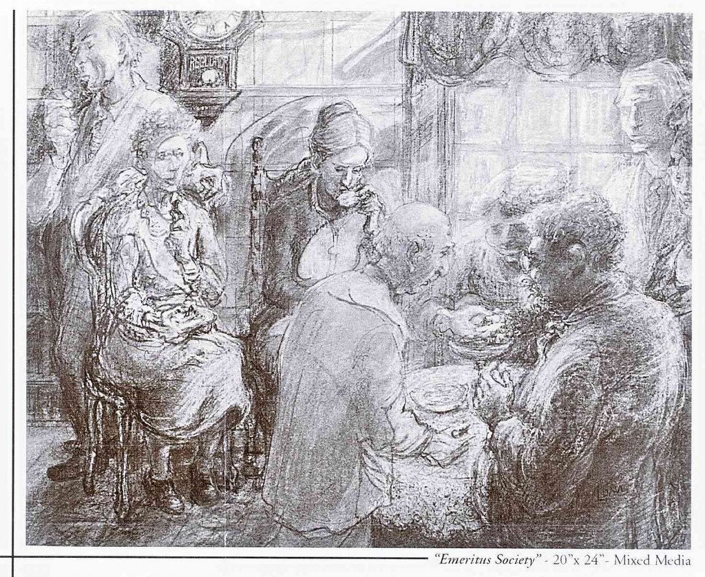
Dec. 16. This one-night-only event-installation on the floor of LAMP's main gallery space was comprised of lots of individual paintings by Owens. Approximately 12-inch square pieces sat in a large rectangle spaced about an inch apart from each other, making one big painting or multifaceted mural. His signature minimalist, layered images were executed with an equally discernable, appealing palette that lends a tactile and torn quality to the wide color fields. As panels sold, the rectangle dissolved into what resembled a brick wall being built or taken apart, so it was difficult, if not totally irrelevant, to count the pieces - maybe 80 or more. At $20 each, they were a mix and match, make your own canvas. Patrons indulged in purchasing six segments or two segments to hang together or simply one alone. While this event was a way for Owens to thank the arts community for the breakthrough year he has had in establishing himself as a notable local talent, it also showed the give-and-take quality of community. It conceptually demonstrated how reciprocation is an innate function of how a community progresses and ticks. It was a very smart, well-conceived show of beautiful modern art. owensl353@msn.com. -Mary Lee Pappas
Wednesday, December 17, 2003
Bill Rasdell, Robert Hewitt, George Durr – The Photography Gallery – Dec. 17, 2003 – 3 1/2 stars
The pieces presented by Rasdell are beautifully mystic images of the Indianapolis Museum of Art grounds that require the viewer to remember that these images of nature are just off of 38th and Michigan Road. These prints were created to hang alongside the Nature Conservancy's amazing exhibit, In Response to Place, at the IMA earlier this year. Images like "Early Morning Light" and "Emergence" capture foggy landscape scenes, which are then made supernaturally more misty through digital techniques. Bill may disagree, but I think they are among his most beautiful images yet. George Durr's black and white interpretations of the California land are dramatic - still with high contrast though the paper has a soft, tactile quality. Though all of his images are very striking, the consistent quality wavered ever so slightly. Some images appear grainy while others are crisp and sharp. His "Hail Bales" from the Badlands in North Dakota is an image any photographer would admire with its hot white light speckling off the hay. Through Dec. 22, 2003; 317-423-9237. – Mary Lee Pappas
Deborah Rosenbloom – The Bungalow – Dec. 17, 2003 – 3 1/2 stars
Beautifully presented flat fields of color embody the abstract work of Rosenbloom. Contours and forms push into each other with solid unlike, but comfortable colors. There is no painting outside of the lines in these square pieces, it's as if they were cut paper decoupage a la Matisse. The compositions have attractive and pleasing results that stretch well beyond the decorative and into the area of illusion with a Fauve-like mind set. Through December, 2003; 317-251-2782. - Mary Lee Pappas
Wednesday, December 10, 2003
Tis the Season Art Market – NCAA Hall of Champions – Dec. 10, 2003 – 3 stars
Dec. 5-6. This Indianapolis Art Center fund-raiser, the first ever winter "art fair," was not a total success for the 60 selected participating artists. Booths were assembled in the grand hall and the inner sanctums of the NCAA facility for the two-day event. The indoor environment was quite pleasant, calm and unfortunately slow, though the IAC employees and volunteers hustled and accommodated the artists no differently than if it were the annual May fair. Perhaps the local TV meteorologists scared potential arts patrons away with their snowstorm predictions (or were their forecasts performance art?). Or, maybe potential audiences had as much difficulty locating the NCAA as some of the artists did. Whatever the case, as with the May art fair of 2003, the public missed out on a top-notch show. Renew your membership to the IAC today! www.indianapolisartcenter.org; 317-255-2464. – Mary Lee Pappas
“Oranje and the Underground” – Key Cinemas – Dec. 10, 2003 – 2 stars
Dec. 5-6. Oranje, at the request of The Film Commune, decked the lobby of Key Cinemas out in art for the Indianapolis Underground Film Festival. Work by Vanessa Oeschle, Gwynn Burgins, Jason Poteet, Brendan Fox, Stuart Sayger and Anna Bradner adorned the space, only it was very difficult to decipher just whose work was whose because the pieces were not labeled in an easily viewable way. That aside, the work made for a great backdrop for a great film event. The cooperative effort is to be applauded and perhaps we will see Oranje offering up their services to other organizations looking to visually spice things up. www.oranjeindy.com. - Mary Lee Pappas
Avra Economakos – Greek Islands – Dec. 10, 2003 – 3 stars

Having lived her entire life in Athens, artist Avra Economakos (formally Delehas) found her way to Indiana a year ago. Surprisingly, her work is along the lines of what you would typically expect to find at the Hoosier Salon. Realistic postcard image landscapes of Greece in lifelike colors line the walls of this restaurant. Her approach looks effortless and comfortable - like she could have painted these in her sleep - and are a beautiful addition to the Greek Islands. Her palette is soft, easy on the eyes without utilizing the full chromatic scale, with complementary contrasts - these are perfected, safe and done very well. Five flower pastel images (close cropped) possessed livelier colors and the same ease of execution. Through December, 2003; 317-636-0700. - Mary Lee Pappas
Wednesday, November 12, 2003
LAMP lighter - LAMP - Nov. 12, 2003
LAMP lighter
Jennifer Kaye makes the scene
Mary Lee Pappas
*Pictured: “I am one of the few galleries where you can walk in and show me your stuff.” —Jennifer Kaye
Oct. 18 marked the one-year anniversary of the Chatham Center, a former nursing home at 901 N. East St., that is home to Jennifer Kaye’s gallery, LAMP. This unwaveringly optimistic and determined artist has successfully followed her heart with fine art. “I found that I really, really loved curating and showcasing local artists’ work,” Kaye says, so she set forth to represent local film, sculpture, 2D and installation art. “All media is important. Your soul needs an outlet.”
Kaye’s efforts are of direct benefit to local artists whose careers need a jump start and/or who might not otherwise get an opportunity to show their work in a professional venue.
“I am one of the few galleries where you can walk in and show me your stuff to be immediately considered for a show,” Kaye says. Though LAMP is booked about a year out, she would “probably give you a slot somewhere.” She honestly evaluates artists’ work and does turn work down, though not without some kind of encouragement or advice.
“The talent here locally is strong,” Kaye asserts — a position she has backed up by showcasing over 150 artists, a large percentage of whom had never shown before. This has given her a great sense of accomplishment.
“There is huge need for what I am doing. Artists come to me and say that I am the only one that’s here for them, that I’m giving them a chance and will make sure their work looks good when it’s hung,” she explains. “Some artists get snubbed at other galleries, which I think is ridiculous because people always ask me, ‘Where did you find this artist?’”
Presentation of artwork is one of Kaye’s strengths. “I’m going overboard on presentation because I want to command that kind of respect for the work.” She explains that LAMP is an alternative venue to the party scene Allotropy or Oranje art shows. “When you put art in a flea market setting, you wonder how they can ask $2,000 for something. If you hang it properly and put the right light on it, well $2,000 isn’t that bad, honey, let’s buy this! There is the trained art buyer that knows what he wants when he sees it and it doesn’t matter what environment that art is in. Then there is that great big group of people who are overwhelmed. They don’t know what they like, they don’t know what they are looking for.” That’s the crowd she wants.
LAMP is an acronym for Local Artists Making Progress. “I wanted the name of the gallery to encompass why I was doing this, so I started writing down all of these words. I wasn’t trying to make an acronym.” Kaye says LAMP, which serves as her mission statement as well, lent itself to the idea of enlightenment. Consequently, exhibition names have followed this light theme. “I thought it was appropriate to be shedding light on the local art community. I had a BANG moment.”
Kaye recently left her predictable and steady job as a loan officer to dedicate all of her time to LAMP. “I had been at a crossroads. I feel like with LAMP I am giving back to my community.” She now employs a staff of two, which include jeweler Wendy Mathiesen, administrator, and Linda Trout, gallery sales.
Despite success in her first year in business, Kaye says The Indianapolis Star told her they wouldn’t cover her gallery because they didn’t suspect it would be around very long. “They wouldn’t take me seriously. I don’t understand that.
“Instead of having the support of the Indiana Arts Commission and Arts Council, I had the Indiana Department of Transportation on my side,” Kaye muses, laughing about last summer’s Hyperfix, which rerouted downtown traffic past LAMP. “I don’t know if Hyperfix helped sales or not, but I am getting traffic on Thursdays and Fridays. I worked really hard on the signage …”
IDADA, the Indianapolis Down-town Association of Art Dealers and Artists, has definitely benefited LAMP. “IDADA is made up of a great group of people — gallery owners! The Arts Council of Indianapolis — they have been really going at it that they need to make a scene and I think IDADA’s point of view is that we already have a scene.” Kaye continues, “I think it will do good things for the galleries of Indianapolis. I think we’re going to get more publicity on our own.”
IDADA, with funding from the Mayor’s Cultural Tourism Initiative, is paying for 10 issues of the Midwest Gallery Guide, which will be in hotels around the Midwest, including Chicago. Visit www.idada.info to learn more about IDADA and link to local galleries.
“You can spend $50 on a steak dinner and you got nothing to take home,” Kaye says. “You buy a piece of art and more than likely one of your grandkids is going to grab that when you’re gone. It’s going to get passed on. People don’t throw away art unless it’s awful. Art should be valuable enough to you that when you look at it, it always brings you pleasure or always makes you think, or whatever you need to push your buttons.”
Kaye hopes to push buttons in as many homes, offices and businesses in Indianapolis as possible. “I would like to fill every office in Indianapolis with original art from LAMP. I hope the art would rub off on employees, that they would see local art on their walls and be intrigued enough to go to some of the art openings.”
Artists get hit up a lot to donate their work to auctions and charities. This is a pet peeve of Kaye’s. “We get asked to put our work up at some fund-raiser as a background for a party. I’m tired of artists being considered the court jesters. We have something to offer: our creativity. I don’t really feel that people think that creativity is something worth paying for and yet I also hear so many people say, ‘I wish I had creativity, I’m so untalented.’ If you’re not talented, then why aren’t you willing to pay for someone else’s talent?”
LAMP’s current exhibits are Sharps and Flats, featuring work by Kaye and David Engelking; “The Way We Saw the World” by Quincy Owens; and “Kingdom Come” by Zan Aufderheide. Hours are Thursdays, 12-6 p.m., Fridays, 12-8 p.m. and Saturdays, 12-6 p.m.
Jennifer Kaye makes the scene
Mary Lee Pappas

*Pictured: “I am one of the few galleries where you can walk in and show me your stuff.” —Jennifer Kaye
Oct. 18 marked the one-year anniversary of the Chatham Center, a former nursing home at 901 N. East St., that is home to Jennifer Kaye’s gallery, LAMP. This unwaveringly optimistic and determined artist has successfully followed her heart with fine art. “I found that I really, really loved curating and showcasing local artists’ work,” Kaye says, so she set forth to represent local film, sculpture, 2D and installation art. “All media is important. Your soul needs an outlet.”
Kaye’s efforts are of direct benefit to local artists whose careers need a jump start and/or who might not otherwise get an opportunity to show their work in a professional venue.
“I am one of the few galleries where you can walk in and show me your stuff to be immediately considered for a show,” Kaye says. Though LAMP is booked about a year out, she would “probably give you a slot somewhere.” She honestly evaluates artists’ work and does turn work down, though not without some kind of encouragement or advice.
“The talent here locally is strong,” Kaye asserts — a position she has backed up by showcasing over 150 artists, a large percentage of whom had never shown before. This has given her a great sense of accomplishment.
“There is huge need for what I am doing. Artists come to me and say that I am the only one that’s here for them, that I’m giving them a chance and will make sure their work looks good when it’s hung,” she explains. “Some artists get snubbed at other galleries, which I think is ridiculous because people always ask me, ‘Where did you find this artist?’”
Presentation of artwork is one of Kaye’s strengths. “I’m going overboard on presentation because I want to command that kind of respect for the work.” She explains that LAMP is an alternative venue to the party scene Allotropy or Oranje art shows. “When you put art in a flea market setting, you wonder how they can ask $2,000 for something. If you hang it properly and put the right light on it, well $2,000 isn’t that bad, honey, let’s buy this! There is the trained art buyer that knows what he wants when he sees it and it doesn’t matter what environment that art is in. Then there is that great big group of people who are overwhelmed. They don’t know what they like, they don’t know what they are looking for.” That’s the crowd she wants.
LAMP is an acronym for Local Artists Making Progress. “I wanted the name of the gallery to encompass why I was doing this, so I started writing down all of these words. I wasn’t trying to make an acronym.” Kaye says LAMP, which serves as her mission statement as well, lent itself to the idea of enlightenment. Consequently, exhibition names have followed this light theme. “I thought it was appropriate to be shedding light on the local art community. I had a BANG moment.”
Kaye recently left her predictable and steady job as a loan officer to dedicate all of her time to LAMP. “I had been at a crossroads. I feel like with LAMP I am giving back to my community.” She now employs a staff of two, which include jeweler Wendy Mathiesen, administrator, and Linda Trout, gallery sales.
Despite success in her first year in business, Kaye says The Indianapolis Star told her they wouldn’t cover her gallery because they didn’t suspect it would be around very long. “They wouldn’t take me seriously. I don’t understand that.
“Instead of having the support of the Indiana Arts Commission and Arts Council, I had the Indiana Department of Transportation on my side,” Kaye muses, laughing about last summer’s Hyperfix, which rerouted downtown traffic past LAMP. “I don’t know if Hyperfix helped sales or not, but I am getting traffic on Thursdays and Fridays. I worked really hard on the signage …”
IDADA, the Indianapolis Down-town Association of Art Dealers and Artists, has definitely benefited LAMP. “IDADA is made up of a great group of people — gallery owners! The Arts Council of Indianapolis — they have been really going at it that they need to make a scene and I think IDADA’s point of view is that we already have a scene.” Kaye continues, “I think it will do good things for the galleries of Indianapolis. I think we’re going to get more publicity on our own.”
IDADA, with funding from the Mayor’s Cultural Tourism Initiative, is paying for 10 issues of the Midwest Gallery Guide, which will be in hotels around the Midwest, including Chicago. Visit www.idada.info to learn more about IDADA and link to local galleries.
“You can spend $50 on a steak dinner and you got nothing to take home,” Kaye says. “You buy a piece of art and more than likely one of your grandkids is going to grab that when you’re gone. It’s going to get passed on. People don’t throw away art unless it’s awful. Art should be valuable enough to you that when you look at it, it always brings you pleasure or always makes you think, or whatever you need to push your buttons.”
Kaye hopes to push buttons in as many homes, offices and businesses in Indianapolis as possible. “I would like to fill every office in Indianapolis with original art from LAMP. I hope the art would rub off on employees, that they would see local art on their walls and be intrigued enough to go to some of the art openings.”
Artists get hit up a lot to donate their work to auctions and charities. This is a pet peeve of Kaye’s. “We get asked to put our work up at some fund-raiser as a background for a party. I’m tired of artists being considered the court jesters. We have something to offer: our creativity. I don’t really feel that people think that creativity is something worth paying for and yet I also hear so many people say, ‘I wish I had creativity, I’m so untalented.’ If you’re not talented, then why aren’t you willing to pay for someone else’s talent?”
LAMP’s current exhibits are Sharps and Flats, featuring work by Kaye and David Engelking; “The Way We Saw the World” by Quincy Owens; and “Kingdom Come” by Zan Aufderheide. Hours are Thursdays, 12-6 p.m., Fridays, 12-8 p.m. and Saturdays, 12-6 p.m.
Wednesday, October 29, 2003
"Humpty Dumpty" Primary Gallery (a Primary Colours annex) at the Harrison Center for the Arts - Oct. 29, 2003 - 1 star
This installation is hardly an installation, as it is not site specific or environmentally sensitive to the gallery space in any way. It's more like a series of very rough film vignettes projected onto a portable screen about our Jabberwocky speaking Humpty Dumpty leader, President Bush. There was no artist statement about this obscure presentation. The rest was left up to the viewer - only if the viewer could endure the boredom of it all.
One film segment is of a Beavis and Butthead drugstore variety fireworks spectacle played out on a table-top and another is a tape of a Bush State of the Union Address where his face is covered by a black band. Words too blurry to read were flashed in the video game images being projected next to the address. Primary is the operative term for this as its profundity is undetectable.
There was nothing to draw you into the chapel turned gallery and nothing to captivate or intrigue once you viewed the piece, which was so slapped together and aesthetically blah, you can't convince me that this four person effort was art. Through November 29, 2003; (317) 902-2772.
Of Note: I arrived to the gallery (an former chapel) and it was not opened the hours it was indicated to be. I waited over a 1/2 hour for the gallery to open and spent aprox. 45 mins viewing the film. There was in fact no statement available that discussed this "exhibition," and no one around to ask questions of. Ordinarily when a show is this bad (I believe this was a university student show if memory serves me correct - again there was nothing to indicate who was responsible) it simply isn't reviewed. I attended this with another member of NUVO's editorial team as well.
Below is a letter submitted to the editor on November 3, 2003, regarding the above review.
It was not appropriate to published. However, it was distributed by Primary Colours to the public at the Harrison Center for the Arts during a holiday open house (December 2003) weeks later where I maintained my art studio and where my artworks were on exhibit. For the safety of my art, my artworks were removed at the advice of a director. Copies of this letter were collected as best as possible by several attendees in the arts community and thrown away.
CRITICAL MESS
I'd like to thank Mary Lee Pappas for providing a fabulously bad example of art criticism, "Humpty-Dumpty," (Oct. 29-Nov. 5 issue, p. 29).
Next semester my students will be writing reviews, and, while itís always helpful to provide examples that are thoughtful, effective, accurate and well-written, a piece which does everything wrong, as Pappas' does, will also prove instructive.
First, get your terms straight. Pappas says "this installation is hardly an installation, as it is not site specific or environmentally sensitive to the gallery space." Installation art may be site specific but need not be. Second, spend sufficient time in the gallery to form an understanding of the work. Pappas' claim that no artist statement exists (when it does), and her failure to mention the presence of a live King snake suggests she spent less time viewing the work than she did composing her mostly unintelligible "review". The statement allows viewers to grasp the complicated metaphors presented in three vignettes. Two have dual video projection; the third features four simultaneous video images. These refer, using appropriations from popular culture, to the Bishops Wars of 1639 and 1640, when the forces of King Charles fell to the Parliamentarians, as well as to our contemporary situation in Iraq. The original "humpty dumpty" was a cannon in Charles' arsenal, the egg, nursery rhyme and George W. Bush came later.
Criticism of contemporary art is, of course, subjective, but it need not be inaccurate, hastily conceived and sloppily written. Ideally criticism should be written by individuals with both a background in art and art history and who are not predisposed to favor one type of art (say, painting) over another (say, installation).
Nuvo should consider reviewers' credentials and potential biases, and provide enough space for a more thorough explanation of area exhibitions.
Elizabeth K. Menon
Assistant Professor, Contemporary Art History Purdue University, West Lafayette
Elizabeth Mix is currently a professor at Butler University
chicago breaking david parrish 101 elizabeth mix association elizabeth menon mix angel mode butler university purdue university lisa farooque alumni imoca Indianapolis Museum of art IMA elizabeth mix dr. elizabeth k. mix lecture gender indiana modern contemporary Butler University art history professor Liberal art Purdue University and sciences University college Groningen
spirituality author writer novel published
Wednesday, August 27, 2003
“Presto” Brian Priest - J. Martin Gallery – Aug. 27, 2003 – 1 1/2 star.
This is an installation/performance piece where Brian lives in a red styrofoam sphere (recycled from a Cisco convention display he made) and creates small assemblage sculptural pieces on order for $20 a pop. Fortunately, Brian is not solely confined to the sphere as lie has the freedom to open or close the gallery and use the toilet. A Samsung monitor displays the isolated interior (documentation more than voyeuristic), showing Brian working away on his art. Visitors to the gallery can choose five objects, then place those five objects into a wire bin that is placed on a shelf while they wait for Brian to work them into one of his clever forms which then gets ejected from the sphere an a green ironing board slide. It's somewhat Little Rascals. When asked if this display was an installation about installation, Brian said, laughing, "I don't know. I'm just in this damn ball makin' shit." To many artists the art is in actually making the art object and not the final product. Here we have that process isolated and under examination. If this is what "Presto” is about, then it's not very thought provoking. Living in a confined space is hardly a fresh idea - and the best art usually has a philosophical purpose to explore. Despite the breadth of talent Brian has, this is an underdeveloped effort. Living in a bubble, after all, implies self-absorption, not seeing the world realistically. Perhaps this is a statement about underestimating the public's knowledge of and appreciation for art. Through Aug. 31, 2003; 317-916-2874. – Mary Lee Pappas
“Peaceful Light” Olga Popova – Indianapolis Artsgarden – Aug. 27, 2003 – 2 stars

Twelve photos from seven countries hang along the South end of the Artsgarden. And in the tradition of Artsgarden exhibits, it's pretty uneventful. Though Popova claims professional fashion and travel photography under her belt, these works fall short when compared to the plethora of local work found at the Photography Gallery. They are images you think you've seen before -snap and click documents of exotic scenery, The mostly calm images with balmy/hazy atmospheres aren't totally without merit. A 1999 black and white image of NYC captures a mirrored image of city life in patterns against a building's windows with more awareness than seen the other works. Her vision in this show is definitely not unique, Through Aug 29, 2003. 317-631-3301. – Mary Lee Pappas
79th Annual Hoosier Salon Exhibition – Indiana State Museum – Aug. 27, 2003 – 4 stars
The 187 works of art hung salon style in the gallery space look great. The variety of quality art by skilled Indiana artisans gets better every year. Indiana landscape and livestock images are abundant, but the selection of portraits are the real stand-outs. Judy Crawford's “Shimmer," a merit award winner, got my vote for popular prize. The soft feeling and gold leaf portrait of a girl in a lavender swimsuit and turquoise swim cap is lush with jewel tones. The handling of her face is beautiful. Pat Cotton's Matisse-like "Ipswich," a purchase award winner, features a woman wearing blue against a patterned yellow background. It is lively and rich next to its nearby works though its primary colors are slightly muddied. And the most remarkable painting of all is "Figure with Blue Background" by Lorraine Sack How does she do it? The model is eerily lifelike even at a distance of less than a foot. It's worth a visit to cast your own vote for popular prize, Through Sept. 21, 2003. 317-232-1637 - Mary Lee Pappas
Wednesday, August 20, 2003
State Fair 2003 – Indiana State Fairgrounds – Aug. 20, 2003 – 3 stars
Closed Aug. 17. The State Fair is composed of so many guilty pleasures the scene becomes surreal. Quite farcical and befuddling were the middle-aged cloggers happily hoofing it to a Bon Jovi remix, but, not moreso than the llama limbo where poodle trimmed llamas literally limboed with that signature limbo song blaring in their competition arena. In the Pepsi Coliseum, the organist played "Don't Cry for Me Argentina" while draft horses pulled their spit-shined carts around the ring. And then there's deep-fried everything, everywhere, producing five-star smells. Elephant ears and corn dogs send my stomach into regressive upset at the thought. The every-walk-of-life crowd carrying huge plush stuffed animal spoils from the Midway games, the colorful lights and the muffled screams from the rides create a fantastic and eccentric once-a-year piece of performance art. - Mary Lee Pappas
State Fair 2003 – Indiana State Fairgrounds – Aug. 20, 2003 – 3 stars
Closed Aug. 17. The State Fair is composed of so many guilty pleasures the scene becomes surreal. Quite farcical and befuddling were the middle-aged cloggers happily hoofing it to a Bon Jovi remix, But, not moreso than the llama limbo where poodle trimmed llamas literally limboed with that signature limbo song blaring in their competition arena In the Pepsi Coliseum, the organist played "Don't Cry for Me Argentina" while draft horses pulled their spit-shined carts around the ring. And then there's deep-fried everything, everywhere, producing five-star smells. Elephant ears and corn dogs send my stomach into regressive upset at the thought. The every-walk-of-life crowd carrying huge plush stuffed animal spoils from the Midway games, the colorful lights and the muffled screams from the rides create a fantastic and eccentric once-a-year piece of performance art. - Mary Lee Pappas
Wednesday, August 13, 2003
Mike Johnson - Hubbard and Cravens – Aug. 13, 2003 – 2 stars
Some of Johnson's landscapes look stiff and uncomfortably executed. "Prairie Sunset" just misses its mark. Though the colors are rich with hot reds, there is awkwardness and a little incongruence to the barn on the horizon and the hills. On the other hand, "Hay Bales" dramatically portrays sun seeping through a dark ominous and white cumulous clouded sky to illuminate the subject matter. The flat yellow of the gold frame is a perfect match to pick up the golden lit bales. Capturing color and atmosphere are Johnson's strengths, though his work technically falls short of that found around the corner at Lucas and also when compared to the collection of talented plein air artists found locally. Through August, 2003; 317-251-516 1, - Mary Lee Pappas
“Endangered Species” - Wire Soul Gallery – Aug. 13, 2003 – 1 1/2 stars
Artist William Arnold is a homespun naturalist whipping up life-sized animal likenesses out of old heavy-duty wire. There is no getting around that this man loves animals and what he does. They are crafty backyard art with prices ranging from $7,500 for a bison (the Indianapolis Zoo has one) to $30 for a hummingbird. Tag on an additional fee for a paint job. Though he recreates animals on order, each is somehow one of a kind, complete with its own certificate of authenticity. 1-70 rest areas in the state and Gas America Travel Plaza in Knightstown can boast Arnold art, too. The Wire Soul space is shabby (a little too a la natural) and not quite as nice as Tim and Avi’s Salvage, only without the salvage. The waterfall and caged raven are pretty cool. Though it hardly looks like a suitable space to do his work justice, it doesn't seem to be hurting his sales. His love of wildlife extends to the Wire Soul "yard," which may be the closest thing to a prairie downtown has (outside of the NE corner of 16th and Central) with its Queen Anne's Lace. At the time of my visit, several hundred sparrows were enjoying it with their pigeon friends. Through Sept 30, 2003; 317-236-9473, - Mary Lee Pappas
“A Mother and Son Paint" Bertie David and Douglas David – Hoosier Salon – Aug. 13, 2003 – 3 stars
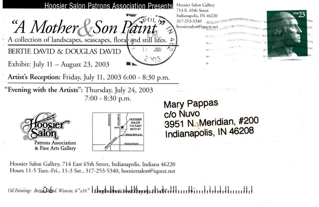
If the David clan had a coat of arms it would bear heraldic bushy peony blossoms and their signature color, powder puff blue. This show is, quite literally, like mother like son in terms of color and topic. Bertie, an accomplished china painter, gingerly layers colors upon one another between firings to create romantic imagery on porcelain and small canvases reminiscent of this style of work from 100 years ago. The overall effect is precise, decorative and flowery. It's simply beautiful on three large German porcelain vases adorned with peonies, hydrangea and wisteria. Douglas, being his mother's painting progeny, seems to have inherited his mother's delicate palette of cool kelly greens, bluey-lavenders and very pale orange and yellows. Unlike his mother, his "Sunset's Passing" is executed with easy, loose, smooth strokes that push some of his work into the sublime. Florals and landscapes fill the Salon. Through Aug. 23, 2003; 317-253-5340. -Mary Lee Pappas
"Intangible Spirit" An obituary for artist Harry Blomme published in NUVO August 13, 2003
 By Mary Lee Pappas
Published in NUVO August 13, 2003
Harry Blomme knows what God looks like. “It’s supposed to be a surprise,” he once told me. Blomme, a local artist, passed away suddenly the weekend of July 12. He was 69.
“He lived his life in preparation for this,” Bill Bickel, director of Holy Family Shelter, said. In 1997, Bill became Harry’s caseworker at the Homeless Initiative. A former Southern Indiana farmer, a Flemish Canadian export, Harry was homeless and epileptic. “Health was always a concern,” Bill said.
I first met Harry six years ago when he and Bill visited a Massachusetts Avenue gallery where I worked to check out the art. I can’t recall whose art was hanging on the walls, but Harry I remember vividly. He gave me a deftly drawn charcoal portrait of a girl as a token of his visit. This was typical Harry.
“It always amazed him when someone would take an interest in him,” Bill recalled. “He was spiritual and approachable. He looked at situations so optimistically and held by his convictions. He was much, much more than a homeless artist. That doesn’t begin to explain who he was. He broke stereotypes and boundaries about homelessness without knowing it. He looked at himself as being one of us and folks treated him that way. That’s what we want. No one should be labeled.”
When U.S. Rep. Julia Carson was presented with two of Harry’s paintings, “She was, I think, very humbled,” Bill said. One was of Carson and the other was of Rosa Parks, who Harry had read was an inspiration to Carson.
Harry sold some of his paintings at Utrillo’s Art, owned by Greg Brown. “He intelligently approached his work. His method was fascinating and impressive. It’s stuck with me and affected my own work,” Greg said of his friend Harry.
Three years ago, just before Harry got settled into his apartment (called “studio-studio”), he lived with David Hittle, of Lutheran Child and Family Services. The annual April Show, an art show inspired by Harry’s talent, started from their close friendship.
“Very intangible” is the only way David could explain the impact Harry has had on him. “Harry had a clear and profound effect on people he may have only met once or twice.”
Harry’s passing was sudden. “He was doing very, very well,” Bill said.
“I saw him the day before and he was having a blast,” Greg recalled. “He’s kind of a gad-about. He was full of life and having fun.”
Harry’s funeral was July 19 in his hometown of Rockport, Ind. “It was packed. It seems that the people of Rockport knew Harry as we knew him here. He was known for pulling out his sketchbook,” David said. “The music was awesome. Southern Indiana shoutin’ Pentecostal music. Very bluegrassy. Real good stuff.”
“I would put Harry up there as one of the greatest teachers I’ve ever had,” Bill said.
David had difficulty putting the effect Harry has had on his life into words. “Gargantuan is the only word to describe it.”
A memorial service for Harry will be held at Roberts Park Church on Aug. 14, 6:30 p.m. If you own a piece of Harry’s work, please bring it for a display after the service.
For more information on Harry’s art visit www.aprilshow.org. The Web page for an interview with Harry July 3, 2002, can be found at www.nuvo.net/news/archive/002660.html.
Harry Blomme, Julia Carson, Bill Bickel, David Hittle, Roberts Park Church, Greg Brown, Utrillo's Art Gallery, Indianapolis, Indiana, The April Show
By Mary Lee Pappas
Published in NUVO August 13, 2003
Harry Blomme knows what God looks like. “It’s supposed to be a surprise,” he once told me. Blomme, a local artist, passed away suddenly the weekend of July 12. He was 69.
“He lived his life in preparation for this,” Bill Bickel, director of Holy Family Shelter, said. In 1997, Bill became Harry’s caseworker at the Homeless Initiative. A former Southern Indiana farmer, a Flemish Canadian export, Harry was homeless and epileptic. “Health was always a concern,” Bill said.
I first met Harry six years ago when he and Bill visited a Massachusetts Avenue gallery where I worked to check out the art. I can’t recall whose art was hanging on the walls, but Harry I remember vividly. He gave me a deftly drawn charcoal portrait of a girl as a token of his visit. This was typical Harry.
“It always amazed him when someone would take an interest in him,” Bill recalled. “He was spiritual and approachable. He looked at situations so optimistically and held by his convictions. He was much, much more than a homeless artist. That doesn’t begin to explain who he was. He broke stereotypes and boundaries about homelessness without knowing it. He looked at himself as being one of us and folks treated him that way. That’s what we want. No one should be labeled.”
When U.S. Rep. Julia Carson was presented with two of Harry’s paintings, “She was, I think, very humbled,” Bill said. One was of Carson and the other was of Rosa Parks, who Harry had read was an inspiration to Carson.
Harry sold some of his paintings at Utrillo’s Art, owned by Greg Brown. “He intelligently approached his work. His method was fascinating and impressive. It’s stuck with me and affected my own work,” Greg said of his friend Harry.
Three years ago, just before Harry got settled into his apartment (called “studio-studio”), he lived with David Hittle, of Lutheran Child and Family Services. The annual April Show, an art show inspired by Harry’s talent, started from their close friendship.
“Very intangible” is the only way David could explain the impact Harry has had on him. “Harry had a clear and profound effect on people he may have only met once or twice.”
Harry’s passing was sudden. “He was doing very, very well,” Bill said.
“I saw him the day before and he was having a blast,” Greg recalled. “He’s kind of a gad-about. He was full of life and having fun.”
Harry’s funeral was July 19 in his hometown of Rockport, Ind. “It was packed. It seems that the people of Rockport knew Harry as we knew him here. He was known for pulling out his sketchbook,” David said. “The music was awesome. Southern Indiana shoutin’ Pentecostal music. Very bluegrassy. Real good stuff.”
“I would put Harry up there as one of the greatest teachers I’ve ever had,” Bill said.
David had difficulty putting the effect Harry has had on his life into words. “Gargantuan is the only word to describe it.”
A memorial service for Harry will be held at Roberts Park Church on Aug. 14, 6:30 p.m. If you own a piece of Harry’s work, please bring it for a display after the service.
For more information on Harry’s art visit www.aprilshow.org. The Web page for an interview with Harry July 3, 2002, can be found at www.nuvo.net/news/archive/002660.html.
Harry Blomme, Julia Carson, Bill Bickel, David Hittle, Roberts Park Church, Greg Brown, Utrillo's Art Gallery, Indianapolis, Indiana, The April Show
Wednesday, August 06, 2003
"Singular Vision" Jeanne McLeish and Mark Burkett – it’sALLart – Aug. 6, 2003 – 3 stars
McLeish has a tunnel vision green and brown watercolor palette for her woodsy plein air efforts. Lovely and technically on the mark, they still feel tight and safe. Burkett's " Bottom-land" farmscape is inspired compared to other efforts on exhibit. A mauve underpainting peeks through a pale blue sky (slightly grey with lavender), edges of distant barns and around bare branches of trees. Yellow dabbles dot their way across the lavender and pale orange foreground. It'sALLart owner, artist Keith Hampton, has altered and oomphed the interior of the former Eye Blink space by painting the walls flat white and the floors terra cotta - a color picked up in the benches and throughout the space. The painting presentation is great. Rotating selections of Hampton's own distinguishable landscapes and flowers are deservedly always on view. Worth a visit. Through Sept. 8, 2003. 317-852-5461. – Mary Lee Pappas
Norman Rockwell’s “Downhill Darling” - Indianapolis Museum of Art, American Gallery – Aug. 6, 2003 – 2 stars
This is not the young love "Downhill Daring" image of a boy, a girl and dog sledding down a hill as popularized by the obscenely mass licensed poster art that can be purchased on the Internet for as little as three dollars. This is another one ... of a bunch of brighteyed boys sledding. On loan to the museum from the Saturday Evening Post Society this illustrated painting was the cover image for an issue of The Country Gentleman magazine in 1919. Rockwell, of course, did hundreds of magazine covers for the Saturday Evening Post, his first in 1916. It's a typical apple pie narrative piece with the prominent vocal point being the blue-eyed, rosy cheeked, boys framed in a solid block of white like an illustration cell. Opposite this painting sits "Love Song," an expressionistically dappled piece of Rockwell's minus the obvious for-production elements, earning it a rightful place in the American Gallery. Through Dec. 2003; 317-923-1331. – Mary Lee Pappas
Wednesday, June 11, 2003
Art of Architects - Woodburn and Westcott - June 11, 2003 - 4 stars
This exhibition, conjured up by gallery owner and curator Doris V. Hails, makes good sense. Local architects make our immediate environments beautiful places to live and work. Architectural design is public and visually engages community in the arts. It’s utilitarian, its our heritage, it is art and deserving of being given a gallery venue. Artwork in the stylistically diverse show ranges from books and nudes, to annoying nonsense machinery. Kipp Normand’s architectural reliquaries, which, he says, “Are all about dead buildings,” sentimentally preserve the stories of notable demolished Indianapolis buildings. History and neighborhoods tend to die, too, when buildings are lost, but tearing down culture to create culture was once the irresponsible Indianapolis way. Original black and white images or the represented buildings lay next to their boxes. Fractured pieces of wood and the unlikeliest of salvaged bits contained in his pieces successfully and sincerely demonstrate the fragile balance and importance of these places better than the Indiana State Museum’s entire School 5 façade “save” which screams of guilt. Through July 26; 317-916-6062. – Mary Lee Pappas
Wednesday, June 04, 2003
One Earth Festival - Garfield Park - June 4, 2003- 1 1/2 stars
May 31-June 1. This event in our city’s oldest park didn’t effectively accomplish its goal of celebrating unity and diversity among different cultures and religions. Isn’t that what the Italian Street Festival at Holyd Roasary Church, the Eiteljorg’s Indian market, the Middle Eastern Festival at St. George Orthodox Church, Fiesta and the International Festival, among others, already do more successfully? Just how the booth selling pewter figurines of wizards and the like meshed with the mission of the event is definitely questionable. If cultural diversity is a key theme, then a diversity of world cultures should be represented beyond hippie clothes and hemp bags. Our city has a history of great cultural diversity that is underestimated and rich with authentic resources that could have been called upon to participate in theis idealized exercise. Booths were not marked and there was no schedule of events to be found. – Mary Lee Pappas
Art Fair at the 54th and Monon Shops - 54th and the Monon - June 4, 2003 - 2 stars
May 31. Admission, popcorn and hotdogs were free at this one-day event. It was less art fair and evidently more promotional tool for the stores inhabiting that block of 54th Street. There was plenty of parking and booths were easy to maneuver through. Located smack-dab off the Monon Trail, biking or walking to this fair was made easy. The caliber of art ranged from very good (Happy Trails, Douglas David and many others) to questionably less-than-average. The crisp, white-tented booths were sturdy and wind resistant, but there was no signage to adequately identify the participating artists. While some booths were set up professionally with art objects carefully displayed, others were uninspired with wares thoughtlessly strewn on foldout tables. A great idea at a great location, setting an aesthetic standard is needed for what could become a nice tradition. – Mary Lee Pappas
"Shaky Hands" - The Enchanted Studio - June 4, 2003 - 3 1/2 stars
The interior of artists Mary Jo DeMyer’s Enchanted Studio, featuring a colorful array of bold outsider art, feels like what could be the feminine side of the Rev. Howard Finster. Glitter-encrusted doll-sized wire beds and chairs are suspended from the ceiling of this playground barn along the Monon Trail at 54th Street. An aged pink piñata, really big papel picado Las Posadas banners and a porch swing add to the folkish flavor. The cartoonish incongruence of the playfully painted walls and floors, along with the cotton quilted tab curtains, warrant the enchantment title. Five other outsider artists’ work can be found here. Kansas City artist Allann Winkler’s soda cracker box big-headed people, round and bright eyed, aren’t too far a cry from Laylah Ali, who recently exhibited at the MOMA and Indianapolis Museum of Art. The comic book inspiration forms, rounded eyes, heads and mouths are all similar though possibly less ambiguous. So, who’s to say that outside art is really so outside? Through June 14; 317-753-1004. – Mary Lee Pappas
Tuesday, June 03, 2003
"An Eye Blink for an Eye Blink" David Kadlec closes his Eye Blink Gallery, Published June 3, 2003 in NUVO
By Mary Lee Pappas
Published in NUVO June 3, 2003
David Kadlec closed his gallery, Eye Blink, after the exhibit of Sam Sartorious’ paintings, Up All Night, came down at the end of last month. Kadlec opened the space after the Faris Building, where he had a studio for 11 years, was sold to Lilly.
“When I left the Faris I had the chance to get this specific space. The gallery came of this place,” Kadlec explains of his Murphy Building gallery.
“I could show my work and other people’s work. It was such a spontaneous thing. It wasn’t like I was always thinking, jeez, I should have a gallery.
“Everything seemed to point to it in that moment.”
Ending Eye Blink is, in essence, an eye blink, too. “Naming Eye Blink was not the end of it. It happens all the time in life. This is absolutely a continuation of that process of paying very deep attention to what it is that excites me and what I need to do,” Kadlec said of closing the gallery to take the next step in his life.
“What I’ve known for some time is that I needed to devote my time to fighting for the planet, for clean air, clean water and for a sustainable relationship between humans and the planet. I’ve had this sense for a long time. This is part of my call to action for myself. I don’t even know what that’s going to look like for me.”
Initially, it means spending time at his family’s cabin in central Minnesota, the state where he grew up. “I want to spend some time up there and watch the spring and summer unfold a bit, go swimming every day, make some new art and think about life. And those are things you can do all at the same time!” Kadlec explains, “I feel this delicious sort of openness about all of it. I trust it all. My job is to keep my heart open and my eyes open and respond to what I’m feeling inside.”
Coming back to Indianapolis isn’t out of the equation either.
“I’m proud of this place,” Kadlec said about Eye Blink. “It’s been a great effort and a lot of fun. To elevate my own work and get it in front of people is the coolest thing I’ve ever done. The whole thing has been about love. Now I think there is something cooler for me to do.”
He’s elevated Todd Lantz, Matt Davey and Terry Steadman along the way, too, and received great joy from their art. “They are doing astounding work. Communicating so, so beautifully and so clearly.”
Unforgettably poetic and lyrical shows of outstanding quality (Kyle Blevins, Doug Travis and Karen Thompson particularly) have been some of Kadlec’s gifts to our arts community.
Painter Keith J. Hampton will be doing something cool of his own when he debuts his new gallery, It’s All Art, in the old Eye Blink space during the next Murphy Building open house June 6.
Wednesday, May 21, 2003
Master class, Jim Sholly makes art of art books - May 21, 2003
The designer just disappears! I’m sure I got credit somewhere in here,” Jim Anders Sholly says as he flips through Crossroads of American Sculpture, a book he designed for the Indianapolis Museum of Art’s retrospective exhibition of the same name in 2000. “It’s in four-point type,” he says, studying the forward pages and talking about how happy he was to be included in the project.
Principal designer and co-founder of the graphic design company Antenna, Sholly recently completed another book design project, The Herron Chronicle, The First One-Hundred Years, for the Herron School of Art’s centennial. It’s been a fitting project as Sholly earned his BFA in design from Herron in 1987 and has been an adjunct visual communications faculty member there.
“I became involved in the book project through Marty Krause,” Sholly explains. Krause, an editor and one of three authors for the Herron book, has been the curator of prints, drawings and photographs at the IMA since 1979.
Garo Andresian: Written in Stone, a catalogue of prints by Andresian, published by the IMA in 1995, “Was my first book with the IMA. Laura and I did it. It was so nice of them to take a chance on us because we had no real book experience. It was exciting ... a learning process.”
Laura Lacy-Sholly, Sholly’s late wife, was also his Antenna design partner. “We were this happy unit, functioning perfectly and then suddenly everything was different,” Sholly says. “It’s sort of hard to explain how that really was. Time is very strange. Sometimes it seems just moments ago and other times it feels a lot longer than that.”
Having met while attending Herron, the Shollys married in 1991. Laura passed away in June of 1999. A scholarship in her name was created at Herron.
Learning to work alone was very difficult. “Totally. Absolutely. Over the years we had worked out our routine,” Sholly recalls. “It wasn’t a conscious decision, but we each ended up taking on different aspects of projects and everything just sort of worked out. I’ve tried to maintain the same ideals and standards.”
The couple founded Antenna in their Broad Ripple townhouse apartment. “Laura and I were students together. We had the business before we were married. I think we always knew that it would happen, that we would be in business some day, but it really came together in 1990.”
While working for a small design studio, Design Ogden, they were offered rental space to do their own design work. Instead, they set up shop at home. “We actually had a typography instructor who was really influential,” Sholly says, referring to former Herron professor Candace Lorimer, who ran her clothing design business out of her apartment in the same complex. “We saw that it could be done that way.” Lorimer, who prints her designs for interior furnishings for her New York shop, employed the Shollys for projects. “We just had a couple of clients and it grew through word of mouth. It was this natural, intuitive progression. We didn’t know anything and we didn’t have anything to lose,” Sholly says.
Being a confident young couple had its benefits. “I think it was very appealing to clients. It showed a certain stability or something. We thought even though we’re independent, we’re small, we’re in Indianapolis, we could still do work that was still really going to be world-class. It was going to be very different, very thoughtful, and interesting.” Sholly starts to laugh and says, “We were really pretty full of ourselves thinking that we could do all of that, but that was the idea anyway.”
A match was made with artist Paul Harris early on. “We did work for an exhibit of Paul’s called One Night Stand.”
The Shollys were students in a silkscreen class Harris taught at Herron. “You could see them migrate toward each other,” Harris says of the Shollys’ initial attraction. “I can’t say enough about Jim. He is a grand, grand person.” Harris, who also received a BFA from Herron, requested that they create a souvenir book for his show. “Jim and Laura came up with all of it. They assembled them on the dining room table. Jim understands artists better than other graphic artists.” This project turned out to be the foot-in-the-door predecessor of future art book projects.
Annually, from 1992 to 2001, Sholly designs were chosen for the American Center for Design’s 100 Show of Excellence, an internationally juried review of graphic design. In 1996 Antenna work was also selected for Mixing Messages: Graphic Design in Contemporary Culture, a major graphic design survey at the Cooper-Hewitt, Smithsonian National Design Museum, which led to multiple works by the Shollys being acquired by the Smithsonian,
“There aren’t many museums that are strictly devoted to design,” Sholly explains. “The inherent nature of graphic design is transient. It is typically meant to be used and then discarded. Some museums will have a small graphic design collection,” Sholly adds, “but it’s rare to have a museum dedicated to preserving it.
“I don’t know that graphic design is highly valued here, or something that most people are even interested in or even care about,” Sholly says of design in Indianapolis.
From production to print, Sholly was involved in every process of the casebound Herron book. “They didn’t impose any restrictions and gave me freedom to create.”
The half coffee table, half history book has a distinguishable Antenna look and feel. It’s physically and aesthetically soft. Even dark browns feel cool and elegant with the Antenna treatment of four-color imagery printed on uncoated paper. “It flattens it. It makes it a little more tactile,” Sholly says of how the technical process enhances the visual elements.
The Herron Chronicle is an Indianapolis art history book and a work of art unto itself, created by one of Herron’s best. Printed were 2,500 copies and they are available for sale at Barnes & Noble and through Herron’s faculty office, building HM, room 109. Copies are $40. Call 317-920-2455 for more information.
Wednesday, May 14, 2003
33rd Annual Broad Ripple Art Fair 4 - Indianapolis Art Center - May 14, 2003 - 4 stars
May 10-11. The not-great weather only demonstrated how well the Indianapolis Art Center is organized and accommodating to attendees and artists under the weirdest of weather conditions. The BRAF turned out to be like a boot camp for artists, complete with thunderstorms, tornado warnings, high winds and cold weather dipping 10-15 degrees below what local forecasters promised. After dodging threatening green skies Saturday, there were a few ideal hours of sunshine and kettle corn aroma wafting through the air. It was so cold on Sunday that the Starbucks booth ran out of coffee. One exhibitor said that if an artist could make it through the weekend, then every art fair after would be a piece of cake. Optimism prevailed through this test of endurance as tents flew and ceramics crashed. Mud pits and rising White River water forced some artists to move to higher ground after the deluge of Saturday morning. A few left altogether. There was a State Fair aroma in the air from the straw salvaging the grounds. The hard-core and generous volunteers who braved it all defitiely earned the art fair wings and will be remembered (Betty, you rock!) for their tour of duty. Kudos to the staff for all their hard work, which is an understatement. Attendance for this fund-raiser was evidently low but that turned out to be of great benefit for the serious shoppers. To their advantage, lines were short and booths were easy to maneuver through. I spoke to several artists who were pleased with their sales while others were taking things in stride. If you stayed home, consider renewing your IAC membership soon. – Mary Lee Pappas
Wednesday, May 07, 2003
Second Annual Artful Tread - Mass. Ave. Arts District - May 7, 2003 - 3 1/2 stars
May 2-3. This fun public display of artfully rethought old tired mixes local commerce with art more successfully than the 500 Festival’s cars to celebrate the 500 Festival. The creative diversity was evidently greater. Participating Mass. Ave. businesses displayed their tire art either in their shop windows or on sidewalks. Just as Chicago’s “Cows on parade” in 1999 brought life-size cow sculptures to the Loop, these real and thus life-sized tires engage the whole community directly with art through a little humor and wit. Urban Bloom’s suspended hangman treatment of a tire within a tire and old sign letters spelling out “ART” along the bottom perimeter was a great assemblage piece in and of itself. The flower planter outside of Jungclaus Campbell with a tire serving as a base was sweet and delightful. Jenny Elkin’s tire at her gallery was transformed into a cartoonish fish by having been painted orange, given fins and one big boggle eye. More obvious and equally silly was the minimalist approach to the project taken by 4 Star Gallery. Propped up in their front windows sat “Really Old Tire,” which was simply a really old tire cracked, worn and unadorned. Yat’s doused their peach-painted tire in glitter (it looked like a Homer Simpson-worthy fantasy iced donut) and Scholar’s Inn turned theirs into a huge Disneyland martini topped off with a cherry. Two days just isn’t enough time for the city to enjoy this. Perhaps next year the 500 Festival will exploit and put their funds toward enhancing this successful grass-roots art endeavor. There was no red tape on these tires. – Mary Lee Pappas
Wednesday, April 30, 2003
Plein Air Paintings from New Harmony - Hoosier Salon - April 30, 2003 - 3 stars
This group shows the broad range of style presented by these artists. Highly representational works in true-to-life colors are expected and found on the uncluttered gallery walls, making the diversity ever apparent. "Yellow Tavern" by Dave Kercheval, a lively New Harmony street scene played out in cotton candy pink, tweety bird yellow and glitter, is a primo example. It's great and works to create the illusion of reality in the same way the more traditional colorists do. Illusion is further achieved with incongruence of perspective to the buildings depicted and serves as another element that made this work stand out. Thomas Robinson's "Spring Hillside" is another standout with its purples and vigorous yet careful paint handling. The framing and presentation is always superb at the Hoosier Salon. Through May 7, 2003; 317-253-5340. - Mary Lee Pappas
"Facts and Fictions" - Domont Studio Gallery - April 30, 2003 - 3 1/2 stars
Facts and Fictions: Harry and Lois Davis
Harry and Lois Davis, married for 55 years, exhibit their stylistically different works together with wonderful and not surprising success.


Lois tastefully tackles social issues in her imaginative, figurative works with lilaclike pastel hues. "Traditions: After a Holiday," a diptych of pre-Christmas sale shopping and post-Christmas returns, shows a funny, but all too true scene of folks relatively void of holiday spirit rushing anxiously to buy now just to take it unsentimentally back. "The Children Die: Winter Enters Our Hearts" is powerfully sad as parents bury their children in the foreground, while havoc plays out behind.
Harry's paintings of buildings familiar to any Indianapolis denizen are amazing. There is no painter locally who is technically comparable or as eloquent. Using acrylic on masonite, paint is thinly and deftly dappled in careful (more like accomplished) layers, creating a beautiful illusion of reality. The texture is super smooth, opaque and tactile, so much so that you can't tell the works on canvas from those on masonite. You can see every brick in the painting of "Coulter Flats," located at 2100 Meridian. The orange-red roof catches noonday sun and contrasts perfectly with the teal sky. Through June 7, 2003; (317) 685-9634
NUVO Newsweekly, April 30 - May 7, 2003
Page 27
Mary Lee Pappas


Wednesday, April 23, 2003
John Bragg, Stephen Hartley, J.D. Nolan - The Photography Gallery - April 23, 2003 - 3 stars
Hartley's negative processing technique requires a flow chart to explain. It's something like developed slide film like regular film, made negative of images, then played in Adobe PhotoShop. Dissection aside, the image result is somewhat rough, punky and clearly unique. Nolan sticks to traditional darkroom processing, an old-fangled formula compared to the new high-tech norm. Ordinary images, like "Sunflower," a straight-on shot of the flower, get color enhanced by oil pencils delicately detailing. Bragg, who shoots professionally for Indy Men's Magazine, is a plain-old great photographer. His candids of Ballet Internationale dancers at rest in the wings hang on the gallery's east wall like a journalistic photo essay. They're damn near perfect. Stripped of glossy stock and sharp graphics, the pure artistry of his work can be seen in these inkjet prints floated on white mats. The grainy quality works in his favor to sculpt out the white-on-white image of Emily Griffen, chef at Tavola di Tosa. Through April 25, 2003; 423-9237. - Mary Lee Pappas
Eclectic Art Sale - Artistik* - April 23, 2003 - 2 stars
One of those two stars is a sympathy star, a designation never before handed out, simply because the venue is brand spankin' new. Though pottery classes, photography, art and picture framing at affordable prices are touted, this venue opened with a whimper. Silver in the City inhabited this space previously and you'll know it because their old signage still traces the bottom border of the windows. This is just one obvious sign of unpreparedness. The art on paper wasn't adhering to the mats they were floating on and were unframed (in a frame shop to boot). Though I was unimpressed with the poor display and presentation of the work, I sincerely wish for them not to go the way of Rocky Mills and Gilda's. The venue has the good fortune of settling into a fine piece of Mass. Ave. arts district real estate, but this address alone is not enough to validate it. Through May 4, 2003; 317-638-0791. - Mary Lee Pappas
*Artistik closed its' doors several months later.
*Artistik closed its' doors several months later.
"Turn On" - LAMP - April 23, 2003 - 3 stars
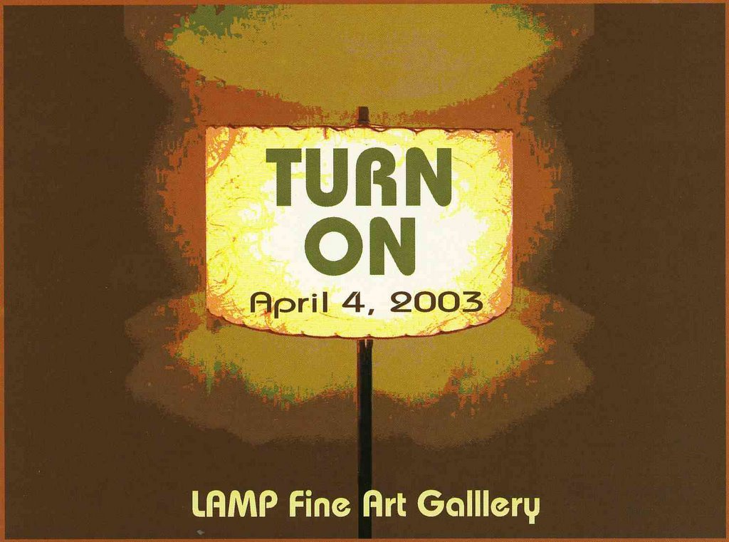
A gallery that started with know-how, talent, sharp survival instincts and not a whole lot else proves that the community wants quality art. This 11-artist group show is another in a series of solid displays of local artists without representation who seek out this professional venue. A lyrical photographic series of a girl and an old window by Herron student Laura Elizabeth Boone was sold-out. The dirty, salvaged window-props cloud the square format images. The girl, sometimes dramatically holding the window, is drenched in beige and nude color though severe light is hitting her. The work is Eyeblink worthy. I can't help but hear a Tom Tom Club song that goes, "With my boyfriend, my lucky boyfriend," every time I see a piece by Greg Seagrave. Multiple layers of bright primary colors zigzag into funky patterns. Mosaics of color with an intricate graffiti feel fuse well and somehow manage to be easy on the eyes. The details make his work more than decorative. The fanciful, not imaginary, landscapes of Ron Stock have a Dr. Seuss whimsy with peter Max colors, only Peter Max can't paint as well. Cheery, Bulbous, lavender trees and orange sidewalks outlined in black are technically refined in execution, making them effectively playful. Through May 31, 2003; 624-9803. - Mary Lee Pappas
Wednesday, April 16, 2003
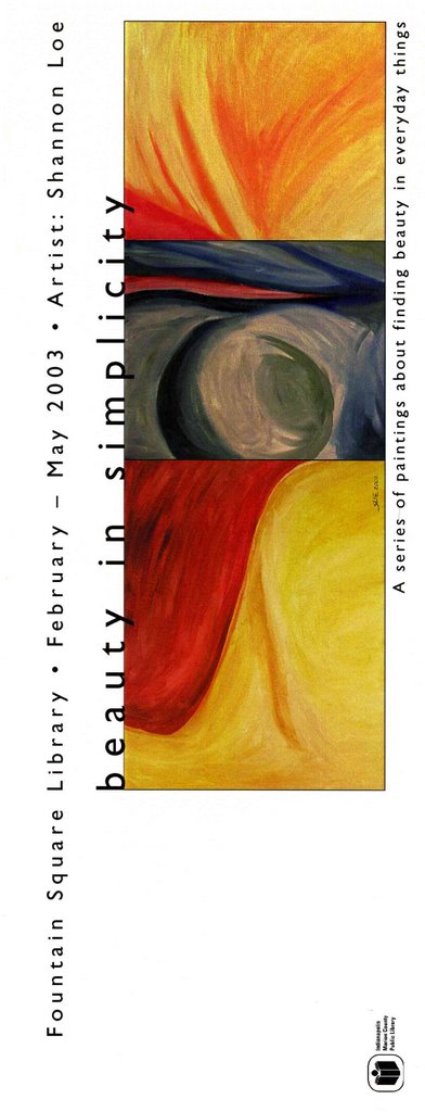
Shannon Lo "Beauty in Simplicity" - Fountain Square Library - April 16, 2003 - 1 1/2 stars
Depth and contrast are missing in these nine simple and dull colored abstract works. Uncomplicated biomorphic swirls and close-up twists are painted timidly. They are an anxious attempt to be something more than whim. This show is a reminder that, ultimately, an artist creates to satisfy oneself and never-ever for review. Putting art out there for the world to see takes guts and has to go hand-in-hand with the desire to elevate that art, to learn from the experience, Objectivity and detachment can be uncomfortable lessons, but improve the purpose for the artwork. A promotional card reads, “A series of paintings about finding beauty in everyday things," which very well could mean finding beauty in the experience of painting. Through April, 2003; 317-269-1877. –Mary Lee Pappas
"Beyond Enron: The Politics of an Aesthetic Revolution in a Post War Economy" - Everyday Inventors - April 16, 2003 - 3 1/2 stars

The only gallery to boast a time machine, Everyday Inventors parodies art as big business better than some do professionally through performance, video, photography and funny fake name badges. It's too bad extra curricular cash can't turn their well-defined let's-pretend concepts into reality, but that's part of the parody, too. "Politics are imbedded in this aesthetic revolution,'” the exhibit statement, "Beyond Enron 2003 Conference" pamphlet, states. "Studies have shown that fine art can no longer survive in museums and traditional gallery space." Beyond Enron emphasizes that a gallery is like a corporation based on aesthetics. Smart and well-conceived, El is tastefully raising the local bar for art with modesty. Through June 6, when their next exhibit, Time Travel Experiments, opens; 317-955-7577. -Mary Lee Pappas
Wednesday, April 09, 2003
Sofiya Inger - Borders River Crossing - APril 9, 2003 - 3 1/2 stars
A single 5-foot-by-10-foot painting, “Vanishing Worlds," hangs alone in the quiet coffee shop. There appear to be six scenes of turmoil acted out in fragmented human silhouettes that Inger refers to in her statement as "bullets," "despair" and "ill." Hot yellows and oranges flare like fire against tile deep burgundy cloth they are painted on. Cool contrasting blues and rich greens create depth and visual comfort walling a Russian expressionistic/folk tradition. A soft and curvilinear treatment adds to the melandio~-meets4antasy mood. The contemporary evolution of humanity has taken some decidedly less than humane stumbles. This is a timely piece of art that approaches truth through genuine sentiment. lnger is represented at Woodburn and Westcott where more of her work can be viewed. Through April, 2003; 317-574-1775. –Mary Lee Pappas
Tim Harmon "The Disposable Coffee Caddy Redefined" - Cath Inc. - April 9, 2003 - 3 stars
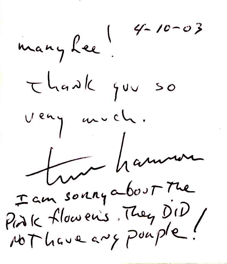
Harmon, of Tim'n'Avi fame, presents 30 good-humored, rethought and recycled four-cup coffee caddys. The pressed composition cardboard trays, strictly utilitarian and immanently disposable, are affectionately appreciated for their purpose and keen design. Silly, impractical and sometimes in left field, this show is not short on giggles or smarts. Caddy #24, "Let It Be" War Scene, features little plastic Army men battling it out on their sand glued caddy under little plastic Iraq and American flags. Crank the music box hidden below and the Beatles' "Let It Be" chimes like a lullaby. It's a sweet message of peace that sucks you in with its playfulness, but doesn't bonk you over the head a la Michael Moore acceptance speech. Caddy #21, nothing more than a cast aluminum caddy made with the assistance of artist Eric Nordgulen, wonderfully emphasizes the design competence of the paper product by timing it into a sculptural piece of an. 'Rainbow Glitter," Caddy #9, with glitter glued all over, is a hoot. Each caddy is more amusing than the last, whether it be "Zen Garden," "Candle," "Jesus on His First Easter" or "Antique Quilt." This stop-and-smell-the-flowers show (take note of everyday design) is a happy offering by someone who loves art and sees artistic potential in all sorts of salvage. Through April, 2003; 317-251-2677. -Mary Lee Pappas
Wednesday, April 02, 2003
Jason A. Miller - Starbucks (3778 Meridian St.) - April 2, 2003 - 3 stars
Two framed landscape photos rest on an easel in the northwest corner of this intergalactic coffee shop. This could be a relatively nice exhibit venue if art could be hung on the west wall and if that particular wall wasn't covered in ugly corporate wallpaper. It would have been great to have seen more work by this photographer. The glossy photo images are slightly blurred, evoking memory and sensory feelings. Colors are cool and few, with black shadows that fuzz out. These very beautifully composed scenes are dreamy and captivating. 317-920-8670. -Mary Lee Pappas
Wednesday, March 26, 2003
William F. Kaeser - Midland Arts and Antiques - March 26, 2003 - 3 stars
Fourteen paintings by Indiana artist Kaeser, from his estate, are currently available for sale by Tom Shipley at Midland. A 1932 Herron graduate, Kaeser is probably best known for his WPA post office mural, "Loggers," in Pendleton, Ind. Having studied with William Forsyth and Clifton Wheeler, the German-born Kaeser painted his share of Indiana landscapes and was as such affiliated with the Hoosier Salon. He exhibited at the New York World's Fair in 1939, much to his credit as well. Modern figurative works were his preference and reflect the crammed, active spaces presented in this group of work. "Topless Tango" has a Good Times feel to it. Its compressed composition of furious topless dancers stacked next to each other has a folky flatness. Most of the pieces, images of Midwestern common man condition, have this mo5aic ambiance. Priced fair for worthy pieces of Indiana art history and worth a look. 317-730-4573. –Mary Lee Pappas
Douglas David "Indiana Peonies" - Midland Arts and Antiques - March 26, 2003 - 3 stars

'INDIANA PEONIES': DOUGLAS DAVID 3 stars Midland Arts & Antiques. Blankets of lush, predominantly pink peony oil paintings line the entrance walls at Midland A palette of soft, rich periwinkles and pinks cover the unframed canvases, creating a light and airy atmosphere. Unrestrained wide strokes push these safe and minimal colors into their bushy flower likenesses. Though paint is handled loosely, the romantically pretty work is too safe to be truly expressionistic, The sense of grace and pastel hues recall Rococo, though are nothing Watteau would know. David beautifully composes his still lifes by gently balancing form and tone. The eyes move gently through his pieces. The small crop-shot peony bloom series is abstracted just enough to suggest their bunchy shapes. This could be said of his even smaller peony oil sketches, full of whirlwind energy, that are a bargain at $65 each, two for Sl 00. His landscapes carry lavenders and deep blues experienced at sunset. By default, everyone in Indiana will have a David work of art in 2003 because he designed the new license plate. Through April 27, 2003; 317-267-9005, -Mary Lee Pappas
Wednesday, March 19, 2003
Randall Scott Harden and John Reynolds "Close to Nature" - Hoosier Salon - March 19, 2003 - 3 1/2 stars

The new and without question improved Hoosier Salon Gallery can boast space, better fighting and easier access to the organization. Traditional Indiana landscapes get a color-tinged twist in the works of Harden and Reynolds. Harden's painterly depictions of Power-laden scenes are executed with thick impasto swabs of color impressionistically dabbling his canvases. His picket fence views are less inspired than the nearly biomorphic oil on paper small landscapes. Smooth and shiny, they are abstracted just enough. "Sunlit Givery," with its purples and pinks against green and hints of blue and hot red on the horizon, are a testament to his well-balanced visual talents. John Reynold's many rooster, cow and nature paintings are executed expressively with a cooler color palette and softer hard. Teals and pea greens shadow and highlight his roosters while contrasting vibrantly against the red-red cock's combs. "Hereford at the Fond" is a comparatively tiny piece at 7-inches-by-5-inches. It's a realistic representation of a cow you'd want to know, with streaks of purple reflecting in the white waters, Both artists are excellent and produce quality in their traditional genre. The Hoosier Salon is a prime, and recommended, spot to view and weigh the transition traditional painting is undergoing in Indiana. Through April 12, 2003; 317-253-5340. –Mary Lee Pappas
Jennifer Bartlett "Prophetic Agenda and the Feminine Mystique" - Jarrett Engineering - March 19, 2003 - 1 1/2 stars
(5335 N. Tacoma Ave.). A federal judge ruled in 2001 that Barbie could be parodied by artists it, their work. Since then, artists have much abused this Mattel medium to explore sexuality, female stereotyping and pop American culture. Barbie exploitation is seen so often that it has become pitifully cliched, particularly in contemporary art photography. Just in time for Lent, Bartlett presents a softly focused, dramatically lit Barbie and Ken enacting stories of the Bible and the Apocrypha in this photo series with titles that include "Eve Defies Adam," "Ester Saves the Jews" and "An Adulteress Repents." You need not be a Bible-thumper to be confused by this show. It's a wee bit overwrought with intended symbolism, among other things, to be just goofy. Local photographer Cy McOuigg, who has done comparable doll imagery, does a much better job. Located in the far corner of a smoky old office (you have to weave between work stations to see it), the work is framed really nicely, complete with brass title plates. Not all atypical art venues work (hair salons, for instance) but the staff was gracious and this office had an eclectic charm. Here is a random smattering of national Barbie art photography to peruse: www.geocities.com/micromarty/ADbarbie.htm; http://helios.acomp.usf.edu/~difrey/. Through March 21, 2003. -Mary Lee Pappas
Wednesday, March 12, 2003
Caroline Mecklin - Deano's Vinos - March 12, 2003 - 4 1/2 stars
Mecklin, known for her nudes and portraits, presents an outstanding new body of work. Her approach to painting is so distinguishable and proficient that it is a delight to see her stretch beyond her already high standard of excellence. Everything is polished. In one piece, a pastel lounging woman is framed by the fabrics she lies on - shapes and dashes of bright color surrounded by black. The spontaneous, patterned image advances toward the viewer and conceptualizes reality and the human form. This odalisque is elegant, beautiful and masterful. Another portrait, in charcoal, is inspired. Mecklin's unending artistic examination is demonstrated well here and worthy of note. An artist reception will take place March 21. Through April 4, 2003. –Mary Lee Pappas
Edie Gray - Joe Reuzar's Deli - March 12, 2003 - 2 stars
While the black beans and rice at Reuzar's were delicious, the art on the walls was bland and state. The collection of naive acrylic abstractions lacked technical substance, yet were still expressive, maybe even personal, in their own psychedelic way. Unfortunately, they carried a generic, replicated look. Only "Soul Dance," with its swirly pastel colors, had a more fluid edge. The manipulated photos on display better expressed the artist's aesthetic sensibilities. While the compositional continuity was maintained, the colors were hotter and the warped forms had depth. The work was enhanced by excellent matting and framing. The photos spoke for themselves. 317-916-DELI. -Mary Lee Pappas
Wednesday, March 05, 2003
Me, Myself and I, Self-Portraits - Indianapolis Museum of Art - March 5, 2003 - 3 stars
The collection of self-portraits, from Durer to Rauschenberg, are sensitively conceived representations of the artists’ personalities and serve as valuable documents of art history. Primarily black and white images (etchings, engravings, lithos and drawings) are crisply presented in plain, bleached wood frames with white mats. Ibis enhances the sketchy and intimate feel of the show. Self-portraits are, as the exhibit explains, "artistic exercise” that every artist utilizes to sharpen skills. Aesthetic sensibilities, status and technique are sharpened through these self-studies. They convey what the artist thinks of herself or, in the case of this grouping, mostly himself. George Cruikshank, who illustrated Grimm's fairy tales and Charles Dickens works, represents himself in the same manner as his famed illustrations. A piece by a promising Indiana artist f the late 19th century, Charles David Fiscus, is displayed. One of only two works completed by this artist before his death at the age of 22, it is delicately and masterfully rendered, especially when compared to fellow Herron student Glen Cooper Henshaw’s pompous pose. This is a show (the Goya and Mora pieces are very cool) that artists and students of art history should see and savor. Let's hope this gallery doesn't experience the abnormally high levels of humidity plaguing the Turner Gallery next to it during this wet weather. A renovated facility with more than a mere hygrothermograph can't come soon enough. Through March 9, 2003; 317-923-1331. -Mary Lee Pappas
Wednesday, February 26, 2003
Full Circle: James Willie Faust - Domont Studio Gallery - Feb. 26, 2003
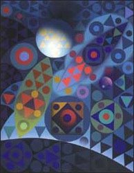
Full circle: James Willie Faust
Visual Arts Review | Thru March 22
Mary Lee Pappas
*Pictured: "Auspicious Night" by James Wille Faust
John Domont speaks articulately and poetically for the art he represents at his Domont Studio Gallery. His words are coup for gallery hopper James Wille Faust, who has settled at Domont for his first solo show in three years. Simply said, the paintings are more of the same - more rote than ripe. A myriad of highly defined, primary colored, stay-in-the-lines circles and triangles wading or warping in modular forms. They need only a black light to enhance the psychedelic optical illusions.
Distance is best for viewing. Pencil marks peek from around the shapes, serving as reminders that these are created by human hand. The repetitive, mechanical formula within Faust"s compositions appears playful and familiar. Hanging powerfully as a group, it"s apparent that his superior color balance and tonality have become more sophisticated and refined.
Internally, the pieces visually contract - not unlike the works of Op artist Auguste Herbin whose famous 1944 "Air, Fire" painting fundamentally achieves what Faust"s do, but without a final acrylic airbrush layer. This body of work (landscapes and the human being series) is, coincidentally, titled Earth Air Fire Water, in tribute to those elements. One influence on these pure-effect works that command questionably steep prices could be early sales successes.
Faust, actively collected locally, is a favorite big fish in our little pond. But his brilliant sculptural models, intended for monumental public works of art, make his paintings look like sketches. Given the opportunity, Faust"s artistic vision would gloriously come full circle. Geometry within geometry, these 3-D pieces bring his hard-edge imagery to spectacular, inspired life. It would be in the interests of the Indianapolis Art Center and the Indianapolis Museum of Art to include him in their sculpture park plans. Through March 22; 685-9634.
Wednesday, February 12, 2003
Bartosz Pietrzak "Pietrzak Puls" - The Photography Gallery - Feb. 12, 2003 - 4 stars

Photographer Bartosz Pietrzak was exiled from Poland in 1982. As a member of the Democratic Opposition Movement, which started in 1976 and became the future inspiration for the national solidarity movement in Poland, Pietrzak was co-editor and photographer for an underground paper, the Puls (Pulse). "You had to do something. It was hopeless," he said of his journalistic efforts. Martial law was imposed on Dec. 13,1981, sending him to prison, but not for long. "They were visibly interested in getting rid of us," he explained of the government. Pietrzak was given a choice in 1982: stay in jail or emigrate to the United States. Grabbing a few personal belongings, including photos, Pietrzak and his wife left Poland. Half of the 20 photos on exhibit at the Photography Gallery are piecemeal examples of his black and white work from the 1970s. Some of these were rescued by friends and sent to him here. These images have been digitally reshot, cleaned up and reprinted, resurrecting them with the same integrity as their original gelatin silver prints. Others have been executed over the last three years. "For 20 years I didn't do anything until three years ago," Pietrzak said. Digital photography was the enabling factor. Most all of the works adhere to a photomontage convention. Viewing the photo fabrications of environments and objects is like reflecting on, or entering, a daydream. Unmodified portrait images from the 1970s are strikingly candid. Pietrzak's explorative montage method is successfully demonstrated in this deserving and splendid show. Though diverse, the images have a poetic uniformity. Pietrzak has exhibited in Germany, Denmark, Malaysia, India, Great Britain, Brazil and now, fortunately, in his Indiana home. Through Feb. 28, 2003; 317-423-9237. –Mary Lee Pappas
2003 National Scholastic Art Awards of Central Indiana, Inc. - Harrison Center ofr the Arts - Feb. 12, 2003 - 3 stars

Three hundred terrific artworks selected from over 3,000 submitted by junior, middle and high schools from around Indiana. Eleven professional artists judged and ranked the works as Gold Key (highest award on a regional level), Silver Key (second highest), Honorable Mention and the Best of Show Awards, known as the American Vision Awards. Gold Key and AVA winners' works will go to NYC to be judged for over $1,000,000, in awards and scholarships, then travel to Washington, D.C., for exhibition. Any of the mature Gold Key drawings created in Jonathan Kane's Carmel HS class will give their national competitors a run for their money. His students have quite a competent and comfortable grasp of color and values, Carmel HS and Jefferson HS (Lafayette) are by far the best represented out of the 582 eligible schools. Visual arts magnet Broad Wipp4e HS was represented by a slim picking of six pieces, but happily garnered an AVA and two Gold Keys. Though some of the work isn't completely indicative of students' own freedom of expression, the overall magnitude of talent is great and, even more, inspiring. To say I had a favorite piece in the show just wouldn't be right. But I must admit that as I have painted in my studio, just up the stairs from the HCA Gallery, I've traipsed down to the gallery to specifically visit work by Joseph Chang, Gold Key Fine Arts Portfolio winner from Harrison HS. Through Feb, 23, 2004; 317-514-6787. -Mary Lee Pappas
Wednesday, February 05, 2003
Millet to Matisse - Speed Museum, Louisville, Kentucky - Feb. 5, 2003 - 3 stars
A joy if you love art history, miserable if you need to visit the two-seater lavatory. Millet to Matisse is fantastic but not the blockbuster exhibit touted. Pioneers of 20th century painting, Van Gogh, Monet and Matisse were used as marketing candy to seduce an audience for a brilliant tutorial. This collection from the Kelvingrove Art Gallery in Glasgow, Scotland, is rich with examples by artists who are sometimes overlooked, like Alfred Sisley and Adolphe Hervier. Paintings by Rouault, Corot, Cezanne and even a piece by Utrillo expertly walk you through a revolution in artistic technique and perception. The Speed was not equipped to handle the car traffic, or the pedestrians awaiting entrance into the show, The limited audio tours were sold out and the line for the WC was longer than for the exhib7it. This show travels to the Frick (Pittsburgh) next and is well worth a visit. –Mary Lee Pappas
Katherine Hanley Knutson "Flowers and Animals" - White River Gardens - Feb. 5, 2003 - 2 1/2 stars
Proficient photo-realistic watercolor paintings of polar bears, zebras, elephants, bears and penguins from the Indianapolis Zoo all look beige and blend into the stone wall of the Schaefer Rotunda where they hang. Though beautifully framed by JoAnne ETC, as a group, the adept works suffer from sameness. Images are painted as intended with little overall surface mixing. The comparatively colorful flower paintings were equally skillful though the still lifes looked like funeral arrangements instead of escapist bouquets. Proceeds from sales benefit the Indiana Zoological Society, Knutson's work is also available in the Indianapolis Zoo's gift shop. Through March 9, 2003; 317-630-20O1. -Mary Lee Pappas
Wednesday, January 29, 2003
"Brain: The World Inside Your Head" exhibit review, Indiana State Museum, Published January 29, 2003 in NUVO

BYOB: Bring your own brain
Exhibit Review | Thru May 4, 2003
Mary Lee Pappas
NUVO, Published January 29, 2003
A deep muffled heartbeat seductively draws you into this hands-on exhibit. Your own brain will determine if you enjoy it - if you can stomach the reproduction dog brains. Will your soft, gelatin-textured brain remember the gory skull of Phineas Gage whose head was penetrated by a rod during an 1848 explosion? Will you relinquish any stigmas you may have had about brain-based diseases and disorders after learning that Abraham Lincoln suffered from depression? That Winston Churchill and Vincent Van Gogh had bipolar disorder?
Author, mental health advocate and Walter"s daughter, Kathy Cronkite, spoke at the member"s preview last Friday and said, "Learning disabilities may just be a different way to learn that may not fit in with the school system." Parents with children labeled by their teachers as generically dyslexic or ADD understand this all too well. Our brains make us uniquely who we are. An exhibit display says it best: "Your sense of who you are comes from an interior movie your brain constantly creates. You are the star, screenwriter, camera operator, producer and director. You are the movie studio and the movie theater. Rather, your brain is."
Commendable programming accompanies the exhibit, from a Brainy Brownies badge workshop to a program about stroke risk factors. Engaging for all audiences, from icky to profound, this exhibit was summed up best by Cronkite: "It"s fabulous."
Brain: The World Inside Your Head is on exhibit at the Indiana State Museum through May 4. Call 232-2637 or log on to www.indianamuseum.org for more information on hours and programs.
Milton Flournoy III "Milton's Mirrors of Contemporary Art" - The Cube Restaurant - Jan. 29, 2003 - 1/2 star
With very dim lights and few fast food counters within its front door, the Cube is an unfavorable venue for art. Not only can the potent burrito and pizza smells permeate artwork, grease can coat it. For the mirrors on display this could be doubly disadvantageous when all things airborne hit the thinly applied acrylic paint on the mirror surfaces. Sure, there are Raushenbergs disintegrating in museum storage rooms, but these mirrors hanging immediately above the laminated patron tables seem especially vulnerable to splattering mustard or greasy fingerprints. A boy at a stream, squiggles, an abstracted figure were a few of the maroon-toned (it was hard to discern in the light) doodled and random images on various store-bought mirrors. The Cube does neither these mirrors, not the artist, Milton Flournoy III, any favors. Through Jan. 30; 317-972-1382. -Mary Lee Pappas
Wednesday, January 22, 2003
Group Show - LAMP - Jan. 22, 2003 - 3 1/2 stars
A variety of female artists' work, mostly good, some quite forgettable, hangs very well as a whole for this show. A+ for presentation. Opaque, flat glazed, small ceramic sculptures by Michelle Smith are kind of Monty Python meets Mary Englebright, but not really. The dainty pieces are given serene faces, one with something that looks like a yellow daisy swim cap, surrounded by the likes of periwinkle-stamped butterflies. Easily likable and bearing merit, they are whimsical without the art fair look. Yasha Persson's distinctively manipulated photographs are ripe with symbology, beauty and color, without an outrageous price tag. Stacy Novak's large oils, recently displayed at Vic's Coffee Shop, on the other hand, are a bit too high. Her soft Images, feminine pale pinks and designs she creates around her figures, are attractive and seductive. Her paints are mixed with some disproportion. It's like nails down a chalkboard to see dull spots next to high shine. Nancy Kruse's straight-on views of local church doors were decorative. She has a real sense of light and illusion, but reeds to work on the painting part. “Boxed ln," an installation by Jan Van Flexon and Indianapolis Museum of Art light designer Carol Cody explores confinement socially, culturally and personally. It's no surprise that MTV2 chose to film a spot with MadLab at LAMP last weekend. The LAMP (Local Artists Making Progress) space, a former nursing home facility, is steadily making progress This gallery is in it for the artists in a good-spirited, fundamental way. To get more of a taste, listen to LAMP director, Jennifer Kaye, on NPR's (90.1 FM) Art of the Matter this Saturday, Jan. 25, 4-5 p.m.;. Through Jan, 25; 317-722-0137. -Mary Lee Pappas
All that glitters - Indianapolis Museum of Art - January 22, 2003

* Pictured - An evening suit, designed by Coco Chanel, part of the "All that Glitters" exhibit at the IMA
* A personal aside - My mother was a buyer at L.S. Ayres during her time there from 1947 to 1968. Her expertise and experience have enabled and fed my fashion and fabric brain.
Currently on exhibit at the Indianapolis Museum of Art, All that Glitters consists of 20 primo examples of classic couture women's evening wear from the IMA's collection of over 700 pieces. Spanning the 1950s through the '80s, these glamorous garments are encrusted with hand-applied sequins and beads. They represent an era when dressing up was the norm for an urban evening. Plum colored walls create a sumptuous backdrop for these extraordinary 20th century garments in the third floor gallery dedicated to textiles. Designers represented are Coco Chanel, Guy Laroche, Givenchy, Fontana and Indiana"s own couturier trio Bill Blass, Halston and Norman Norell. Terrific examples of these designers' looks go hand-in-hand with the glitter of their meticulous, hand-embellished ornamentation.
Beautiful examples of Halston's work, the best represented of the group, size up style trends, quality and his distinctive look. Cute on the right person, a Pinto orange tank dress saturated with orange beads and a solid bugle-beaded tie belt from 1980 is a bit on the dramatic side. His bubble look jacket, made from a single piece of fabric, gathered at the shoulders, is masterfully constructed. More typical is a timeless 1980s red, long-sleeved cardigan jacket and pants, beaded in the same red with a unique, swirly pattern on synthetic fabric. It's topped off by a gorgeous double-layered silk chiffon halter top with a wrap-around waist sash. Though Halston's bead work was done in India from 1973 on, these two outfits represent the tedious art of beading by hand, which has mostly been replaced by machine beading.
You only have to think leisure suits to know that the 1970s and '80s weren't an elegant time in fashion history. Dressing up was fizzling out and a dated pink and black diamond patterned Givenchy top from 1985 shows it. This piece has a generic Bill Cosby sweater-trend look as opposed to the revered Hepburn style for which Givenchy is best remembered.
Though simple and tailored, the single Blass piece, a pink and purple painted and studded python jacket, would have required the right wearer to carry it off as elegantly as it was made.
A graceful, late 1950s strapless Givenchy ball gown is more to the point. The salmon pink silk shantung skirt is dreamily exquisite and need only be accompanied by Prince Charming. It's a typically cultivated ball gown of the day with a gathered skirt, fitted and embellished bodice, a little lowered waistband and horsehair reinforced skirt. Today, women don"t have the opportunity to buy dresses like this, let alone have a place to wear them. This dress would have been pricey for the day, though probably not a one-of-a-kind.
Hopefully, only one was made of the over-the-top Fontana early 1950s ball gown of silk velvet trimmed in ermine. It's no wonder that Fontana became known for theatrical clothes, having produced such an outlandish gown. It is more costume than evening attire. In extreme contrast is a Fontana silk lace and organza ball gown from the same period. All kinds of beads - scallops, metal, glass - sprinkle through the four panels of bias cut fabric.
The two Chanel offerings in the exhibit are by far the most timeless and refined. A silver and gold three-piece suit shows Coco Chanel's classic tailoring and unprecedented style. Francois Lesage, who did bead work for couturiers, should get full credit for a green Chanel suit on exhibit. A straight, ankle-length skirt falls below a simple hip-length jacket with a small mandarin collar - both meticulously adorned with green bugle beads. It is a gorgeous masterpiece. Lesage, who worked with all the best designers, took over an embroidery workshop in 1949 that was historically synonymous with luxury, having created for the likes of Napoleon III.
Most all of the beaded pieces displayed are executed on lightweight silk chiffon. Most notable is a sarong style dress by Halston from 1973 with a fish tail back. The silk organza is so heavily ornamented with crowded mirror, glass and other beads, you wonder how the raglan sleeves could hold under their weight. It appears to be remarkably heavy - though hardly a sacrifice for the lucky wearer of this work of art. This exhibit is a real treat, superbly exemplifying clothes as a complex artform. Fashion is an elaborate mix of collaborators, fabrics, designers, colors and trends all coming together - for a party dress. Through May 4; 317-923-1331.
Wednesday, January 15, 2003
Ivy Campbell and Zenobia Weigel - Hot House, Murphy Art Center - Jan. 15, 2003 - 4 stars

Ten-year-old Ivy is the daughter of artist Phil Campbell and 11-year-old Zenobia the daughter of artist Jo Legner Phil's partner, so it's no wonder that these two young ladies would be artistically ahead of the game for their age. Very imaginative and keenly observant, they've already staged four sold-out showings of their young drawings and paintings, the last of which was at Deano's Vinos. The girls talked about how they were founding their own theater club, having determined that a Shirley Temple styled Little Princess would be their first performance, all the while holding a yellow plastic Hello Kitty mini safe for their drawing sales. The 40 or so nude female drawings, executed in No. 2 and colored pencils, from 8-by-1O's to 2-by-2s, are quite admirable. Artist Lois Templeton purchased two drawings and praised the girls' confidence with portraying the naked female form and doing so with accuracy. They are all proportionately correct, cartoonish with outlines (not sketchy), each unique with individual expressions and Barbie enviable hairstyles that only girls this age could draw to boot. They asked their parents' permission to draw naked women, saying to Legner, "We need to do luxurious nude women." And so a reference book of nudes throughout art history was handed over and the prepubescent two copied classical poses for their darling line drawings. Every picture is appropriately titled for the woman depicted. Foe example, "Alien" depicts a single-breasted, naked, bulbous-headed alien, while "Devil" has red skin, a tail and horns popping out of her black Betty Paige hairdo. Priced art only $1 to $3, they would make a memorable Valentine's gift framed. The show ends when all the pieces have been sold; 317-686-0895. –Mary Lee Pappas
"Beige Vinyl" Prajex - pay toilet studio space, Murphy Art Center - Jan. 15, 2003 - 2 stars

"Polymedia by Prajex" is what the postcard touted and polymedia is what was delivered in this quasi installation, more a room with stuff in K. Artists Mark Diekhoff and Jed Bagby turned what was formally a pay toilet into nothing short of an interesting exhibition (quite literally) space. You can't put your finger on whatever in God's name they were trying to convey, but it was still fun to peer into the space with artist-recorded twangy, plunk-plunk-plunk guitar music eerily playing an annoying, nonstop, poetically impulsive ballad. Are they funnier than the rest of us, have more time on their hands or artistically more intelligent? An intentionally awkward sounding singer sang lines like, 'The lightning bugs in jars / (refrain) give it a chance / ahhhh Aubergine." Kermit the Frog is Pavaratti and Madonna a lyricist in contrast, so it was not a surprise that the tip jar was empty. Even though there were Reese's Cups and York Peppermint Patties to seduce an audience, I was the only one I know of that visited the space, had a Patty and happily signed their guestbook. In this tiny space were copies of their novels, inkjet prints for $25 and other stuff for sale. Their Web site has more of this curious "art" stuff for sale. Marketing was played up heavily here, more so than art, of which quality was sacrificed overall. Several large paintings, offered up at $799 each, were stacked in the hall and too big to flip through though the pale and warm colored swirling abstract on top was great. This was clumsy, but not without a funny factor. I hope it was supposed to be funny. 317-357-4710; www.prajex.com. -Mary Lee Pappas
Subscribe to:
Posts (Atom)