An art critique as well as exhibition preview and overview archive spanning from 1999 to 2012 by Mary Lee Pappas, the art critic for the alternative weekly newspaper, NUVO, and visual arts columnist for the daily paper, The Indianapolis Star. Indianapolis, Indiana.
Ad
Wednesday, April 30, 2003
Plein Air Paintings from New Harmony - Hoosier Salon - April 30, 2003 - 3 stars
This group shows the broad range of style presented by these artists. Highly representational works in true-to-life colors are expected and found on the uncluttered gallery walls, making the diversity ever apparent. "Yellow Tavern" by Dave Kercheval, a lively New Harmony street scene played out in cotton candy pink, tweety bird yellow and glitter, is a primo example. It's great and works to create the illusion of reality in the same way the more traditional colorists do. Illusion is further achieved with incongruence of perspective to the buildings depicted and serves as another element that made this work stand out. Thomas Robinson's "Spring Hillside" is another standout with its purples and vigorous yet careful paint handling. The framing and presentation is always superb at the Hoosier Salon. Through May 7, 2003; 317-253-5340. - Mary Lee Pappas
"Facts and Fictions" - Domont Studio Gallery - April 30, 2003 - 3 1/2 stars
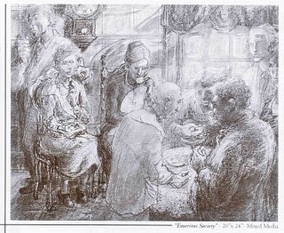
Facts and Fictions: Harry and Lois Davis
Harry and Lois Davis, married for 55 years, exhibit their stylistically different works together with wonderful and not surprising success.
Lois tastefully tackles social issues in her imaginative, figurative works with lilaclike pastel hues. "Traditions: After a Holiday," a diptych of pre-Christmas sale shopping and post-Christmas returns, shows a funny, but all too true scene of folks relatively void of holiday spirit rushing anxiously to buy now just to take it unsentimentally back. "The Children Die: Winter Enters Our Hearts" is powerfully sad as parents bury their children in the foreground, while havoc plays out behind.
Harry's paintings of buildings familiar to any Indianapolis denizen are amazing. There is no painter locally who is technically comparable or as eloquent. Using acrylic on masonite, paint is thinly and deftly dappled in careful (more like accomplished) layers, creating a beautiful illusion of reality. The texture is super smooth, opaque and tactile, so much so that you can't tell the works on canvas from those on masonite. You can see every brick in the painting of "Coulter Flats," located at 2100 Meridian. The orange-red roof catches noonday sun and contrasts perfectly with the teal sky. Through June 7, 2003; (317) 685-9634
NUVO Newsweekly, April 30 - May 7, 2003
Page 27
Mary Lee Pappas
Wednesday, April 23, 2003
John Bragg, Stephen Hartley, J.D. Nolan - The Photography Gallery - April 23, 2003 - 3 stars
Hartley's negative processing technique requires a flow chart to explain. It's something like developed slide film like regular film, made negative of images, then played in Adobe PhotoShop. Dissection aside, the image result is somewhat rough, punky and clearly unique. Nolan sticks to traditional darkroom processing, an old-fangled formula compared to the new high-tech norm. Ordinary images, like "Sunflower," a straight-on shot of the flower, get color enhanced by oil pencils delicately detailing. Bragg, who shoots professionally for Indy Men's Magazine, is a plain-old great photographer. His candids of Ballet Internationale dancers at rest in the wings hang on the gallery's east wall like a journalistic photo essay. They're damn near perfect. Stripped of glossy stock and sharp graphics, the pure artistry of his work can be seen in these inkjet prints floated on white mats. The grainy quality works in his favor to sculpt out the white-on-white image of Emily Griffen, chef at Tavola di Tosa. Through April 25, 2003; 423-9237. - Mary Lee Pappas
Eclectic Art Sale - Artistik* - April 23, 2003 - 2 stars
One of those two stars is a sympathy star, a designation never before handed out, simply because the venue is brand spankin' new. Though pottery classes, photography, art and picture framing at affordable prices are touted, this venue opened with a whimper. Silver in the City inhabited this space previously and you'll know it because their old signage still traces the bottom border of the windows. This is just one obvious sign of unpreparedness. The art on paper wasn't adhering to the mats they were floating on and were unframed (in a frame shop to boot). Though I was unimpressed with the poor display and presentation of the work, I sincerely wish for them not to go the way of Rocky Mills and Gilda's. The venue has the good fortune of settling into a fine piece of Mass. Ave. arts district real estate, but this address alone is not enough to validate it. Through May 4, 2003; 317-638-0791. - Mary Lee Pappas
*Artistik closed its' doors several months later.
*Artistik closed its' doors several months later.
"Turn On" - LAMP - April 23, 2003 - 3 stars
A gallery that started with know-how, talent, sharp survival instincts and not a whole lot else proves that the community wants quality art. This 11-artist group show is another in a series of solid displays of local artists without representation who seek out this professional venue. A lyrical photographic series of a girl and an old window by Herron student Laura Elizabeth Boone was sold-out. The dirty, salvaged window-props cloud the square format images. The girl, sometimes dramatically holding the window, is drenched in beige and nude color though severe light is hitting her. The work is Eyeblink worthy. I can't help but hear a Tom Tom Club song that goes, "With my boyfriend, my lucky boyfriend," every time I see a piece by Greg Seagrave. Multiple layers of bright primary colors zigzag into funky patterns. Mosaics of color with an intricate graffiti feel fuse well and somehow manage to be easy on the eyes. The details make his work more than decorative. The fanciful, not imaginary, landscapes of Ron Stock have a Dr. Seuss whimsy with peter Max colors, only Peter Max can't paint as well. Cheery, Bulbous, lavender trees and orange sidewalks outlined in black are technically refined in execution, making them effectively playful. Through May 31, 2003; 624-9803. - Mary Lee Pappas
Wednesday, April 16, 2003
Shannon Lo "Beauty in Simplicity" - Fountain Square Library - April 16, 2003 - 1 1/2 stars
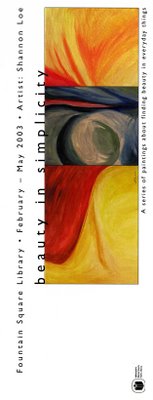
Depth and contrast are missing in these nine simple and dull colored abstract works. Uncomplicated biomorphic swirls and close-up twists are painted timidly. They are an anxious attempt to be something more than whim. This show is a reminder that, ultimately, an artist creates to satisfy oneself and never-ever for review. Putting art out there for the world to see takes guts and has to go hand-in-hand with the desire to elevate that art, to learn from the experience, Objectivity and detachment can be uncomfortable lessons, but improve the purpose for the artwork. A promotional card reads, “A series of paintings about finding beauty in everyday things," which very well could mean finding beauty in the experience of painting. Through April, 2003; 317-269-1877. –Mary Lee Pappas
"Beyond Enron: The Politics of an Aesthetic Revolution in a Post War Economy" - Everyday Inventors - April 16, 2003 - 3 1/2 stars
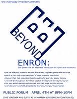
The only gallery to boast a time machine, Everyday Inventors parodies art as big business better than some do professionally through performance, video, photography and funny fake name badges. It's too bad extra curricular cash can't turn their well-defined let's-pretend concepts into reality, but that's part of the parody, too. "Politics are imbedded in this aesthetic revolution,'” the exhibit statement, "Beyond Enron 2003 Conference" pamphlet, states. "Studies have shown that fine art can no longer survive in museums and traditional gallery space." Beyond Enron emphasizes that a gallery is like a corporation based on aesthetics. Smart and well-conceived, El is tastefully raising the local bar for art with modesty. Through June 6, when their next exhibit, Time Travel Experiments, opens; 317-955-7577. -Mary Lee Pappas
Wednesday, April 09, 2003
Sofiya Inger - Borders River Crossing - APril 9, 2003 - 3 1/2 stars
A single 5-foot-by-10-foot painting, “Vanishing Worlds," hangs alone in the quiet coffee shop. There appear to be six scenes of turmoil acted out in fragmented human silhouettes that Inger refers to in her statement as "bullets," "despair" and "ill." Hot yellows and oranges flare like fire against tile deep burgundy cloth they are painted on. Cool contrasting blues and rich greens create depth and visual comfort walling a Russian expressionistic/folk tradition. A soft and curvilinear treatment adds to the melandio~-meets4antasy mood. The contemporary evolution of humanity has taken some decidedly less than humane stumbles. This is a timely piece of art that approaches truth through genuine sentiment. lnger is represented at Woodburn and Westcott where more of her work can be viewed. Through April, 2003; 317-574-1775. –Mary Lee Pappas
Tim Harmon "The Disposable Coffee Caddy Redefined" - Cath Inc. - April 9, 2003 - 3 stars
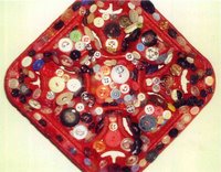
Harmon, of Tim'n'Avi fame, presents 30 good-humored, rethought and recycled four-cup coffee caddys. The pressed composition cardboard trays, strictly utilitarian and immanently disposable, are affectionately appreciated for their purpose and keen design. Silly, impractical and sometimes in left field, this show is not short on giggles or smarts. Caddy #24, "Let It Be" War Scene, features little plastic Army men battling it out on their sand glued caddy under little plastic Iraq and American flags. Crank the music box hidden below and the Beatles' "Let It Be" chimes like a lullaby. It's a sweet message of peace that sucks you in with its playfulness, but doesn't bonk you over the head a la Michael Moore acceptance speech. Caddy #21, nothing more than a cast aluminum caddy made with the assistance of artist Eric Nordgulen, wonderfully emphasizes the design competence of the paper product by timing it into a sculptural piece of an. 'Rainbow Glitter," Caddy #9, with glitter glued all over, is a hoot. Each caddy is more amusing than the last, whether it be "Zen Garden," "Candle," "Jesus on His First Easter" or "Antique Quilt." This stop-and-smell-the-flowers show (take note of everyday design) is a happy offering by someone who loves art and sees artistic potential in all sorts of salvage. Through April, 2003; 317-251-2677. -Mary Lee Pappas
Wednesday, April 02, 2003
Jason A. Miller - Starbucks (3778 Meridian St.) - April 2, 2003 - 3 stars
Two framed landscape photos rest on an easel in the northwest corner of this intergalactic coffee shop. This could be a relatively nice exhibit venue if art could be hung on the west wall and if that particular wall wasn't covered in ugly corporate wallpaper. It would have been great to have seen more work by this photographer. The glossy photo images are slightly blurred, evoking memory and sensory feelings. Colors are cool and few, with black shadows that fuzz out. These very beautifully composed scenes are dreamy and captivating. 317-920-8670. -Mary Lee Pappas
Subscribe to:
Posts (Atom)

