Wednesday, May 19, 2004
James Lane - Cath Inc. - May 19, 2004 - 2 stars
A little heavy-handed with the watercolors, Lane could stand to visit the Munce and see Bill Borden's work. A lack of continuity suggests he is still experimenting with his medium and composition. The dryness of his paints in a couple of still lifes were like nails down a chalkboard. But technical woes aside, there is a drive to convey emotion and to communicate with beauty. There is a narrative quality to the work as well. Not a bad effort. Through May 31, 2004; 317-251-2677. -Mary Lee Pappas


Sixth Annual Sculpture in the Park - White River State Park - May 19, 2004 - 3 stars
It's hard to believe that only 10 artists statewide submitted work for consideration for this Indiana-only display spanning the old Washington Street Bridge. The pieces are installed on the grassy stretch along the center of the bridge, an ideal venue for large works. I don't know what the designation, "the only urban state park in Indiana," means, but the works fit excellently into these surroundings. "Life Balance" by Bernie Carreno of Indianapolis, "A Slice of Time: Epoch" by Timothy Fitzgerald of Evansville, "Flying Wedge" by Jerald Jacquard of Bloomington, "Sky Spheres" by John Mishler of Goshen, "People Emerging from the Stone" by C.R. Schiefer of Martinsville and "Star Seeker" by Stephen Wooldridge of Sheridan are the seven works
exhibited. Individually, none of them are exceptional. Fitzgerald's steel grey and royal blue painted metal sculpture is in theme, spirit and emotion a fitting piece for the bridge. Through March 2005. Artists interested in being considered for next year's exhibit may call 317-233-2434. -Mary Lee Pappas
exhibited. Individually, none of them are exceptional. Fitzgerald's steel grey and royal blue painted metal sculpture is in theme, spirit and emotion a fitting piece for the bridge. Through March 2005. Artists interested in being considered for next year's exhibit may call 317-233-2434. -Mary Lee Pappas
Wednesday, May 12, 2004
Art Bloodbath - Art vs. Art - Fountain Square Theatre - May 12, 2004
NUVO Newsweekly, May 12 - 19, 2004, pg. 28.
By Mary Lee Pappas
Pictured: Mike Wiltrout was MC at Art vs. Art.
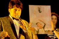
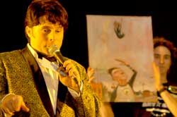
The third Art. vs. Art took place May 7 at the Fountain Square Theatre. This rambunctious art brawl and study in social politics was presented by the arts not-for-profit Primary Colours and their pals at Groove Truck Productions.
The event was a $1,000 winner-take-all competition in the form of head-to-head bouts between paintings. The winning works, determined by a decibel reader measuring audience cheers, went on to the next round while the loser’s fate was determined by a spin on the “Wheel of Death.” Death could be avoided by purchase.
Sixty-four artists participated, executing their paintings with identical materials supplied by Prizm Art Supplies. Sixteen top paintings, selected by audience ballot, went on to face off in front of a crowd of 300 spectators.
Nikki Sutton, an interior designer with Axis Architecture, commended the event while filling her three-choice ballot, saying, “A lot of people don’t feel comfortable interacting with art … but this little ballot makes someone decide. I see a lot of people I haven’t seen at any of the Murphy open houses. At the Murphy, things are all about having a cocktail and not interacting with it. Some people may have some hangups about judging what’s good art, what’s not good art. I don’t think this is what this is about. This is about people feeling comfortable expressing opinions about art where normally they would just keep it to themselves because they’re intimidated by it.”
Nikki chose one painting twice on her ballot for lack of quality options.
Artur Silva, an artist represented at Editions Limited, chose not to participate because, “I just don’t want my work to be chopped up. I don’t understand the validity of it.” He added that if anyone were to destroy his work it would be him. “I’ve lost my hope in democracy — it’s lost its value.”
“Are you ready to fuck up some paintings people?” MC Mike Wiltrout — of local bands Leisure Kings and Mr. Sparkle — asked the audience, which enthusiastically cheered and blew their party favor horns. The Arts Council’s Dave Lawrence and Brian Payne, president of the Central Indiana Community Foundation, were among the groundlings. “This is an evening of art, music … and most of all destruction,” Wiltrout said with more bravado. “You’re a cruel, bloodthirsty lot of people. Let the bloodbath begin!”
The event was basically postmodern art 101: First destroy art for the sake of art, shock the audience, but still vie for their applause and support. It’s an old idea and not always a bad one if you’re “making art available to everybody,” as Wiltrout said of the Primary Colours mission.
Filmmaker David Yosha said, “It’s not that the pieces are profound. It’s great theater and people are getting involved. I’m surprised there aren’t more people bidding on the art.”
And just then Mark Haesler, manager of Raleigh Limited, came running by excitedly explaining, “I had to save a painting. It was too good!”
Four Letters to the editor regarding Art vs. Art review published May 19, 2004
Letter #1
From Participating artist, Pat Mack published May 12-19, 2004, NUVO Newsweekly, Page 4.


Issues with coverage
As a sponsor of the Art vs. Art at the Fountain Square Theatre on May 7, I am happy to see the local media sponsorship and coverage. However, as is often the case with her writing, I found Mary Lee Pappas’ article to be catty and unbalanced (Culture Vulture, May 12-19). This is fine for a society or fashion column, but it undermines the credibility of NUVO’s visual arts coverage and hurts our city’s growing cultural standing. So I’d like to offer a few Journalism 101 suggestions.
First of all, use actual facts. For instance, attendance for this event was closer to 600 and participation was 75 individuals, not the 300 and 64, respectively, reported.* Also, this event was not just for artists. Many first-time painters joined in the fun, and more than a dozen serious artists (apparently willing to forgo taking themselves too seriously) came from Louisville, Dayton, Chicago and other regional locales.
Second, obtain facts from those who know them. Building positive relationships with reliable sources is often good for news or feature content. Any one of the 10 organizers not interviewed for the article would happily offer accurate information about this grander-scale Art vs. Art.
Third, when covering an event, actually cover it. Quote the people who participate. In this case, it would be nice to know why dozens of people were willing to spend four hours creating a painting with the risk of it being destroyed on stage. Quotes from a friend of the writer who did not participate due to philosophical issues (why was he there, then?) are suspect as a writer’s device, not substance for an article about the subject.
Fourth, use the word “fuck” only where appropriate, if at all. The usage of the MC’s quote was a sardonic commentary of the writer. It did nothing to capture the true flavor of the night, and was a shameful, transparent attempt to put important community leaders mentioned in the paragraph in an awkward context.
Finally, when it comes to covering the visual arts, please send reporters without burned bridges within the community, without personal vendettas and without a narrow understanding of the subject. It does nothing for NUVO’s integrity, and it is embarrassing to our entire art scene as we host a growing number of knowledgeable guests from other cities, such as the artists currently featured in the new iMOCA (Indianapolis Museum of Contemporary Art).
I doubt I will be alone as I continue to support Art vs. Art in its evolution into something potentially relevant to the emerging Post-Post Modern world. It’s 2004, and positive change for the visual arts is afoot in Indianapolis. I hope that NUVO will be a part of it.
Alan Schoff
Mansuzak/Schoff, Inc.
Innovative Advertising & Other Stuff
As far as Mr. Mack's letter is concerned I have to consider he's a "full-time metal sculptor" and therefore did not take the time to understand the rules. And maybe, just maybe, is taking himself a little too seriously. In general, any person, including serious artists should not take themselves too seriously.
* Jeff Martin of Primary Colours was called regarding attendance details, but didn't return the call until the piece had gone to print many days later.

Letter #3
Correcting some errors
We at Primary Colours would like to thank NUVO for their sponsorship and Mary Lee Pappas for her review of Art vs. Art. Upon reading Ms. Pappas’ journalistic offering, we felt compelled to inform you of a couple of facts and correct some errors. Seventy-five (not 64) artists participated in the event which took place before a crowd of 600-plus (not 300). Also, she misquoted our mission statement, which in its entirety reads “Primary Colours is a non-profit organization devoted to integrating visual artists and the community to create and sustain a thriving environment for the arts.”
We would also like to take this opportunity to respond to a rather negative letter from Patrick Mack, full-time metal sculptor. The official rules for Art vs. Art have been posted on our Web site for over three months. Perhaps, Pat, you read them when you registered online. Well, if not, then you surely read the rules before you signed a copy of them when you checked in and received the provided materials. The “wonton destruction and mayhem” you refer to should have come at no surprise. If you didn’t agree with what the possibilities were, then perhaps you shouldn’t have participated. Anyway, you looked like you were having a pretty good time on our video footage.
You wrote, “How great it would be if Primary Colours took this energy and enthusiasm to create and display paintings through a similar venue.” “One where the art isn’t destroyed” and “The public would have more time to absorb and decide to purchase the work.” We have done that, it’s called Allotropy, and we have done it six times: generating over $50,000 for the local arts community. And if our memories serve us, you had hesitation about that event, too.
This event was meant to be something different from the average art exhibition. An event that the audience didn’t just go see, but an event that they took part in. Art doesn’t have to be so pretentious and self-important. It can be fun and entertaining as well. If this event caught the attention and attendance of people who wouldn’t normally attend art functions, great. Maybe they had a good time and will attend future, more conventional exhibits. To say that this event “turns back the clock on our future as artists in this city” is absurd. One event, no matter what you might think of it, will not be able to do that. Over the last five years, Primary Colours has done nothing but good things for the Indianapolis Arts Community. Whether it be through Allotropy, the Primary Gallery, the annual TOYS exhibit or Art vs. Art, we are always promoting visual artists and exposing new audiences to their work. We have done all of this on a volunteer basis, we do not get paid. We do it for the love of art and to make where we live a better place.
We ask you, Pat, what events or programs have you developed to advance the local arts community? None that we are aware of. Perhaps you should redirect energies used to tear down unique and innovative art events and create something yourself.
Jeff Martin, Fred Shields, Dane Sauer, Jim Clinger, Robert Evans, Larry Endicott
Primary Colours
Primary Colours, Alan Schoff, Jeff Martin, Nikki Sutton, Dave Lawrence, Brian Payne, Fred Shields, Dane Sauer, Robert Evans, Pat Mack, David Yosha, Jim Clinger, Larry Endicott, Art vs. Art, Allotropy, Brian Phillips, iMOCA, Primary Gallery, Mike Wiltrout, J. Martin Gallery, Indianapolis Downtown Artist and Dealers Board, Centerline Studio
Urban Silos marketing champion one point IPS Becky Wilson
Centerline Studio
Bill Rasdell "A Celebration of Music and Dance" - College Avenue Library - May 12, 2004 - 3 stars
A serious artist with a distinguished photographic aesthetic, Rasdell produces consistent quality artworks that set him apart in the local community. Scenes of Cuban people and culture are captured colorfully in his prints and prints on canvas. His genuine passion for craft and subject matter is evident and keen. The exhibit is a good marriage of talent (great eye for composition and technical craftsmanship), self-exploration and expression. Art seems to come first for this artist. Through June 30, 2004; 317-269-1863. – Mary Lee Pappas
"Longing For Meadows" Bill Borden, Ron Mack, Carol Strock-Wasson- Munce Art Center - May 12, 2004 - 3 stars

An exeptional show of Indiana plein air works by Bill Borden, Ron Mack and Carol Strock-Wasson. It's all great stuff. Stock-Wasson's pastel, "Winter Cornfield," is museum worthy. Borden's watercolors are expert and priced absurdly low. Both "O'Conner's House" and “Talbott Hyatt House" are perfectly storybook and demonstrate a great understanding and control of the medium. Mack shows a keen sense of light in his pasture scenes. Overall, a very refined show from three gifted artists. Through May 29, 2004; 317-873-6862. -Mary Lee Pappas
Wednesday, May 05, 2004
Wheeler Arts Community Spring Show - Wheeler Arts Community - May 5, 2004 - 2 stars
Mostly familiar work by familiar artists presented beautifully in the front lobby and trickling back into one artist's home studio. Susan Hodgin's "The Lake," a large 40-inch-by-1 20-inch three-part painting on panel was reminiscent of an art nouveau illustration. The scene in red features heavily outlined ornamental trees, again familiar, against a landscape of flat, staggered planes in varying flat fields of poppy tones that emphasize the design quality. Three mixed media pieces trace flower designs in flat brushes in pen and paint. Choices of color give these pieces appeal. Kipp Normand's three home shrines, found object ceramic religious statuary tucked into decorative glass front boxes - were just that - lacked context and greater meaning than his architectural reliquaries of last year. Overall, this was a design-heavy show with the artwork displayed dependent on competent arrangement. Participants, a diverse group of sure talents, were only in part Wheeler artists. Occurred May 1, 2004. -Mary Lee Pappas
"Another Slovakia" - Indianapolis Artsgarden - May 5, 2004 - 4 stars
Perfectly pure and masterful photography by Martin Kollar. This small collection of 16-inch-by-20-inch Type C prints are the discerning footprints of everyday life in a changing Slovakia where old and new ways have been merging. Born in Zilina, Slovakia, Kollar captures an intimacy of expression and action that reflects the state of the country beyond strict documentation. The contrast is unglamorously portrayed, but not without intrigue and keen perception. Overcast skies secure the good light and set the stage for viewers to examine the streets along with the expressions and activities of inhabitants, whether that be a fox kill or simply getting one's hands in the dirt. Kollar's compositional aptitude only enhances the appeal and inviting quality of his work. Kollar's work is currently at the Kathleen Ewing Gallery in Washington D.C., and is touring the U.S. thanks to the Embassy of the Slovak Republic - a fine endorsement of how this work captures the culture. This is the best visual treat the Artsgarden has presented, thanks, in part, to the Czech and Slovak Society of Central Indiana. Through May 7 2004. -Mary Lee Pappas
"First Brush of Spring" - Hoosier Salon - May 5, 2004 - 3 stars

This show, featuring works created at the New Harmony Paint-Out April 15-17, offers a taste of the season with something for varying aesthetic sensibilities. All pieces adhere to the hard-to-shake local color landscape genre because this is a plein air venture. And, simply said, this kind of work is done pretty well here and is meaningful. Stylistically, the range of execution is reasonably diverse from folkish to the downright inspired "Mumford Farm Memory" by Robert Eberle. Tranquil and moody, the space is organized with a sharp vanishing point (in the form of a path) ending with a light muddied peach color. The contrast is warm against the muddied purple and green cool tones of the tree-lined scene. Small dappled flashes of true pink pop in one small area to reveal spring. "Two Quackers" by Lynn Dunbar is a gesture-rich appealing composition. The ducks are formed from light blue and ashen shades of yellow swiped confidently and easily onto the canvas. Through May 22, 2004; 317-253-5340. -Mary Lee Pappas
Wednesday, April 28, 2004
"Greatest Generation of Sports Artists in War and Peace" - National Museum of Art and Sport - April 28, 2004 - 3 stars
Sometimes the themes of shows at this museum, located at the University Place Hotel and Conference Center on the campus of IUPUI, feel like a stretch. The "museum" is essentially in the corridors of the convention-heavy facility. This art should create a point of destination for visitors instead of being an afterthought for those who attend one thing or another. This show focuses on artists who, during World War II, served as combat artists, correspondents or were members of the armed forces who happened to be artists. Some of the art is on loan from the U.S. Army, Navy-Marines and Coast Guard. Donald Moss, a combat artist in the Marines and longtime illustrator for Sports Illustrated, served as chairman for the exhibit, which is testament to the quality of work on display. Germain G. Glidden, Ray Ellis, John Groth, Fletcher Martin, Ogden M. Pleissner, Cecile Johnson, Peter Cook and Kipp Soldwedel (a pilot during World War II, he was commissioned to paint a mural for the memorial at Pearl Harbor - "The Day of Infamy") are the wartime artists represented. A very thoughtful and responsible exhibition. Through May 31, 2004; 317-274-3627. -Mary Lee Pappas
"Art Deco" A Decade of American Design" - PH Sullivan Museum - April 28, 2004 - 1 1/2 stars

A humdrum tour of American mass-marketed utilitarian objects in the 1930s. Certainly the parameters of Art Deco are broad, with something for every Modernist's taste and pocketbook - then and now. But this show hovers toward the unremarkable Fiesta ware end. On the high-end of Le Style, an enameled and wood inlaid Kodak camera by Indiana born industrial designer Waker Dorwin Teague is quite nice and significant in contrast with the content of the rest of this small show. Overall, this peek at a decade of design mass marketed to mainstream America reflects a very limited aesthetic of chromed-out, inexpensive daily accessories, like the spun aluminum relish rosette by Russel Wright. It is not a well-rounded representation of Art Deco by any stretch, but serves as reminder of how the ordinary can be taken as art. Through June 26, 2004; 317-873-4900. -Mary Lee Pappas
Wednesday, April 21, 2004
New Works By Indiana Artists - Editions Limited - April 21, 2004 - 3 1/2 stars
Thirty-two local artists working in 32 different genres comprise the first show at the new Broad Ripple location of this 35-year-old local gallery institution. A fresh red front door, natural light, the location and an intimate gallery space are definite improvements. Notable local favorite Lois Templeton gets ample wall space with one large washed abstraction that employs a decidedly brighter than usual palette executed on paper. The gestural quality of her work is emphasized on this surface and appears brasher as well. This is a welcome, energized evolution. On the other end of the scale, a tactile and chalky landscape on panel by Amanda Presnell, an EL art consultant, is calming and deceptively controlled with dark, cool colors. Everything is lovely, of note and worth a visit. Through May 7, 2004; 317-466-9940. -Mary Lee Pappas
"Brickhead #3" - Massachusetts Avenue - April 21, 2004 - 2 stars

Outside of Elements restaurant in the Davlan building at the corner of Alabama and Massachusetts sits "Brickhead #3," a large ceramic sculpture by Indiana native James Tyler. It's a colossal head, sculpted and sliced apart into many hundred brick pieces only to be reassembled. The symmetrical facial features, swollen lips and sanguine expression remotely recall a Fourth Dynasty Egyptian look and some may say that's a stretch. Is there supposed to be an ancient context here of keeping the head away from the body after death? This big terra cotta-colored head, neckless and bodiless, does compliment the brick facade of the Davlan building and the grassy courtyard where it resides. Of better quality and more interesting than most of the publicly displayed sculptural works along the avenue, it still lags. Funded by the Indianapolis Cultural Development Commission, "Brickhead #3" feels a bit more like a gimmick than a sculpture. Sounds are supposed to emit from the head as people wander by, only, unfortunately, it was difficult to decipher if this feature was working. "Brickhead #3" is missing some of the fluidity and detail found in other works by Tyler, making this piece appear to be a second-best effort. Through Sept. 30, 2004; 317-634-3114. -Mary Lee Pappas
Wednesday, April 14, 2004
George Murff "Figurative Expressions - College Avenue Library - April 14, 2004 - 2 stars
Upon walking into the library with Murff's work encompassing the upper periphery of the walls, your eyes are diverted to the primary bright yellow barren background of "Survivor," a portrait recently exhibited at Dean Johnson in No Boundaries - A Multicultural Viewpoint. It may be the best of the bunch. A collection of oil paintings, pastels and watercolors, this body of work has a graphic sensibility to it, not a surprise considering Murff has designed banners and posters for local government, including "Shower your baby with love." Compositions look too extracted from photographs, as does the wavering realistic approach to the work. There is something a little amiss - some trepidation in the depiction of faces - that gives the portraits and figurative scenes in the painted works a stiffness instead of a lively lightness. The style in some pieces isn't personally distinguishable. Though passionate in subject matter, emotion isn't fully realized in the overall finished products. Through April 30, 2004; 317-269-1863. -Mary Lee Pappas
Itza Pizza Art - Itza Pizza - April 14, 2004 - 2 stars
Itza' Pizza usually serves up fresh, hand-tossed crust pizzas with dough made daily. An 8-inch pizza is a mere $6 and a 16-inch is still only $12. Better yet, sandwiches and pastas are all under $5. Open Monday through Saturday, 4-11 p.m., it's also currently serving up art with a portion of the sales going toward the little eatery situated smack dab in the middle of the Fountain Square arts district - one with more art than retail shops. Collectively, the grouping is of pizza-themed artworks - from ceramic vessels and photography, to styrofoam slices. Prices are very low, from around $25 on up. Though tiny, this is a funny, quirky display that does require a basic sense of humor. Through May, 3, 2004; www.discoverfountainsquare.com, 317-635-6252. -Mary Lee Pappas
Wednesday, April 07, 2004
Ugly Dolls, a toy review - April 7, 2004
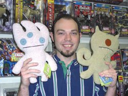
Ugly Dolls
Toy Review
Mary Lee Pappas
*Pictured:
Matt Booher, assistant manager of Comic Carnival’s Westside location.
Forget Kestner, Kewpie and Madame Alexander, the Ugly Dolls are the cuddly wuddly antidoll dolly of today. And they are soooo cute even though they are soooo ugly. “That’s the mentality,” Matt Booher, assistant manager of Comic Carnival’s Westside location, said about their uncommon irresistibility.
Ugly Dolls are adorable dorky alien creatures made of baby soft polyester fleece. They aren’t jointed or multidimensional, but rather flat and pillowy, with appliqued perfect circle felt eyes with itty-bitty pupils. Their simplistic facial features and linear body design give these plush stuffed Martians a charming vulnerability that make them practically spontaneously huggable. Couple that with a few involuntary simpering, “Ahhhhs,” and other loving coos and you’ve got a typical tender reaction to the cartoonish Ugly Dolls.
Though well-suited for a little baby, adults are the primary consumers of Ugly Dolls. “I don’t know why they haven’t caught on with kids. They’re a lot cuter than Beanie Babies,” Booher said. Comic Carnival has been selling out of the dolls at their four Indianapolis locations since they started carrying them six months ago. “They’ve been pretty good for us,” Booher added, saying that both men and women have been charmed to bits by these freaky cuties. “It’s been a mixture. Guys have probably been buying them as gifts.”
People across the country have been buying them, from the artsy-fartsy likes of the Whitney Museum of American Art and the MOCAs in Cleveland and L.A. The success of their design is unquestionable. To learn more about Ugly Dolls visit www.uglydolls.com. Ugly Dolls are available at Comic Carnival’s four locations: North, 253-8882; South, 889-8899; East, 898-5010; and West, 293-4386. Dolls are $19.99.
Gym Stoffer- Joe Reuzers Deli - April 7, 2004 - 2 1/2 stars
A graduate of Herron School of Art, Gym Stoffer has worked in the medium of collage for the past 20 years. An accurate statement read, "He reconfigures commercial imagery into surrealistic dreamscapes filled with hybridized archetypes performing bizarre comedies." His precision cut and paste magazine paper-pieced works take disparate images and transform them into bizarre and dimly colored, somewhat creative compositions. Most are rather amusing with titles like "Robo Eskimo Expo." Looking meticulously conceived, they are quite curious, but don't require stellar leaps of the imagination as most are dependent on visually comfortable and identifiable elements. Nevertheless, the work has definite merit. 317-916-DELI. -Mary Lee Pappas
"Everything Goes Better with Alcohol" - Everyday Inventors - April 7, 2004 - 1 1/2 stars
"An art show about painting and getting drunk," a show description read. This show just can't be taken seriously when the premise was to get drunk and paint the contents the evening before the opening. It was hardly an exploration of process, self-discovery or losing inhibitions to loosen up the creative mojo. The theme is a turn-off, the art is mediocre and you can't tell what artist painted what piece. "The show has legitimacy beyond the brash and garish paintings that may have been influenced by alcohol." This appears to be a statement about an ill-conceived show that may have been written under the influence of alcohol as well. A very disappointing venture from Everyday Inventors, a usually quirkier, inventive and more capable bunch. Through April 17, 2004; 317-955-7577. --Mary Lee Pappas
Wednesday, March 24, 2004
Andrew Hutchison, Skateboard Photogrpher - Two Sisters Trading Company - March 31, 2004 - 3 stars

Hutchison is a skateboard journalist, having both witten and photographed the sport professionally for publications like Heckter Skate and Big Brother. That said, the photos collectively are an essay on the sport. They capture athleticism, speed, motion and even some bloody palms rather beautifully. There is a certain stillness to the images that conjures up the heightened sense of self-awareness and meditation it must take to muster up some of the risky stunts skaters pull off. Lining a hall and filling a little room of this new, funky gift and clothing shop, they are artful and should hold the interest of anyone who appreciates quality photography or skateboarding. A distinct sense of skateboard culture across the U.S. is what you'll take away from this exhibt. Through April 6, 2004. -Mary Lee Pappas
Thomas Kerrigan "Desert Soul" - The Bungalow - March 24, 2004 - 3 1/2 stars

The color of these hand-built earthenware pieces from the artist's Desert Flora Series were oxidized metal. Predominantl opaque surfaces contrasted with high, primary colored glossy glazes emphasizing intricate design elements that appeared hot next to the overall cool finishes. The richly detailed surface treatments of the abstracted ceramic sculptures possess an almost irresistible tactile quality, like sand on a beach that you want to run your fingers through. The complexity of the surfaces and the soft curves of the pieces are imbued with meditation and tranquillity. Though March 31, 2004; 317-253-5028. -Mary Lee Pappas
Brad Schwieger "Cut Constructions" Architectural Vessels" - Artifacts - March 24, 2004 - 3 1/2 stars
The NCECA Convention's presence in the city has, without question, beautified the place. With these high-quality ceramics exhibitions happening all at once at so many venues around town, it was difficult not to get a healthy dose of good art last weekend, no matter which way you turned. Schwieger's (Ohio University Ceramic chair) skewed architectural ceramic sculptures, displayed in the window of Artifacts, were absolutely intriguing. Disassembled and reconstructed built forms possessed flatness and contrasting volume, giving them a kinetic, wobbly feeling. Symmetry in his column pieces (like architectural balustrades) was moderately distorted, creating a visual sensation of melting. This vapor, soda fired treatment only enhanced the animation, the movement of the forms. Through April 10, 2004; 317-255-1178. -Mary Lee Pappas
Wednesday, March 17, 2004
"Common Clay: Creating Old and New Ceramics" - Indiana Historical Society - March 17, 2004 - 3 stars
This is an overview of Indiana's pottery history, including a manufactured piece from the American Art Clay Company (AMACO), which mainly sells pottery supplies now. Most intriguing were examples by the Overbeck sisters, who produced work from their Cambridge City home (now a museum) from 1911 until 1955, when the last living sister, Mary Francis, died. Lovely, abstracted flower patterned vessels (probably thrown by Elizabeth and decorated by Hannah) are exhibited alongside little people and animal figurines, known as "grotesques" or "humor of the kilns" that the sisters made to earn pocket money. An exhibition on the unmatched Arts and Crafts sisters (who took their art secrets to their graves) alone would be most welcomed as this little element of the exhibition was great. Exceptional contemporary pottery pieces flank the second floor, like "Mother's Milk" by Kathy Roussel. It's a white shiny porcelain wall sculpture of three stacked utter covered round forms. A wonderful show overall, it's unfortunate that the pieces were distributed so thinly throughout the facility instead of dedicating a concentrated gallery space to this exhibition effort. Through June 6, 2004; 317-232-1882. -Mary Lee Pappas
Patrick Craig Manning " Cardinal Points - The Photography Gallery - March 17, 2004 - 1 1/2 stars

At the Photography Gallery, when pieces are visually uninteresting, the quality and presentation are usually still quite high, redeeming the work. In this case, the presentation is faulty. The Bitmap Series, multicolored cubes of color that, as the statement explains, are "created by a computer program that randomly assigns 16.7 million possible colors to each file in the digital bitmap file," are printed on an Epson matte paper that bows from the flat black mat boards they are mounted to. This presentation is sloppy for such visually clean work, although one image from the series has a small ink globby in one mini color block that is glaring against the mod design. The artist's intent, that each map is a "presentation of choices, a record of what we value, what we represent, and what we ignore," is ineffective. Through March 31, 2004; 317-423-9237. -Mary Lee Pappas
Wednesday, March 10, 2004
"Cartoon and Caricature from Iran" - IUPUI Cultural Arts Gallery - March 10, 2004 - 2 stars
Artists' statements and inspiration or purpose for the exhibition were not available. Stylistically, nothing about this work suggested a distinctive sense of place. It looked like it could have come out of any American newspaper. Organized by the Iranian America Student Association of IUPUI, this small exhibition of work by Touka Neyestani, Nik Ahang Kowsar and Massad Shojaitabatabai (IUPUI students or artists from Iran?) left something to the imagination. Cartoons and caricatures on display were inkjet reproductions of originals with some colors and details being lost in this process. A predominant theme was that of power struggle touching on the war in Iraq. One cell depicted Saddam Hussein in a Santa suit being approached by a small reindeer that asks, "Are you a Bad Santa?" Many of these frames could very well accompany news pieces covering current events in the Middle East. Through March 31, 2004; 317-274-3931. -Mary Lee Pappas
Maryann Michna "National Road" - Bona Thompson Center - March 10, 2004 - 2 1/2 stars
A video specialist at the Indiana State Library, Michna is too dependent on her camera to achieve painted works that make up this show based on her back and forth travels along U.S. 40, the old National Road, from her home in Terre Haute. There is a meditation that takes place when you drive great distances in a car by yourself with an awareness of horizon points, sky and landscape whizzing by. Epitomizing that experience most effectively is an acrylic on clayboard painting, "Three Views of 40," where three landscape scenes are stacked to achieve this experience. Other paintings executed with acrylics on clayboard are painted in a hurried, gestural way, like a painted sketch. Paint appears flat and opaque as it is thinly applied. The anxious appearance of the work overlooks tone and contrast while simply filling in shapes with some color. Through April 18, 2004;
317-353-BONA. -Mary Lee Pappas
317-353-BONA. -Mary Lee Pappas
Maria Magdalena: "La Familia" - Munce Fine Art Center - March 10, 2004 - 4 1/2 stars
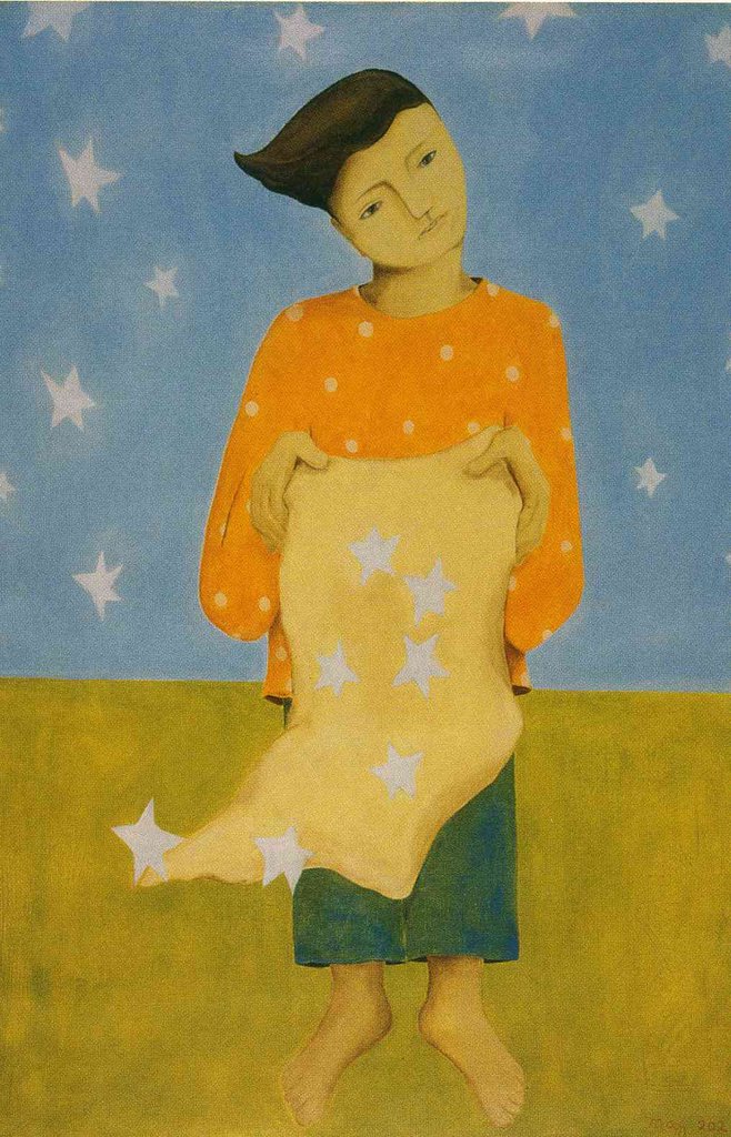
Abbreviated and generalized family portraits in oil, whose circular and rhythmic compositions fill the canvas space, are elegantly linear and refined. The naturalistic faces are masks of serenity, waning on elongated necks. Romantic and weightless, they recall the gentle quality of Botticelli's works (think "Birth of Venus") and Modigliani's portraits though stylistically they are Magdalena's own. Soft, vibrant shades of lavender, cool light blues, yellow and oranges fill the flat pictorial Cubist-like components. These works capture the soul of Magdalena's family. Every element of good painting is represented in this body of work. It should be noted that prices are not only reasonable, but also actually low for this high quality of work. Cheech Marin should have one of her pieces in his collection. This will knock your socks off as will the exceptional blown glass vases by Joan Schneider created specifically to accompany Magdalena's work. Through March 20, 2004; 317-873-6862. -Mary Lee Pappas
Wednesday, March 03, 2004
Judy Leiviska - Cafe Patachou (Carmel) - March 3, 2004 - 3 stars
Leiviska's work on display, monotypes and color reduction hand printed woodcuts, possess a tranquillity through muted color and a linear execution of composition. The elongated quality of the woodcuts is reminiscent of water rushing wherever it goes, giving the work an element of rhythm and life. Colors, such as muted deep purples and greens with an undercurrent of faded orange, further this sense of ease, stillness and softness. One abstracted monotype, on the other hand, is composed primarily of red, yellow and blue (the sacred trinity of color), with touches of washed orange and light blue. The blotches of color, dry and smooth, are given a pulsating life through her gestural application. The basic colors and hot white paper background achieve an engaging, sophisticated abstraction. More of Leiviska's work can be viewed at the Hoosier Salon. Through March 31, 2004; 317-569-0965. -Mary Lee Pappas
Rick Epley - Cafe Patachou (River Crossing) - March 3, 2004 - 1 star
A gallery owner recently asked me, "Who do you think is buying all of these art supplies at art supply stores and craft stores?" Painting prowess doesn't always lie in a particular brand of paint, a certain grade of prefab canvases or any other marketed utensil pointed in the direction of aspiring artists. Aside from acquiring a painting mojo (a very beautiful thing), there is an element of fine tuning that needs to occur, a level of craftsmanship that needs to go hand-in-hand with desire and is to be aspired to. Epley's sequences of strictly decorative, layered squares lacked substance, depth and a sense of color even though the paintings displayed possess bright palettes. These works, filling the north wall of the restaurant, did just that - they filled a bare wall. Through March 31, 2004; 317-815-0765. -Mary Lee Pappas
Christopher Smock - Cafe Patachou (49th & Penn.) - March 3, 2004 - 3 1/2 stars
Acrylic and graphite on board paintings line the very poorly lit south wall - unfortunate for this good show. Nevertheless, red "sold" dots are affixed to the title labels, testament to the astute quality and reasonable prices of these pieces. Produced primarily from leftover theatrical set supplies, these works are polished and superior without a footprint of their workroom origination. Great artist's statement, too. Smock's art doesn't pretend to be anything it's not though it hardly lacks substance. Void of pretension or ulterior motives, a sincere interest in craft shines as this artist has seemingly freed his mind of sales, material cost and ego. Local street scenes, interiors and bustling spaces are laid out in washed layers of acrylic to compose accomplished representational images. Expressionistically sketchy, these paintings are inspired and aptly executed. More please. Through March 31, 2004; 317-925-2823. –Mary Lee Pappas
Wednesday, February 25, 2004
George Michael Bell: "Discovery and Explorations" - White River Gardens - Feb. 25, 2004 - 1 1/2 stars
Boring and forgettable. Only sometimes beautiful when independent of each other, this exhibition of color photography is the stuff found in a generic travel brochure. Overall, little artistry is demonstrated in these shots that are more homage to technical prowess than individual style. A point and click feel exists without any compositional consideration. A great shot looks like good luck. It doesn't help that most of the photos are matted in unflattering black set in stock metal frames. The most radiant image, "Sunset with Clouds," has a suitable, colorfully complimentary blue mat that enlivens and enhances the quality of the image. Sunset sky colors reflect neon pink, red, yellow and rich purple off of a field of clouds. It's heavenly. However, "Vultures in Trees," shot at the Indianapolis Zoo, doesn't benefit from its well-chosen color mat. The primary vulture's beak, the picture's focal point, is out of focus while the back of another vulture, half out of the scene, is sharp. Through March 3, 2004; 317-630-2001. -Mary Lee Pappas
"The Art of Healing: The Wishard Art Collection" - Indiana Historical Society - Feb. 25, 2004 - 4 1/2 stars
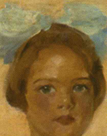
Having once adorned the walls of Wishard Memorial Hospital, these works by prominent Indiana artists at the turn of the cerrtury are a who's who treasure trove. Outstanding examples by TC. Steele, William Forsyth, Wayman Adams, John Ottis Adams and William Edouard Scott were created in an ingenious public art project - to decorate the then new hospital wings (around 1914) for the benefit of uplifting patients' spirits. Forsyth's thoughts on this project are included in the exhibition: "Perhaps the best work ever done by most of these artists is to be found on these walls; and it is no exaggeration to say that it is a monument to their accomplishments." Pieces hang on the first floor in the Lacy Gallery and in the fourth floor hall of the IHS. Three season-themed, 60-inch-by-111-inch paintings by Steele of the Brown County countryside have an expressionistic grace and grandeur though two of the three, "Autumn" and "Spring," are blocked by column obstacles in the narrow space, preventing a proper view of the works. Steele's signature has been chopped to make way for framing. "Whitewater at Brookville," an atypical landscape by Adams, is clouded behind an ancient varnish and nicotine film like so many pieces on display from the hospital. Conservation is required. A test cleaning in a corner revealed a lush light blue true color that had turned green from the pollution. The sale of exhibition mementos from the IHS gift shop will generate funds for the conservation needs of so many of these historical works. Instead of reinventing this city's history, perhaps this 90-year-old public art effort can serve as an example to the powers that be that art in public spaces is age-old and a win-win situation. To make a contribution to the Wishard Memorial Foundation visit www.wishardfoundation.com. Through May 23, 2004; 317-232-1882. -Mary Lee Pappas
Wednesday, February 18, 2004
"What's New?" - G.C. Lucas Gallery - Feb. 18, 2004 - 4 stars
Always consistent in presenting quality, G.C. Lucas now delivers work by more homegrown artists up to snuff with his national fare and very much in keeping with his keen aesthetic sense. John Reynold's farm animal paintings are beautiful beyond their subject matter. Using old bed linens, paint and a multitude of other devices, Jen Swearington's works are sophisticated autobiographical narratives. Quilted scenes of powerlines, bears and cars assemble to symbolically conceptualize her life experiences and create unique visual treats. Eric Jacobsen and Angel Mercado join the impressive fold of outstanding artists represented at G.C. Lucas as well as the notable Debra Delbecq. New works by Lorraine Sack are on view also. Through Feb. 26, 2004; 317-255-4000. -Mary Lee Pappas
G. C. Lucas Gallery, John Reynold, Jen Swearington, Eric Jacobson, Angel Mercado, Lorraine Sack, Artist, painting, drawing, Indianapolis, Indiana, Debra Delbecq
Kristen Lee Florey - Amici's Italian Restaurant - Feb. 18, 2004 - 3 1/2 stars
Florey's work - the energy, colors and the execution of her encaustic paintings - is such a breath of fresh air. These are real action paintings. A propane stove, woodcarving tools and a blowtorch are a few of the tools that assist in these spontaneous abstracted creations. Broad applications of beeswax and rich pigments to her canvases create lush, thick and deep textured surfaces. "Flexing Muscles," a steal at $250, contains a pure Zuni turquoise blue tone that practically flashes against the subdued orange and black it shares the canvas with. Her energetic process gives life to the deconstructed forms she paints. The word "Liberty" resonates as a descriptor for the overall visual appearance of this show ripe with gesture. Www.kristenleeflorey.com. Through Feb. 29, 2004; 317-634-0440. -Mary Lee Pappas
Wednesday, February 11, 2004
Justin Cooper - Vic's Downtown Expresso Bar - Feb. 11, 2004 - 3 1/2 stars
Cooper's work, a small selection of painted panel pieces and large canvases, are a good fit for this space. The panel pieces are of distorted, definable female portraits. There is no model and there's no need for one as facial features, are broken down and defined by balanced forms. The forms independently float and stack like puzzle pieces, seemingly disassociated from one another, combining foreground and background. This merge, enhanced by the colors, is reminiscent of cubist style, "Ma Jolie" color scheme (though not Picasso at all) and conceptual execution. Forms are done in washed sienna and tawny tones, executed on white, and are surrounded by brown stained board. Terrazzo marble-like squares decoratively set the physical forms off and are sometimes set on top of mazes of Greek key designs. This work is about the art process and how an artist perceives the world through an art geometry, constantly dissecting what they view into colors and shapes and light. Through February 2004; 317-951-0335. -Mary Lee Pappas
Rich Clarkson "The Champions: Portraits from the NCAA Arena" - NCAA Hall of Champions - Feb. 11, 2004 - 4 stars

* Pictured - Pete Maravich by Rich Clarkson, 1968.
Considered one of the 50 most influential individuals in American photography, Clarkson's sport portraits and action shots on exhibit at the NCAA are supreme. An exhibit display explains that his portraits are "Slices of the emotional ride through which sports take us." And so true this is upon surveying the unglamourized, unheroic or idealized images of sports greats through game candids and portraits from the 1950s to now. "Pistol" Pete Maravich's 1968 portrait as a player for Louisiana State is one example. The beautiful, true-to-life color and technical expertise of the shot allows the viewer to see Maravich's ruddy knuckles and the tender little boy looks of this super star with a way-out-there jump shot. Though beautiful, this piece, like all of the pieces in the exhibit, also reflects a triumphant sense of success. There is an emotional sense of drama within the tiny exhibition space. The images are approximately 24-by-40-inches, a large size that only enhances their lifelike crispness. Clarkson's images have appeared in Sports Illustrated, Time and Life magazines. He, like his subjects, is the best of the best. Through April 24, 2004; 317-916-HALL. -Mary Lee Pappas
Wednesday, January 28, 2004
"From A Different Perspective" - Hoosier Salon - Jan. 28, 2004 - 3 stars
This nonrepresentational art show is not the stuff you'd necessarily expect from the Hoosier Salon artists participating. Julie Muney Moore, Indianapolis Art Center director of exhibitions and artist services, and juror for this show, says in a statement, "I would urge those who work in this vein to look to the Hoosier Salon as a venue for promoting work of quality by all Indiana artists regardless of style or approach." I second that. This colorful exhibition is a surprise of a show and flips the bill for quality modern-minded works. Judith A. Leiviska's acyrlic abstractions of strictly color and form concoctions are executed in a painterly way. A rhythmic Synchronism-like piece - reds, fleshy pinks and orange yellows embody this exercise of artistic expression. Compared to similar works shown in the city recently, this show is above average. Well worth a visit. Through Feb. 14, 2004; 317-253-5340. -Mary Lee Pappas
Laura Boone: Photographer - IUPUI Cultural Arts Gallery - Jan. 28, 2004 - 2 1/2 stars
Ordinarily an artist's statement enhances and validates their art. It serves as bridge between the artist and the audience because pretty pictures aren't always enough. Fortunately for Boone, her photos are great as is. A typically youngish angst is revealed in the writing and in titles like "Isolate" and "Numb." But in the work itself, very personal, and yet universal, expressions are examined and beautifully, lyrically manifested. A digital print, "Voice," the least impressive image among the silver gelatin and c-type prints displayed, conceptually interprets how much information there is in the world, how hard it is to keep up and how it can make an individual's voice feel smothered. It would make for a great installation. The venue, a concrete block room at the old IUPUI library, is pretty sanitary with an inadequate florescent haze, which is not up to standard with Boone's work. But she hits a home run with her images. Next time pick a venue that compliments the work. Through Feb. 20, 2004; 317-274-3931. -Mary Lee Pappas
Wednesday, January 21, 2004
Bartosz Pietrzak: Photographs - Bona Thompson Center - Jan. 21, 2004 - 4 stars

An exceptional display of photography: Pietrzak possesses an unmatched imaginative aesthetic that spans his life experiences as a photographic artist. Photography composites, in many instances, are montaged to create surreal landscapes, like "Terra Est Rotunda," where desert dry earth monumentally curves into an earthy sphere, suggesting a poetic fragility to the planet. His works, both montage and journalistic spanning the last 30 years, possess a narrative quality without the suggestions of the titles. Simply the expressions of his human subjects juxtaposed against or within the natural panoramas he captures are quite fantastic. A sense of wonder and emotion are imparted from each piece. All 24 images (black and white, color, collage, montage) exhibited are technically and consistently pristine and crisp. Through Feb. 22, 2004; 317-353-2662. -Mary Lee Pappas
Wednesday, January 14, 2004
"The Portfolio Club: Then and Now" - Bona Thompson Center - Jan. 7, 2004 - 3 stars

The Neo-Classical Revival building that is the Bona Thompson Center, once Butler University's library and now a centerpiece to a quiet neighborhood, was renovated by the Irvington Historical Society two years ago and serves as a gallery venue. One of the state's oldest arts organizations, founded in 1890 by Mrs. Mary Steele (TCs first wife), many Portfolio Club members resided in Irvington close to the BT Center. Among the pieces on view in the exhibit are works by William Forsyth, Clifton Wheeler and Constance Forsyth belonging to the Irvington Historical Society; Wayman Adams' portrait of Forsyth, Simon Baus' portrait of Hilton U. Brown and a portrait of Kurt Vonnegut Sr. by Clifton Wheeler belonging to the Portfolio Club; TC. Steele's portrait of Bona Thompson, on loan from Butler University's Fairview Campus. Two slightly cartoonish mural pieces by Clifton Wheeler, extracted from the Propyleum during their renovations years ago, are also on view. Once hung above a fireplace in the basement of the Propyleum, a charming painting, "Portfolians in a Classical Landscape," of Baus, Forsyth and other notable Portfolians, had been set against the white painted back of "Woman in an Empty Landscape" also by Wheeler. Only when the first painting was pulled was it realized the second was there - a hidden painting now on view at the BT Center. While esteemed members of the past are exhibited in the North Gallery, contemporary efforts are exhibited in the South Gallery by the likes of Cynthia Blasingham and Mary Ann Davis. Through Jan. 11, 2004; 317-353-BONA. -Mary Lee Pappas
Susan Brewer "Up with the Blues: Rhythms of Color in Painting" - Stutz Gallery - Jan. 14, 2004 - 2 1/2 stars

The Stutz Art Gallery (established by Print Resources) is an angular hall, flanked with white exhibition walls that cut right through the Print Resources office space running southwest to northeast. It's an attractive, seductive niche with bright lights that accent every minute detail of the paintings on view. There is an apparent dry quality to the abstract acrylic on canvas pieces, like the super bright lights had overwhelmed the life out of the work. The warmth of colors seems strangled. Some pieces contain a horizon line element where color divides north and south and where geometric, decorative factors scatter across. Upon first glance, the work is dreamily color-filled and expansive with lots of blue. Closer inspection reveals a compositional order to most of the pieces that looks like temperate lobby art. "Dream the Dance" has a bit more punch, with warm yellows and greens saturating through whites. Pinks, assembled in smatterings of bar code-like lines here and there, jump from the space. As a whole, the exhibition is very attractive. The large-scale paintings hang well as a group and compliment the space. Through Jan. 30, 2004; 317-501-9337. -Mary Lee Pappas
Justin Bleep - Cath Inc. - Jan. 14, 2004 - 4 stars

Justin Bleep (his DJ name) is a super talented, comic-minded sequential artist. His penciled cells, about 8-inches-by-10 inches each, are matted in pale yellow with black frames clustered on the north wall of the neighborhood coffeehouse. His comic look has a street-styled angularity to it, a refined graffiti feel that has, not surprisingly, recently landed him national projects for the likes of Nerf and Hasbro Toys, Inc. Local ad agencies, you'd think, would be all over his stuff. Compositional strength and an overall unique look for this genre makes Bleep's work unlike anything else comparable in the city. Some of his drawn characters possess a certain monumentality to enforce the feeling of action while other diminutive figures fill the background, completing a story without words. The look is solid, but fluid and loose. Bleep's Web site, www.urbansequence.com, is one of the best artist websites I have seen to date. It includes a forum with a " Diggin' Through the Crates" discussion board including topics in current comic issues, back issues and wanted issues. Bleep is setting a standard for cool and comics locally. Through January 2004; 317-251-2677. -Mary Lee Pappas
Wednesday, January 07, 2004
"Seussentennial" The Art of Dr. Seuss - A Restrospective Exhibit" - Masterpiece Gallery - Jan. 7, 2004- 3 stars

* Pictured - Two Horned Drouberhannis by Dr. Suess
In April/May of 2002 this venue highlighted Seuss - but not with this depth. A pseudo mini museum show minus any original
work, this is a comprehensive peek into Theodor Seuss Geisel's life and work. It's a seduction, a sales technique, albeit a pleasing, well-done one to get you in the doors to view the saleable limited edition works of Seuss. Oh, the things you can sell! And really, nothing is wrong with that. Touring the venues across the country that sell Dr. Seuss limited edition, licensed work, this exhibit gives prominence to his early cartoon work for ad campaigns and magazines. It's the interested public's opportunity to see early works they may never have the opportunity to become acquainted with otherwise. Whether he was contemplating his unemployment through a mini Seussically poetic novelette (with fluffy fanciful characters and rhyming words) or advertising Flit pesticide, the shrewd Seuss candor and pen is consistent throughout his life and work. William Dreyer, curator for this traveling show presented by the Chase Group, who has licensing rights to Dr. Seuss images, will speak at the gallery on Jan. 9, 2004, 6 p.m. Through Jan. 19, 2004; 317-845-9990. -Mary Lee Pappas
Thursday, January 01, 2004

Wednesday, December 31, 2003
"Dreams of Art: A Creative Exploration of Sleep-Time Images” - Indianapolis Art Center, Ruth Lilly Library – Dec. 31, 2003 – 2 stars
Art can be used to find meaning in the emotions and the confounding visual elements experienced in dreams. Art is a release, a therapy. The images seen in this exhibit are of personal growth on paper and canvas by five people who have long studied their dreams. As a didact explains, the art on view "Mediates between the dreamer and the unconscious." The accompanying dream explanations and reflections allow viewers to tap into the self-realizations of the artist/dreamer. "Monarch Jewels," a simple fabric sculpture by Janet Fox, is the visual embodiment and an extension of a poignant dream. "Family Portrait" by Barbara Koons is a cut and paste collage composite of many dream emotions while "In a Pink House" captures the tactile pink colors and sensations of a happy dream she experienced. Collage is used as a primary means of exploration in this show. Self-exploration takes precedence over visual aesthetics seen in the work, but that's not to say it isn't extremely fascinating and very valid. Through Jan. 11, 2004; 317-255-2464. – Mary Lee Pappas
Carol Boarman – Mavris Cultural Center – Dec. 31, 2003

Boarman's golden-hued images, both abstract and angel, recall myth and fantasy. One angel's face is delicately pink and rutty with detail, while the body and wings are formed in raised chunks of pearlized paint. There is a feminine storybook quality to the ethereal manner in which the characters in Boarman's works hold their gaze and grace. A sense of abandonment and satisfaction is relayed here albeit in the framework of these soft, comforting pieces. The overt expression of freedom in her painting is quite a release from the formality and structure of her Eastern Orthodox icons currently on view at the Indianapolis Art Center. Through Jan. 31, 2004; 317-917-9999. - Mary Lee Pappas
Wednesday, December 24, 2003
Cheryl Paswater – Vencino’s Café – Dec. 24, 2003 – 2 stars
It's said that the sincerest form of flattery is to copy. In art, there is a certain creative validity to this visual mimicry. Creative growth happens when techniques and manners of expression are tinkered with and taken through a certain trial and error. A truly unique personal vision or style eventually can be discerned, though usually not overnight, from this exercise and consequent artistic experiments. This is being an artist. Not every piece created, or presented to the public, need be the end-all of an artist's creative boundary. Nine acrylic pieces clipped with clothes pins on a string at a mere $35 each, two framed pieces and four canvases by Paswater hang beautifully at Vencino's - only they too closely resemble the context-heavy work of fellow Harrison Center for the Arts mate Artur Silva. Visually they are quite appealing: abstracts with caked layers of dribbles and drippy swaths of color. Occasionally there is a seemingly meaningless word, more a compositional element than symbol, added. Influence and admiration of another's work could be a plausible, valid and a natural piece of an artist's journey; with some journeys more obvious than others. Through December, 2003; 317-634-1995. – Mary Lee Pappas
Quincy Owens – Lamp – Dec. 24, 2003 – 3 1/2 stars
Dec. 16. This one-night-only event-installation on the floor of LAMP's main gallery space was comprised of lots of individual paintings by Owens. Approximately 12-inch square pieces sat in a large rectangle spaced about an inch apart from each other, making one big painting or multifaceted mural. His signature minimalist, layered images were executed with an equally discernable, appealing palette that lends a tactile and torn quality to the wide color fields. As panels sold, the rectangle dissolved into what resembled a brick wall being built or taken apart, so it was difficult, if not totally irrelevant, to count the pieces - maybe 80 or more. At $20 each, they were a mix and match, make your own canvas. Patrons indulged in purchasing six segments or two segments to hang together or simply one alone. While this event was a way for Owens to thank the arts community for the breakthrough year he has had in establishing himself as a notable local talent, it also showed the give-and-take quality of community. It conceptually demonstrated how reciprocation is an innate function of how a community progresses and ticks. It was a very smart, well-conceived show of beautiful modern art. owensl353@msn.com. -Mary Lee Pappas
Wednesday, December 17, 2003
Bill Rasdell, Robert Hewitt, George Durr – The Photography Gallery – Dec. 17, 2003 – 3 1/2 stars
The pieces presented by Rasdell are beautifully mystic images of the Indianapolis Museum of Art grounds that require the viewer to remember that these images of nature are just off of 38th and Michigan Road. These prints were created to hang alongside the Nature Conservancy's amazing exhibit, In Response to Place, at the IMA earlier this year. Images like "Early Morning Light" and "Emergence" capture foggy landscape scenes, which are then made supernaturally more misty through digital techniques. Bill may disagree, but I think they are among his most beautiful images yet. George Durr's black and white interpretations of the California land are dramatic - still with high contrast though the paper has a soft, tactile quality. Though all of his images are very striking, the consistent quality wavered ever so slightly. Some images appear grainy while others are crisp and sharp. His "Hail Bales" from the Badlands in North Dakota is an image any photographer would admire with its hot white light speckling off the hay. Through Dec. 22, 2003; 317-423-9237. – Mary Lee Pappas
Deborah Rosenbloom – The Bungalow – Dec. 17, 2003 – 3 1/2 stars
Beautifully presented flat fields of color embody the abstract work of Rosenbloom. Contours and forms push into each other with solid unlike, but comfortable colors. There is no painting outside of the lines in these square pieces, it's as if they were cut paper decoupage a la Matisse. The compositions have attractive and pleasing results that stretch well beyond the decorative and into the area of illusion with a Fauve-like mind set. Through December, 2003; 317-251-2782. - Mary Lee Pappas
Wednesday, December 10, 2003
Tis the Season Art Market – NCAA Hall of Champions – Dec. 10, 2003 – 3 stars
Dec. 5-6. This Indianapolis Art Center fund-raiser, the first ever winter "art fair," was not a total success for the 60 selected participating artists. Booths were assembled in the grand hall and the inner sanctums of the NCAA facility for the two-day event. The indoor environment was quite pleasant, calm and unfortunately slow, though the IAC employees and volunteers hustled and accommodated the artists no differently than if it were the annual May fair. Perhaps the local TV meteorologists scared potential arts patrons away with their snowstorm predictions (or were their forecasts performance art?). Or, maybe potential audiences had as much difficulty locating the NCAA as some of the artists did. Whatever the case, as with the May art fair of 2003, the public missed out on a top-notch show. Renew your membership to the IAC today! www.indianapolisartcenter.org; 317-255-2464. – Mary Lee Pappas
“Oranje and the Underground” – Key Cinemas – Dec. 10, 2003 – 2 stars
Dec. 5-6. Oranje, at the request of The Film Commune, decked the lobby of Key Cinemas out in art for the Indianapolis Underground Film Festival. Work by Vanessa Oeschle, Gwynn Burgins, Jason Poteet, Brendan Fox, Stuart Sayger and Anna Bradner adorned the space, only it was very difficult to decipher just whose work was whose because the pieces were not labeled in an easily viewable way. That aside, the work made for a great backdrop for a great film event. The cooperative effort is to be applauded and perhaps we will see Oranje offering up their services to other organizations looking to visually spice things up. www.oranjeindy.com. - Mary Lee Pappas
Avra Economakos – Greek Islands – Dec. 10, 2003 – 3 stars

Having lived her entire life in Athens, artist Avra Economakos (formally Delehas) found her way to Indiana a year ago. Surprisingly, her work is along the lines of what you would typically expect to find at the Hoosier Salon. Realistic postcard image landscapes of Greece in lifelike colors line the walls of this restaurant. Her approach looks effortless and comfortable - like she could have painted these in her sleep - and are a beautiful addition to the Greek Islands. Her palette is soft, easy on the eyes without utilizing the full chromatic scale, with complementary contrasts - these are perfected, safe and done very well. Five flower pastel images (close cropped) possessed livelier colors and the same ease of execution. Through December, 2003; 317-636-0700. - Mary Lee Pappas
Wednesday, November 12, 2003
LAMP lighter - LAMP - Nov. 12, 2003
LAMP lighter
Jennifer Kaye makes the scene
Mary Lee Pappas

*Pictured: “I am one of the few galleries where you can walk in and show me your stuff.” —Jennifer Kaye
Oct. 18 marked the one-year anniversary of the Chatham Center, a former nursing home at 901 N. East St., that is home to Jennifer Kaye’s gallery, LAMP. This unwaveringly optimistic and determined artist has successfully followed her heart with fine art. “I found that I really, really loved curating and showcasing local artists’ work,” Kaye says, so she set forth to represent local film, sculpture, 2D and installation art. “All media is important. Your soul needs an outlet.”
Kaye’s efforts are of direct benefit to local artists whose careers need a jump start and/or who might not otherwise get an opportunity to show their work in a professional venue.
“I am one of the few galleries where you can walk in and show me your stuff to be immediately considered for a show,” Kaye says. Though LAMP is booked about a year out, she would “probably give you a slot somewhere.” She honestly evaluates artists’ work and does turn work down, though not without some kind of encouragement or advice.
“The talent here locally is strong,” Kaye asserts — a position she has backed up by showcasing over 150 artists, a large percentage of whom had never shown before. This has given her a great sense of accomplishment.
“There is huge need for what I am doing. Artists come to me and say that I am the only one that’s here for them, that I’m giving them a chance and will make sure their work looks good when it’s hung,” she explains. “Some artists get snubbed at other galleries, which I think is ridiculous because people always ask me, ‘Where did you find this artist?’”
Presentation of artwork is one of Kaye’s strengths. “I’m going overboard on presentation because I want to command that kind of respect for the work.” She explains that LAMP is an alternative venue to the party scene Allotropy or Oranje art shows. “When you put art in a flea market setting, you wonder how they can ask $2,000 for something. If you hang it properly and put the right light on it, well $2,000 isn’t that bad, honey, let’s buy this! There is the trained art buyer that knows what he wants when he sees it and it doesn’t matter what environment that art is in. Then there is that great big group of people who are overwhelmed. They don’t know what they like, they don’t know what they are looking for.” That’s the crowd she wants.
LAMP is an acronym for Local Artists Making Progress. “I wanted the name of the gallery to encompass why I was doing this, so I started writing down all of these words. I wasn’t trying to make an acronym.” Kaye says LAMP, which serves as her mission statement as well, lent itself to the idea of enlightenment. Consequently, exhibition names have followed this light theme. “I thought it was appropriate to be shedding light on the local art community. I had a BANG moment.”
Kaye recently left her predictable and steady job as a loan officer to dedicate all of her time to LAMP. “I had been at a crossroads. I feel like with LAMP I am giving back to my community.” She now employs a staff of two, which include jeweler Wendy Mathiesen, administrator, and Linda Trout, gallery sales.
Despite success in her first year in business, Kaye says The Indianapolis Star told her they wouldn’t cover her gallery because they didn’t suspect it would be around very long. “They wouldn’t take me seriously. I don’t understand that.
“Instead of having the support of the Indiana Arts Commission and Arts Council, I had the Indiana Department of Transportation on my side,” Kaye muses, laughing about last summer’s Hyperfix, which rerouted downtown traffic past LAMP. “I don’t know if Hyperfix helped sales or not, but I am getting traffic on Thursdays and Fridays. I worked really hard on the signage …”
IDADA, the Indianapolis Down-town Association of Art Dealers and Artists, has definitely benefited LAMP. “IDADA is made up of a great group of people — gallery owners! The Arts Council of Indianapolis — they have been really going at it that they need to make a scene and I think IDADA’s point of view is that we already have a scene.” Kaye continues, “I think it will do good things for the galleries of Indianapolis. I think we’re going to get more publicity on our own.”
IDADA, with funding from the Mayor’s Cultural Tourism Initiative, is paying for 10 issues of the Midwest Gallery Guide, which will be in hotels around the Midwest, including Chicago. Visit www.idada.info to learn more about IDADA and link to local galleries.
“You can spend $50 on a steak dinner and you got nothing to take home,” Kaye says. “You buy a piece of art and more than likely one of your grandkids is going to grab that when you’re gone. It’s going to get passed on. People don’t throw away art unless it’s awful. Art should be valuable enough to you that when you look at it, it always brings you pleasure or always makes you think, or whatever you need to push your buttons.”
Kaye hopes to push buttons in as many homes, offices and businesses in Indianapolis as possible. “I would like to fill every office in Indianapolis with original art from LAMP. I hope the art would rub off on employees, that they would see local art on their walls and be intrigued enough to go to some of the art openings.”
Artists get hit up a lot to donate their work to auctions and charities. This is a pet peeve of Kaye’s. “We get asked to put our work up at some fund-raiser as a background for a party. I’m tired of artists being considered the court jesters. We have something to offer: our creativity. I don’t really feel that people think that creativity is something worth paying for and yet I also hear so many people say, ‘I wish I had creativity, I’m so untalented.’ If you’re not talented, then why aren’t you willing to pay for someone else’s talent?”
LAMP’s current exhibits are Sharps and Flats, featuring work by Kaye and David Engelking; “The Way We Saw the World” by Quincy Owens; and “Kingdom Come” by Zan Aufderheide. Hours are Thursdays, 12-6 p.m., Fridays, 12-8 p.m. and Saturdays, 12-6 p.m.
Jennifer Kaye makes the scene
Mary Lee Pappas
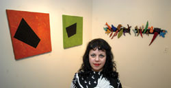
*Pictured: “I am one of the few galleries where you can walk in and show me your stuff.” —Jennifer Kaye
Oct. 18 marked the one-year anniversary of the Chatham Center, a former nursing home at 901 N. East St., that is home to Jennifer Kaye’s gallery, LAMP. This unwaveringly optimistic and determined artist has successfully followed her heart with fine art. “I found that I really, really loved curating and showcasing local artists’ work,” Kaye says, so she set forth to represent local film, sculpture, 2D and installation art. “All media is important. Your soul needs an outlet.”
Kaye’s efforts are of direct benefit to local artists whose careers need a jump start and/or who might not otherwise get an opportunity to show their work in a professional venue.
“I am one of the few galleries where you can walk in and show me your stuff to be immediately considered for a show,” Kaye says. Though LAMP is booked about a year out, she would “probably give you a slot somewhere.” She honestly evaluates artists’ work and does turn work down, though not without some kind of encouragement or advice.
“The talent here locally is strong,” Kaye asserts — a position she has backed up by showcasing over 150 artists, a large percentage of whom had never shown before. This has given her a great sense of accomplishment.
“There is huge need for what I am doing. Artists come to me and say that I am the only one that’s here for them, that I’m giving them a chance and will make sure their work looks good when it’s hung,” she explains. “Some artists get snubbed at other galleries, which I think is ridiculous because people always ask me, ‘Where did you find this artist?’”
Presentation of artwork is one of Kaye’s strengths. “I’m going overboard on presentation because I want to command that kind of respect for the work.” She explains that LAMP is an alternative venue to the party scene Allotropy or Oranje art shows. “When you put art in a flea market setting, you wonder how they can ask $2,000 for something. If you hang it properly and put the right light on it, well $2,000 isn’t that bad, honey, let’s buy this! There is the trained art buyer that knows what he wants when he sees it and it doesn’t matter what environment that art is in. Then there is that great big group of people who are overwhelmed. They don’t know what they like, they don’t know what they are looking for.” That’s the crowd she wants.
LAMP is an acronym for Local Artists Making Progress. “I wanted the name of the gallery to encompass why I was doing this, so I started writing down all of these words. I wasn’t trying to make an acronym.” Kaye says LAMP, which serves as her mission statement as well, lent itself to the idea of enlightenment. Consequently, exhibition names have followed this light theme. “I thought it was appropriate to be shedding light on the local art community. I had a BANG moment.”
Kaye recently left her predictable and steady job as a loan officer to dedicate all of her time to LAMP. “I had been at a crossroads. I feel like with LAMP I am giving back to my community.” She now employs a staff of two, which include jeweler Wendy Mathiesen, administrator, and Linda Trout, gallery sales.
Despite success in her first year in business, Kaye says The Indianapolis Star told her they wouldn’t cover her gallery because they didn’t suspect it would be around very long. “They wouldn’t take me seriously. I don’t understand that.
“Instead of having the support of the Indiana Arts Commission and Arts Council, I had the Indiana Department of Transportation on my side,” Kaye muses, laughing about last summer’s Hyperfix, which rerouted downtown traffic past LAMP. “I don’t know if Hyperfix helped sales or not, but I am getting traffic on Thursdays and Fridays. I worked really hard on the signage …”
IDADA, the Indianapolis Down-town Association of Art Dealers and Artists, has definitely benefited LAMP. “IDADA is made up of a great group of people — gallery owners! The Arts Council of Indianapolis — they have been really going at it that they need to make a scene and I think IDADA’s point of view is that we already have a scene.” Kaye continues, “I think it will do good things for the galleries of Indianapolis. I think we’re going to get more publicity on our own.”
IDADA, with funding from the Mayor’s Cultural Tourism Initiative, is paying for 10 issues of the Midwest Gallery Guide, which will be in hotels around the Midwest, including Chicago. Visit www.idada.info to learn more about IDADA and link to local galleries.
“You can spend $50 on a steak dinner and you got nothing to take home,” Kaye says. “You buy a piece of art and more than likely one of your grandkids is going to grab that when you’re gone. It’s going to get passed on. People don’t throw away art unless it’s awful. Art should be valuable enough to you that when you look at it, it always brings you pleasure or always makes you think, or whatever you need to push your buttons.”
Kaye hopes to push buttons in as many homes, offices and businesses in Indianapolis as possible. “I would like to fill every office in Indianapolis with original art from LAMP. I hope the art would rub off on employees, that they would see local art on their walls and be intrigued enough to go to some of the art openings.”
Artists get hit up a lot to donate their work to auctions and charities. This is a pet peeve of Kaye’s. “We get asked to put our work up at some fund-raiser as a background for a party. I’m tired of artists being considered the court jesters. We have something to offer: our creativity. I don’t really feel that people think that creativity is something worth paying for and yet I also hear so many people say, ‘I wish I had creativity, I’m so untalented.’ If you’re not talented, then why aren’t you willing to pay for someone else’s talent?”
LAMP’s current exhibits are Sharps and Flats, featuring work by Kaye and David Engelking; “The Way We Saw the World” by Quincy Owens; and “Kingdom Come” by Zan Aufderheide. Hours are Thursdays, 12-6 p.m., Fridays, 12-8 p.m. and Saturdays, 12-6 p.m.
Wednesday, October 29, 2003
"Humpty Dumpty" Primary Gallery (a Primary Colours annex) at the Harrison Center for the Arts - Oct. 29, 2003 - 1 star
This installation is hardly an installation, as it is not site specific or environmentally sensitive to the gallery space in any way. It's more like a series of very rough film vignettes projected onto a portable screen about our Jabberwocky speaking Humpty Dumpty leader, President Bush. There was no artist statement about this obscure presentation. The rest was left up to the viewer - only if the viewer could endure the boredom of it all.
One film segment is of a Beavis and Butthead drugstore variety fireworks spectacle played out on a table-top and another is a tape of a Bush State of the Union Address where his face is covered by a black band. Words too blurry to read were flashed in the video game images being projected next to the address. Primary is the operative term for this as its profundity is undetectable.
There was nothing to draw you into the chapel turned gallery and nothing to captivate or intrigue once you viewed the piece, which was so slapped together and aesthetically blah, you can't convince me that this four person effort was art. Through November 29, 2003; (317) 902-2772.
Of Note: I arrived to the gallery (an former chapel) and it was not opened the hours it was indicated to be. I waited over a 1/2 hour for the gallery to open and spent aprox. 45 mins viewing the film. There was in fact no statement available that discussed this "exhibition," and no one around to ask questions of. Ordinarily when a show is this bad (I believe this was a university student show if memory serves me correct - again there was nothing to indicate who was responsible) it simply isn't reviewed. I attended this with another member of NUVO's editorial team as well.
Below is a letter submitted to the editor on November 3, 2003, regarding the above review.
It was not appropriate to published. However, it was distributed by Primary Colours to the public at the Harrison Center for the Arts during a holiday open house (December 2003) weeks later where I maintained my art studio and where my artworks were on exhibit. For the safety of my art, my artworks were removed at the advice of a director. Copies of this letter were collected as best as possible by several attendees in the arts community and thrown away.
CRITICAL MESS
I'd like to thank Mary Lee Pappas for providing a fabulously bad example of art criticism, "Humpty-Dumpty," (Oct. 29-Nov. 5 issue, p. 29).
Next semester my students will be writing reviews, and, while itís always helpful to provide examples that are thoughtful, effective, accurate and well-written, a piece which does everything wrong, as Pappas' does, will also prove instructive.
First, get your terms straight. Pappas says "this installation is hardly an installation, as it is not site specific or environmentally sensitive to the gallery space." Installation art may be site specific but need not be. Second, spend sufficient time in the gallery to form an understanding of the work. Pappas' claim that no artist statement exists (when it does), and her failure to mention the presence of a live King snake suggests she spent less time viewing the work than she did composing her mostly unintelligible "review". The statement allows viewers to grasp the complicated metaphors presented in three vignettes. Two have dual video projection; the third features four simultaneous video images. These refer, using appropriations from popular culture, to the Bishops Wars of 1639 and 1640, when the forces of King Charles fell to the Parliamentarians, as well as to our contemporary situation in Iraq. The original "humpty dumpty" was a cannon in Charles' arsenal, the egg, nursery rhyme and George W. Bush came later.
Criticism of contemporary art is, of course, subjective, but it need not be inaccurate, hastily conceived and sloppily written. Ideally criticism should be written by individuals with both a background in art and art history and who are not predisposed to favor one type of art (say, painting) over another (say, installation).
Nuvo should consider reviewers' credentials and potential biases, and provide enough space for a more thorough explanation of area exhibitions.
Elizabeth K. Menon
Assistant Professor, Contemporary Art History Purdue University, West Lafayette
Elizabeth Mix is currently a professor at Butler University
chicago breaking david parrish 101 elizabeth mix association elizabeth menon mix angel mode butler university purdue university lisa farooque alumni imoca Indianapolis Museum of art IMA elizabeth mix dr. elizabeth k. mix lecture gender indiana modern contemporary Butler University art history professor Liberal art Purdue University and sciences University college Groningen
spirituality author writer novel published
Wednesday, August 27, 2003
“Presto” Brian Priest - J. Martin Gallery – Aug. 27, 2003 – 1 1/2 star.
This is an installation/performance piece where Brian lives in a red styrofoam sphere (recycled from a Cisco convention display he made) and creates small assemblage sculptural pieces on order for $20 a pop. Fortunately, Brian is not solely confined to the sphere as lie has the freedom to open or close the gallery and use the toilet. A Samsung monitor displays the isolated interior (documentation more than voyeuristic), showing Brian working away on his art. Visitors to the gallery can choose five objects, then place those five objects into a wire bin that is placed on a shelf while they wait for Brian to work them into one of his clever forms which then gets ejected from the sphere an a green ironing board slide. It's somewhat Little Rascals. When asked if this display was an installation about installation, Brian said, laughing, "I don't know. I'm just in this damn ball makin' shit." To many artists the art is in actually making the art object and not the final product. Here we have that process isolated and under examination. If this is what "Presto” is about, then it's not very thought provoking. Living in a confined space is hardly a fresh idea - and the best art usually has a philosophical purpose to explore. Despite the breadth of talent Brian has, this is an underdeveloped effort. Living in a bubble, after all, implies self-absorption, not seeing the world realistically. Perhaps this is a statement about underestimating the public's knowledge of and appreciation for art. Through Aug. 31, 2003; 317-916-2874. – Mary Lee Pappas
“Peaceful Light” Olga Popova – Indianapolis Artsgarden – Aug. 27, 2003 – 2 stars

Twelve photos from seven countries hang along the South end of the Artsgarden. And in the tradition of Artsgarden exhibits, it's pretty uneventful. Though Popova claims professional fashion and travel photography under her belt, these works fall short when compared to the plethora of local work found at the Photography Gallery. They are images you think you've seen before -snap and click documents of exotic scenery, The mostly calm images with balmy/hazy atmospheres aren't totally without merit. A 1999 black and white image of NYC captures a mirrored image of city life in patterns against a building's windows with more awareness than seen the other works. Her vision in this show is definitely not unique, Through Aug 29, 2003. 317-631-3301. – Mary Lee Pappas
79th Annual Hoosier Salon Exhibition – Indiana State Museum – Aug. 27, 2003 – 4 stars
The 187 works of art hung salon style in the gallery space look great. The variety of quality art by skilled Indiana artisans gets better every year. Indiana landscape and livestock images are abundant, but the selection of portraits are the real stand-outs. Judy Crawford's “Shimmer," a merit award winner, got my vote for popular prize. The soft feeling and gold leaf portrait of a girl in a lavender swimsuit and turquoise swim cap is lush with jewel tones. The handling of her face is beautiful. Pat Cotton's Matisse-like "Ipswich," a purchase award winner, features a woman wearing blue against a patterned yellow background. It is lively and rich next to its nearby works though its primary colors are slightly muddied. And the most remarkable painting of all is "Figure with Blue Background" by Lorraine Sack How does she do it? The model is eerily lifelike even at a distance of less than a foot. It's worth a visit to cast your own vote for popular prize, Through Sept. 21, 2003. 317-232-1637 - Mary Lee Pappas
Wednesday, August 20, 2003
State Fair 2003 – Indiana State Fairgrounds – Aug. 20, 2003 – 3 stars
Closed Aug. 17. The State Fair is composed of so many guilty pleasures the scene becomes surreal. Quite farcical and befuddling were the middle-aged cloggers happily hoofing it to a Bon Jovi remix, but, not moreso than the llama limbo where poodle trimmed llamas literally limboed with that signature limbo song blaring in their competition arena. In the Pepsi Coliseum, the organist played "Don't Cry for Me Argentina" while draft horses pulled their spit-shined carts around the ring. And then there's deep-fried everything, everywhere, producing five-star smells. Elephant ears and corn dogs send my stomach into regressive upset at the thought. The every-walk-of-life crowd carrying huge plush stuffed animal spoils from the Midway games, the colorful lights and the muffled screams from the rides create a fantastic and eccentric once-a-year piece of performance art. - Mary Lee Pappas
State Fair 2003 – Indiana State Fairgrounds – Aug. 20, 2003 – 3 stars
Closed Aug. 17. The State Fair is composed of so many guilty pleasures the scene becomes surreal. Quite farcical and befuddling were the middle-aged cloggers happily hoofing it to a Bon Jovi remix, But, not moreso than the llama limbo where poodle trimmed llamas literally limboed with that signature limbo song blaring in their competition arena In the Pepsi Coliseum, the organist played "Don't Cry for Me Argentina" while draft horses pulled their spit-shined carts around the ring. And then there's deep-fried everything, everywhere, producing five-star smells. Elephant ears and corn dogs send my stomach into regressive upset at the thought. The every-walk-of-life crowd carrying huge plush stuffed animal spoils from the Midway games, the colorful lights and the muffled screams from the rides create a fantastic and eccentric once-a-year piece of performance art. - Mary Lee Pappas
Wednesday, August 13, 2003
Mike Johnson - Hubbard and Cravens – Aug. 13, 2003 – 2 stars
Some of Johnson's landscapes look stiff and uncomfortably executed. "Prairie Sunset" just misses its mark. Though the colors are rich with hot reds, there is awkwardness and a little incongruence to the barn on the horizon and the hills. On the other hand, "Hay Bales" dramatically portrays sun seeping through a dark ominous and white cumulous clouded sky to illuminate the subject matter. The flat yellow of the gold frame is a perfect match to pick up the golden lit bales. Capturing color and atmosphere are Johnson's strengths, though his work technically falls short of that found around the corner at Lucas and also when compared to the collection of talented plein air artists found locally. Through August, 2003; 317-251-516 1, - Mary Lee Pappas
“Endangered Species” - Wire Soul Gallery – Aug. 13, 2003 – 1 1/2 stars
Artist William Arnold is a homespun naturalist whipping up life-sized animal likenesses out of old heavy-duty wire. There is no getting around that this man loves animals and what he does. They are crafty backyard art with prices ranging from $7,500 for a bison (the Indianapolis Zoo has one) to $30 for a hummingbird. Tag on an additional fee for a paint job. Though he recreates animals on order, each is somehow one of a kind, complete with its own certificate of authenticity. 1-70 rest areas in the state and Gas America Travel Plaza in Knightstown can boast Arnold art, too. The Wire Soul space is shabby (a little too a la natural) and not quite as nice as Tim and Avi’s Salvage, only without the salvage. The waterfall and caged raven are pretty cool. Though it hardly looks like a suitable space to do his work justice, it doesn't seem to be hurting his sales. His love of wildlife extends to the Wire Soul "yard," which may be the closest thing to a prairie downtown has (outside of the NE corner of 16th and Central) with its Queen Anne's Lace. At the time of my visit, several hundred sparrows were enjoying it with their pigeon friends. Through Sept 30, 2003; 317-236-9473, - Mary Lee Pappas
“A Mother and Son Paint" Bertie David and Douglas David – Hoosier Salon – Aug. 13, 2003 – 3 stars
If the David clan had a coat of arms it would bear heraldic bushy peony blossoms and their signature color, powder puff blue. This show is, quite literally, like mother like son in terms of color and topic. Bertie, an accomplished china painter, gingerly layers colors upon one another between firings to create romantic imagery on porcelain and small canvases reminiscent of this style of work from 100 years ago. The overall effect is precise, decorative and flowery. It's simply beautiful on three large German porcelain vases adorned with peonies, hydrangea and wisteria. Douglas, being his mother's painting progeny, seems to have inherited his mother's delicate palette of cool kelly greens, bluey-lavenders and very pale orange and yellows. Unlike his mother, his "Sunset's Passing" is executed with easy, loose, smooth strokes that push some of his work into the sublime. Florals and landscapes fill the Salon. Through Aug. 23, 2003; 317-253-5340. -Mary Lee Pappas
"Intangible Spirit" An obituary for artist Harry Blomme published in NUVO August 13, 2003
 By Mary Lee Pappas
Published in NUVO August 13, 2003
Harry Blomme knows what God looks like. “It’s supposed to be a surprise,” he once told me. Blomme, a local artist, passed away suddenly the weekend of July 12. He was 69.
“He lived his life in preparation for this,” Bill Bickel, director of Holy Family Shelter, said. In 1997, Bill became Harry’s caseworker at the Homeless Initiative. A former Southern Indiana farmer, a Flemish Canadian export, Harry was homeless and epileptic. “Health was always a concern,” Bill said.
I first met Harry six years ago when he and Bill visited a Massachusetts Avenue gallery where I worked to check out the art. I can’t recall whose art was hanging on the walls, but Harry I remember vividly. He gave me a deftly drawn charcoal portrait of a girl as a token of his visit. This was typical Harry.
“It always amazed him when someone would take an interest in him,” Bill recalled. “He was spiritual and approachable. He looked at situations so optimistically and held by his convictions. He was much, much more than a homeless artist. That doesn’t begin to explain who he was. He broke stereotypes and boundaries about homelessness without knowing it. He looked at himself as being one of us and folks treated him that way. That’s what we want. No one should be labeled.”
When U.S. Rep. Julia Carson was presented with two of Harry’s paintings, “She was, I think, very humbled,” Bill said. One was of Carson and the other was of Rosa Parks, who Harry had read was an inspiration to Carson.
Harry sold some of his paintings at Utrillo’s Art, owned by Greg Brown. “He intelligently approached his work. His method was fascinating and impressive. It’s stuck with me and affected my own work,” Greg said of his friend Harry.
Three years ago, just before Harry got settled into his apartment (called “studio-studio”), he lived with David Hittle, of Lutheran Child and Family Services. The annual April Show, an art show inspired by Harry’s talent, started from their close friendship.
“Very intangible” is the only way David could explain the impact Harry has had on him. “Harry had a clear and profound effect on people he may have only met once or twice.”
Harry’s passing was sudden. “He was doing very, very well,” Bill said.
“I saw him the day before and he was having a blast,” Greg recalled. “He’s kind of a gad-about. He was full of life and having fun.”
Harry’s funeral was July 19 in his hometown of Rockport, Ind. “It was packed. It seems that the people of Rockport knew Harry as we knew him here. He was known for pulling out his sketchbook,” David said. “The music was awesome. Southern Indiana shoutin’ Pentecostal music. Very bluegrassy. Real good stuff.”
“I would put Harry up there as one of the greatest teachers I’ve ever had,” Bill said.
David had difficulty putting the effect Harry has had on his life into words. “Gargantuan is the only word to describe it.”
A memorial service for Harry will be held at Roberts Park Church on Aug. 14, 6:30 p.m. If you own a piece of Harry’s work, please bring it for a display after the service.
For more information on Harry’s art visit www.aprilshow.org. The Web page for an interview with Harry July 3, 2002, can be found at www.nuvo.net/news/archive/002660.html.
Harry Blomme, Julia Carson, Bill Bickel, David Hittle, Roberts Park Church, Greg Brown, Utrillo's Art Gallery, Indianapolis, Indiana, The April Show
By Mary Lee Pappas
Published in NUVO August 13, 2003
Harry Blomme knows what God looks like. “It’s supposed to be a surprise,” he once told me. Blomme, a local artist, passed away suddenly the weekend of July 12. He was 69.
“He lived his life in preparation for this,” Bill Bickel, director of Holy Family Shelter, said. In 1997, Bill became Harry’s caseworker at the Homeless Initiative. A former Southern Indiana farmer, a Flemish Canadian export, Harry was homeless and epileptic. “Health was always a concern,” Bill said.
I first met Harry six years ago when he and Bill visited a Massachusetts Avenue gallery where I worked to check out the art. I can’t recall whose art was hanging on the walls, but Harry I remember vividly. He gave me a deftly drawn charcoal portrait of a girl as a token of his visit. This was typical Harry.
“It always amazed him when someone would take an interest in him,” Bill recalled. “He was spiritual and approachable. He looked at situations so optimistically and held by his convictions. He was much, much more than a homeless artist. That doesn’t begin to explain who he was. He broke stereotypes and boundaries about homelessness without knowing it. He looked at himself as being one of us and folks treated him that way. That’s what we want. No one should be labeled.”
When U.S. Rep. Julia Carson was presented with two of Harry’s paintings, “She was, I think, very humbled,” Bill said. One was of Carson and the other was of Rosa Parks, who Harry had read was an inspiration to Carson.
Harry sold some of his paintings at Utrillo’s Art, owned by Greg Brown. “He intelligently approached his work. His method was fascinating and impressive. It’s stuck with me and affected my own work,” Greg said of his friend Harry.
Three years ago, just before Harry got settled into his apartment (called “studio-studio”), he lived with David Hittle, of Lutheran Child and Family Services. The annual April Show, an art show inspired by Harry’s talent, started from their close friendship.
“Very intangible” is the only way David could explain the impact Harry has had on him. “Harry had a clear and profound effect on people he may have only met once or twice.”
Harry’s passing was sudden. “He was doing very, very well,” Bill said.
“I saw him the day before and he was having a blast,” Greg recalled. “He’s kind of a gad-about. He was full of life and having fun.”
Harry’s funeral was July 19 in his hometown of Rockport, Ind. “It was packed. It seems that the people of Rockport knew Harry as we knew him here. He was known for pulling out his sketchbook,” David said. “The music was awesome. Southern Indiana shoutin’ Pentecostal music. Very bluegrassy. Real good stuff.”
“I would put Harry up there as one of the greatest teachers I’ve ever had,” Bill said.
David had difficulty putting the effect Harry has had on his life into words. “Gargantuan is the only word to describe it.”
A memorial service for Harry will be held at Roberts Park Church on Aug. 14, 6:30 p.m. If you own a piece of Harry’s work, please bring it for a display after the service.
For more information on Harry’s art visit www.aprilshow.org. The Web page for an interview with Harry July 3, 2002, can be found at www.nuvo.net/news/archive/002660.html.
Harry Blomme, Julia Carson, Bill Bickel, David Hittle, Roberts Park Church, Greg Brown, Utrillo's Art Gallery, Indianapolis, Indiana, The April Show
Wednesday, August 06, 2003
"Singular Vision" Jeanne McLeish and Mark Burkett – it’sALLart – Aug. 6, 2003 – 3 stars
McLeish has a tunnel vision green and brown watercolor palette for her woodsy plein air efforts. Lovely and technically on the mark, they still feel tight and safe. Burkett's " Bottom-land" farmscape is inspired compared to other efforts on exhibit. A mauve underpainting peeks through a pale blue sky (slightly grey with lavender), edges of distant barns and around bare branches of trees. Yellow dabbles dot their way across the lavender and pale orange foreground. It'sALLart owner, artist Keith Hampton, has altered and oomphed the interior of the former Eye Blink space by painting the walls flat white and the floors terra cotta - a color picked up in the benches and throughout the space. The painting presentation is great. Rotating selections of Hampton's own distinguishable landscapes and flowers are deservedly always on view. Worth a visit. Through Sept. 8, 2003. 317-852-5461. – Mary Lee Pappas
Norman Rockwell’s “Downhill Darling” - Indianapolis Museum of Art, American Gallery – Aug. 6, 2003 – 2 stars
This is not the young love "Downhill Daring" image of a boy, a girl and dog sledding down a hill as popularized by the obscenely mass licensed poster art that can be purchased on the Internet for as little as three dollars. This is another one ... of a bunch of brighteyed boys sledding. On loan to the museum from the Saturday Evening Post Society this illustrated painting was the cover image for an issue of The Country Gentleman magazine in 1919. Rockwell, of course, did hundreds of magazine covers for the Saturday Evening Post, his first in 1916. It's a typical apple pie narrative piece with the prominent vocal point being the blue-eyed, rosy cheeked, boys framed in a solid block of white like an illustration cell. Opposite this painting sits "Love Song," an expressionistically dappled piece of Rockwell's minus the obvious for-production elements, earning it a rightful place in the American Gallery. Through Dec. 2003; 317-923-1331. – Mary Lee Pappas
Subscribe to:
Posts (Atom)