Wednesday, May 26, 2004
Jacob Bryan - Two Sisters Trading Company - May 26, 2004 - 3 stars
Seventeen-year-old Bryan displays a range of paintings and sketches. The raw talent and uninhibitedness in execution shown here is loud with earnestness. His abstracted style is relaxed, energetic and free with subdued colors in burnt browns and hot contrasting whites. It's action painting with the personality of this young talent, still in high school, putting his own scratchy aesthetic stamp on every canvas,. canvas board, wooden box and piece of cardboard he can get his hands on. Through June, 2004. –Mary Lee Pappas
Broad Ripple Art Fair - Indianapolis Art Center - May 26, 2004 - 3 1/2 stars
At art fair boot camp this year, artists learned how to disassemble their booths in record speeds as the winds picked up and storms threatened Sunday afternoon. Storms out of the west passed over, but kudos to the IAC powers at hand to play it safe and call things off by 3 p.m. Serious shoppers flooded the gates Saturday morning and the momentum never slowed through the day. It was a perfect art fair day with sunshine and cool breezes. The quality and diversity of craft the selected artisans displayed was great as usual. It's like having a couple of hundred galleries assemble in one spot every year. 317-255-2464. -Mary Lee Pappas
Wednesday, May 19, 2004
James Lane - Cath Inc. - May 19, 2004 - 2 stars
A little heavy-handed with the watercolors, Lane could stand to visit the Munce and see Bill Borden's work. A lack of continuity suggests he is still experimenting with his medium and composition. The dryness of his paints in a couple of still lifes were like nails down a chalkboard. But technical woes aside, there is a drive to convey emotion and to communicate with beauty. There is a narrative quality to the work as well. Not a bad effort. Through May 31, 2004; 317-251-2677. -Mary Lee Pappas
Sixth Annual Sculpture in the Park - White River State Park - May 19, 2004 - 3 stars
It's hard to believe that only 10 artists statewide submitted work for consideration for this Indiana-only display spanning the old Washington Street Bridge. The pieces are installed on the grassy stretch along the center of the bridge, an ideal venue for large works. I don't know what the designation, "the only urban state park in Indiana," means, but the works fit excellently into these surroundings. "Life Balance" by Bernie Carreno of Indianapolis, "A Slice of Time: Epoch" by Timothy Fitzgerald of Evansville, "Flying Wedge" by Jerald Jacquard of Bloomington, "Sky Spheres" by John Mishler of Goshen, "People Emerging from the Stone" by C.R. Schiefer of Martinsville and "Star Seeker" by Stephen Wooldridge of Sheridan are the seven works
exhibited. Individually, none of them are exceptional. Fitzgerald's steel grey and royal blue painted metal sculpture is in theme, spirit and emotion a fitting piece for the bridge. Through March 2005. Artists interested in being considered for next year's exhibit may call 317-233-2434. -Mary Lee Pappas
exhibited. Individually, none of them are exceptional. Fitzgerald's steel grey and royal blue painted metal sculpture is in theme, spirit and emotion a fitting piece for the bridge. Through March 2005. Artists interested in being considered for next year's exhibit may call 317-233-2434. -Mary Lee Pappas
Wednesday, May 12, 2004
Art Bloodbath - Art vs. Art - Fountain Square Theatre - May 12, 2004
NUVO Newsweekly, May 12 - 19, 2004, pg. 28.
By Mary Lee Pappas
Pictured: Mike Wiltrout was MC at Art vs. Art.

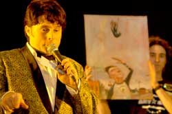
The third Art. vs. Art took place May 7 at the Fountain Square Theatre. This rambunctious art brawl and study in social politics was presented by the arts not-for-profit Primary Colours and their pals at Groove Truck Productions.
The event was a $1,000 winner-take-all competition in the form of head-to-head bouts between paintings. The winning works, determined by a decibel reader measuring audience cheers, went on to the next round while the loser’s fate was determined by a spin on the “Wheel of Death.” Death could be avoided by purchase.
Sixty-four artists participated, executing their paintings with identical materials supplied by Prizm Art Supplies. Sixteen top paintings, selected by audience ballot, went on to face off in front of a crowd of 300 spectators.
Nikki Sutton, an interior designer with Axis Architecture, commended the event while filling her three-choice ballot, saying, “A lot of people don’t feel comfortable interacting with art … but this little ballot makes someone decide. I see a lot of people I haven’t seen at any of the Murphy open houses. At the Murphy, things are all about having a cocktail and not interacting with it. Some people may have some hangups about judging what’s good art, what’s not good art. I don’t think this is what this is about. This is about people feeling comfortable expressing opinions about art where normally they would just keep it to themselves because they’re intimidated by it.”
Nikki chose one painting twice on her ballot for lack of quality options.
Artur Silva, an artist represented at Editions Limited, chose not to participate because, “I just don’t want my work to be chopped up. I don’t understand the validity of it.” He added that if anyone were to destroy his work it would be him. “I’ve lost my hope in democracy — it’s lost its value.”
“Are you ready to fuck up some paintings people?” MC Mike Wiltrout — of local bands Leisure Kings and Mr. Sparkle — asked the audience, which enthusiastically cheered and blew their party favor horns. The Arts Council’s Dave Lawrence and Brian Payne, president of the Central Indiana Community Foundation, were among the groundlings. “This is an evening of art, music … and most of all destruction,” Wiltrout said with more bravado. “You’re a cruel, bloodthirsty lot of people. Let the bloodbath begin!”
The event was basically postmodern art 101: First destroy art for the sake of art, shock the audience, but still vie for their applause and support. It’s an old idea and not always a bad one if you’re “making art available to everybody,” as Wiltrout said of the Primary Colours mission.
Filmmaker David Yosha said, “It’s not that the pieces are profound. It’s great theater and people are getting involved. I’m surprised there aren’t more people bidding on the art.”
And just then Mark Haesler, manager of Raleigh Limited, came running by excitedly explaining, “I had to save a painting. It was too good!”
Four Letters to the editor regarding Art vs. Art review published May 19, 2004
Letter #1
From Participating artist, Pat Mack published May 12-19, 2004, NUVO Newsweekly, Page 4.


Issues with coverage
As a sponsor of the Art vs. Art at the Fountain Square Theatre on May 7, I am happy to see the local media sponsorship and coverage. However, as is often the case with her writing, I found Mary Lee Pappas’ article to be catty and unbalanced (Culture Vulture, May 12-19). This is fine for a society or fashion column, but it undermines the credibility of NUVO’s visual arts coverage and hurts our city’s growing cultural standing. So I’d like to offer a few Journalism 101 suggestions.
First of all, use actual facts. For instance, attendance for this event was closer to 600 and participation was 75 individuals, not the 300 and 64, respectively, reported.* Also, this event was not just for artists. Many first-time painters joined in the fun, and more than a dozen serious artists (apparently willing to forgo taking themselves too seriously) came from Louisville, Dayton, Chicago and other regional locales.
Second, obtain facts from those who know them. Building positive relationships with reliable sources is often good for news or feature content. Any one of the 10 organizers not interviewed for the article would happily offer accurate information about this grander-scale Art vs. Art.
Third, when covering an event, actually cover it. Quote the people who participate. In this case, it would be nice to know why dozens of people were willing to spend four hours creating a painting with the risk of it being destroyed on stage. Quotes from a friend of the writer who did not participate due to philosophical issues (why was he there, then?) are suspect as a writer’s device, not substance for an article about the subject.
Fourth, use the word “fuck” only where appropriate, if at all. The usage of the MC’s quote was a sardonic commentary of the writer. It did nothing to capture the true flavor of the night, and was a shameful, transparent attempt to put important community leaders mentioned in the paragraph in an awkward context.
Finally, when it comes to covering the visual arts, please send reporters without burned bridges within the community, without personal vendettas and without a narrow understanding of the subject. It does nothing for NUVO’s integrity, and it is embarrassing to our entire art scene as we host a growing number of knowledgeable guests from other cities, such as the artists currently featured in the new iMOCA (Indianapolis Museum of Contemporary Art).
I doubt I will be alone as I continue to support Art vs. Art in its evolution into something potentially relevant to the emerging Post-Post Modern world. It’s 2004, and positive change for the visual arts is afoot in Indianapolis. I hope that NUVO will be a part of it.
Alan Schoff
Mansuzak/Schoff, Inc.
Innovative Advertising & Other Stuff
As far as Mr. Mack's letter is concerned I have to consider he's a "full-time metal sculptor" and therefore did not take the time to understand the rules. And maybe, just maybe, is taking himself a little too seriously. In general, any person, including serious artists should not take themselves too seriously.
* Jeff Martin of Primary Colours was called regarding attendance details, but didn't return the call until the piece had gone to print many days later.

Letter #3
Correcting some errors
We at Primary Colours would like to thank NUVO for their sponsorship and Mary Lee Pappas for her review of Art vs. Art. Upon reading Ms. Pappas’ journalistic offering, we felt compelled to inform you of a couple of facts and correct some errors. Seventy-five (not 64) artists participated in the event which took place before a crowd of 600-plus (not 300). Also, she misquoted our mission statement, which in its entirety reads “Primary Colours is a non-profit organization devoted to integrating visual artists and the community to create and sustain a thriving environment for the arts.”
We would also like to take this opportunity to respond to a rather negative letter from Patrick Mack, full-time metal sculptor. The official rules for Art vs. Art have been posted on our Web site for over three months. Perhaps, Pat, you read them when you registered online. Well, if not, then you surely read the rules before you signed a copy of them when you checked in and received the provided materials. The “wonton destruction and mayhem” you refer to should have come at no surprise. If you didn’t agree with what the possibilities were, then perhaps you shouldn’t have participated. Anyway, you looked like you were having a pretty good time on our video footage.
You wrote, “How great it would be if Primary Colours took this energy and enthusiasm to create and display paintings through a similar venue.” “One where the art isn’t destroyed” and “The public would have more time to absorb and decide to purchase the work.” We have done that, it’s called Allotropy, and we have done it six times: generating over $50,000 for the local arts community. And if our memories serve us, you had hesitation about that event, too.
This event was meant to be something different from the average art exhibition. An event that the audience didn’t just go see, but an event that they took part in. Art doesn’t have to be so pretentious and self-important. It can be fun and entertaining as well. If this event caught the attention and attendance of people who wouldn’t normally attend art functions, great. Maybe they had a good time and will attend future, more conventional exhibits. To say that this event “turns back the clock on our future as artists in this city” is absurd. One event, no matter what you might think of it, will not be able to do that. Over the last five years, Primary Colours has done nothing but good things for the Indianapolis Arts Community. Whether it be through Allotropy, the Primary Gallery, the annual TOYS exhibit or Art vs. Art, we are always promoting visual artists and exposing new audiences to their work. We have done all of this on a volunteer basis, we do not get paid. We do it for the love of art and to make where we live a better place.
We ask you, Pat, what events or programs have you developed to advance the local arts community? None that we are aware of. Perhaps you should redirect energies used to tear down unique and innovative art events and create something yourself.
Jeff Martin, Fred Shields, Dane Sauer, Jim Clinger, Robert Evans, Larry Endicott
Primary Colours
Primary Colours, Alan Schoff, Jeff Martin, Nikki Sutton, Dave Lawrence, Brian Payne, Fred Shields, Dane Sauer, Robert Evans, Pat Mack, David Yosha, Jim Clinger, Larry Endicott, Art vs. Art, Allotropy, Brian Phillips, iMOCA, Primary Gallery, Mike Wiltrout, J. Martin Gallery, Indianapolis Downtown Artist and Dealers Board, Centerline Studio
Urban Silos marketing champion one point IPS Becky Wilson
Centerline Studio
Bill Rasdell "A Celebration of Music and Dance" - College Avenue Library - May 12, 2004 - 3 stars
A serious artist with a distinguished photographic aesthetic, Rasdell produces consistent quality artworks that set him apart in the local community. Scenes of Cuban people and culture are captured colorfully in his prints and prints on canvas. His genuine passion for craft and subject matter is evident and keen. The exhibit is a good marriage of talent (great eye for composition and technical craftsmanship), self-exploration and expression. Art seems to come first for this artist. Through June 30, 2004; 317-269-1863. – Mary Lee Pappas
"Longing For Meadows" Bill Borden, Ron Mack, Carol Strock-Wasson- Munce Art Center - May 12, 2004 - 3 stars

An exeptional show of Indiana plein air works by Bill Borden, Ron Mack and Carol Strock-Wasson. It's all great stuff. Stock-Wasson's pastel, "Winter Cornfield," is museum worthy. Borden's watercolors are expert and priced absurdly low. Both "O'Conner's House" and “Talbott Hyatt House" are perfectly storybook and demonstrate a great understanding and control of the medium. Mack shows a keen sense of light in his pasture scenes. Overall, a very refined show from three gifted artists. Through May 29, 2004; 317-873-6862. -Mary Lee Pappas
Wednesday, May 05, 2004
Wheeler Arts Community Spring Show - Wheeler Arts Community - May 5, 2004 - 2 stars
Mostly familiar work by familiar artists presented beautifully in the front lobby and trickling back into one artist's home studio. Susan Hodgin's "The Lake," a large 40-inch-by-1 20-inch three-part painting on panel was reminiscent of an art nouveau illustration. The scene in red features heavily outlined ornamental trees, again familiar, against a landscape of flat, staggered planes in varying flat fields of poppy tones that emphasize the design quality. Three mixed media pieces trace flower designs in flat brushes in pen and paint. Choices of color give these pieces appeal. Kipp Normand's three home shrines, found object ceramic religious statuary tucked into decorative glass front boxes - were just that - lacked context and greater meaning than his architectural reliquaries of last year. Overall, this was a design-heavy show with the artwork displayed dependent on competent arrangement. Participants, a diverse group of sure talents, were only in part Wheeler artists. Occurred May 1, 2004. -Mary Lee Pappas
"Another Slovakia" - Indianapolis Artsgarden - May 5, 2004 - 4 stars
Perfectly pure and masterful photography by Martin Kollar. This small collection of 16-inch-by-20-inch Type C prints are the discerning footprints of everyday life in a changing Slovakia where old and new ways have been merging. Born in Zilina, Slovakia, Kollar captures an intimacy of expression and action that reflects the state of the country beyond strict documentation. The contrast is unglamorously portrayed, but not without intrigue and keen perception. Overcast skies secure the good light and set the stage for viewers to examine the streets along with the expressions and activities of inhabitants, whether that be a fox kill or simply getting one's hands in the dirt. Kollar's compositional aptitude only enhances the appeal and inviting quality of his work. Kollar's work is currently at the Kathleen Ewing Gallery in Washington D.C., and is touring the U.S. thanks to the Embassy of the Slovak Republic - a fine endorsement of how this work captures the culture. This is the best visual treat the Artsgarden has presented, thanks, in part, to the Czech and Slovak Society of Central Indiana. Through May 7 2004. -Mary Lee Pappas
"First Brush of Spring" - Hoosier Salon - May 5, 2004 - 3 stars

This show, featuring works created at the New Harmony Paint-Out April 15-17, offers a taste of the season with something for varying aesthetic sensibilities. All pieces adhere to the hard-to-shake local color landscape genre because this is a plein air venture. And, simply said, this kind of work is done pretty well here and is meaningful. Stylistically, the range of execution is reasonably diverse from folkish to the downright inspired "Mumford Farm Memory" by Robert Eberle. Tranquil and moody, the space is organized with a sharp vanishing point (in the form of a path) ending with a light muddied peach color. The contrast is warm against the muddied purple and green cool tones of the tree-lined scene. Small dappled flashes of true pink pop in one small area to reveal spring. "Two Quackers" by Lynn Dunbar is a gesture-rich appealing composition. The ducks are formed from light blue and ashen shades of yellow swiped confidently and easily onto the canvas. Through May 22, 2004; 317-253-5340. -Mary Lee Pappas
Wednesday, April 28, 2004
"Greatest Generation of Sports Artists in War and Peace" - National Museum of Art and Sport - April 28, 2004 - 3 stars
Sometimes the themes of shows at this museum, located at the University Place Hotel and Conference Center on the campus of IUPUI, feel like a stretch. The "museum" is essentially in the corridors of the convention-heavy facility. This art should create a point of destination for visitors instead of being an afterthought for those who attend one thing or another. This show focuses on artists who, during World War II, served as combat artists, correspondents or were members of the armed forces who happened to be artists. Some of the art is on loan from the U.S. Army, Navy-Marines and Coast Guard. Donald Moss, a combat artist in the Marines and longtime illustrator for Sports Illustrated, served as chairman for the exhibit, which is testament to the quality of work on display. Germain G. Glidden, Ray Ellis, John Groth, Fletcher Martin, Ogden M. Pleissner, Cecile Johnson, Peter Cook and Kipp Soldwedel (a pilot during World War II, he was commissioned to paint a mural for the memorial at Pearl Harbor - "The Day of Infamy") are the wartime artists represented. A very thoughtful and responsible exhibition. Through May 31, 2004; 317-274-3627. -Mary Lee Pappas
"Art Deco" A Decade of American Design" - PH Sullivan Museum - April 28, 2004 - 1 1/2 stars

A humdrum tour of American mass-marketed utilitarian objects in the 1930s. Certainly the parameters of Art Deco are broad, with something for every Modernist's taste and pocketbook - then and now. But this show hovers toward the unremarkable Fiesta ware end. On the high-end of Le Style, an enameled and wood inlaid Kodak camera by Indiana born industrial designer Waker Dorwin Teague is quite nice and significant in contrast with the content of the rest of this small show. Overall, this peek at a decade of design mass marketed to mainstream America reflects a very limited aesthetic of chromed-out, inexpensive daily accessories, like the spun aluminum relish rosette by Russel Wright. It is not a well-rounded representation of Art Deco by any stretch, but serves as reminder of how the ordinary can be taken as art. Through June 26, 2004; 317-873-4900. -Mary Lee Pappas
Wednesday, April 21, 2004
New Works By Indiana Artists - Editions Limited - April 21, 2004 - 3 1/2 stars
Thirty-two local artists working in 32 different genres comprise the first show at the new Broad Ripple location of this 35-year-old local gallery institution. A fresh red front door, natural light, the location and an intimate gallery space are definite improvements. Notable local favorite Lois Templeton gets ample wall space with one large washed abstraction that employs a decidedly brighter than usual palette executed on paper. The gestural quality of her work is emphasized on this surface and appears brasher as well. This is a welcome, energized evolution. On the other end of the scale, a tactile and chalky landscape on panel by Amanda Presnell, an EL art consultant, is calming and deceptively controlled with dark, cool colors. Everything is lovely, of note and worth a visit. Through May 7, 2004; 317-466-9940. -Mary Lee Pappas
"Brickhead #3" - Massachusetts Avenue - April 21, 2004 - 2 stars

Outside of Elements restaurant in the Davlan building at the corner of Alabama and Massachusetts sits "Brickhead #3," a large ceramic sculpture by Indiana native James Tyler. It's a colossal head, sculpted and sliced apart into many hundred brick pieces only to be reassembled. The symmetrical facial features, swollen lips and sanguine expression remotely recall a Fourth Dynasty Egyptian look and some may say that's a stretch. Is there supposed to be an ancient context here of keeping the head away from the body after death? This big terra cotta-colored head, neckless and bodiless, does compliment the brick facade of the Davlan building and the grassy courtyard where it resides. Of better quality and more interesting than most of the publicly displayed sculptural works along the avenue, it still lags. Funded by the Indianapolis Cultural Development Commission, "Brickhead #3" feels a bit more like a gimmick than a sculpture. Sounds are supposed to emit from the head as people wander by, only, unfortunately, it was difficult to decipher if this feature was working. "Brickhead #3" is missing some of the fluidity and detail found in other works by Tyler, making this piece appear to be a second-best effort. Through Sept. 30, 2004; 317-634-3114. -Mary Lee Pappas
Wednesday, April 14, 2004
George Murff "Figurative Expressions - College Avenue Library - April 14, 2004 - 2 stars
Upon walking into the library with Murff's work encompassing the upper periphery of the walls, your eyes are diverted to the primary bright yellow barren background of "Survivor," a portrait recently exhibited at Dean Johnson in No Boundaries - A Multicultural Viewpoint. It may be the best of the bunch. A collection of oil paintings, pastels and watercolors, this body of work has a graphic sensibility to it, not a surprise considering Murff has designed banners and posters for local government, including "Shower your baby with love." Compositions look too extracted from photographs, as does the wavering realistic approach to the work. There is something a little amiss - some trepidation in the depiction of faces - that gives the portraits and figurative scenes in the painted works a stiffness instead of a lively lightness. The style in some pieces isn't personally distinguishable. Though passionate in subject matter, emotion isn't fully realized in the overall finished products. Through April 30, 2004; 317-269-1863. -Mary Lee Pappas
Itza Pizza Art - Itza Pizza - April 14, 2004 - 2 stars
Itza' Pizza usually serves up fresh, hand-tossed crust pizzas with dough made daily. An 8-inch pizza is a mere $6 and a 16-inch is still only $12. Better yet, sandwiches and pastas are all under $5. Open Monday through Saturday, 4-11 p.m., it's also currently serving up art with a portion of the sales going toward the little eatery situated smack dab in the middle of the Fountain Square arts district - one with more art than retail shops. Collectively, the grouping is of pizza-themed artworks - from ceramic vessels and photography, to styrofoam slices. Prices are very low, from around $25 on up. Though tiny, this is a funny, quirky display that does require a basic sense of humor. Through May, 3, 2004; www.discoverfountainsquare.com, 317-635-6252. -Mary Lee Pappas
Wednesday, April 07, 2004
Ugly Dolls, a toy review - April 7, 2004
Ugly Dolls
Toy Review
Mary Lee Pappas
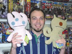
*Pictured:
Matt Booher, assistant manager of Comic Carnival’s Westside location.
Forget Kestner, Kewpie and Madame Alexander, the Ugly Dolls are the cuddly wuddly antidoll dolly of today. And they are soooo cute even though they are soooo ugly. “That’s the mentality,” Matt Booher, assistant manager of Comic Carnival’s Westside location, said about their uncommon irresistibility.
Ugly Dolls are adorable dorky alien creatures made of baby soft polyester fleece. They aren’t jointed or multidimensional, but rather flat and pillowy, with appliqued perfect circle felt eyes with itty-bitty pupils. Their simplistic facial features and linear body design give these plush stuffed Martians a charming vulnerability that make them practically spontaneously huggable. Couple that with a few involuntary simpering, “Ahhhhs,” and other loving coos and you’ve got a typical tender reaction to the cartoonish Ugly Dolls.
Though well-suited for a little baby, adults are the primary consumers of Ugly Dolls. “I don’t know why they haven’t caught on with kids. They’re a lot cuter than Beanie Babies,” Booher said. Comic Carnival has been selling out of the dolls at their four Indianapolis locations since they started carrying them six months ago. “They’ve been pretty good for us,” Booher added, saying that both men and women have been charmed to bits by these freaky cuties. “It’s been a mixture. Guys have probably been buying them as gifts.”
People across the country have been buying them, from the artsy-fartsy likes of the Whitney Museum of American Art and the MOCAs in Cleveland and L.A. The success of their design is unquestionable. To learn more about Ugly Dolls visit www.uglydolls.com. Ugly Dolls are available at Comic Carnival’s four locations: North, 253-8882; South, 889-8899; East, 898-5010; and West, 293-4386. Dolls are $19.99.
Gym Stoffer- Joe Reuzers Deli - April 7, 2004 - 2 1/2 stars
A graduate of Herron School of Art, Gym Stoffer has worked in the medium of collage for the past 20 years. An accurate statement read, "He reconfigures commercial imagery into surrealistic dreamscapes filled with hybridized archetypes performing bizarre comedies." His precision cut and paste magazine paper-pieced works take disparate images and transform them into bizarre and dimly colored, somewhat creative compositions. Most are rather amusing with titles like "Robo Eskimo Expo." Looking meticulously conceived, they are quite curious, but don't require stellar leaps of the imagination as most are dependent on visually comfortable and identifiable elements. Nevertheless, the work has definite merit. 317-916-DELI. -Mary Lee Pappas
"Everything Goes Better with Alcohol" - Everyday Inventors - April 7, 2004 - 1 1/2 stars
"An art show about painting and getting drunk," a show description read. This show just can't be taken seriously when the premise was to get drunk and paint the contents the evening before the opening. It was hardly an exploration of process, self-discovery or losing inhibitions to loosen up the creative mojo. The theme is a turn-off, the art is mediocre and you can't tell what artist painted what piece. "The show has legitimacy beyond the brash and garish paintings that may have been influenced by alcohol." This appears to be a statement about an ill-conceived show that may have been written under the influence of alcohol as well. A very disappointing venture from Everyday Inventors, a usually quirkier, inventive and more capable bunch. Through April 17, 2004; 317-955-7577. --Mary Lee Pappas
Wednesday, March 24, 2004
Andrew Hutchison, Skateboard Photogrpher - Two Sisters Trading Company - March 31, 2004 - 3 stars

Hutchison is a skateboard journalist, having both witten and photographed the sport professionally for publications like Heckter Skate and Big Brother. That said, the photos collectively are an essay on the sport. They capture athleticism, speed, motion and even some bloody palms rather beautifully. There is a certain stillness to the images that conjures up the heightened sense of self-awareness and meditation it must take to muster up some of the risky stunts skaters pull off. Lining a hall and filling a little room of this new, funky gift and clothing shop, they are artful and should hold the interest of anyone who appreciates quality photography or skateboarding. A distinct sense of skateboard culture across the U.S. is what you'll take away from this exhibt. Through April 6, 2004. -Mary Lee Pappas
Subscribe to:
Posts (Atom)