Wednesday, December 29, 2004
"First Come, First Hung" Sulllivan Munce Cultural Center - Dec. 29, 2004 - 3 stars
I love the concept of this show, where the first 40 artists to submit their work automatically get accepted regardless of refinement, skill or any other criteria or theme. Children's, professional and amateur artworks, framed appropriately of course, hang side by side. In their randomness they somehow manage to make for a cohesive and interesting visual display, as if there was more to this than being lucky enough to be one of the first in line. A riddle of a task for the curator, this hardly feels like a free-for-all, but rather an inspired representation of what art is for anyone who actually has the gumption to make art. A fabric art piece, "Designer Martini" by Janet Cohen, is an eye-catching delineation from the predominantly 2-D fair filling the Mahaney Gallery with its stitched mosaic texture. Through Jan. 8, 2005; 317-873-4900. -Mary Lee Pappas
Wednesday, December 22, 2004
"Poignancy Lost" The Marilyn Monroe exhibit at the CMG Legends Museum Dec. 18-19, 2004, Published in NUVO Dec. 22, 2004
Marilyn Monroe: The Exhibit
CMG Legends Museum
Dec. 18-19
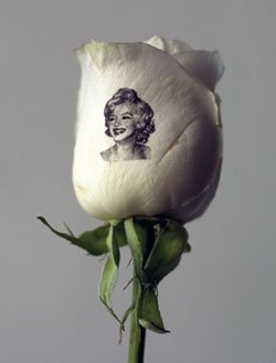
* A favor from the Press Preview Event, this real white rose pictured was inkjet embossed with an image of Marilyn by www.speakingroses.com.
CMG Worldwide, which manages intellectual property rights of famous celebrities like Marilyn Monroe, staged a two-day exhibit, a fund-raiser for St. Vincent’s Center of Hope, of what they touted to be “the largest collection of Marilyn Monroe artifacts ever assembled.” But why?
Even with international magazine covers donning Marilyn’s images wallpapering one lobby exhibit room, these “thousands” of said items, primarily belonging to collector Robert W. Otto of Chicago, didn’t seem to add up to the contents of even the Christies’ offerings at their infamous October 1999 auction.
“Never before seen,” another sales descriptor for the show, was more apt. Fake graduated pearls, dowdy underpants with Marilyn’s name markered upon them, plastic tissue box covers and a bad, faux jaguar three-quarter length sleeve coat an impersonator would turn their nose up at are probably items Marilyn never wanted to see again. With the $25 steep ticket price, importance beyond ownership was necessary for value to have been gained in this unflattering look at Monroe.
Any poignancy, significance or glimpse into the real Norma Jean these mostly mundane (no furs, no little black dresses) objects could have offered was lost in horrible presentation and inconsistent labels — some unprofessionally gushy. The average-for-the-time bathing suits weren’t the ones immortalized in Richard Avedon or Ben Stern photos. Were the awful dresses on display costumes or from photography shoots? Not even the alleged “Happy Birthday Mr. President” pink back-up dress was red carpet. The Irish knit sweater wasn’t the one from the George Barris photos. Context, historical interest, purport, personal history or any ordinary accompanying details to drive the authenticity of these pieces was needed.
The exception was an easily missed French black suit Marilyn wore in the late 1940s to modeling and movie auditions. Displayed within a case in the breezeway of the CMG building, it was not only exposed to damaging direct sunlight, but had hot, harsh, overhead can light beaming down on it from a very short distance. Set against a loosely woven lipstick red fabric, as everything exhibited was, the suit should have been given more precedence.
CMG should’ve used its not-for-profit museum status to garner funding to employ qualified museum professionals to safely display and author a cohesive story for the objects. T-pinning loose 40- to 50-year-old candid photographs to red fabric is unacceptable, shoddy to boot, and gave this “exhibit” an unsatisfying homemade look.
Currently the Brooklyn Museum of Art (www.brooklynmuseum.org) is exhibiting I Wanna Be Loved By You: Photographs of Marilyn Monroe from the Leon and Michaela Constantiner Collection through March 20, 2005, a more dignified and less weird display than this unfortunate local offering. Visit CMG online at www.marilynmonroe.com.
Elaine Wolf and Lee Ellis - CCA Gallery - Dec. 22, 2004 - 1 1/2 stars
You could drown in the plethora of watercolor floral arrangements and landscape style works in the CCA Gallery. Most are somewhat provincial and common while others, like Jane Wiley (great compositions and jewel-toned colors) and Bob Bratton's offerings, are way above the average - even moreso when their fair prices are compared to those of lesser works sharing the same space. Elaine Woffe's flat, cluttered scenes of streetscapes and the like are naively handled, skimming the boundary of outsider art when compared to other works on view. Of note: She offers the service of turning a favorite family photo (vacation scene?) into a painting. Elegant turned wood bowls are something the CCA has no shortage of either. Their co-op artisans consistently create unique and refined vessels, bowls and platters, including those featured currently by Lee Ellis. They are as sculptural as functional. Through Dec. 28, 2004; 317-255-9633. –Mary Lee Pappas
"Eclectica" - Arthouse 60 - Dec. 22, 2004 - 2 1/2 stars
Currently overexposed Indianapolis artists have a new venue and audience for their works in the very art friendly Zionsville at the former home of the Pidge. Works maybe seen too many times before in other places by Kipp Normand, Ellie Siskind and Kyle Ragsdale make this feel like a mini Harrison Center for the Arts with the unleveled salon-style hanging. Artwork felt crowded in this little old house. The jewelry was of limited string and bead skill, the glass works were fantastic, though knick-knackishly small, and most of the art represented a visually current pop genre. The best art in the place were the limited edition rock concert posters (there's a serigraphy shop on site) by co-owner Jeff Brown for the likes of the String Cheese Incident. More of this please! Kudos for showing art without a theme dictating the direction of exhibited work and for making a concerted good start. www.arthouse6O.com. Through Dec. 26, 2004; 317-735-1460. -Mary Lee Pappas
Wednesday, December 15, 2004
Artists seek new home - Bodner Studios - Dec. 15, 2004
Artists seek new home
Visual Art
By Mary Lee Pappas

*Pictured: Barbara Zech in the Bodner gallery.
Bodner Studios, the 3-year-old artist community located immediately south of Eli Lilly on Madison Avenue, will be having its last group show this Friday, Dec. 17, 6-10 p.m.
Owned by the Bodner real estate group, the building was put up for auction and consequently sold in late November.
“It might be our last show, or it might not be. As far as we can see, this is our last show,” ceramicist and Bodner artist liaison Barbara Zech said, referencing the Dec. 13 close date on the sale, which could get pushed back pending the status of the new owner. “We knew the chance was there that they would sell the building. We knew it was a matter of time. They didn’t lead us on.”
The Bodner artists (none tied to a lease) have 60 days from close to vacate. However, anxieties regarding what the actual close date is exist and, if delayed, it could afford them another possible art show and production time.
“Art is our business,” Zech said of the artists maintaining studios at the large, raw, industrial building. “We have to be ready to put our work on hold. A lot of artists have abandoned ship. I’m holding out until the last minute because I have a kiln [about 500 pounds] to move. Artists are getting anxious. We don’t know if we have two more months or a year.”
Bodner Studio artists have been a do-it-yourself bunch from building and tearing down gallery walls in the rent-free gallery, painting the expanse of walls (with paint donations matched by Bodner) and pitching in three clamp lights each for gallery lighting. Their hands-on volunteer efforts have made it one of the best local visual arts venues in the city, accomplished without not-for-profit status or outside funding. “It’s made us a strong community,” Zech said.
Artists who have been a part of the Bodner community will be participating in this group, tentatively the last art show for this group in this space of which Zech said, “About the only thing you could use this space for is artist space.”
Bodner Studios is located at 1200 S. Madison Ave. Call 679-4062 or e-mail bodner_arts@hotmail.com with any questions. Visit www.IDADA.info for more information on the Bodner community of artists.
Traveling through another dimension of sight and sound. It's NUVO Blogs. A place where time and space no longer have meaning.
Visual Art
By Mary Lee Pappas
*Pictured: Barbara Zech in the Bodner gallery.
Bodner Studios, the 3-year-old artist community located immediately south of Eli Lilly on Madison Avenue, will be having its last group show this Friday, Dec. 17, 6-10 p.m.
Owned by the Bodner real estate group, the building was put up for auction and consequently sold in late November.
“It might be our last show, or it might not be. As far as we can see, this is our last show,” ceramicist and Bodner artist liaison Barbara Zech said, referencing the Dec. 13 close date on the sale, which could get pushed back pending the status of the new owner. “We knew the chance was there that they would sell the building. We knew it was a matter of time. They didn’t lead us on.”
The Bodner artists (none tied to a lease) have 60 days from close to vacate. However, anxieties regarding what the actual close date is exist and, if delayed, it could afford them another possible art show and production time.
“Art is our business,” Zech said of the artists maintaining studios at the large, raw, industrial building. “We have to be ready to put our work on hold. A lot of artists have abandoned ship. I’m holding out until the last minute because I have a kiln [about 500 pounds] to move. Artists are getting anxious. We don’t know if we have two more months or a year.”
Bodner Studio artists have been a do-it-yourself bunch from building and tearing down gallery walls in the rent-free gallery, painting the expanse of walls (with paint donations matched by Bodner) and pitching in three clamp lights each for gallery lighting. Their hands-on volunteer efforts have made it one of the best local visual arts venues in the city, accomplished without not-for-profit status or outside funding. “It’s made us a strong community,” Zech said.
Artists who have been a part of the Bodner community will be participating in this group, tentatively the last art show for this group in this space of which Zech said, “About the only thing you could use this space for is artist space.”
Bodner Studios is located at 1200 S. Madison Ave. Call 679-4062 or e-mail bodner_arts@hotmail.com with any questions. Visit www.IDADA.info for more information on the Bodner community of artists.
Traveling through another dimension of sight and sound. It's NUVO Blogs. A place where time and space no longer have meaning.
Forrest Solis "A Celebration of Women in the Arts" - Bodner Studio - Dec. 15, 2004 - 3 1/2 stars

Indianapolis has seen an abundance of women-themed art shows in the last three years that have mostly fallen short on purpose and, in one instance, was simply an excuse to have a party according to the event organizer. Those errors in purport and substance by default help shape this group of large paintings about "women artists in underrepresented art forms" as comparatively original and honest. A costume designer, quilters and even a self-portrait of Solis herself are seen in these vibrant, somewhat painterly, compositions. A drawing, collage and painting faculty member at DePauw University having received her MPA from IU Bloomington, Solis' series is somber despite the warm jewel tones and though the women are depicted engaged in their art. Through Dec. 15, 2004; 679-4062. –Mary Lee Pappas
2004 Group Show - 4 Star Gallery - Dec. 15, 2004 - 2 1/2 stars
Artists represented by Katherine Carter and Associates (an arts marketing group) comprise this small show with some hits and some misses. Fortunately, the strength of the hits outweigh the weaker pieces by the likes of the questionably celebrated Rita Blitt, whose work looked like nothing more than streaks of worn-out magic marker on white paper. "Incendience," one of several 36-inch-by-30-inch paintings by Ron Clark, is downright sublime. It looks to follow a Rothko compositional formula where color (appearing like layers of laquer) is emotion. While this approach is hardly anything new, it's done exceptionally well and with great effect. Also of note were Elizabeth Austin's reverse glass paintings executed on half-inch plexiglass with acrylic paints. The pieces are dependent on her decoratively applied strokes of opalescent blues and greens speckled with glittered confetti. Organic vines are formed and appear mystical like shadows in moonlight. Through Dec. 31, 2004; 317-686-6382. -Mary Lee Pappas
Wednesday, December 08, 2004
Residue and newness, "Flood/Margin, Part/Whole" an installation by Robert Bubp - Indianapolis Art Center - December 8, 2004

* Pictured - "Flood/Margin, Part/Whole," an installation by Robert Bubp, is on view at the IAC.
“One touch of nature makes the whole world kin,” Shakespeare told us in Troilus and Cressida. Robert Bubp tells us, similarly, that for every action there is a reaction in nature with his installation “Flood/Margin, Part/Whole.” For Indianapolis it’s imminent, this Wichita, Kan., artist reminds.
Eloquent and pointed in content, Bubp’s installation is composed of indelicate concrete blocks, sandbags, metal maps, dirt and video projections that appropriately feel plopped down into the Churchman-Fehsenfeld Gallery at the Indianapolis Art Center. Though a prevailing visual symptom of Indianapolis’ urban-rural sprawl, these rough elements are unexpected, if not temporarily startling to see assembled in a gallery setting.
“The inside looks like the outside,” a bemused visitor accurately said of the installation, referring to Kosene and Kosene’s Monon Row $375,000 a pop condos (phase V), seemingly spontaneously generating from concrete slab on mud foundations just yards from the IAC’s front doors on Ferguson Street.
Two fractional concrete block walls are stretcher bound in the gallery just as “phase V” appears at this moment. And, just like those and 55 other construction sites along the White River from the IAC to Noblesville the artist documents here, they appear as architectural residue combined with evidence of newness.
One wall bears sandbags and the other dirt rubble at its base while both reflect video images of the White River, fields of purple blooms, woods and farmland (some blurred images suggest fleetingness) juxtaposed against maps of Carmel. The consequences dealt with in this piece include the White River flooding downstream in communities like Rocky Ripple at Butler University.
Bubp reminds us that while Carmel has gone from a population of 2,000 in 1960 to 38,000 now, agricultural and wooded lands in this outlying district have been destroyed without a greater city plan. “Wherever root systems and foliage are cleared and replaced with non-absorbent materials [cars, roofs, streets, parking lots] runoff is significantly increased, which means river levels will also increase,” the artist explains in his statement. “Is Carmel going to develop a plan for flood control that will ensure its growth is not responsible for downriver flooding in a city that hands out sandbags when it rains?” This is also a town that has been unwilling to procure paper recycling receptacles because of their perceived unsightliness.
Aesthetically abrupt and intellectually in tune, this message of fragmentation in our new-growth community demands that citizens question city planners and the environmental scars that short-term developments are creating — the costs of which greatly outweigh rental income from the limited life of an AMLI apartment complex. It begs for responsibility from all parties. This work is a success from every perceivable angle.
“Flood/Margin, Part/Whole” will be up through Jan. 16, 2005. For info call 317-255-2464. - Mary Lee Pappas
Taylor Anne Smith - Starbucks (Broad Ripple) - Dec. 8, 2004 - 1 star
Smith's artist statement attempts to justify an artistic substance in her painfully informal canvases that simply doesn't exist. Infusing expresso, cabernet and shiraz into her paints for this "Coffee and Wine" series of minimalist splatter pieces seems a bit dramatic for the flat, low-pressure results. "Crimson Adagio," a big red ameba blob covering a prefabricated canvas, has a thin wash of coffee-stained color that doesn't even tiptoe along the decorative. But see for yourself at www.abstractmodern.com. Through December, 2004; (317) 255-1624. –Mary Lee Pappas
NUVO Newsweekly, December 8 to 15, 2004
Greg Seagrave - The Bungalow - Dec. 8, 2004 - 3 stars

Seagrave's locally distinguishable paintings are as colorful as they are busy. Improvisational twirls and angles, set predominantly in black, get sandwiched between woven brushes of layered color. The congestion is consistent from piece to piece and is as confidently applied as it is free. The freer the application in Seagrave's case, the more valuable the result. "Diva of the Boxed Wine Crowd," a large painting containing paper collage elements, demonstrates his apparent unending mania to keep pushing through the spatial elements of airy space that eventually create a finished effect more visually complex than some complacent Pattern. Evidenced also is a personal thrill, if not compulsion, to create. Through December, 2004; 317-253-5038. –Mary Lee Pappas
Edgar Degas "The Little Dancer, Aged Fourteen" - Indianapolis Museum of Art - Dec. 8, 2004 - 3 stars

A loan from the Virginia Museum of Fine Arts, this bronze sculpture stands in the company of paintings by Degas' Impressionist contemporaries Monet, Vuillard and Renoir. This is but one of 27 bronzes and two plaster casts of " La Petite Danseuse de Quatorze Ons" (1878-1881) made after Degas' death by Paris founder Adrien A. H6brard that reside in museums from the Joslyn Art Museum in Nebraska to the Musee d'Orsay in Paris. In person, this iconic work held no surprises or insight in part because it's been so prolifically reproduced. Rather, it pushed me to imagine what the wax, flesh toned, wig adorned original exhibited at the Sixth Impressionistic Exhibition in 1881 would have looked like and how that first incarnation was pivotal in changing the face of modern sculpture. What aren't we seeing that caused such a commotion and how did it embody Degas' intentions? Here, we do see the dancer (Marie van Goetham) in fourth position, as an obvious unflattering break from idealized conventions - no pedestal, not pretty, from a family of prostitutes, ballet was unfashionable – though she passes for charming today. Having inspired the Paris Opera's La Petite Danseuse last year and been the subject of a children's book among other things, she is deservedly delightful. This variation's successfully subtle tutu is of gathered white tulle over two layers of aged taupe colored crepe all edged in pinking shears. Her hair ribbon is effective though looks to be inventively executed from store bought metallic mesh ribbon reinforced with wire. Through Jan. 2, 2005; 317-923-1331. -Mary Lee Pappas
Wednesday, December 01, 2004
Honoring Hails - obituary for artist, art critic, and gallery owner Doris Vlasek Hails of Woodburn and Westcott - Dec. 1, 2004

Doris Vlasek Hails, of Woodburn and Westcott Contemporary Fine Art, passed away Nov. 17.
A Bohemian born in Chicago, she opened her gallery in the Murphy Building because Virginia Avenue reminded her of her childhood neighborhood. She trained at the School of the Art Institute of Chicago “at a time when professors taught the pictorial space of the Old Masters, before the era of marketing and artspeak,” she wrote in a letter to me.
She exhibited in Paris, France, had her first solo show at age 40 in Chicago and learned she could schmooze in a checkout lane at Marsh in the mid-’80s just after moving to Indianapolis. She authored art critiques and a farcical advice column, “Miss Advise,” for a local paper, taught at Herron in the early ’90s and painted compulsively her entire adult life, sometimes 12 hours a day for months on end.
In March of 1993 Doris lost her ego and, having been raised an atheist, found (or was found by) God through her TV on a Wednesday evening, for which her gratitude was immense. She enjoyed trees, animals (especially her cats), morning skies, seasons, opera and dispensing advice and encouragement to artists. She considered marrying Stanley Woodburn Hails one of her best decisions and believed that her purpose in life was to make art. Love and relationships were among the most important things she believed any of us could acquire on this planet.
In lieu of a wake, a retrospective of her artworks will take place at Woodburn and Westcott, located at 1043 Virginia Ave., Friday, Dec. 3, beginning at 5 p.m. 916-6062.
*Pictured is "Living Room," by Doris.
"Art for Their Sake" - Glendale Mall - Dec. 1, 2004 - 1 1/2 stars
A collaboration between Glendale Mall and Herron School of Art/IUPUI, the sale of these decorated, maple, pint-sized chairs donated by Glendale benefits Prevent Child Abuse Indiana. Efforts to collaboratively raise funds for this deserving not-for-profit are five-star worthy, but the actual student art up for bid (which is what is being evaluated) was not produced on a high level. A Pacers chair with a basketball net dangling below the seat and a Spiderman theme chair, among others, demonstrate the limited imaginative scope of these Herron students, not to mention how poorly some were rendered. But presentation, the community collaboration idea and promotion for this second annual event are great. Though the chairs are lackluster, they are deserving of bids for the sake of raising funds for PCAI. Winners of an ongoing silent auction for these chairs, called "Chairish the Children," will be announced Dec. 4. The last opportunities to place bids takes place Friday, Dec. 3, 12-5 p.m. and Saturday, Dec. 4, 12-5 p.m. with the live auction of faculty designed chairs at 4 p.m. Through Dec. 4, 2004. –Mary Lee Pappas
William Forsyth "A True Artist" - G. C. Lucas Gallery - Dec.1, 2004 - 4 stars
This is a museum-worthy show and sale of oils, watercolors and charcoal drawings by William Forsyth from the Forsyth family collection that offers a great variety of approaches from this Hoosier Group notable. "Sunset ll," one of the smaller canvases available, radiates true colors of the remarkable natural occurrence it depicts. Brilliant yellow, white, hot pink and periwinkle are spontaneously applied with a palette knife across the horizon line, streaking the sky. These gestures compliment the mood and gradations of light. This 1898 effort, though highly Expressionistic, is reminiscent of the Romantic notion of pursuing the momentary and of nature mirroring human emotion. This elegant piece offers a most original aspect, particularly when displayed across from unflattering, informal charcoal portraits executed in a much stricter temper. Through Dec. 31, 2004; 317-926-2893. -Mary Lee Pappas
Wednesday, November 24, 2004
Open House - Bear Creek Gallery - Nov. 24, 2004 - 3 1/2 stars
Nov. 20-21, 2004. An American Indian-owned store specializing in American Indian art and jewelry, Western home furnishings and gifts, Bear Creek Gallery celebrated the onslaught of the holiday shopping season with guest artists, food and new artful merchandise last weekend. Navajo silversmith Gerald Begay was on hand offering up his elegant silver butterfly earrings and slide pendants delicately inlaid with semiprecious stones, raw chunky specimens of which he had on hand. The designs he imagined in his jewelry are uniquely new and modern while still being distinguishably Navajo. This point particularly hit home among the enormity of handmade American Indian jewelry available, the prices of which are bargains at best when compared to lesser quality, overpriced, replica or silver import jewelry sold ad nauseam at local boutiques. It can't be forgotten that metalsmithing jewelry is an art-form definitely not learned overnight. Sure, BC sells pottery, art, fetishes and jewelry all year long, but the girth and diversity of handmade stock at this holiday time is a particular delight for those that fancy anything American Indian. 317-580-0882. -Mary Lee Pappas
Aloysius - Urban Element Restaurant - Nov. 24, 2004 - 3 stars
Murph Aloysius Kissel, describes his acrylic-based paintings on canvas and salvage as "colorful, primitive abstractions," which doesn't do his work justice. For starters, "primitive," in terms of art history (not excluding cultural objects of the Oceanic, African, etc. communities, children's artwork, outsider art or any art movement) is simply an unacceptable descriptor as it has too many negative (unsophisticated, uncivilized) connotations. There are too many other words to use in its place. Overt symbolism trickles through the sherbet-hued solid backdrops for his literal, abstracted scenes on UE's north wall. Two paintings of St. George and the Dragon, an Orthodox Christian image that dates to Roman Egypt, are stripped of any spiritual perspective (literally and figuratively) and interpreted successfully into an aggressive surrealist moment. The minimal iconic language gracefully subsists void of George (here a rigid, angular, stick figure) the Martyr's victory crown, Roman armor, horse and metaphoric layers. The weightless drama is depicted in a graphic, flat style that suggests the distortion of Miro with angular plasticity. Aloysius' work can be seen regularly at LAMP Gallery (lampfineart.com). The naiive at best work of Herron grad Brett Jones hangs on UE's east wall in sharp and homely contrast, compliments of Artistrunway.com, who should be discriminating about what they tout as fine art to Indianapolis. Through November, 2004; 317-331-U82. -Mary Lee Pappas
Wednesday, November 17, 2004
Mihai Micu - boxx fine art - Nov. 17, 2004 - 3 1/2 stars

* Pictured - "Three Cupids" or "Flying Bunnies" by Mihai Micu.
Wednesday, November 03, 2004
"These are a Few of Our Favorite Things" - Editions Limited Gallery - Nov. 3, 2004 - 3 1/2 stars
I find it admirably ballsy of the tenured EL crew to pick their favorite pieces by their represented artists without any other premise, particularly when other local arts entities do so flagrantly as if no one is catching on. And while curators are employed to be objective keepers of their designated collections and avoid favoritism, in this setting where associates' appreciation of the work fuels sales (and artists' livelihoods) it's most appropriate. Why not? It's simple. When you love the work and can speak passionately about it, you can sell it. Their personal tastes and daily intimate interactions with the works are bound to lead to some emotional slant. EL’s judgement to openly disclose their favorites is certainly a lovely stunner (very considerately arrangeo) that other organizations that lack discipline along these lines should observe. Oh, and every piece of color-filled art on hand could hold its own (like the Hal Davis piece) against anything anywhere locally. Go see for yourself. Through Nov. 5, 2004; 317-466-9940. –Mary Lee Pappas
Wednesday, September 29, 2004
AYS - Hubbard and Cravens, 49th and Pennsylvania - Sept. 29, 20004 - 3 stars
Three energized paintings by students from three schools that participate in AYS (At Your School) after-school cultural arts programs just so happen to be a pretty good match for the coffee shop interior. "African Musical Family" by Stony Creek Elementary School kindergartners in Noblesville has a hot chocolate-colored background on which bold black outlined drums seem to wigggle in some musical unison. It's lively and playful. "Massai Warrior Shield" by Washington Woods Elementary students is almost a step-by-step lesson on how to compose. A black outlined shield image lays on top of a colorful striped, stylized, Kente cloth-like background that contrasting swipes and strokes of color have been layered on top of to create depth. It's a great way to teach freedom and control with a paint brush. All three works were inspired directly by the African drumming lessons on djembes the students received from local percussionist Lawrence Clark. The paintings truly reflect the spirit and presence of drums. The efforts by Shamrock Springs in Westfield, "Masks of Luck," likewise builds on the African arts theme in a way that any anstract expressionist would commend. Action painting in reds, blues and greens revolve around kid-rendered images of African masks. It's like one big rhythmic burst created by many, many hands. All three paintings were group efforts among student participants who learned color, contrast, illusion and painting through these uninhibited exercises. Through September; 317-251-5161. - Mary Lee Pappas
Wednesday, September 15, 2004
"Eyes Wide Open: The Human Cost of the Iraq War" - Monument Circle and the Wheeler Arts Community Building - Sept. 15, 2004 - 5 stars


Sept. 11-13, 2004. Organized by the American Friends Service Committee (www.afsc.org), Eyes Wide Open was emotionallly and politically poignant. It was only by miraculous coincidence that this wound up being exhibited in Indianapolis on the anniversary of the Sept. 11 terrorist attacks in New York City. Scaling the north steps of the Monument, 1,007 pairs of black combat boots created a very graphic portrayal of the war in Iraq's military casualties. The appearance was eerily suggestive of the rows of small white Civil War solders' headstones at Crown Hill Cemetery, as if these boots were funerary monuments. "It makes the numbers real," said Richard K. Curtis, P51 "Mustang" fighter pilot in WWII, awarded the Distinguished Flying Cross, the Air Medal with oak leaf clusters and the Presidential Unit Citation. Every pair of boots was tagged with a laminated, white piece of paper that in black ink simply labeled the name, age and state of each killed American soldier - "Sgt. Eliu A. Miersandoval, 27, CA," one read. Some boots were adorned with American flags, pictures of those fallen soldiers represented and symbols of peace. Also gripping was a board listing some of the over 10,000 Iraqi civilian casualties - "Fathollah Hejazi, 71, 30 Nov., Samarra, tanks and gunfire." Innumerable civilians were listed as anonymous - children and elderly among them. It was a stirring form of tribute for the lives lost and the families that grieve. The installation was truly an instrument for mourning and a reminder of what civility and humanity are. Shame on Indianapolis' TV and print media for the lazy coverage of this moving display. For local information email dwpillbrow@scglobal.net. - Mary Lee Pappas
*Visit http://www.nuvo.net/archive/2004/09/15/eyes_wide_open.html to read writer Becky Oberg's news coverage, "Eyes Wide Open, Ugliness ensues as groups clash over war"
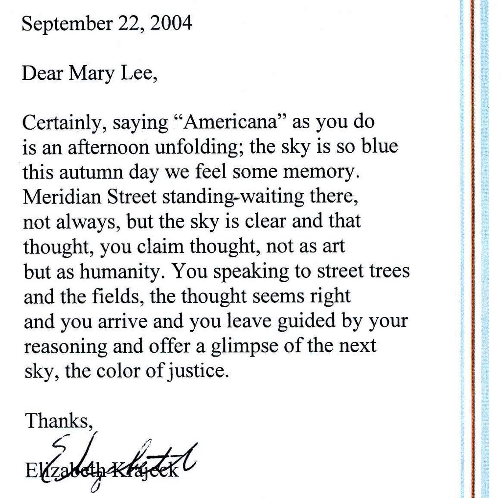
"Americana" - 805 S. Meridian St. - Sept. 15, 2004 - 4 1/2 stars
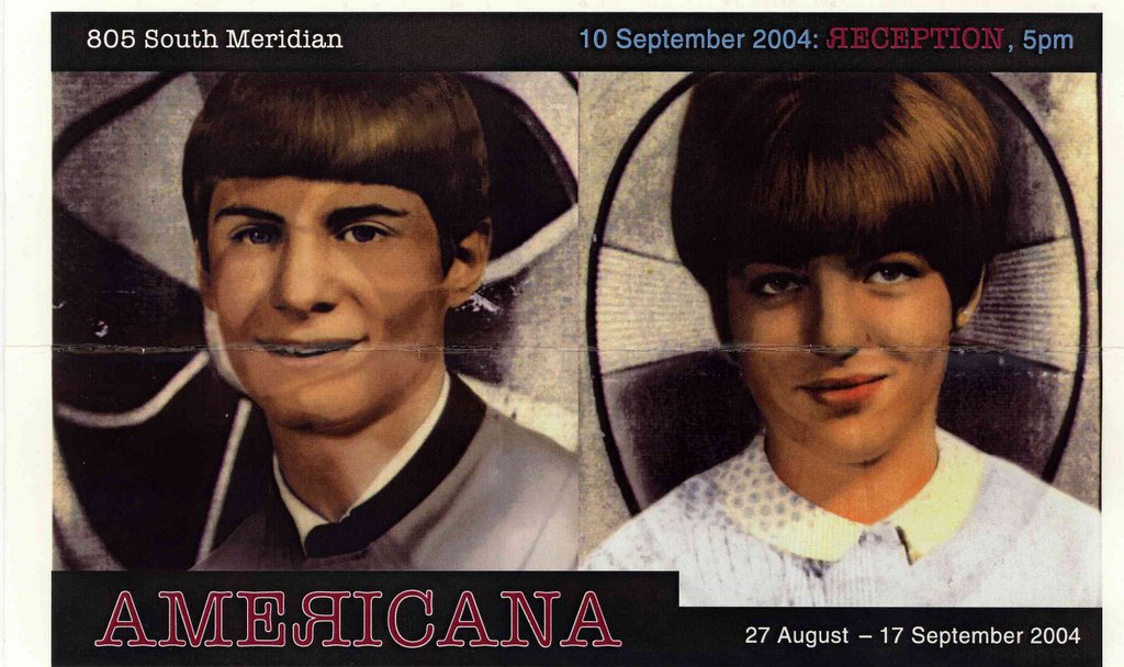


Dear Laura Bush, poets are writing more anti-war poetry now than ever even with your censorship of it at the White House. And the poetry of Elizabeth Krajeck ("Color-coded Sin Advisory System" and "Color-coded Homeland Security Shame Advisory Card") inspired this satirical and passionate exhibit curated superbly by artist/photographer Jack Hartigan. Krajeck's poetry paint chips and expressions of grieving for democracy fill a chalkboard as you enter the space, setting a smartly critical tone of how free speech has been stifled under the current "W" administration. That sweeping theme is allowed to breathe in this space, with each participating artist's political statements being expressed and understood without the use of pretentious, contrived or overblown jargon. Every piece in this show is of great quality and could stand alone as simply a great piece of art. Though each piece is worth discussion (aesthetic, technique and intent) the photographic works of Hartigan are ripe with shrewd satire and censure of the current state of our government. A portrait series based upon a 20th cerrtury German photographer, Walter Sanders, depicts Indianapolis citizens, including one of a Latino immigrant. When viewed in the historical context of Sander's work, the image addresses the issue of temporary work permits that enable a modern state of slavery and questions the current state of human rights. "It's Almost 9:11; Church and State; It's Almost 9:11 " is a piece that takes direct aim at civil rights without brashness. It's a six-image photographic triptych, half true-life documentation of a local Catholic elementary school and half of enlarged studio-shot hands - a hand over heart during the recitation of "The Pledge of Allegiance," a handshake between a white and black hand and hands in prayer. Our flag hangs above a picture of Martin Luther King and President George Washington in one frame with another frame showing a statue of the Virgin Mary draped with a rosary that also shares the classroom space. A cut out of Sponge Bob near the statue reminds us of the effervescent youth that inhabit this school and of childhood. The clock on the wall indicates the time as nearly 9:11 a.m. The center scene is a close-up image of a child's awkward new cursive on large lined beige paper that reads of gay hate rhetoric posted with other written assignments displayed in the school's hallway. It is shocking and sad, but also a reminder of the freedom upon which this country is based and of what faith truly is. Other participating artists are Angela Edwards, Adam Noel and Linda Adele Goodine. For more information contact Jack Hartigan at jchartigan@iupui.edu. Through Sept. 17; 955-8601. -Mary Lee Pappas
Wednesday, August 25, 2004
"Artist Trading Cards: An Interactive Experience" - Indianapolis Artsgarden - Aug. 25, 2004 - 4 stars
Aug. 21, 2004. Artist trading cards were initiated in 1997 by Zurich artist Stirnemann. Basically, they are baseball card-sized (2.5-inch-by-3.5-inch), 2D canvases of paper that artists and non-artists create and then trade. There is no money or sales involved in the social exchange of cards, which is essentially performance art. At this event, initiated by local artist John Essex II, people were encouraged to create card works of art, view his exhibit of cards from artists around the globe, including students at the Girls School where he teaches, and be participants in this performance. This idea is not only cool, but really works to engage people in the arts via tiny canvases and familiar tools (markers, magazine clippings, colored pencils, etc.) that are psychologically freeing. It was and is successful. With many random passers-by indulging in the creation and exchange of these cards it is hoped that we'll see more Artist Trading Card events in the city and on a regular basis. Contact John Essex II at jessex2@emaii.com. Phone: 317-631-3301. -Mary Lee Pappas
Wednesday, August 18, 2004
Patricia Cole - Indianapolis Art Center - Aug. 18, 2004 - 3 stars
View these works only after reading Cole's very personal artist statement. It will give you a reference point for her sincerity and sense of emotional exploration that plays out as you walk down the west hall of the facility where her 29 works of meditative doodling hang. All the pieces are ballpoint on Bristol paper that further lends the feeling of meditative doodling where formality really does take the wayside of purpose in process. Contemplative renderings where tangible subjects phase in and out of mystical checkered realms, the works are a series of varied tones executed in simple crosshatch. Cyclical intertwining doodles appear like abstracted murmurs. They are like seismography of the soul interpreting every tremble or passionate upheaval that comes with the psychological aftermath of war. Through Aug. 29, 2004; 317-255-2464. –Mary Lee Pappas
Wednesday, August 11, 2004
Kay Grimm "The Revival of the IV Apocalyptic Horses: Evolutionary Revelations, install #1 " - LAMP - Aug. 11, 2004 - 3 1/2 stars
Grimm is a very thoughtful artist whose work reflects her desire to emotionally investigate either her identity or her community. Her latest installation is, simply put, about making our community (local/global) a better place to live. Not a mind-bender (to her credit) that is expressed successfully through overlapping Christian/American Indian spiritual symbology - none of which is executed in a bastardization that would be an offense to anyone subscribing to those spiritual sects because her approach is intelligent and knowing. Toy hobbyhorses, representing the four horses of Revelations, are the messengers of gloom and doom and given the colors of the four directions (red, white, black and pale) which represent the earth and the cycle of life. In this case that life cycle is peace to war and death. The toy horses are on posts anchored to bowling balls (life ain't no game?) that literally show how we accept life as a merry-go-round. Grimm begs the question: "Can evil transcend personal ego and view how our choices reflect and impact society on a larger scale?" Ultimately, this piece, composed of many separate installation vignettes including "Confession Booth Drama" and "Herd Mentality" is about living life to the fullest. My only disappointment is that this piece deserves a larger setting and more dramatic lighting than the modest space it is contained within. That said, more galleries should be opening up their spaces (and their brains) to quality installations such as this. Through Sept. 4, 2004. 317-624-9803. – Mary Lee Pappas
Leah S. Traugott, Lois Davis, and Brouwer: "Triple Treat" - Hoosier Salon - Aug. 11, 2004 - 3 1/2 stars
Leah S. Traugott, Lois Davis, and Brouwer show their works together in this show that highlights the best of their talents. Davis' work is presented with more care here in part because of the choice to exhibit her lovely pen and ink figure study sketches. They possess a certain sophistication and ease that isn't totally realized in her paintings. "Nude," in particular, a tea stain color washed pastel and ink drawing of a model has the swift and knowing minimal movement of an Asian painting. It is a piece that demonstrates the breadth of her talent as a fine artist. Brouwer's wet landscape watercolors allow her applied dark colors to muddy into each other, effectively heavy with atmosphere. The result is a reality as if remembered in a foggy dream or memory. "A Sense of Place," aptly titled, depicts a distant barn through a haze of army green and deep teal where pink and yellow tinged light bounces off a silo. Traugott's sweet watercolors of fresh cut garden flowers in random cupboard pitchers offer more than meets the eye. Though the compositional arrangements in many pieces are somewhat uninteresting, there is skill that usurps the safe arrangements. Through Aug. 28, 2004. 317-253-5340. -Mary Lee Pappas
Wednesday, August 04, 2004
"Get the Vote Out" - Stutz Gallery - Aug. 4, 2004 - 3 stars
A campaign by the American Institution of Graphic Arts to encourage voter turnout, "Get Out the Vote" is an exhibition of local and national poster competition entries. Only one image, the local competition winner entry by Terry Howe, really spoke to me as a graphic should. No other entry grabbed my attention or emotions with color or a strong pictorial scene and message as this one did. "For 80 years, an average of just over 50% of US residents have turned out to vote in presidential elections," the top of his poster reads. Red bar graphs (showing the stats over the last eighty years) form stripes that only go half way up a row of American flags. The literal interpretation of the stats in this design are more poignant because this one symbol of our freedoms isn't complete and in essence isn't realized by American citizens. It's a reminder that every vote does count and that everyone should exercise this freedom. All of the entries can be viewed at www.aiga.org/content.cfm/getoutthevote. Voter registration applications are available at the Stutz gallery. Through Aug. 20, 2004. 317-926-2980. – Mary Lee Pappas
"After Midnight" - The Bungalow - Aug. 4, 2004 - 1 1/2 stars
At first, the collected paintings looked like 20-inch by 24-inch Shrinky Dink stained glass because of their stucco appearance. The surfaces are more like textured truckbed lining than genuine impasto. They adhere to staying within the lines with draftsman-like precision and flat colors. Metal silver frames set this generic rigidity off. Compass composed circles and lines zigzag across the compositions, lacking depth and detail. Executed methodically with two layers of oil paint, the results look like decoratively finished house paint. Through Aug. 31, 2004. 317-251-2782, vvww.skoalar.com. - Mary Lee Pappas
Wednesday, July 28, 2004
Kawabata and Flory - Photography Gallery - July 28, 2004 - 2 stars
Both artists present artistic endeavors in digital technology. And where better to present works executed in this new media than the Photography Gallery. Eight drab black/white small works by Kawabata line the east wall of this tiny space. Dreary images that border on the sublime, they seem to probe forms as if to convince that they are of some crucial importance not unlike so many imaginary artists' world themes seen often in contemporary art. Flory combines paint and digital media in her blocky images, of which there are five same images on view. To understand this work is to understand how digital "new" media fits into the development and adaptation of art and the new materials by which artists express themselves and their ideas. As far as these two artists go, their explorations into this realm are pretty safe - with mediocre results. Through July 31, 2004; 423-9237. –Mary Lee Pappas
Flava Fresh - LAMP - July 28, 2004 - 2 1/2 stars

Works by local multicultural visual artists line the halls of the Chatham Centre, or annex of LAMP Fine Art Gallery. Many familiar names are in the show, like Anthony Radford, who exhibits "Keep It Real." A piece we've seen many time before, and for good reason, it makes a cultural, political, social, emotional statement. Black and white clippings of the likes of Malcolm X to Madame Walker are collaged in a white frame with reminders (like assemblaged chain) of our country's unique African-American cultural evolution. It iconically says this is what you have overcome to become who you are today. "Looking," an oil on canvas by Bruce Armstrong of a man, is exceptionally beautiful and refined in its minimalist execution and earthy green color palette. D. Delreverda-Jennings' sculptures are the real stand-out in this group show, which, like so many group shows, wanes here and there. Her mixed media sculptures like "Eve, Earth, Adam" are harmoniously easy on the eyes. Though the blocky structures are tinged with bronze and copper colors, the weightiness is lifted by greens, blues and lavenders that set those tones off. Through July 31, 2004; 317-624-9803. -Mary Lee Pappas
Wednesday, July 14, 2004
Quincy Owens and Daniel Evans - Thai One On Restaurant - July 14, 2004 - 3 stars
"is two," a large diptych hanging in the bar area of this restaurant, is the neo-abstract route Owens should be traveling on. It's his best work to date. Though not technically or truly similar, it reminded me of David Hockney's "The Splash" in both choices of blue, orange and white coloring, and action. The image resonated with me as though it was a zoom of this famous intensified burst, albeit by a much different hand. It shines even brighter when contrasted against his stenciled letter block paintings spelling the likes of "spicy" that have a gift shop air about hem and don't do his deserving pieces any favor in their company. Other works from the "Divergent Series" fail to pack a textured color field punch along side older works with decidedly rich coloration and a high varnish shine. The stagnant trio of paintings "sons I," "sons II" and "sons III" also look unemotionally produced in comparison and lack the intensity of radiance that earlier works possess. Daniel Evans' photographs are technically keen and really pretty perfect manipulations of light and tools of the trade. Lyrical and eloquent, each still, whether color or black and white, holds quality and a consistent aesthetic in common. Through July 25, 2004; 317-202-0193. –Mary Lee Pappas
"Objects of Desire: Cars and Clothes of the Jazz Age" - Indiana State Museum - July 14, 2004 - 3 stars
Indiana's luxury autos from the '20s and '30s are presented as the works of art that they are in this appropriately straightforward display. Label text is minimal, but poignantly gives the scope of context for the cars and the clothes that accompany the single stellar examples of famous Indiana manufactured models: Stutz, McFarian, Marmon, Studebaker (from the Henry Ford Museum) and the Duesenberg. When a typical car price was $600 and under, the Duesenberg, a favorite of the Hollywood set, fetched $15,000. A short film of black and white stills, set to old jazz recordings, shows Gary Cooper next to his. The exhibit is such that you can really stand back and appreciate the distinguishing design hallmarks of each maker. But the clothes are most excellent as well (particularly because they hail from a pre-synthetic era), are natural and have body. Clothes from the time were typically pretty and made better by people who knew how to cut fabric and not just chop them up in a factory for mass production. All the gowns are amazingly elegant because they are so plainly cut, mostly on the bias. They predate any usage of big designer names and any other hierarchical pretensions because all clothes were basically made well. Actually, if you set aside cut and fabric, many of them aren't too different from dresses today with the exception of necklines and sleeves, which change with trends. Most elegant of all is a "Medieval" hand-dyed and stenciled deep green, silk velvet, plain, long-sleeve dress. It certainly should squash anyone's cartoon stereotype of what costuming during a time of mega mobsters like Dillinger and Capone, prohibition, Hollywood high life and all that comes with jazz was like. While the raccoon full-length coat on display was an OK example, the thick 1935 Brooks Brothers tuxedo was quite nice. The only thing better today is that synthetic blends offer lighter fabrics for men's wear. This exhibit space is not fussy and is such that you can practically envision yourself in the scenarios created for each car. Through Oct. 3, 2004; 317-232-1637. -Mary Lee Pappas
Wednesday, June 30, 2004
Humdrum hodge-podge - Herron Alumni Show - June 30, 2004
Humdrum hodge-podge
Visual Arts
By Mary Lee Pappas
This sixth annual Herron Alumni Show maintained the hodge-podge sameness of shows past, though this time around the collection of very unlike works were exhibited in a hodge-podge setting — the vast warehouse lobby of Midland Arts and Antiques Market. Basically, the setting was as drab as the art.
Several pieces in the show were individually deserving of praise, such as John Gee’s “Co-Folco,” executed in 1963. It was out of place it’s so good — triangles and half circles formed from fields of multicolored pattern that looks modern for the time. “Public School #57” by Harry A. Davis (former faculty) and “Seated Nude” by Frank Downton, executed in 1963-’64, were among the exceptional pieces on view.
Most of the work, however, was humdrum and forgettable, hanging by wires from a makeshift-looking metal pipe-rigged hanging system. Hung too high for a comfortable view, they lost color against the brick wall background. At least everything was centered properly. Is this all that lone juror Greg Lucas of G.C. Lucas Gallery had to pick from? His aesthetic sense is such that it can be trusted blindly, so it’s a reasonable guess that entries weren’t quite up to snuff.
Though an unfortunately uninteresting and uneven show, it is indicative of a larger cultural conundrum Indianapolis falls victim to: innumerable shoddy art shows without vision that forsake quality for just another exhibition opportunity.
Indianapolis has had a constant visual arts scene predating any political cultural initiatives. Local visual arts culture has not been recently generated as campaigns might make it appear. Yes, there is more art now, but quality has never been more in question.
Herron has been a major contributor to local art history — its sheer longevity deserves praise. Herron also has substance beyond the citywide promotion of the arts … and beyond this exhibit. But if this is the best that Herron alumni can share publicly, then how can an Indianapolis-based art school expect to compete on a national level?
The 2004 Herron Alumni Show was at Midland Arts and Antiques Market and closed June 25.
Lauren Yoho - Two Sisters Trading Co. - June 30, 2004 - 3 stars
Yoho creates well-versed abstractions with color and compositional balance that keep the eye happy and in motion. There is no illusion of depth and no trace of reality to decipher in her larger works composed of mostly like-sized chunky color blocks that neatly appear to interlock with each other in Abstract Expressionist fashion. The cool color palette enhances the tactile look and appealing visual sensations. "Birds," a series of four small paintings, are exceptional little pieces. The birds, made with one dab of the brush, are ocher toned against hot orange surrounded by a two-toned taupe and deep plum sky. Simple and elegant, this is artwork that artists can appreciate for the technical command of materials, the unique vision and her understanding for the substance of color. This is yet another discerning fine art show from this humble little Broad Ripple shop. Through July 8, 2004; 317-255-0027. –Mary Lee Pappas
Laura "Dinkie" LaForge: "Sassy Ladies" - Stutz Gallery - June 30, 2004 - 1/2 star
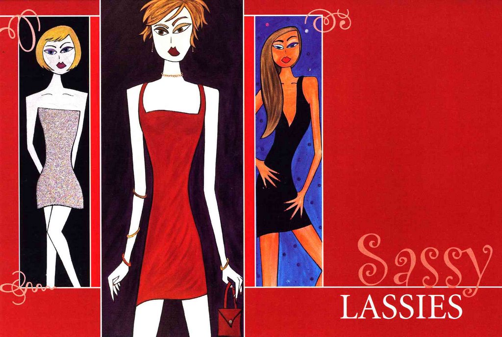
The artist's statement for this show of rigid, ill proportioned, cartoony-looking painted women reads, in part, that the work "strives to reveal beauty of empowerment that exists in all females," which only furthers the visual arts Spinal Tap experience. All the female figures have the same, stylized, flat poofed lips, oversized and elongated eyes, a line for a nose. Flat on many levels, and painted with acrylics that look right out of a jar, the pieces actually all look alike - only the blanks have been filled in with different colors. Static, stale and following a base, dated design formula, the dressed up girlies resemble what an early '80s Valley Girl might aspire to. Through July 16, 2004; 317-833-7000. -Mary Lee Pappas
Wednesday, June 23, 2004
Robert Teckenrock - Vecino's Coffee Gallery - June 23, 2004 - 2 stars
This is detailed doodling with an outsider spirit and a comic book, heavy metal style. It's a thinking man's Beavis and Butthead and that's not a bad approach. "Still Life Kaleidoscope," a doodled rainbow landscape with banana, is meticulous and shows the artist's soft color sensibility that unfortunately didn't find its way into most of the works (black and white) on display. Red ballpoint ink abstracted floral doodles frame a purple monochromatic segmented scene of floating fruit in this piece, showing that this artist, despite technical drawing challenges, has a keen sense of value. This is further framed by blue ink flower doodles framing a continuum fruit scene in light blue. "Football Church" features a scene set into an incongruously naive gymnasium-church hybrid where cheerleaders (her kicking leg appears to come out of her shoulder) and nuns are side by side. Stained glass windows are sports teams. A wonderful commentary on cultural fanaticism and personal priority, the painting is elementarily flat and ill proportioned ... but who cares? Sense of humor and intent give worth to this work. Through June, 2004. –Mary Lee Pappas
Johnathan McClure: "Unstill Life" - The Bungalow - June 23, 2004 - 1 star
Tempera swathed on paper isn't too far of a stretch from finger painting in these paintings, with titles like "Underneath it All," "Mattie," "Ripple Effect" and "Afterglow." Muddied tones of lifeless periwinkles, rusts and Army greens sweep down revealing wine bottle-like forms of bald paper. This work lacks the aesthetic presence, color space or spontaneity to be taken too seriously as the abstracts they are supposed to be. An instant-artist state of mind is reinforced with the stack of prints available next to the work. Through June 30, 2004; 317-251-2782. -Mary Lee Pappas
Wednesday, June 16, 2004
Minature and Small Works - Woodburn and Westcott Contemporary Fine Art Gallery - June 16, 2004 - 3 1/2 stars
The miniatures of M. Jan Schroeder anchor and inspire this particularly nice show featuring the work of W&W represented artists: Fick, Vlasek Hails, Line, Hampton, Morrison, Leslie, Kivela and von der Lohe among them. Schroeder's aptitude for the miniature certainly would have won her the favor of royalty in a past life. Technically sophisticated and astonishingly executed, her images of fruit, boats and animals recall the realistic Baroque approach of this tradition that requires a magnifying glass. The itty-bitty pieces reflect a craft of the past combined with a personal style that is something entirely new. Let the French miniaturists roll in their graves. Anchoring every show at this gallery is the supreme presentation. The lighting is always superior and enhances the work as does the arrangement of work and inviting environment. Through July 17, 2004; 317-916-6062. –Mary Lee Pappas
Desiree Beauchamp: "What is a Home?" - Duke Realty Corporation Atrium - June 16, 2004 - 1/1/2 stars
1 N. Capitol office. Kudos to Duke Realty Corporation for providing a student sculpture competition that awarded Desiree Beauchamp, Herron School or Art student, a $3,000 scholarship and a year-long exhibition opportunity for her winning entry, "What Is a Home." The piece, composed of multitudes of little felt houses suspended from the ceiling, is inferior in design, execution, and purpose. The last point is especially true when compared to comparably themed successful installations by Jenny Elkins at the Harrison Center for the Arts of card houses set in sand as a statement on the fragility of home and home life, or "Suberburbia" by Emily Kennerk at the Stutz Gallery. Ceramicist Barbara Zech presented a series of same-sized and shaped homes in an installation last year which also lined a wall in the Harrison Center for the Arts Gallery. Design-wise, the houses feature intentionally childlike constructed box home forms of synthetic felts with two flat square windows and a door flat on front. It's iconic signage for home. Only, this 3-D derivation is ineffectively childlike with its perfect 90-degree angles and unappealing, hard to look at color combinations - white with brown, blue with maroon. With some felt houses collapsing in, not maintaining their form and sloppy machine stitch work perfectly visible, this "playful" and "happy" vision of home further fizzled. -Mary Lee Pappas
Wednesday, June 09, 2004
Art in the Garden - Garfield Park Conservatory - June 9, 2004 - 2 stars
Scattered through the lush tropical setting of the conservatory, pieces displayed are mostly accomplished, but don't meld with the escapist environment. Extreme juxtapositions reign. An assembled metal sculpture of a flamingo by Amanda Keller with its Honda gas tank, Chevy front fender body and flu pipe neck sticks out like a sore thumb. The work doesn't quite match the setting. Functional, decorative, original, local items intended for a garden setting would be better placed in a Midwestern woodland backyard than this Indianapolis oasis. Of note were drawings by Jason Kishell on bleached wood panels that were a combination of naturalist's studies and sci-fi fantasy. Alan Reinhard's pebble and tile mosaic tables were beautifully envisioned. Work by Ruth Stoner, C. David Schumaker, Randy Johnson, Jolee Rene Chartrand and Kevin L. Houppert are also on View. Art featured in this show will be for sale. June 13. Through June 18, 2004; 317-327-7221. -Mary Lee Pappas
Kevin Johnson: "The Outsider" - Fountain Square Library - June 9, 2004 - 1 1/2 stars
Five paintings made for this exhibit in the wall space above the book shelves. Carefully and skillfully rendered, the three portrait pieces lacked inspiration. They were too cautious, so much so that they have an outsider, or untrained quality due, in part, to the subject matter and symbolism. In one piece, a seductive magazine ad-looking woman borders the side, melding into a band of blue paint. To the right of her, on a flat black canvas, a large rose is blooming while below that a blue marble world just floats, like the rose, in blackness. In another painting, a person is crying with an image of an apple as the world below. My advice to this artist is to just start sketching people in informal settings and break loose from the restrictive style. Johnson has the skills for a more individualistic approach. Through July 31, 2004; 317-269-1877. –Mary Lee Pappas
Wednesday, June 02, 2004
Curious, amusing and ingenious - Stutz residents - June 2, 2004
Curious, amusing and ingenious
Visual Arts
By Mary Lee Pappas
*Pictured: Work by Greg Hull is part of the Stutz ‘Return of the Residents’ exhibit.

The Stutz Art Gallery, a corridor of crooked walls, is a space that lends itself to installation. Any visual encounter in this small space has an element of unpredictability to it due its incongruence. It’s especially enticing with the current efforts of former Stutz resident artists Greg Hull, Larry Endicott, Susan Watt and Emily Kennerk, on view in an exhibit called Return of the Residents.
“Supersuberbia,” a miniature stenciled landscape scaling the length of the south walls by Kennerk, is conceptually ingenious. Intellectually embodying Indianapolis’ contemporary suburb culture, it speaks volumes about home, family, work and conditions of the American way of life, or as Kennerk’s artist statement reads, “The transitional state of our current modernity.”
Beige prefabricated housing bordering I-65 plays the protagonist in the scenes set off by little clusters of green trees. Mass produced with neutral siding and roofs, the rows of cookie cutter box homes recede in skewed perspective into the horizon line suffocated by a vast, overcast Indiana sky. The repetitive, yet very specific, panorama bends around the walls as if they were turns on a highway. It’s a many-sided meditation on the literal and figurative illusion of home and the new, real Indiana landscape. Kennerk’s installation, an intrinsic quest to explore neoteric Midwestern culture, is both fascinating and effective in surveying this human experience. Demonstrating that art is more than trivial play or aesthetic escapism, this is art for life’s sake.
Suspended from the ceiling, Hull’s mechanized sculpture “Indeterminate Volume” employs a Minimalist aesthetic. Ordinary black umbrellas open and close intermittently, abstracting time more than space. Rhythmically, the kinetic gizmo swiftly transitions from one umbrella to the next with the nylon material creating a quiet swooshing sound reminiscent of an ocean wave. The theatrically imagined large spherical object appears to breathe as if mimicking something cellular or organic. Curious and amusing, this piece successfully interacts with viewers and its environment. It’s a spectacle that’s cause for conversation.
Watt’s installation, composed of cassette tape film and other similar rubbish from obsolete technology, climbs to the ceiling from the floor. The spiderweb of shimmering brown ribbons merges with the architecture and winds its way around the air conditioning vent. The plastic cassette sheaths are staggered through the netting as if technology is its own black widow. Watt’s ability to embrace space and meld it thoughtfully to a concept is unparalleled locally.
Two separate wall sculptures by Watt, “Logo Landscape 1” and “Logo Landscape 2,” composed of blue Astroturf, multicolored neon cable and twist ties, electric tape and an assortment of hardware store accessories (Watt works exclusively with discarded materials), are assembled similarly to a latch hook rug. Visually booming, the abstracted canvases demand attention. Emblematically puzzling, a certain subordination to product and lifestyle branding is raised by these neutralized, color heavy signs. It’s a subtle commentary on how, visually, these lifestyle labels ultimately capture our attention.
“Nucleus Origin” by Endicott, a photographer, is a series of six color transparencies of a glowing girl against downtown Indianapolis settings that include Mass. Ave. and the Mapleton Fall Creek Neighborhood. She looks as though she’s disconnected or isolated somehow from the active surroundings she inhabits. The conceptual grouping maintains the glossy look that defines Endicott’s work, including stylistic lighting devices and an overall commercial appearance. Displayed in wall-mounted SPI light box fixtures, the ghostly female figure in each vignette looks like energy, the essence of an apparition. She is the embodiment of a nucleus from which all else stems — whether that is in the form of a past life or one that has yet to be.
Four very different approaches to space and environment are presented well by this local all-star cast. The Stutz Gallery serves as an excellent venue for this work and for offering artists the residence opportunity. Return of the Residents continues at the Stutz Art Gallery through June 11; 833-7000.
Applications for the 2004-2005 Stutz Residency are available at www.stutzartists.com/residency.htm.
Visual Arts
By Mary Lee Pappas
*Pictured: Work by Greg Hull is part of the Stutz ‘Return of the Residents’ exhibit.
The Stutz Art Gallery, a corridor of crooked walls, is a space that lends itself to installation. Any visual encounter in this small space has an element of unpredictability to it due its incongruence. It’s especially enticing with the current efforts of former Stutz resident artists Greg Hull, Larry Endicott, Susan Watt and Emily Kennerk, on view in an exhibit called Return of the Residents.
“Supersuberbia,” a miniature stenciled landscape scaling the length of the south walls by Kennerk, is conceptually ingenious. Intellectually embodying Indianapolis’ contemporary suburb culture, it speaks volumes about home, family, work and conditions of the American way of life, or as Kennerk’s artist statement reads, “The transitional state of our current modernity.”
Beige prefabricated housing bordering I-65 plays the protagonist in the scenes set off by little clusters of green trees. Mass produced with neutral siding and roofs, the rows of cookie cutter box homes recede in skewed perspective into the horizon line suffocated by a vast, overcast Indiana sky. The repetitive, yet very specific, panorama bends around the walls as if they were turns on a highway. It’s a many-sided meditation on the literal and figurative illusion of home and the new, real Indiana landscape. Kennerk’s installation, an intrinsic quest to explore neoteric Midwestern culture, is both fascinating and effective in surveying this human experience. Demonstrating that art is more than trivial play or aesthetic escapism, this is art for life’s sake.
Suspended from the ceiling, Hull’s mechanized sculpture “Indeterminate Volume” employs a Minimalist aesthetic. Ordinary black umbrellas open and close intermittently, abstracting time more than space. Rhythmically, the kinetic gizmo swiftly transitions from one umbrella to the next with the nylon material creating a quiet swooshing sound reminiscent of an ocean wave. The theatrically imagined large spherical object appears to breathe as if mimicking something cellular or organic. Curious and amusing, this piece successfully interacts with viewers and its environment. It’s a spectacle that’s cause for conversation.
Watt’s installation, composed of cassette tape film and other similar rubbish from obsolete technology, climbs to the ceiling from the floor. The spiderweb of shimmering brown ribbons merges with the architecture and winds its way around the air conditioning vent. The plastic cassette sheaths are staggered through the netting as if technology is its own black widow. Watt’s ability to embrace space and meld it thoughtfully to a concept is unparalleled locally.
Two separate wall sculptures by Watt, “Logo Landscape 1” and “Logo Landscape 2,” composed of blue Astroturf, multicolored neon cable and twist ties, electric tape and an assortment of hardware store accessories (Watt works exclusively with discarded materials), are assembled similarly to a latch hook rug. Visually booming, the abstracted canvases demand attention. Emblematically puzzling, a certain subordination to product and lifestyle branding is raised by these neutralized, color heavy signs. It’s a subtle commentary on how, visually, these lifestyle labels ultimately capture our attention.
“Nucleus Origin” by Endicott, a photographer, is a series of six color transparencies of a glowing girl against downtown Indianapolis settings that include Mass. Ave. and the Mapleton Fall Creek Neighborhood. She looks as though she’s disconnected or isolated somehow from the active surroundings she inhabits. The conceptual grouping maintains the glossy look that defines Endicott’s work, including stylistic lighting devices and an overall commercial appearance. Displayed in wall-mounted SPI light box fixtures, the ghostly female figure in each vignette looks like energy, the essence of an apparition. She is the embodiment of a nucleus from which all else stems — whether that is in the form of a past life or one that has yet to be.
Four very different approaches to space and environment are presented well by this local all-star cast. The Stutz Gallery serves as an excellent venue for this work and for offering artists the residence opportunity. Return of the Residents continues at the Stutz Art Gallery through June 11; 833-7000.
Applications for the 2004-2005 Stutz Residency are available at www.stutzartists.com/residency.htm.
Wednesday, May 26, 2004
Jacob Bryan - Two Sisters Trading Company - May 26, 2004 - 3 stars
Seventeen-year-old Bryan displays a range of paintings and sketches. The raw talent and uninhibitedness in execution shown here is loud with earnestness. His abstracted style is relaxed, energetic and free with subdued colors in burnt browns and hot contrasting whites. It's action painting with the personality of this young talent, still in high school, putting his own scratchy aesthetic stamp on every canvas,. canvas board, wooden box and piece of cardboard he can get his hands on. Through June, 2004. –Mary Lee Pappas
Broad Ripple Art Fair - Indianapolis Art Center - May 26, 2004 - 3 1/2 stars
At art fair boot camp this year, artists learned how to disassemble their booths in record speeds as the winds picked up and storms threatened Sunday afternoon. Storms out of the west passed over, but kudos to the IAC powers at hand to play it safe and call things off by 3 p.m. Serious shoppers flooded the gates Saturday morning and the momentum never slowed through the day. It was a perfect art fair day with sunshine and cool breezes. The quality and diversity of craft the selected artisans displayed was great as usual. It's like having a couple of hundred galleries assemble in one spot every year. 317-255-2464. -Mary Lee Pappas
Wednesday, May 19, 2004
James Lane - Cath Inc. - May 19, 2004 - 2 stars
A little heavy-handed with the watercolors, Lane could stand to visit the Munce and see Bill Borden's work. A lack of continuity suggests he is still experimenting with his medium and composition. The dryness of his paints in a couple of still lifes were like nails down a chalkboard. But technical woes aside, there is a drive to convey emotion and to communicate with beauty. There is a narrative quality to the work as well. Not a bad effort. Through May 31, 2004; 317-251-2677. -Mary Lee Pappas
Sixth Annual Sculpture in the Park - White River State Park - May 19, 2004 - 3 stars
It's hard to believe that only 10 artists statewide submitted work for consideration for this Indiana-only display spanning the old Washington Street Bridge. The pieces are installed on the grassy stretch along the center of the bridge, an ideal venue for large works. I don't know what the designation, "the only urban state park in Indiana," means, but the works fit excellently into these surroundings. "Life Balance" by Bernie Carreno of Indianapolis, "A Slice of Time: Epoch" by Timothy Fitzgerald of Evansville, "Flying Wedge" by Jerald Jacquard of Bloomington, "Sky Spheres" by John Mishler of Goshen, "People Emerging from the Stone" by C.R. Schiefer of Martinsville and "Star Seeker" by Stephen Wooldridge of Sheridan are the seven works
exhibited. Individually, none of them are exceptional. Fitzgerald's steel grey and royal blue painted metal sculpture is in theme, spirit and emotion a fitting piece for the bridge. Through March 2005. Artists interested in being considered for next year's exhibit may call 317-233-2434. -Mary Lee Pappas
exhibited. Individually, none of them are exceptional. Fitzgerald's steel grey and royal blue painted metal sculpture is in theme, spirit and emotion a fitting piece for the bridge. Through March 2005. Artists interested in being considered for next year's exhibit may call 317-233-2434. -Mary Lee Pappas
Wednesday, May 12, 2004
Art Bloodbath - Art vs. Art - Fountain Square Theatre - May 12, 2004
NUVO Newsweekly, May 12 - 19, 2004, pg. 28.
By Mary Lee Pappas
Pictured: Mike Wiltrout was MC at Art vs. Art.


The third Art. vs. Art took place May 7 at the Fountain Square Theatre. This rambunctious art brawl and study in social politics was presented by the arts not-for-profit Primary Colours and their pals at Groove Truck Productions.
The event was a $1,000 winner-take-all competition in the form of head-to-head bouts between paintings. The winning works, determined by a decibel reader measuring audience cheers, went on to the next round while the loser’s fate was determined by a spin on the “Wheel of Death.” Death could be avoided by purchase.
Sixty-four artists participated, executing their paintings with identical materials supplied by Prizm Art Supplies. Sixteen top paintings, selected by audience ballot, went on to face off in front of a crowd of 300 spectators.
Nikki Sutton, an interior designer with Axis Architecture, commended the event while filling her three-choice ballot, saying, “A lot of people don’t feel comfortable interacting with art … but this little ballot makes someone decide. I see a lot of people I haven’t seen at any of the Murphy open houses. At the Murphy, things are all about having a cocktail and not interacting with it. Some people may have some hangups about judging what’s good art, what’s not good art. I don’t think this is what this is about. This is about people feeling comfortable expressing opinions about art where normally they would just keep it to themselves because they’re intimidated by it.”
Nikki chose one painting twice on her ballot for lack of quality options.
Artur Silva, an artist represented at Editions Limited, chose not to participate because, “I just don’t want my work to be chopped up. I don’t understand the validity of it.” He added that if anyone were to destroy his work it would be him. “I’ve lost my hope in democracy — it’s lost its value.”
“Are you ready to fuck up some paintings people?” MC Mike Wiltrout — of local bands Leisure Kings and Mr. Sparkle — asked the audience, which enthusiastically cheered and blew their party favor horns. The Arts Council’s Dave Lawrence and Brian Payne, president of the Central Indiana Community Foundation, were among the groundlings. “This is an evening of art, music … and most of all destruction,” Wiltrout said with more bravado. “You’re a cruel, bloodthirsty lot of people. Let the bloodbath begin!”
The event was basically postmodern art 101: First destroy art for the sake of art, shock the audience, but still vie for their applause and support. It’s an old idea and not always a bad one if you’re “making art available to everybody,” as Wiltrout said of the Primary Colours mission.
Filmmaker David Yosha said, “It’s not that the pieces are profound. It’s great theater and people are getting involved. I’m surprised there aren’t more people bidding on the art.”
And just then Mark Haesler, manager of Raleigh Limited, came running by excitedly explaining, “I had to save a painting. It was too good!”
Four Letters to the editor regarding Art vs. Art review published May 19, 2004
Letter #1
From Participating artist, Pat Mack published May 12-19, 2004, NUVO Newsweekly, Page 4.


Issues with coverage
As a sponsor of the Art vs. Art at the Fountain Square Theatre on May 7, I am happy to see the local media sponsorship and coverage. However, as is often the case with her writing, I found Mary Lee Pappas’ article to be catty and unbalanced (Culture Vulture, May 12-19). This is fine for a society or fashion column, but it undermines the credibility of NUVO’s visual arts coverage and hurts our city’s growing cultural standing. So I’d like to offer a few Journalism 101 suggestions.
First of all, use actual facts. For instance, attendance for this event was closer to 600 and participation was 75 individuals, not the 300 and 64, respectively, reported.* Also, this event was not just for artists. Many first-time painters joined in the fun, and more than a dozen serious artists (apparently willing to forgo taking themselves too seriously) came from Louisville, Dayton, Chicago and other regional locales.
Second, obtain facts from those who know them. Building positive relationships with reliable sources is often good for news or feature content. Any one of the 10 organizers not interviewed for the article would happily offer accurate information about this grander-scale Art vs. Art.
Third, when covering an event, actually cover it. Quote the people who participate. In this case, it would be nice to know why dozens of people were willing to spend four hours creating a painting with the risk of it being destroyed on stage. Quotes from a friend of the writer who did not participate due to philosophical issues (why was he there, then?) are suspect as a writer’s device, not substance for an article about the subject.
Fourth, use the word “fuck” only where appropriate, if at all. The usage of the MC’s quote was a sardonic commentary of the writer. It did nothing to capture the true flavor of the night, and was a shameful, transparent attempt to put important community leaders mentioned in the paragraph in an awkward context.
Finally, when it comes to covering the visual arts, please send reporters without burned bridges within the community, without personal vendettas and without a narrow understanding of the subject. It does nothing for NUVO’s integrity, and it is embarrassing to our entire art scene as we host a growing number of knowledgeable guests from other cities, such as the artists currently featured in the new iMOCA (Indianapolis Museum of Contemporary Art).
I doubt I will be alone as I continue to support Art vs. Art in its evolution into something potentially relevant to the emerging Post-Post Modern world. It’s 2004, and positive change for the visual arts is afoot in Indianapolis. I hope that NUVO will be a part of it.
Alan Schoff
Mansuzak/Schoff, Inc.
Innovative Advertising & Other Stuff
As far as Mr. Mack's letter is concerned I have to consider he's a "full-time metal sculptor" and therefore did not take the time to understand the rules. And maybe, just maybe, is taking himself a little too seriously. In general, any person, including serious artists should not take themselves too seriously.
* Jeff Martin of Primary Colours was called regarding attendance details, but didn't return the call until the piece had gone to print many days later.

Letter #3
Correcting some errors
We at Primary Colours would like to thank NUVO for their sponsorship and Mary Lee Pappas for her review of Art vs. Art. Upon reading Ms. Pappas’ journalistic offering, we felt compelled to inform you of a couple of facts and correct some errors. Seventy-five (not 64) artists participated in the event which took place before a crowd of 600-plus (not 300). Also, she misquoted our mission statement, which in its entirety reads “Primary Colours is a non-profit organization devoted to integrating visual artists and the community to create and sustain a thriving environment for the arts.”
We would also like to take this opportunity to respond to a rather negative letter from Patrick Mack, full-time metal sculptor. The official rules for Art vs. Art have been posted on our Web site for over three months. Perhaps, Pat, you read them when you registered online. Well, if not, then you surely read the rules before you signed a copy of them when you checked in and received the provided materials. The “wonton destruction and mayhem” you refer to should have come at no surprise. If you didn’t agree with what the possibilities were, then perhaps you shouldn’t have participated. Anyway, you looked like you were having a pretty good time on our video footage.
You wrote, “How great it would be if Primary Colours took this energy and enthusiasm to create and display paintings through a similar venue.” “One where the art isn’t destroyed” and “The public would have more time to absorb and decide to purchase the work.” We have done that, it’s called Allotropy, and we have done it six times: generating over $50,000 for the local arts community. And if our memories serve us, you had hesitation about that event, too.
This event was meant to be something different from the average art exhibition. An event that the audience didn’t just go see, but an event that they took part in. Art doesn’t have to be so pretentious and self-important. It can be fun and entertaining as well. If this event caught the attention and attendance of people who wouldn’t normally attend art functions, great. Maybe they had a good time and will attend future, more conventional exhibits. To say that this event “turns back the clock on our future as artists in this city” is absurd. One event, no matter what you might think of it, will not be able to do that. Over the last five years, Primary Colours has done nothing but good things for the Indianapolis Arts Community. Whether it be through Allotropy, the Primary Gallery, the annual TOYS exhibit or Art vs. Art, we are always promoting visual artists and exposing new audiences to their work. We have done all of this on a volunteer basis, we do not get paid. We do it for the love of art and to make where we live a better place.
We ask you, Pat, what events or programs have you developed to advance the local arts community? None that we are aware of. Perhaps you should redirect energies used to tear down unique and innovative art events and create something yourself.
Jeff Martin, Fred Shields, Dane Sauer, Jim Clinger, Robert Evans, Larry Endicott
Primary Colours
Primary Colours, Alan Schoff, Jeff Martin, Nikki Sutton, Dave Lawrence, Brian Payne, Fred Shields, Dane Sauer, Robert Evans, Pat Mack, David Yosha, Jim Clinger, Larry Endicott, Art vs. Art, Allotropy, Brian Phillips, iMOCA, Primary Gallery, Mike Wiltrout, J. Martin Gallery, Indianapolis Downtown Artist and Dealers Board, Centerline Studio
Urban Silos marketing champion one point IPS Becky Wilson
Centerline Studio
Bill Rasdell "A Celebration of Music and Dance" - College Avenue Library - May 12, 2004 - 3 stars
A serious artist with a distinguished photographic aesthetic, Rasdell produces consistent quality artworks that set him apart in the local community. Scenes of Cuban people and culture are captured colorfully in his prints and prints on canvas. His genuine passion for craft and subject matter is evident and keen. The exhibit is a good marriage of talent (great eye for composition and technical craftsmanship), self-exploration and expression. Art seems to come first for this artist. Through June 30, 2004; 317-269-1863. – Mary Lee Pappas
"Longing For Meadows" Bill Borden, Ron Mack, Carol Strock-Wasson- Munce Art Center - May 12, 2004 - 3 stars

An exeptional show of Indiana plein air works by Bill Borden, Ron Mack and Carol Strock-Wasson. It's all great stuff. Stock-Wasson's pastel, "Winter Cornfield," is museum worthy. Borden's watercolors are expert and priced absurdly low. Both "O'Conner's House" and “Talbott Hyatt House" are perfectly storybook and demonstrate a great understanding and control of the medium. Mack shows a keen sense of light in his pasture scenes. Overall, a very refined show from three gifted artists. Through May 29, 2004; 317-873-6862. -Mary Lee Pappas
Wednesday, May 05, 2004
Wheeler Arts Community Spring Show - Wheeler Arts Community - May 5, 2004 - 2 stars
Mostly familiar work by familiar artists presented beautifully in the front lobby and trickling back into one artist's home studio. Susan Hodgin's "The Lake," a large 40-inch-by-1 20-inch three-part painting on panel was reminiscent of an art nouveau illustration. The scene in red features heavily outlined ornamental trees, again familiar, against a landscape of flat, staggered planes in varying flat fields of poppy tones that emphasize the design quality. Three mixed media pieces trace flower designs in flat brushes in pen and paint. Choices of color give these pieces appeal. Kipp Normand's three home shrines, found object ceramic religious statuary tucked into decorative glass front boxes - were just that - lacked context and greater meaning than his architectural reliquaries of last year. Overall, this was a design-heavy show with the artwork displayed dependent on competent arrangement. Participants, a diverse group of sure talents, were only in part Wheeler artists. Occurred May 1, 2004. -Mary Lee Pappas
"Another Slovakia" - Indianapolis Artsgarden - May 5, 2004 - 4 stars
Perfectly pure and masterful photography by Martin Kollar. This small collection of 16-inch-by-20-inch Type C prints are the discerning footprints of everyday life in a changing Slovakia where old and new ways have been merging. Born in Zilina, Slovakia, Kollar captures an intimacy of expression and action that reflects the state of the country beyond strict documentation. The contrast is unglamorously portrayed, but not without intrigue and keen perception. Overcast skies secure the good light and set the stage for viewers to examine the streets along with the expressions and activities of inhabitants, whether that be a fox kill or simply getting one's hands in the dirt. Kollar's compositional aptitude only enhances the appeal and inviting quality of his work. Kollar's work is currently at the Kathleen Ewing Gallery in Washington D.C., and is touring the U.S. thanks to the Embassy of the Slovak Republic - a fine endorsement of how this work captures the culture. This is the best visual treat the Artsgarden has presented, thanks, in part, to the Czech and Slovak Society of Central Indiana. Through May 7 2004. -Mary Lee Pappas
"First Brush of Spring" - Hoosier Salon - May 5, 2004 - 3 stars

This show, featuring works created at the New Harmony Paint-Out April 15-17, offers a taste of the season with something for varying aesthetic sensibilities. All pieces adhere to the hard-to-shake local color landscape genre because this is a plein air venture. And, simply said, this kind of work is done pretty well here and is meaningful. Stylistically, the range of execution is reasonably diverse from folkish to the downright inspired "Mumford Farm Memory" by Robert Eberle. Tranquil and moody, the space is organized with a sharp vanishing point (in the form of a path) ending with a light muddied peach color. The contrast is warm against the muddied purple and green cool tones of the tree-lined scene. Small dappled flashes of true pink pop in one small area to reveal spring. "Two Quackers" by Lynn Dunbar is a gesture-rich appealing composition. The ducks are formed from light blue and ashen shades of yellow swiped confidently and easily onto the canvas. Through May 22, 2004; 317-253-5340. -Mary Lee Pappas
Wednesday, April 28, 2004
"Greatest Generation of Sports Artists in War and Peace" - National Museum of Art and Sport - April 28, 2004 - 3 stars
Sometimes the themes of shows at this museum, located at the University Place Hotel and Conference Center on the campus of IUPUI, feel like a stretch. The "museum" is essentially in the corridors of the convention-heavy facility. This art should create a point of destination for visitors instead of being an afterthought for those who attend one thing or another. This show focuses on artists who, during World War II, served as combat artists, correspondents or were members of the armed forces who happened to be artists. Some of the art is on loan from the U.S. Army, Navy-Marines and Coast Guard. Donald Moss, a combat artist in the Marines and longtime illustrator for Sports Illustrated, served as chairman for the exhibit, which is testament to the quality of work on display. Germain G. Glidden, Ray Ellis, John Groth, Fletcher Martin, Ogden M. Pleissner, Cecile Johnson, Peter Cook and Kipp Soldwedel (a pilot during World War II, he was commissioned to paint a mural for the memorial at Pearl Harbor - "The Day of Infamy") are the wartime artists represented. A very thoughtful and responsible exhibition. Through May 31, 2004; 317-274-3627. -Mary Lee Pappas
"Art Deco" A Decade of American Design" - PH Sullivan Museum - April 28, 2004 - 1 1/2 stars

A humdrum tour of American mass-marketed utilitarian objects in the 1930s. Certainly the parameters of Art Deco are broad, with something for every Modernist's taste and pocketbook - then and now. But this show hovers toward the unremarkable Fiesta ware end. On the high-end of Le Style, an enameled and wood inlaid Kodak camera by Indiana born industrial designer Waker Dorwin Teague is quite nice and significant in contrast with the content of the rest of this small show. Overall, this peek at a decade of design mass marketed to mainstream America reflects a very limited aesthetic of chromed-out, inexpensive daily accessories, like the spun aluminum relish rosette by Russel Wright. It is not a well-rounded representation of Art Deco by any stretch, but serves as reminder of how the ordinary can be taken as art. Through June 26, 2004; 317-873-4900. -Mary Lee Pappas
Wednesday, April 21, 2004
New Works By Indiana Artists - Editions Limited - April 21, 2004 - 3 1/2 stars
Thirty-two local artists working in 32 different genres comprise the first show at the new Broad Ripple location of this 35-year-old local gallery institution. A fresh red front door, natural light, the location and an intimate gallery space are definite improvements. Notable local favorite Lois Templeton gets ample wall space with one large washed abstraction that employs a decidedly brighter than usual palette executed on paper. The gestural quality of her work is emphasized on this surface and appears brasher as well. This is a welcome, energized evolution. On the other end of the scale, a tactile and chalky landscape on panel by Amanda Presnell, an EL art consultant, is calming and deceptively controlled with dark, cool colors. Everything is lovely, of note and worth a visit. Through May 7, 2004; 317-466-9940. -Mary Lee Pappas
"Brickhead #3" - Massachusetts Avenue - April 21, 2004 - 2 stars

Outside of Elements restaurant in the Davlan building at the corner of Alabama and Massachusetts sits "Brickhead #3," a large ceramic sculpture by Indiana native James Tyler. It's a colossal head, sculpted and sliced apart into many hundred brick pieces only to be reassembled. The symmetrical facial features, swollen lips and sanguine expression remotely recall a Fourth Dynasty Egyptian look and some may say that's a stretch. Is there supposed to be an ancient context here of keeping the head away from the body after death? This big terra cotta-colored head, neckless and bodiless, does compliment the brick facade of the Davlan building and the grassy courtyard where it resides. Of better quality and more interesting than most of the publicly displayed sculptural works along the avenue, it still lags. Funded by the Indianapolis Cultural Development Commission, "Brickhead #3" feels a bit more like a gimmick than a sculpture. Sounds are supposed to emit from the head as people wander by, only, unfortunately, it was difficult to decipher if this feature was working. "Brickhead #3" is missing some of the fluidity and detail found in other works by Tyler, making this piece appear to be a second-best effort. Through Sept. 30, 2004; 317-634-3114. -Mary Lee Pappas
Wednesday, April 14, 2004
George Murff "Figurative Expressions - College Avenue Library - April 14, 2004 - 2 stars
Upon walking into the library with Murff's work encompassing the upper periphery of the walls, your eyes are diverted to the primary bright yellow barren background of "Survivor," a portrait recently exhibited at Dean Johnson in No Boundaries - A Multicultural Viewpoint. It may be the best of the bunch. A collection of oil paintings, pastels and watercolors, this body of work has a graphic sensibility to it, not a surprise considering Murff has designed banners and posters for local government, including "Shower your baby with love." Compositions look too extracted from photographs, as does the wavering realistic approach to the work. There is something a little amiss - some trepidation in the depiction of faces - that gives the portraits and figurative scenes in the painted works a stiffness instead of a lively lightness. The style in some pieces isn't personally distinguishable. Though passionate in subject matter, emotion isn't fully realized in the overall finished products. Through April 30, 2004; 317-269-1863. -Mary Lee Pappas
Itza Pizza Art - Itza Pizza - April 14, 2004 - 2 stars
Itza' Pizza usually serves up fresh, hand-tossed crust pizzas with dough made daily. An 8-inch pizza is a mere $6 and a 16-inch is still only $12. Better yet, sandwiches and pastas are all under $5. Open Monday through Saturday, 4-11 p.m., it's also currently serving up art with a portion of the sales going toward the little eatery situated smack dab in the middle of the Fountain Square arts district - one with more art than retail shops. Collectively, the grouping is of pizza-themed artworks - from ceramic vessels and photography, to styrofoam slices. Prices are very low, from around $25 on up. Though tiny, this is a funny, quirky display that does require a basic sense of humor. Through May, 3, 2004; www.discoverfountainsquare.com, 317-635-6252. -Mary Lee Pappas
Wednesday, April 07, 2004
Ugly Dolls, a toy review - April 7, 2004

Ugly Dolls
Toy Review
Mary Lee Pappas
*Pictured:
Matt Booher, assistant manager of Comic Carnival’s Westside location.
Forget Kestner, Kewpie and Madame Alexander, the Ugly Dolls are the cuddly wuddly antidoll dolly of today. And they are soooo cute even though they are soooo ugly. “That’s the mentality,” Matt Booher, assistant manager of Comic Carnival’s Westside location, said about their uncommon irresistibility.
Ugly Dolls are adorable dorky alien creatures made of baby soft polyester fleece. They aren’t jointed or multidimensional, but rather flat and pillowy, with appliqued perfect circle felt eyes with itty-bitty pupils. Their simplistic facial features and linear body design give these plush stuffed Martians a charming vulnerability that make them practically spontaneously huggable. Couple that with a few involuntary simpering, “Ahhhhs,” and other loving coos and you’ve got a typical tender reaction to the cartoonish Ugly Dolls.
Though well-suited for a little baby, adults are the primary consumers of Ugly Dolls. “I don’t know why they haven’t caught on with kids. They’re a lot cuter than Beanie Babies,” Booher said. Comic Carnival has been selling out of the dolls at their four Indianapolis locations since they started carrying them six months ago. “They’ve been pretty good for us,” Booher added, saying that both men and women have been charmed to bits by these freaky cuties. “It’s been a mixture. Guys have probably been buying them as gifts.”
People across the country have been buying them, from the artsy-fartsy likes of the Whitney Museum of American Art and the MOCAs in Cleveland and L.A. The success of their design is unquestionable. To learn more about Ugly Dolls visit www.uglydolls.com. Ugly Dolls are available at Comic Carnival’s four locations: North, 253-8882; South, 889-8899; East, 898-5010; and West, 293-4386. Dolls are $19.99.
Gym Stoffer- Joe Reuzers Deli - April 7, 2004 - 2 1/2 stars
A graduate of Herron School of Art, Gym Stoffer has worked in the medium of collage for the past 20 years. An accurate statement read, "He reconfigures commercial imagery into surrealistic dreamscapes filled with hybridized archetypes performing bizarre comedies." His precision cut and paste magazine paper-pieced works take disparate images and transform them into bizarre and dimly colored, somewhat creative compositions. Most are rather amusing with titles like "Robo Eskimo Expo." Looking meticulously conceived, they are quite curious, but don't require stellar leaps of the imagination as most are dependent on visually comfortable and identifiable elements. Nevertheless, the work has definite merit. 317-916-DELI. -Mary Lee Pappas
"Everything Goes Better with Alcohol" - Everyday Inventors - April 7, 2004 - 1 1/2 stars
"An art show about painting and getting drunk," a show description read. This show just can't be taken seriously when the premise was to get drunk and paint the contents the evening before the opening. It was hardly an exploration of process, self-discovery or losing inhibitions to loosen up the creative mojo. The theme is a turn-off, the art is mediocre and you can't tell what artist painted what piece. "The show has legitimacy beyond the brash and garish paintings that may have been influenced by alcohol." This appears to be a statement about an ill-conceived show that may have been written under the influence of alcohol as well. A very disappointing venture from Everyday Inventors, a usually quirkier, inventive and more capable bunch. Through April 17, 2004; 317-955-7577. --Mary Lee Pappas
Wednesday, March 24, 2004
Andrew Hutchison, Skateboard Photogrpher - Two Sisters Trading Company - March 31, 2004 - 3 stars

Hutchison is a skateboard journalist, having both witten and photographed the sport professionally for publications like Heckter Skate and Big Brother. That said, the photos collectively are an essay on the sport. They capture athleticism, speed, motion and even some bloody palms rather beautifully. There is a certain stillness to the images that conjures up the heightened sense of self-awareness and meditation it must take to muster up some of the risky stunts skaters pull off. Lining a hall and filling a little room of this new, funky gift and clothing shop, they are artful and should hold the interest of anyone who appreciates quality photography or skateboarding. A distinct sense of skateboard culture across the U.S. is what you'll take away from this exhibt. Through April 6, 2004. -Mary Lee Pappas
Subscribe to:
Posts (Atom)