Wednesday, December 18, 2002
Art Exhibition and Sale - Bodner Studio Building - Dec. 18, 2002 - 3 stars
Wednesday, December 04, 2002
Adam’s Children: The Art of Adam Emory Albright - Indiana State Museum, Wilbur E. and Florence Jeup Ford Gallery – Dec. 4, 2002 – 3 stars
Wednesday, August 28, 2002
Fred E. Cooney – Continental Towers – Aug. 28, 2002 – 3 1/2 stars
Suzanne Young – Holliday Park – Aug. 28, 2002 – 2 stars

Suzanne Young creates watercolor nature paintings void of vivid color. Capturing an animal's character (a main subject) and meticulous naturalist detail aren't there either. This is not the stuff of Audubon, but it appropriately suits the nature center setting. Some of the wide scenes of generic forests, many silhouetting leafless trees, are more inspired than others. Depth is created by blurring backgrounds and adding crisp foreground details. This technique interrupts the illusion of space in some pieces. "Deer at Sunset” features two deer in the immediate foreground (multiple attempts to accomplish them is very noticeable) that are stiff and uneasy. "Angry Sky" has an unconvincing orange-yellow sky ominously popping into a literally black scene. Color is flat and doesn't define shape in this nearly surreal atmosphere. "The Secret of the Mist" is the best of the bunch, accomplished with a less limited palette and ease not seen in all the works. The few etchings displayed were notably beautiful. Through Sept. 29, 2002; 317-327-7180. –Mary Lee Pappas
Creative Renewal Fellows - Dean Johnson – Aug. 28, 2002 – 3 stars.
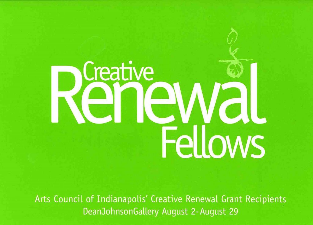
The Arts Council of Indianapolis Creative Renewal Fellowship that gives artists money to renew themselves, rediscover their inspirations and create art is about the best wish an artist could ask for. Knock on wood and pinch somebody. It doesn't seem fair to gauge this body of work by 14 Fellows against other work being created in the community because of the personal growth nature of this grant, but so it goes. The art displayed was not out of the ordinary for these familiar and good artists. Dan Francis, known for his photographs of churches, exhibits his series of Carnegie Library images taken around the state. Killing two birds with one stone, his selenium-toned silver prints preserved a dreamy, visible record of Indiana history and, better still, renewed his creative spirit. Locally accomplished artists Andrea Eberbach, Stephanie Robertson and Karen Chevalier-Smith, who all consistently create quality art, exhibited their tried and true new works. All of the Fellows in this show are artists who contribute to our visual culture and are just recipients. Through Aug. 29, 2002; 317-634-8020, www.deanjohnson.com. -Mary Lee Pappas
Wednesday, August 21, 2002
Fine Arts Competition – Indiana State Fairgrounds – Aug. 21, 2002 – 3 stars
Art in the Garden – 3001 N. New Jersey Studios – Aug. 21, 2002 – 3 1/2 stars
Wednesday, July 03, 2002
Painting in my sleep, formerly homeless man makes his mark as an artist - Harry Blomme - July 3, 2002

* Pictured - Greg Brown and Harry Blomme outside of Utrillo's Art Gallery. "He's become quite a good cook. He can make spaghetti taste good," Blomme said of Brown.
Harry Blomme farmed his Southern Indiana land for nearly 40 years before finding himself homeless in Indianapolis five years ago. He has a little apartment now, just big enough for his art supplies and a few modest furnishings that his new career as an artist has helped provide for him.
Cupid lured Blomme to rural Indiana from his native Toronto when he was a young man. A frenzy of love letter exchanges with a woman he met through a pen pal ad in the back of a farm journal engaged him enough to buy a bus ticket and meet her in person. "She was meant to be my wife," he says. She was African-American, from a family of traveling Southern Indiana Pentecostal preachers. He was second generation Flemish-Canadian and Catholic.
They had a love- and faith-based marriage, followed the preaching circuit as far north as Detroit and, meanwhile, farmed their land. "You gotta' grease and oil all your tractors, engines, make sure you got enough gas and carry gas with you ... make sure you've got enough seed with you. And plowing 40 acres is a chore," Blomme says of his former Evansville farm.
Tragedy overtook Blomme when one of his two sons was killed in a convenience store robbery. Then Blomme's wife died. Not long after that, he lost control of his farm and was left destitute.
Deeply spiritual and innately artistic, Blomme found comfort through painting and drawing. "I always knew I could paint, even when I was a little kid," he says over a boombox playing Madame Butterfly in his small, square, immaculately white and tidy one-bedroom home. Because sketch paper was not an available option while Blomme was living on the streets, his pieces were customarily rendered on dumpster finds like the backs of TVs. Luckily for him, people liked and wanted to buy this work that brought him so much personal salvation.
Delicately-labored strokes
Utrillo's Art Gallery, owned by Greg Brown, is where Blomme's landscape, still life and figurative works are currently housed. "He's always advising me and he's always offering me coffee, tea or whatever," Blomme says of Brown.
Blomme's creativity is encouraged by Brown, who occasionally outfits him with painting materials and recovered frames.
Though some are quick to classify Blomme's work as naive, he was formally trained in visual art at Danforth Technical School in Toronto. They "taught all sorts of arts - anything you wanted," Blomme recalls, adding that anatomy was his favorite class. He recalls the naked female models. "Us youngsters, just growing up, we loved that stuff." And as a result, Blomme has a wonderful sense of the human form without much of the proportional awkwardness that can plague even the most seasoned artists.
His knowledge of art and technique is hardly unsophisticated. "I think I"m a little haphazard the way I paint," he says of his delicately-labored strokes. "Sometimes you're just filling a space with color because something else was supposed to have gone there. Ninety percent of any painting is the actual proportion and drawing of it. If you can draw it up good, the painting part is secondary." Ten percent is lighting, Blomme reasons. "The lighting is the hardest thing to conquer. Incidental lighting - it might be just glaring in it; a spot on the street, or in through a window and onto a floor or just a slight glare off the side of a wall." Light is key in many of his dimly colored expressionistic works.
"You get so engrossed in a painting, you talk to yourself about it. I find myself painting in my sleep. When you come to dream about it, you have to pay attention to it. You can get hung up on a painting and lose your perspective in it. You really have to go away from it and put it to the side and then come back and look at it. Color-wise, the proportion of it, figure-wise or whatever, you have to stand back from everything." Blomme says he paints compulsively while sitting on his green floral sheet-covered twin bed, next to a sheet-covered table and sheet-covered overstuffed chair.
"I like to paint anything that suits my style," except religious scenes or images of Christ. "As far as actually trying to paint the likeness of what He looked like, I don't think it"s possible for any artist. It's a big responsibility for an artist. It's supposed to be a surprise anyway."
National Geographic serves as Bloome's image source when he can"t draw from life. "I do a lot of sketchin' everywhere I go. I was drawing people at the bus station. Constantly doing it made me learn how to intone the colors and shading, and handling the pencils and charcoal."
This artistic urge kept Blomme's mind active and content when he was homeless.
Redeeming reality
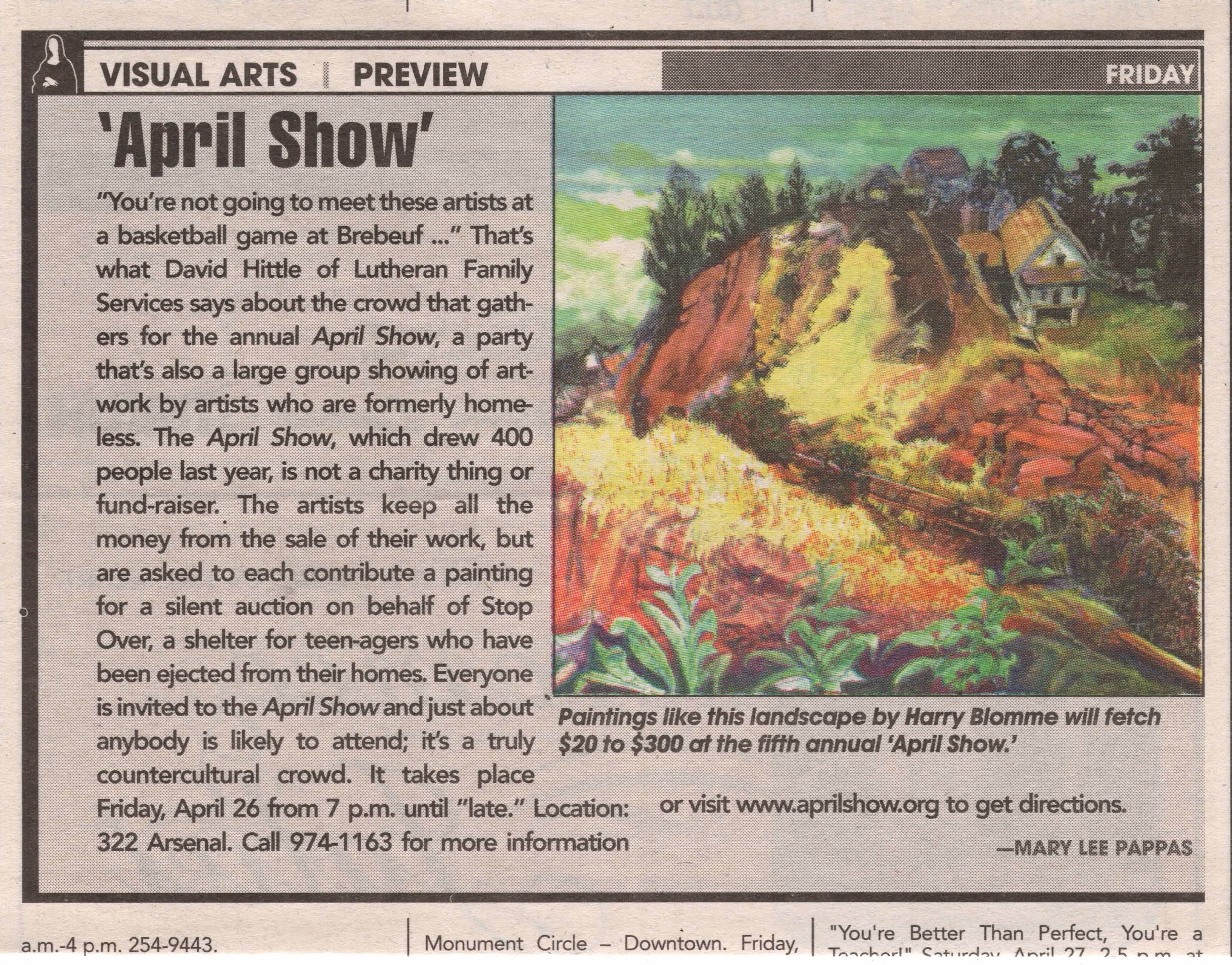
Blomme met Julia Carson during a homeless church service at Christ Church Cathedral and sketched her. The resulting portrait now resides in her Washington, D.C., office. Some of Blomme's other honors include a mural at Catholic Social Services and a commission for the homeless memorial service held annually at Christ Church Cathedral. He's taught art at Holy Family Transitional Housing in Fountain Square to children and adults. ""Mommy, that's the artist man." They called me "artist man,"" he recalls. "With a child you can practically mold them and inspire - give them inspiration when they're young. They know if you're teaching them right." He's exhibited at IPALCO's Crystal Gallery, the Governor's Mansion and was the inspiration for the April Show, an annual art show comprised of artists who have overcome obstacles that most of us will never have to face - like mental illness and homelessness.
David Hittle of Lutheran Family Services met Blomme while working as a case manager for a homeless transitional housing effort, Homeless Initiative Project. Blomme's case manager, Bill Bickel, current director of Holy Family Shelter Services, introduced the two. Hittle, who describes Blomme as "one of the swellest guys I know," was motivated to open up his downtown turn-of the-century home for the April Show exhibition featuring Blomme"s artwork because he realized there were no other venue opportunities for him. Greg Brown loved Hittle"s idea and introduced him to two other artists from similar backgrounds.
Bickel and Hittle have ventured outside of their social work worlds to effectively improve lives by encouraging visual arts. They have confirmed the redeeming reality of how the arts can actually restore lives like Harry Blomme"s, whose paintings renewed his life and rescued him from an uncertain future. This work has enabled him to start concentrating on other important life matters like finding a good church: "One with good music," he stresses. And establishing himself as the artist he is. "I would love to get my name out there and be known as a good artist." - Mary Lee Pappas
Fine art of afterthought - The Indiana State Museum, NiSource Gallery - July 3, 2002

The new Indiana State Museum provides visitors with a family-friendly joyride through Indiana history with slick multisensory, hands-on, interactive exhibitions. Video components, buttons to push, music to hear and differing floorplans to stroll through immerse the Average Joe into a subconscious and effective learning experience. It is actually a fun and full sensory encounter with Indiana culture. That is, until you enter the NiSource, Inc. Gallery on the third floor.
The high-tech continuity suddenly breaks and fizzles hard, flattening the experience of viewing the 200 years of Indiana-made fine art that this gallery is dedicated to showing. It's actually so startlingly sober in contrast to the rest of the facility that it feels like an underdeveloped afterthought. Museums have evolved into design-heavy entertainment facilities meant to seduce all walks of life through their $7-per-adult doors. Steep admission costs and capital campaigns compensate for the now-absent Daddy Warbucks big-time donors. Museums have full-time staff grant writers who have to prove museum interaction with community, education, children and everything else other than the quality of art to garner funds. Donors would rather contribute $10,000 to have a hallway named after them than anonymously funding fine art acquisitions. And so, art and art experiences have become dictated less by quality than by catering to those who will scrape together dollars to keep the museum afloat. Are museums forgetting how to present fine art?
Doubly dull in the painting gallery were the taupe-colored walls that struck awkward angles. I suppose this was done to break up the monotonously sanitary-toned space and add a dynamic energy to the room. Plunked down in the center of this space are two free-standing exhibition walls, moveable I hope, that face each other and contain mostly Hoosier Group favorites.
I watched about 30 people enter the gallery and bumper car off of each other, not knowing what kind of a traffic pattern to follow. The gallery space didn't flow or represent how the rest of the museum was handled. There was no obvious topic, theme or other explanation to guide visitors through it. Most people seemed seduced into the gallery by John Domont's two large and glowing color landscapes near the entrance. After that, they consistently made their way to the large window in a corner of the room that juts over the canal to check out the view.
Those free-standing walls, by the way, are painted a too-bright shade of French blue. It's so bright it dulls the rich colors of extraordinary paintings like "Pastoral" by Richard B. Gruelle. "The Bridge," an expressionistic landscape by William Forysth, has so much blue in it already that it only made me dizzy, hung as it was against the overpowering blue on the walls. Work was crammed together. Did the museum feel the need to exhibit every single piece in their collection (or so it seemed) in this new, climate-controlled space?
"The Confers," by Thelma Confer, hung only 2 inches away from "Acme Milling Co." by Harry Davis. That's not close, it's cluttered. Placed at an open end of an exhibition wall, the Confer piece was hanging crooked, no doubt the result of being elbowed by a patron cutting the corner too close. Paintings were shoved into the corners of the mostly useless interior wall configurations. The viewer is forced to view large-scale work at close range in this tight space. "Still Life," by John Otis Adams, is too large to be placed in one of these cupped ends. Only when you stand directly in front of it can you begin to see it properly. Forsyth's "Dahlias" has to be viewed within 8 feet (with a slight glare) or less before you back into an exhibition wall. A Willie Faust piece was tucked behind one of the weird room exterior wall angles next to the emergency door exit. You have to turn around to look at it. One woman commented, "Is this art?" and then promptly walked to the window.
And one more thing. Where was the security guard when an early 20-something woman, admiring the T.C. Steele portrait of James Whitcomb Riley, slowly wiped her hand across it? The NiSource Inc. Gallery space is awkward for the art and for visitors. It's as if the museum is saying, "Here's our art!" and that's it. Compared to other exhibitions, there is nothing to effectively engage or guide the Average Joe through the work or tell the stories of styles, influences, technique and successes of the rich fine arts heritage of our state. It does the art, the artists represented and the Indiana State Museum"s ambitious contemporary collection an injustice. - Mary Lee Pappas
Wednesday, May 15, 2002
Oreho tehkhnee/beautiful art - Christos Koutouras - May 15 - 22, 2002


Wednesday, April 24, 2002
“Twilight in Arcadia: Tobacco Farming in Indiana” - Indiana Historical Society – April 24, 2002 – 3 1/2 stars
Ron Leonetti, Mavis Flora DeVoe, John Green John – The Photography Gallery at the Hyatt Regency – April 24, 2002 – 3 stars
Wednesday, April 17, 2002
“Colors of Indiana” John Domont – Domont Studio Gallery – April 17, 2002 – 4 stars
University of Indianapolis Student Show – Dean Johnson Gallery – April 17, 2002 – 3 1/2 stars
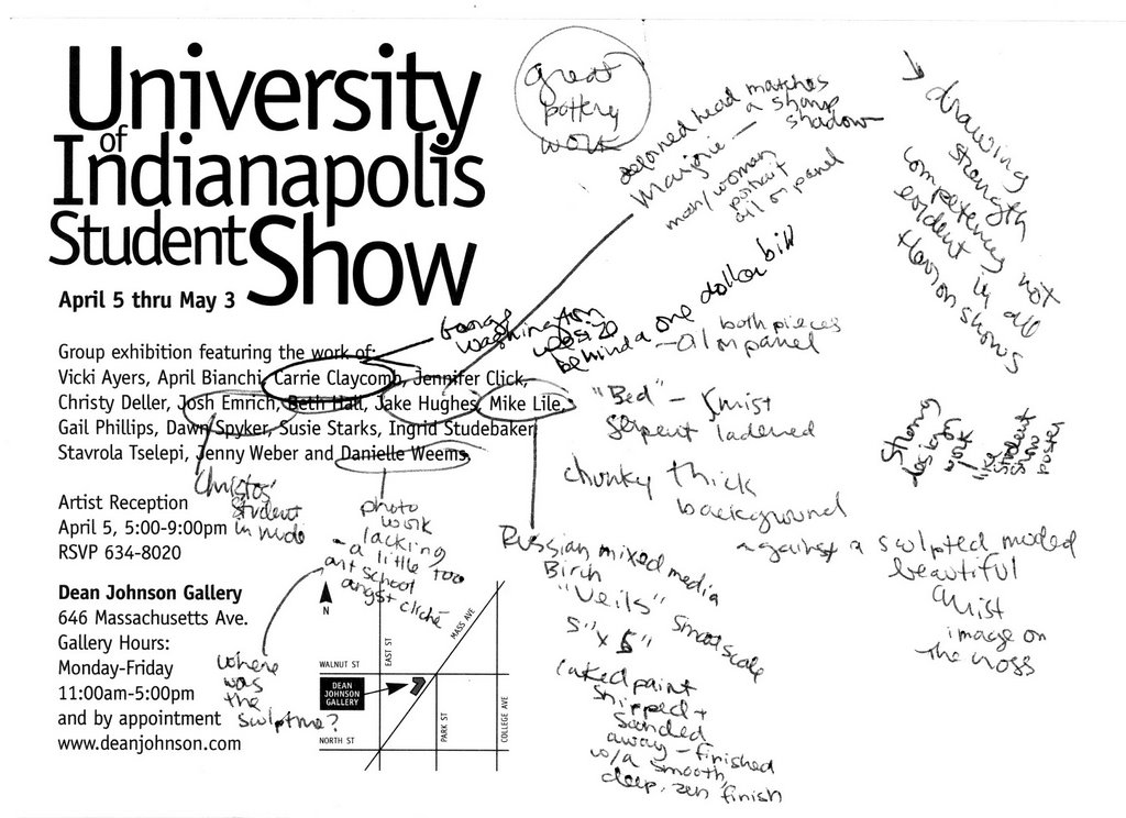
The scribbling on the postcard above are my notes for the critique below. That's how I write critiques - on whatever scrap piece of paper I have handy. I just usually need to write a key word to bring an image I viewed to life in my mind.
The gallery renews itself with refreshing new work by 16 students that smoothly knock most of the recycled, Herron-looking work at various Herron senior shows out of new art contention. Exceptions were the sculpture and photography, which were just a tad on the art school angst side. The show’s strengths are most evident in strong basic drawing competency and fluid graphic design as demonstrated in the student show poster. Josh Emrich offers technical and expressive maturity in his large-scale figurative painting while Carrie Claycomb's nearly life-size George Washington and Crucifixion paintings exhibit color and in-your-face composition confidence. A chunky, thick paint background frames a softly sculpted, molded image of Christ. Other paintings by Jake Hughes and Mike Lile serve as notable examples of real talent and visual refinement not always seen in local student shows. It is unfortunate that the opening reception had so few attendees when the work as this excellent. Through May 3, 2002; 317-634-8020, www.deanjohnson.com. -Mary Lee Pappas
Wednesday, April 10, 2002
“Symphony in Color, A Young People’s Art Contest” – Indianapolis Museum of Art – April 10, 2002 – 3 1/2 stars
“Learning to See: The Art of Art Education” – Herron Gallery - April 10, 2002 – 4 stars
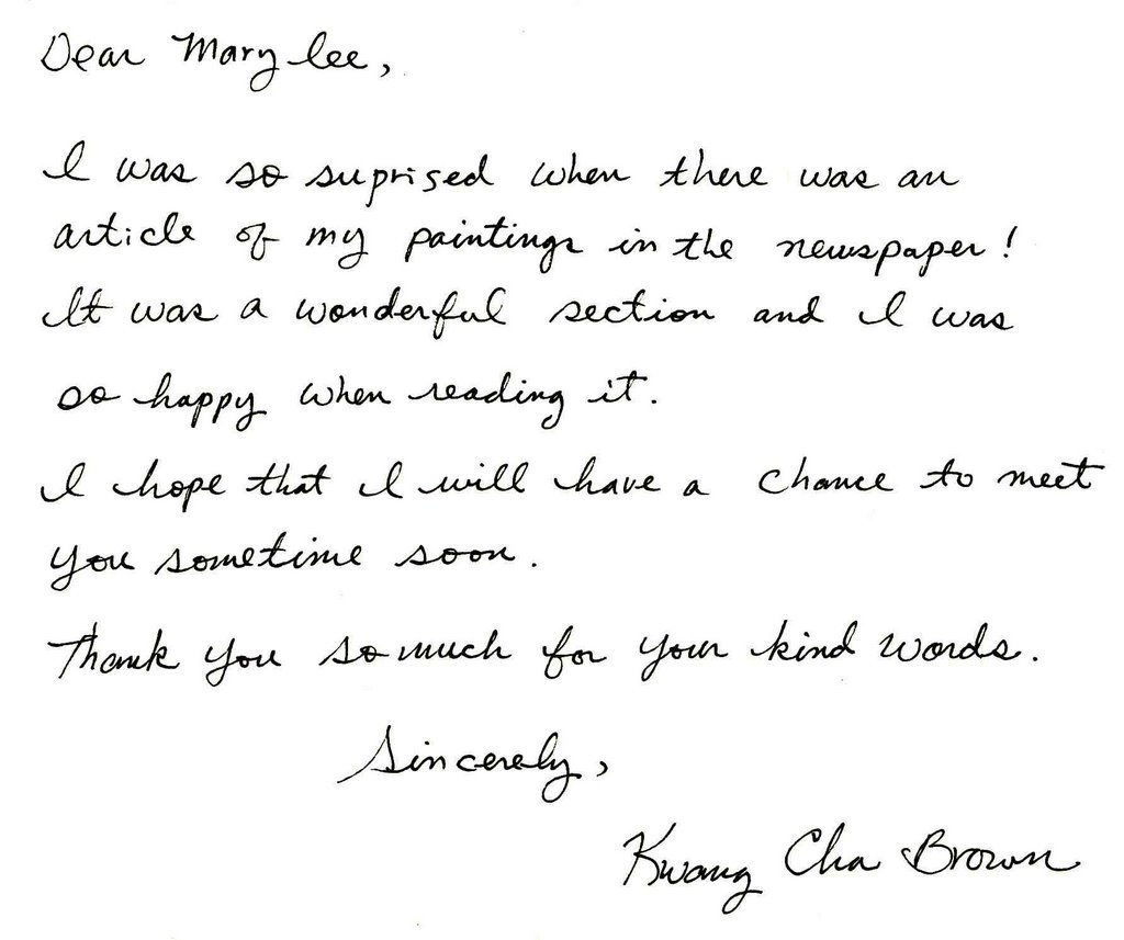
Kwang Cha Brown - CCA Gallery – April 10, 2002 – 4 stars
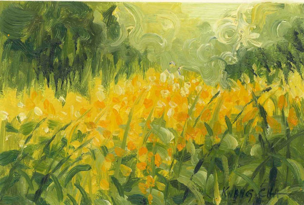
Three pieces by this Herron painting BFA, Indiana State University MFA and Pont-Aven School of Art attendee are masterful impressionistic paintings rich with the lush, deep tones of caked oil paint one would expect to see on museum walls, particularly when juxtaposed against most CCA sterile standards. Brush strokes look intentionally inspired, as if she is painting history or painting from her past life. One landscape's amber yellow grassy foreground, with its specific speckled strokes, sinks into its green grassy background. Visual appearances of atmosphere and light are brilliantly interpreted. Through May 31, 2002; 317-255-9633. -Mary Lee Pappas
Wednesday, March 06, 2002
Art stalwarts closing - March 6 - 13, 2002
Art stalwarts closing
NUVO Newsweekly, March 6 - 13, 2002
Page 8


Wednesday, February 27, 2002
“White Light” Joy Jackson – Harrison Center for the Arts – Feb. 27, 2002 – 3 1/2 stars
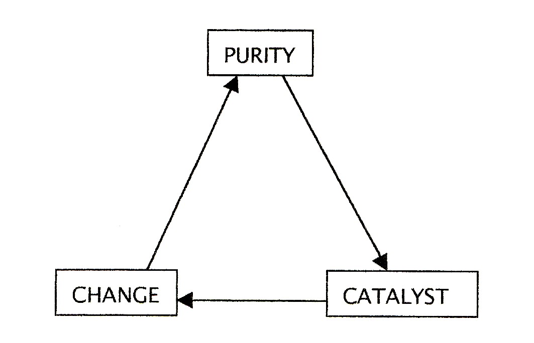
No relation (or inspiration) to the Herron show of last September by the same name, its examination of white light is less precise and simplified into a metaphor for purity as a catalyst for change. Jackson, who teaches glass blowing at the Indianapolis Art Center, having received her MFA in the subject at Temple University in Philadelphia, presents 20 clear, milky and white glass vases sitting upon suspended wire and perfecting eye-level glass shelving cutting across one of the gallery's corners. Jackson, an installation artist of talent, transforms the gallery space into her unique environment moreso than any other paintings-perfectly-centered-on-the-wall exhibit in this space has even come close to with lighting and installation, tic tac mask sculptures and glassware. A 2,000-pound Morton salt block installation is ghostly unnatural with its electric blue-tinged white light emitting from the crevices of the manufactured salt bricks. Under ownership of Redeemer Presbyterian Church the Harrison Gallery is improved with this exhibit as its proof, Through April 7, 2002; 317-514-6787. – Mary Lee Pappas
“Enchanted Bloom” Andrea Eberbach and Riccardo Consciasecca – Hilbert Conservatory, White River Gardens – Feb. 27, 2002 – 3 stars
Wednesday, February 20, 2002
“A Hobby Handed Down” Elizabeth Young – College Ave. Library – Feb. 20, 2002 – 2 1/2 stars
Brian L. Phillips - Barnes & Noble – Feb. 20, 2002 – 2 1/2 stars
Wednesday, January 30, 2002
Cheryl Paswater – The Bungalow – Jan. 30, 2002 – 3 stars
“Behold” Sandy Day and Sara Vanderkleed – Hoosier Salon – Jan. 30, 2002 – 2 1/2 stars

Greg Brown's misfit masterpieces
NUVO Newsweekly, January 30 to February 6, 2002
Page 8
Mary Lee Pappas
An eccentric repository for orphaned kitsch paintings, Utrillo's Art Gallery, appropriately named for a so-so artist whose work was mass-marketed in the 1950s, falls someplace between a thrift shop and a gallery. “I collect art from the thrift store,“ Greg Brown, artist an owner of Utrill's Art, states. Provincial grandma art, religious kitsch, student stuff, paint by numbers and 1950s schlock reproduction popular prints are among the genres of original kitsch art paintings he emancipates from thrift shop shelves. Some are kept for his personal collection, others are sold.
“More people’s paintings are going to end up at thrift shops the museums,“ Brown says. “Thrift stores make art valuable,“ and affordable for anyone to own.
Brown has been conducting misfit masterpiece search and rescue missions since opening his first shop at 10th and Rural in December 1994. That venue became a successful free-form arts space for five years, before moving to the current location at 3318 E. 10th St., where the focus is kitsch recovery and frame sales. Original fine’s cell anywhere from $5 to $500 to a clientele Brown described as “a real wide variety.“ He adds that some people are embarrassed to admit they like this instinctive, thrift shop sort of art. Regular Utrillo customers “are right across the social spectrum. All shapes and sizes and colors and economic conditions – everybody. It’s neat that way.“ Brown’s collecting advice is, “start cheap and work your way up.“
Brown is supporting the local arts in a very fundamental way. He understands, validates and celebrates the simplicity and necessity of self expression. He knows and already practices with the Arts Council of Indianapolis is preaching in their new the Arts Can Help add campaign: “The arts play an integral role in the daily fabric of our lives… We work hard to support the creative and meaningful work of our arts and cultural organizations as well as our local talented artist.“ The difference is they see “critical activities for the arts community," as their website and TicketCentral in the ArtsGarden, stating, “Your assistance is needed to help us continue to create the best climate for the arts to thrive."
The anonymous, untrained and amateur artists whose salvaged work winds up at Utrillo's paint in a style affectionately dubbed “naïve." Brown defines naïve artist as those “who have a sense of art history and strive to paint in a European style,“ though they actually have no training, sense of depth, composition or color. Creating art is purely joy filled and experiential for them. “I like that kind of sweet art,“ Brown explains.
Some naïve art comes straight from artist to him without the second-hand retrieval effort. Jerome Neil, Jan Boyer and Harry Blomme are three such artist in Indianapolis who are represented at Utrillo's. “I try to promote stuff I love personally,“ Brown says. “Different artists have different needs for representation. I promote amateur art and naive art because I feel it’s important to validate."
Brown, who received formal art training at Indiana University in Bloomington, recently examined his fascination with naïve art by attempting to paint similarly styled figures. “One thing I was really bad at was figures. I thought, I’m gonna do something I don’t know how to do." Humbled, he gained valuable personal insight about how art should be approached. “That was the hardest thing.“ Brown says. “The simplicity embarrassed me. Why could I love it in somebody else and not love it for myself? That’s when I really started to examine my attitude toward art.“
Brown deduced the art he loved represented emotional, private and meditative qualities derived from the primary, free and flexible act of making art. Naïve art became for him, “people really trying really hard to do something they wanted to do." They are honest artistic efforts that liberate personal creativity, produce pride, create a sense of fulfillment and artistic accomplishment. Brown concluded that the sweeping demographic eureka, that anyone can paint, was precisely why he sells and collects this kind of work. “They do it for love and I think it comes through."
Brown adds, “Art is not for the elite anymore." The arts have to be for everyone now, as elitist dwindle and charitable anonymity seems passé. “It’s a breakdown of dominance,“ Brown says.
Paint by numbers kits, recently celebrated an annual exhibition at the Smithsonian, and once thought to be a violation of art by arts aficionados, testify to the power, need and desire for personal expression – even if simulated. Realistically themed kits introduced people to art, supplies, the process of creating, personal expression (albeit predetermined) and gave them works of art to hang in their homes. The paint by numbers paintings, which Brown collects, became a popular pastime in the 1950s when increased prosperity, consumerism and leisure time were on the rise. The art experience suddenly became easily accessible at an affordable price.
“People are starting to look toward art. The inherent experience of painting and being creative is a good common ground,“ Brown says. “The breakdown of the rules will disperse art into the general population. Some people will be offended and some people are gonna be thrilled. I see the universality of it, but I also insist on my own personal path." Brown knows the principle of joy that creating and observing art produces – and how that experience can be muddled or lost in the arts administration underbrush of grants, commissions or capital campaigns. Of his forsaken finds, he says, “They’re worth more than three dollars to me."
Jerome Neil
“This is my think tank,“ Jerome Neil said of his Wheeler art studio. Born and raised in Chicago, a lifelong Midwestern inhabitant, Neil has been humbly selling (his painting start at $65) and exhibiting his work here and there for four decades. The Wheeler has enabled him to pursue his newfound, full-time artist life. Paintings of airplanes, dinosaurs, trains, cowboys, landscapes, musicians, monorails, Dick Tracy, Roman soldiers and an R2-D2 portrait – “I’m on a Star Wars kick for the kids“ – are perched, displayed and stacked anywhere space allows.
“There’s no special topic. I paint what I want to,“ he says of his diverse imagery that stylistically hops, skips and jumps, from traditional tree filled landscapes to energy and people filled murals. “Figuring out what color you’re gonna to start with is hard, but they’re nope problem,“ he says of his even more different, yet proficiently composed, tribal and angular abstracts. Most of his can’t-pin-the-tail-down instinctive works are randomly named after song titles from his jazz record collection and fueled by his love of world history.
“That is it. That’s the main thing,“ he says of his passion for the past. A whole new series of Paris, London and Amsterdam Street scenes and architectural paintings, inspired by a recent tour of Europe with his children, have begun to creep across what little wall space is left. Could the painting of Notre Dame be named “April in Paris “or “Cool Boppin'"?
“It was wild taking a boat trip up and down the Thames,“ he recalls, explaining that he was too busy “taking in the sights" to paint there. He is currently executing dual images of Piccadilly Square: “All it is, is a place with a bunch of stores.“
Neil usually paints two or three nearly identical paintings, keeping the best of the set for himself. He toils with paint texture to achieve small strokes of painterly thickness as he elaborates on and enhances the finished work – a testament to his compulsive personal perfectionist tendencies.
“Changing light changes the color and movement and presents problems,“ he says if his ceaseless touchups on always evolving paintings. When asked why he painted in oils, Neil matter-of-factly says, “I like the smell of it. “
Wednesday, January 23, 2002
'Zeit ist Kunst" = Time is art
Art Review: 'Zeit ist Kunst' + Time is art
Artworks by Rae Witvoet and Klaas Weert
NUVO Newsweekly January 23 - 30, 2002
Mary Lee Pappas


Wednesday, January 16, 2002
Annual Herron School of Art/IUPUI Senior Photography Exhibit - Eye Blink Gallery - Jan. 16, 2002 - 2 1/2 stars

Uninhibited spice of life variety is the usual fare at student shows, whether it be Herron or high school, because exploring all media is still available, creativity is encouraged and competitive and the inevitability of a non-art day job has yet to kick in. This body of senior Herron photo work, as a whole, doesn't quite hit the experimentation or risk-taking level that an art school education should allow. An animal rights interactive installation of fur coats and photos does effectively force viewers to participate voluntarily and react/think involuntarily, howver. Overall, the artists' work didn't look challenged from a subject/content perspective - their talents not pushed beyond technically commendable work. But the black and white farm animal images were well-composed and had a personality all their own. Through Feb. 28, 2003; 317-636-6363. -Mary Lee Pappas