Ad

Wednesday, July 03, 2002

Painting in my sleep, formerly homeless man makes his mark as an artist - Harry Blomme - July 3, 2002


* Pictured - Greg Brown and Harry Blomme outside of Utrillo's Art Gallery. "He's become quite a good cook. He can make spaghetti taste good," Blomme said of Brown.

Harry Blomme farmed his Southern Indiana land for nearly 40 years before finding himself homeless in Indianapolis five years ago. He has a little apartment now, just big enough for his art supplies and a few modest furnishings that his new career as an artist has helped provide for him.

Cupid lured Blomme to rural Indiana from his native Toronto when he was a young man. A frenzy of love letter exchanges with a woman he met through a pen pal ad in the back of a farm journal engaged him enough to buy a bus ticket and meet her in person. "She was meant to be my wife," he says. She was African-American, from a family of traveling Southern Indiana Pentecostal preachers. He was second generation Flemish-Canadian and Catholic.

They had a love- and faith-based marriage, followed the preaching circuit as far north as Detroit and, meanwhile, farmed their land. "You gotta' grease and oil all your tractors, engines, make sure you got enough gas and carry gas with you ... make sure you've got enough seed with you. And plowing 40 acres is a chore," Blomme says of his former Evansville farm.

Tragedy overtook Blomme when one of his two sons was killed in a convenience store robbery. Then Blomme's wife died. Not long after that, he lost control of his farm and was left destitute.

Deeply spiritual and innately artistic, Blomme found comfort through painting and drawing. "I always knew I could paint, even when I was a little kid," he says over a boombox playing Madame Butterfly in his small, square, immaculately white and tidy one-bedroom home. Because sketch paper was not an available option while Blomme was living on the streets, his pieces were customarily rendered on dumpster finds like the backs of TVs. Luckily for him, people liked and wanted to buy this work that brought him so much personal salvation.


Delicately-labored strokes

Utrillo's Art Gallery, owned by Greg Brown, is where Blomme's landscape, still life and figurative works are currently housed. "He's always advising me and he's always offering me coffee, tea or whatever," Blomme says of Brown.

Blomme's creativity is encouraged by Brown, who occasionally outfits him with painting materials and recovered frames.
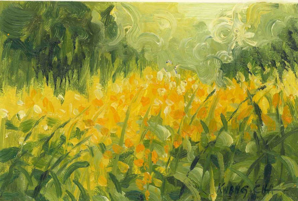
Though some are quick to classify Blomme's work as naive, he was formally trained in visual art at Danforth Technical School in Toronto. They "taught all sorts of arts - anything you wanted," Blomme recalls, adding that anatomy was his favorite class. He recalls the naked female models. "Us youngsters, just growing up, we loved that stuff." And as a result, Blomme has a wonderful sense of the human form without much of the proportional awkwardness that can plague even the most seasoned artists.

His knowledge of art and technique is hardly unsophisticated. "I think I"m a little haphazard the way I paint," he says of his delicately-labored strokes. "Sometimes you're just filling a space with color because something else was supposed to have gone there. Ninety percent of any painting is the actual proportion and drawing of it. If you can draw it up good, the painting part is secondary." Ten percent is lighting, Blomme reasons. "The lighting is the hardest thing to conquer. Incidental lighting - it might be just glaring in it; a spot on the street, or in through a window and onto a floor or just a slight glare off the side of a wall." Light is key in many of his dimly colored expressionistic works.

"You get so engrossed in a painting, you talk to yourself about it. I find myself painting in my sleep. When you come to dream about it, you have to pay attention to it. You can get hung up on a painting and lose your perspective in it. You really have to go away from it and put it to the side and then come back and look at it. Color-wise, the proportion of it, figure-wise or whatever, you have to stand back from everything." Blomme says he paints compulsively while sitting on his green floral sheet-covered twin bed, next to a sheet-covered table and sheet-covered overstuffed chair.

"I like to paint anything that suits my style," except religious scenes or images of Christ. "As far as actually trying to paint the likeness of what He looked like, I don't think it"s possible for any artist. It's a big responsibility for an artist. It's supposed to be a surprise anyway."

National Geographic serves as Bloome's image source when he can"t draw from life. "I do a lot of sketchin' everywhere I go. I was drawing people at the bus station. Constantly doing it made me learn how to intone the colors and shading, and handling the pencils and charcoal."

This artistic urge kept Blomme's mind active and content when he was homeless.


Redeeming reality

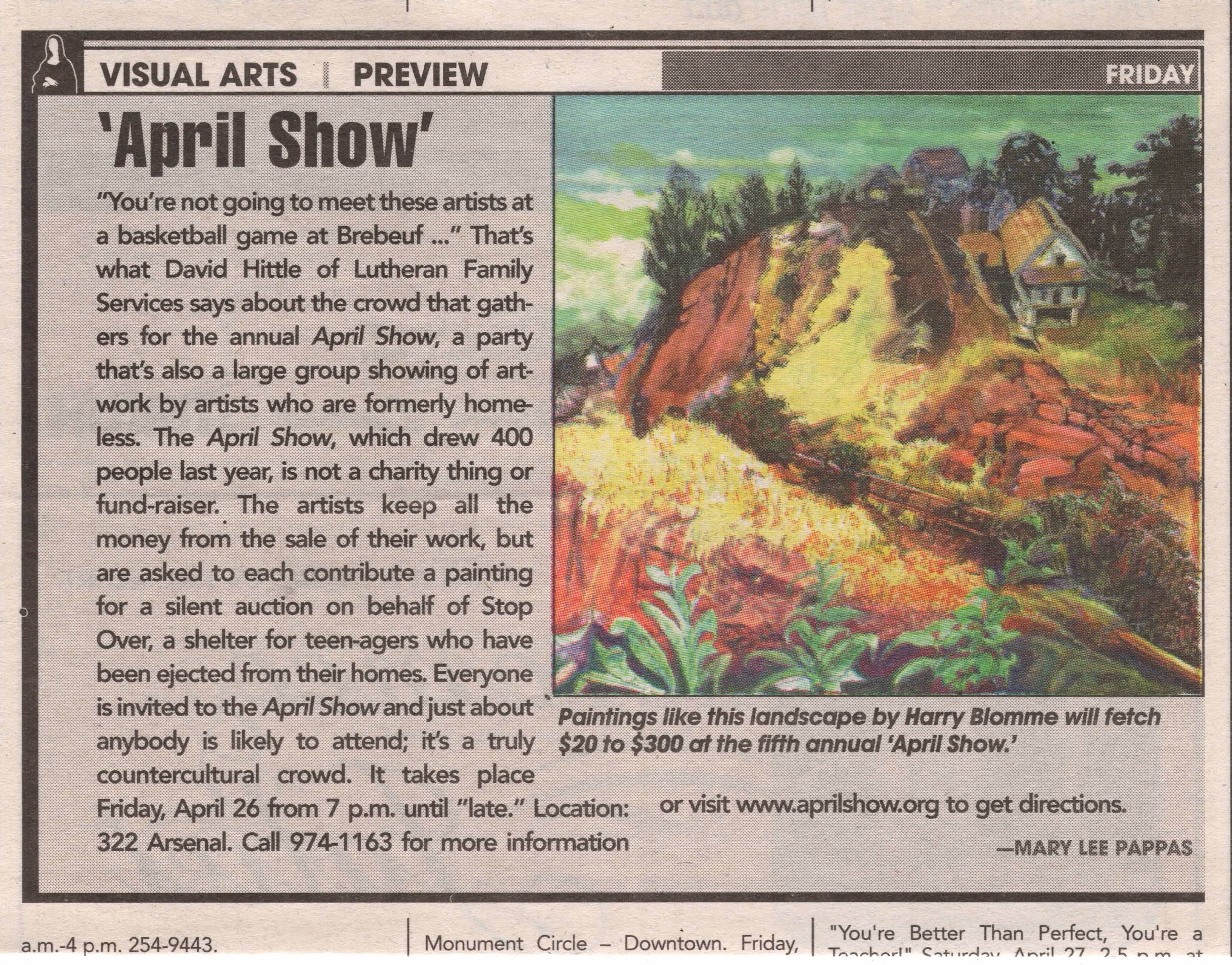
Blomme met Julia Carson during a homeless church service at Christ Church Cathedral and sketched her. The resulting portrait now resides in her Washington, D.C., office. Some of Blomme's other honors include a mural at Catholic Social Services and a commission for the homeless memorial service held annually at Christ Church Cathedral. He's taught art at Holy Family Transitional Housing in Fountain Square to children and adults. ""Mommy, that's the artist man." They called me "artist man,"" he recalls. "With a child you can practically mold them and inspire - give them inspiration when they're young. They know if you're teaching them right." He's exhibited at IPALCO's Crystal Gallery, the Governor's Mansion and was the inspiration for the April Show, an annual art show comprised of artists who have overcome obstacles that most of us will never have to face - like mental illness and homelessness.

David Hittle of Lutheran Family Services met Blomme while working as a case manager for a homeless transitional housing effort, Homeless Initiative Project. Blomme's case manager, Bill Bickel, current director of Holy Family Shelter Services, introduced the two. Hittle, who describes Blomme as "one of the swellest guys I know," was motivated to open up his downtown turn-of the-century home for the April Show exhibition featuring Blomme"s artwork because he realized there were no other venue opportunities for him. Greg Brown loved Hittle"s idea and introduced him to two other artists from similar backgrounds.

Bickel and Hittle have ventured outside of their social work worlds to effectively improve lives by encouraging visual arts. They have confirmed the redeeming reality of how the arts can actually restore lives like Harry Blomme"s, whose paintings renewed his life and rescued him from an uncertain future. This work has enabled him to start concentrating on other important life matters like finding a good church: "One with good music," he stresses. And establishing himself as the artist he is. "I would love to get my name out there and be known as a good artist." - Mary Lee Pappas

Fine art of afterthought - The Indiana State Museum, NiSource Gallery - July 3, 2002


The new Indiana State Museum provides visitors with a family-friendly joyride through Indiana history with slick multisensory, hands-on, interactive exhibitions. Video components, buttons to push, music to hear and differing floorplans to stroll through immerse the Average Joe into a subconscious and effective learning experience. It is actually a fun and full sensory encounter with Indiana culture. That is, until you enter the NiSource, Inc. Gallery on the third floor.

The high-tech continuity suddenly breaks and fizzles hard, flattening the experience of viewing the 200 years of Indiana-made fine art that this gallery is dedicated to showing. It's actually so startlingly sober in contrast to the rest of the facility that it feels like an underdeveloped afterthought. Museums have evolved into design-heavy entertainment facilities meant to seduce all walks of life through their $7-per-adult doors. Steep admission costs and capital campaigns compensate for the now-absent Daddy Warbucks big-time donors. Museums have full-time staff grant writers who have to prove museum interaction with community, education, children and everything else other than the quality of art to garner funds. Donors would rather contribute $10,000 to have a hallway named after them than anonymously funding fine art acquisitions. And so, art and art experiences have become dictated less by quality than by catering to those who will scrape together dollars to keep the museum afloat. Are museums forgetting how to present fine art?

Doubly dull in the painting gallery were the taupe-colored walls that struck awkward angles. I suppose this was done to break up the monotonously sanitary-toned space and add a dynamic energy to the room. Plunked down in the center of this space are two free-standing exhibition walls, moveable I hope, that face each other and contain mostly Hoosier Group favorites.

I watched about 30 people enter the gallery and bumper car off of each other, not knowing what kind of a traffic pattern to follow. The gallery space didn't flow or represent how the rest of the museum was handled. There was no obvious topic, theme or other explanation to guide visitors through it. Most people seemed seduced into the gallery by John Domont's two large and glowing color landscapes near the entrance. After that, they consistently made their way to the large window in a corner of the room that juts over the canal to check out the view.

Those free-standing walls, by the way, are painted a too-bright shade of French blue. It's so bright it dulls the rich colors of extraordinary paintings like "Pastoral" by Richard B. Gruelle. "The Bridge," an expressionistic landscape by William Forysth, has so much blue in it already that it only made me dizzy, hung as it was against the overpowering blue on the walls. Work was crammed together. Did the museum feel the need to exhibit every single piece in their collection (or so it seemed) in this new, climate-controlled space?

"The Confers," by Thelma Confer, hung only 2 inches away from "Acme Milling Co." by Harry Davis. That's not close, it's cluttered. Placed at an open end of an exhibition wall, the Confer piece was hanging crooked, no doubt the result of being elbowed by a patron cutting the corner too close. Paintings were shoved into the corners of the mostly useless interior wall configurations. The viewer is forced to view large-scale work at close range in this tight space. "Still Life," by John Otis Adams, is too large to be placed in one of these cupped ends. Only when you stand directly in front of it can you begin to see it properly. Forsyth's "Dahlias" has to be viewed within 8 feet (with a slight glare) or less before you back into an exhibition wall. A Willie Faust piece was tucked behind one of the weird room exterior wall angles next to the emergency door exit. You have to turn around to look at it. One woman commented, "Is this art?" and then promptly walked to the window.

And one more thing. Where was the security guard when an early 20-something woman, admiring the T.C. Steele portrait of James Whitcomb Riley, slowly wiped her hand across it? The NiSource Inc. Gallery space is awkward for the art and for visitors. It's as if the museum is saying, "Here's our art!" and that's it. Compared to other exhibitions, there is nothing to effectively engage or guide the Average Joe through the work or tell the stories of styles, influences, technique and successes of the rich fine arts heritage of our state. It does the art, the artists represented and the Indiana State Museum"s ambitious contemporary collection an injustice. - Mary Lee Pappas

Wednesday, May 15, 2002

Oreho tehkhnee/beautiful art - Christos Koutouras - May 15 - 22, 2002


Christos Koutouras, paintings, drawings, Samos, Greece, Greek, Harrison Art Center, Harrison Centre for the Arts, Indianapolis, Indiana, artist

Wednesday, April 24, 2002

“Twilight in Arcadia: Tobacco Farming in Indiana” - Indiana Historical Society – April 24, 2002 – 3 1/2 stars

Poignant photographic extractions, pulled from a book of the same name by Butler University's Susan Neville, depict the life of laborers who work Indiana tobaccoland. Tyagan Miller, a Bloomington-based photojournalist, brings to life the drudgery migrant workers from El Salvador and Mexico confront and the social issues that ensue on tobacco farms in New Washington, Ind. It portrays, in part, the new era of immigration. As a quote from the show reads, "I get American boys, I have to bail them out of jail. The Mexican boys come in, they work eight and a half hours, and they whistle when they leave the fields." Those "boys" are 18-45 years old. The crisp black and white images exhibited are powerful storytellers. Shot by shot, the tobacco fields are chronicled and probed through harvest time. Fortunately, the small exhibit's dialogue is presented in both English and Spanish. Taken from March 1998 through January 1999, they capture a timely piece of Indiana's farming heritage. The book, containing 75 photos, is available at the IHS's bookstore for $24.95. Call 317-234-0026 or e-mail orders@indianahistory.org. Www.indianahistory.org. Through June 2, 2002; 317-232-1882. – Mary Lee Pappas

Ron Leonetti, Mavis Flora DeVoe, John Green John – The Photography Gallery at the Hyatt Regency – April 24, 2002 – 3 stars

John and Joan Green offered up photography selections from their Mass. Ave. gallery, The Photography Gallery, to fill the new art space located in the atrium lobby of the Hyatt. Meditative spots in nature are the familiar, true color photo topics aimed at the downtown office types and convention sorts who visit here. Leonetti's greeting card-like woodsy landscape images are tranquil and idealized. They bring to mind Bob Ross and "Deep Thoughts." One photo, "Fall Spectrum," could also be retitled "Full Spectrum," as close-up silver maple leaves in all stages of decay become a natural collage. DeVoe's super close-ups of mist-laden black-eyed susans, moth orchids and bleeding hearts against blurred-out dark backgrounds offer more intimate glimpses of "as is" nature. Two striking canyon scenes by John Green stand above the others and identify the not so obvious compositional quality all pieces in the show possess. Kudos to the high traffic Hyatt for becoming another venue where local fine art can be experienced. Through June 30, 2002; 317-616-6009. -Mary Lee Pappas

April Show

NUVO Newsweekly, April 24 - May 1, 2002
Page 18
Mary Lee Pappas


David Hittle Lutheran Family Service, April Show, Harry Bloome, Jerome Neal, Thomas Curtis, Berry Connell, William McKenna, Zara Stephens, Stephen Mutt, Jeanette Tibbs, Naive, Outsider, Indianapolis, Indiana, Painter, artist, drawings


Wednesday, April 17, 2002

“Colors of Indiana” John Domont – Domont Studio Gallery – April 17, 2002 – 4 stars

Domont has rethought and redefined the Indiana landscape - given it a facelift. If you perceive our rustic countryside as an unsophisticated art topic, not "cutting-edge" enough, then it is high time to allow Domont to change your mind. Ten new and big panoramic landscapes all representing a sunset, sunrise or noon-days from specific someplaces all around Indiana (and one new Iris painting) are the most recent visual feasts by Domont, who, by all accounts, is the new master of the infamous Indiana landscape painting. He has taken our skies and given them a new innovative brightness, a real life like electric brightness in purple, orange and periwinkle that other artists have had a tendency to turn into typical tube stock shades of blue. Big swooping words and big shoes to fill but all true. "Ripening Sky" breaks down a typical Indiana small town rural scene from the road we all know well into solid masses of color. A group of trees becomes a blue, undulating color mass on top of a yellow and green color block. Fields of fields. "Respite" utilizes a solid band of bright purple to divide the horizon line dramatically. The new 48-inch-by-60-inch paintings have recently garnered Domont a solo exhibition at the Sheldon Swope Museum of Art in Terre Haute – a very, very excellent museum with a very, very strong collection of American work - planned for 2003 sometime. A few pieces from this show can be seen at the White River Gardens entrance rotunda in May. Through April 27, 2002; 317-685-9634. – Mary Lee Pappas

University of Indianapolis Student Show – Dean Johnson Gallery – April 17, 2002 – 3 1/2 stars


The scribbling on the postcard above are my notes for the critique below. That's how I write critiques - on whatever scrap piece of paper I have handy. I just usually need to write a key word to bring an image I viewed to life in my mind.

The gallery renews itself with refreshing new work by 16 students that smoothly knock most of the recycled, Herron-looking work at various Herron senior shows out of new art contention. Exceptions were the sculpture and photography, which were just a tad on the art school angst side. The show’s strengths are most evident in strong basic drawing competency and fluid graphic design as demonstrated in the student show poster. Josh Emrich offers technical and expressive maturity in his large-scale figurative painting while Carrie Claycomb's nearly life-size George Washington and Crucifixion paintings exhibit color and in-your-face composition confidence. A chunky, thick paint background frames a softly sculpted, molded image of Christ. Other paintings by Jake Hughes and Mike Lile serve as notable examples of real talent and visual refinement not always seen in local student shows. It is unfortunate that the opening reception had so few attendees when the work as this excellent. Through May 3, 2002; 317-634-8020, www.deanjohnson.com. -Mary Lee Pappas

Wednesday, April 10, 2002

“Symphony in Color, A Young People’s Art Contest” – Indianapolis Museum of Art – April 10, 2002 – 3 1/2 stars

This 50-year-old annual staple in art competitions explores children's musical experiences through the visual arts. One hundred works created by first through sixth-graders while listening to classical standards, such as Debussy's "La Mer," "Dialogue du vent et de la mer," were selected for exhibit in the Clowes Galleries. The crayon and pastel art pieces created under the influence of Scriabin's Symphony No. 2 Opus 29 are full of delightful pink energy and imaginative floating instruments reflecting the young listeners' unadulterated experiences of the music. Organized by the Junior Group of the Women's committee of the Indianapolis Symphony Orchestra, this is one of two wonderful examples of the value of arts education. Through April 25, 2002; 317-923-1331. – Mary Lee Pappas

“Learning to See: The Art of Art Education” – Herron Gallery - April 10, 2002 – 4 stars

The Herron Gallery scores with this show. Twelve Herron alumni, currently K-12 art educators in Central Indiana, executed their ingenious and intriguing classroom lesson plans inspired by art history, music and art processes. They incorporate all visual art forms in the gallery, creating a very interactive, friendly and informative experience. A Jasper Johns flag lesson plan by Lisa Cooreman, St. Richard's School, meshes individual student created flag pieces (constructed with the likes of Popsicle sticks and other craft closet goodies) into a single large-scale sculptural piece that holds its own in the gallery as well as anything shown here at any time. Mindy Jared's Pike High School students' handmade books are all unbelievably well-crafted; each is also a carefully, thoughtfully executed piece of art. Museum programmers and art teachers take note: A CD-Rom of the featured lesson plans are available for free in the gallery. Through April 13, 2002; 317-920-242). – Mary Lee Pappas

Kwang Cha Brown - CCA Gallery – April 10, 2002 – 4 stars


Three pieces by this Herron painting BFA, Indiana State University MFA and Pont-Aven School of Art attendee are masterful impressionistic paintings rich with the lush, deep tones of caked oil paint one would expect to see on museum walls, particularly when juxtaposed against most CCA sterile standards. Brush strokes look intentionally inspired, as if she is painting history or painting from her past life. One landscape's amber yellow grassy foreground, with its specific speckled strokes, sinks into its green grassy background. Visual appearances of atmosphere and light are brilliantly interpreted. Through May 31, 2002; 317-255-9633. -Mary Lee Pappas

Wednesday, March 06, 2002

Art stalwarts closing - March 6 - 13, 2002

 Art stalwarts closing 

NUVO Newsweekly, March 6 - 13, 2002

Page 8


CCA Gallery, Alliance Rental Gallery, Indianapolis Museum of Art, Paul Sweeney, Hoosier Salon, Watercolor Society, John Robert Dickhaus


Wednesday, February 27, 2002

“White Light” Joy Jackson – Harrison Center for the Arts – Feb. 27, 2002 – 3 1/2 stars


No relation (or inspiration) to the Herron show of last September by the same name, its examination of white light is less precise and simplified into a metaphor for purity as a catalyst for change. Jackson, who teaches glass blowing at the Indianapolis Art Center, having received her MFA in the subject at Temple University in Philadelphia, presents 20 clear, milky and white glass vases sitting upon suspended wire and perfecting eye-level glass shelving cutting across one of the gallery's corners. Jackson, an installation artist of talent, transforms the gallery space into her unique environment moreso than any other paintings-perfectly-centered-on-the-wall exhibit in this space has even come close to with lighting and installation, tic tac mask sculptures and glassware. A 2,000-pound Morton salt block installation is ghostly unnatural with its electric blue-tinged white light emitting from the crevices of the manufactured salt bricks. Under ownership of Redeemer Presbyterian Church the Harrison Gallery is improved with this exhibit as its proof, Through April 7, 2002; 317-514-6787. – Mary Lee Pappas

“Enchanted Bloom” Andrea Eberbach and Riccardo Consciasecca – Hilbert Conservatory, White River Gardens – Feb. 27, 2002 – 3 stars

Illustrator Eberbach finally frames her beautiful pastels appropriately (big white mats in black frames instead of decorated foam board), giving them a proper presentation they deserve. Her pastel handling is soft, perfectly melting the warm, rich colors with the same weight of hand, creating an even and gentle rendering of what might otherwise be a flat image. Eberbach's illustrations are unmistakably hers both for technique and her keen compositional knack. Consciasecca's super close-up digital image photos are sharp and force you to stop and smell the flowers if you never have before. Snapping super zooms of blossoms isn't anything new by any means - a flower at such a magnifying glass perspective is hard to get wrong as the flower abstracts and speaks for itself, but these are well-presented with the digital image allowing for a crisper, cleaner image. Through March 3, 2002; 317-630-2001. -Mary Lee Pappas

Wednesday, February 20, 2002

“A Hobby Handed Down” Elizabeth Young – College Ave. Library – Feb. 20, 2002 – 2 1/2 stars

Numbered handmade quilts, most folded over so they don't hang over into shelves and walkways, line library walls in their mostly very contemporary colors and fabrics. Some older quilt pieces incorporating floor sacks rescued and refiniggled enforce the sweet utility and family feel of this technically everyday ensemble. All of the quilts carry a family story or significance (each explained by Young in a little photoalbum scrapbook), having all been created for use over art, lending this exhibit its true charm. The fabrics and combinations in which they are teamed into patterns are not always aesthetically pleasing, but this is easily discounted when seen as real women's work. Through Feb. 28, 2002; 317-269-1732. – Mary Lee Pappas

Brian L. Phillips - Barnes & Noble – Feb. 20, 2002 – 2 1/2 stars

Phillip's business cards tout "self taught artist," a truth made most evident by the uncomfortable, unmixed handling of the oil paints. The black-outlined, geometric, generic painted portrait heads with dinner plate eyes softly twist into distinct multidimensional, primary-colored, flat-component puzzle piece fragments. Egon Schiele's elementary school doodlings may have resembled this work. Phillips' artistic strength lies in the fluid and tight compositions that feature the broken down angularity of these idealized, abstracted and gaunt faces. Compositional strength would benefit from mixing, layering and playing a bit more with the paint. Through February, 2002; 317-634-2515. - Mary Lee Pappas

Wednesday, January 30, 2002

Cheryl Paswater – The Bungalow – Jan. 30, 2002 – 3 stars

Non-narrative, non-Pop, found image paintings are the stuff of pure aesthetics, here void of Rauschenberg hidden meanings, or influence, and with no revolting against anything going on. They are familiar, mundane, cultural paper images collaged into ambiguous landscaped colorscapes, suitably matted and framed. Bubble wrap, graph paper and some interestingly scribbled poetry get doused with slaps of pure bright mauve and hill green cakey paint to form easily attractive and well-composed pieces with no meaning necessary. Through Feb. 14, 2002; 317-253-5028. – Mary Lee Pappas

“Behold” Sandy Day and Sara Vanderkleed – Hoosier Salon – Jan. 30, 2002 – 2 1/2 stars

Day's strength is with oils. Her stronger, bolder brushstrokes in oil paint befit her sometimes heavy-handed style, creating a maze of yellows, greens and pinks in representational, painterly spots of color, like in the foreground of "Thistle Down," one of many pleasant, tranquil, easy-breezy landscapes. Her true-to-life-color pastel people and landscapes are on the traditionally illustrative side. Vanderkleed's abstracted fields of deep and warm-toned watercolors undulate into dreamy wave landscapes (that turn out to be not that abstract at all after all), made possible by her carefree handling, risk and fate-trusting strokes. One artist's work compliments the other and both are successfully shown together. Through Feb. 15, 2002; 317-253-5340. -Mary Lee Pappas

Greg Brown's misfit masterpieces


NUVO Newsweekly, January 30 to February 6, 2002

Page 8

Mary Lee Pappas


An eccentric repository for orphaned kitsch paintings, Utrillo's Art Gallery, appropriately named for a so-so artist whose work was mass-marketed in the 1950s, falls someplace between a thrift shop and a gallery. “I collect art from the thrift store,“ Greg Brown, artist an owner of Utrill's Art, states. Provincial grandma art, religious kitsch, student stuff, paint by numbers and 1950s schlock reproduction popular prints are among the genres of original kitsch art paintings he emancipates from thrift shop shelves. Some are kept for his personal collection, others are sold.


“More people’s paintings are going to end up at thrift shops the museums,“ Brown says. “Thrift stores make art valuable,“ and affordable for anyone to own.


Brown has been conducting misfit masterpiece search and rescue missions since opening his first shop at 10th and Rural in December 1994. That venue became a successful free-form arts space for five years, before moving to the current location at 3318 E. 10th St., where the focus is kitsch recovery and frame sales. Original fine’s cell anywhere from $5 to $500 to a clientele Brown described as “a real wide variety.“ He adds that some people are embarrassed to admit they like this instinctive, thrift shop sort of art. Regular Utrillo customers “are right across the social spectrum. All shapes and sizes and colors and economic conditions – everybody. It’s neat that way.“ Brown’s collecting advice is, “start cheap and work your way up.“


Brown is supporting the local arts in a very fundamental way. He understands, validates and celebrates the simplicity and necessity of self expression. He knows and already practices with the Arts Council of Indianapolis is preaching in their new the Arts Can Help add campaign: “The arts play an integral role in the daily fabric of our lives… We work hard to support the creative and meaningful work of our arts and cultural organizations as well as our local talented artist.“ The difference is they see “critical activities for the arts community," as their website and TicketCentral in the ArtsGarden, stating, “Your assistance is needed to help us continue to create the best climate for the arts to thrive."


The anonymous, untrained and amateur artists whose salvaged work winds up at Utrillo's paint in a style affectionately dubbed “naïve." Brown defines naïve artist as those “who have a sense of art history and strive to paint in a European style,“ though they actually have no training, sense of depth, composition or color. Creating art is purely joy filled and experiential for them. “I like that kind of sweet art,“ Brown explains.


Some naïve art comes straight from artist to him without the second-hand retrieval effort. Jerome Neil, Jan Boyer and Harry Blomme are three such artist in Indianapolis who are represented at Utrillo's. “I try to promote stuff I love personally,“ Brown says. “Different artists have different needs for representation. I promote amateur art and naive art because I feel it’s important to validate."


Brown, who received formal art training at Indiana University in Bloomington, recently examined his fascination with naïve art by attempting to paint similarly styled figures. “One thing I was really bad at was figures. I thought, I’m gonna do something I don’t know how to do." Humbled, he gained valuable personal insight about how art should be approached. “That was the hardest thing.“ Brown says. “The simplicity embarrassed me. Why could I love it in somebody else and not love it for myself? That’s when I really started to examine my attitude toward art.“


Brown deduced the art he loved represented emotional, private and meditative qualities derived from the primary, free and flexible act of making art. Naïve art became for him, “people really trying really hard to do something they wanted to do." They are honest artistic efforts that liberate personal creativity, produce pride, create a sense of fulfillment and artistic accomplishment. Brown concluded that the sweeping demographic eureka, that anyone can paint, was precisely why he sells and collects this kind of work. “They do it for love and I think it comes through."


Brown adds, “Art is not for the elite anymore." The arts have to be for everyone now, as elitist dwindle and charitable anonymity seems passé. “It’s a breakdown of dominance,“ Brown says. 


Paint by numbers kits, recently celebrated an annual exhibition at the Smithsonian, and once thought to be a violation of art by arts aficionados, testify to the power, need and desire for personal expression – even if simulated. Realistically themed kits introduced people to art, supplies, the process of creating, personal expression (albeit predetermined) and gave them works of art to hang in their homes. The paint by numbers paintings, which Brown collects, became a popular pastime in the 1950s when increased prosperity, consumerism and leisure time were on the rise. The art experience suddenly became easily accessible at an affordable price.


“People are starting to look toward art. The inherent experience of painting and being creative is a good common ground,“ Brown says. “The breakdown of the rules will disperse art into the general population. Some people will be offended and some people are gonna be thrilled. I see the universality of it, but I also insist on my own personal path." Brown knows the principle of joy that creating and observing art produces – and how that experience can be muddled or lost in the arts administration underbrush of grants, commissions or capital campaigns. Of his forsaken finds, he says, “They’re worth more than three dollars to me."


Jerome Neil


“This is my think tank,“ Jerome Neil said of his Wheeler art studio. Born and raised in Chicago, a lifelong Midwestern inhabitant, Neil has been humbly selling (his painting start at $65) and exhibiting his work here and there for four decades. The Wheeler has enabled him to pursue his newfound, full-time artist life. Paintings of airplanes, dinosaurs, trains, cowboys, landscapes, musicians, monorails, Dick Tracy, Roman soldiers and an R2-D2 portrait – “I’m on a Star Wars kick for the kids“ – are perched, displayed and stacked anywhere space allows.


“There’s no special topic. I paint what I want to,“ he says of his diverse imagery that stylistically hops, skips and jumps, from traditional tree filled landscapes to energy and people filled murals. “Figuring out what color you’re gonna to start with is hard, but they’re nope problem,“ he says of his even more different, yet proficiently composed, tribal and angular abstracts. Most of his can’t-pin-the-tail-down instinctive works are randomly named after song titles from his jazz record collection and fueled by his love of world history.


“That is it. That’s the main thing,“ he says of his passion for the past. A whole new series of Paris, London and Amsterdam Street scenes and architectural paintings, inspired by a recent tour of Europe with his children, have begun to creep across what little wall space is left. Could the painting of Notre Dame be named “April in Paris “or “Cool Boppin'"?


“It was wild taking a boat trip up and down the Thames,“ he recalls, explaining that he was too busy “taking in the sights" to paint there. He is currently executing dual images of Piccadilly Square: “All it is, is a place with a bunch of stores.“


Neil usually paints two or three nearly identical paintings, keeping the best of the set for himself. He toils with paint texture to achieve small strokes of painterly thickness as he elaborates on and enhances the finished work – a testament to his compulsive personal perfectionist tendencies.


“Changing light changes the color and movement and presents problems,“ he says if his ceaseless touchups on always evolving paintings. When asked why he painted in oils, Neil matter-of-factly says, “I like the smell of it. “


Wednesday, January 23, 2002

'Zeit ist Kunst" = Time is art

Art Review:  'Zeit ist Kunst' + Time is art

Artworks by Rae Witvoet and Klaas Weert

NUVO Newsweekly January 23 - 30, 2002 

Mary Lee Pappas


Rae Witvoet's Bio - https://www.artland.com/artists/rae-witvoet

Rae's obituary - https://www.legacy.com/us/obituaries/nwitimes/name/rae-witvoet-obituary?id=25569910

Memorial for Rae in NUVO - https://nuvo.newsnirvana.com/arts/visual/memorial-rae-witvoet-1950-2007/article_008dfa38-edb4-5f76-be14-2880caacb47a.html

Rae Witvoet, Klaas Weert, artwork, painting, Lincoln National, Fort Wayne, Sand Ridge Bank, Chicago, Julia Carson, Frank O'Bannon, Ford Foundation, JJC, Hubbard and Cravens, Indianapolis, 911, Dutch, A Moveable Feast, IPALCO, Holland, Indianapolis, Indiana, artist, Amsterdam


Wednesday, January 16, 2002

Annual Herron School of Art/IUPUI Senior Photography Exhibit - Eye Blink Gallery - Jan. 16, 2002 - 2 1/2 stars


Uninhibited spice of life variety is the usual fare at student shows, whether it be Herron or high school, because exploring all media is still available, creativity is encouraged and competitive and the inevitability of a non-art day job has yet to kick in. This body of senior Herron photo work, as a whole, doesn't quite hit the experimentation or risk-taking level that an art school education should allow. An animal rights interactive installation of fur coats and photos does effectively force viewers to participate voluntarily and react/think involuntarily, howver. Overall, the artists' work didn't look challenged from a subject/content perspective - their talents not pushed beyond technically commendable work. But the black and white farm animal images were well-composed and had a personality all their own. Through Feb. 28, 2003; 317-636-6363. -Mary Lee Pappas

Scott Westphal - Munce Art Center - Jan. 16, 2002 - 3 1/2 stars

Five minimalist bronze sculptures make for a mighty art statement when seen corralled together as a body of work. Too often, Westphal's ever so gently wavering steel beam-fabricaw forms have gotten lost in multiperson shows by being stuck against walls as if they were curatorial second thoughts. This small sampling of oxidized bronze work, set into a small, unassuming gallery space void of colorful abstractions, is really perfect for allowing the blocky work to trust the space and create a striking visual experience - you'll forget that the evolving Munce Art Cerrter's floors are brick patterned linoleum. These five, truly minimalist, sculptures softly quiver and stretch out of their industrial facade irtto organic geometrical forms recalling the sensibilities of Indiana's own niega-minimalist David Smith. "Vaas," a piece contorted irvto a domestic vase form, tinkers with the illusionism of space and traditional aesthetics. Through Feb. 23, 2002; 317-873-6862. -Mary Lee Pappas

Wednesday, January 09, 2002

Lyanne Musselman – Out Word Bound – Jan. 9, 2002 – 2 stars

Closed Dec. 29. Out Word Bound is a most excellent bookstore worth visiting regardless of whatever art may be hanging on its walls, and in this case, it's a smattering of forgettable black and white charcoal pet portraits. The face-forward, straight-on doggy likenesses were definite renderings of individual, distinctive pups that made this artist's work look commission worthy and cheerfully admirable, yet mundane and dull from a 10-foot distance. It looked like practice work when creative juices were indisposed or dormant. Close inspection revealed sloppy technical understanding of a pooch package and hesitation with drawing materials. A mere two stars doesn't mean that this artist's work stinks altogether, it means that Miss Musselman has the potential faculty to do work that could garner more stars with patience and practice. Cheers! – Mary Lee Pappas

The Photography of Ben Winans of Brookville, Ind., 1902-1926 - Indiana Historical Society – Jan. 9, 2002 – 3 1/2 stars

Rita Kohn gave a thumbs up review of the Winans photo collection book in the Oct. 11, 2001, issue, but after revisiting the exhibit four times, I thought that a review of the 34 (of nearly 3,000 shot by Winans) exhibited images themselves were worthy of accolades again. History is dictated by and large by authors with opinions and enduring images like those that Winans chose to shoot of modest, everyday Brookville, Ind., life where he spent his entire existence. Nestled in the rolling hills of Eastern Indiana, a stone's throw from Cincinnati and casket Mecca Batesville, Brookville was in its unassuming glory days when Winans snapped it up in its very ordinary grandeur without spectacle or staging. This is no-frills, turn of the century small-town Indiana life at its purest. With journalistic artistry and straight-forward distinguishing style, scenes of the 1913 flood and antiquated hard time rural lifestyles are captured in his crisp glass plate images thankfully accompanied with historical data about the captured event. It gave me quite a thrill to see my own great-grandfather's pharmacy (a stepping stone resident after leaving Kentucky and before moving to the Old Northside) in the backdrop of a most somber and humble Brookville funeral procession. Through Feb. 3, 2002; 317-232-1862, www.indiaiahistory.org. - Mary Lee Pappas

Wednesday, December 12, 2001

The Photography Gallery - The Stutz Business Center - Dec. 12, 2001 - 3 stars

Seven Stutz artists show their stuff, a confetti finale, at the gallery which has relocated to Mass. Ave. The varied (textile, bronze and painted) art pieces work well together. One artist's work doesn't overwhelm another's as the spacious gallery gives even the largest color splashes of Stutz standards such as Mecklin, Darrell and the many very different and design heavy painted mannequin forms by Brooks equal quality wall time. Technically graceful with overlapping, subtle layers of fabric acting like paint, Rebecca Lyons' fabric art is effective, conceptually intelligent and a pleasure to view. Through Dec. 21, 2001; 317-972-1981. -Mary Lee Pappas

Wednesday, December 05, 2001

Night Vision - Utrillo's Art – Dec. 5, 2001 – 3 1/2 stars

No other art space in the city is as authentically and honestly eclectic - really and truly - as Greg Brown's Utrillo's. "Outsider" art in the paint-by-numbers variety and new to antique frame sales (a must stop shop for starving artists) in addition to Brown's own work (far from naive) are what's found during the daylight hours. After dark, his interchangeable, vaguely Gothic, comforting, stained glass-looking painted panels fill the storefront space ceiling to floor, and are illuminated to create an ethereal holiday display, best viewed from the "X" marked on the sidewalk across the street. Drive by and jump out of your car for a minute to enjoy Brown’s work, which is part of an infinite series joy-filled, humble and somewhat spiritual paintings titled The Kingdom of Heaven is like the Psychological Realm. Through Dec. 29, 2001; 317-684-9883. – Mary Lee Pappas

Holiday One Piece Show – Dean Johnson – Dec. 5, 2001 – 2 stars

This variety show needs more cayenne in its jumbled gumbo. The sculpted cherry wood chair and blanket, "Bull Legged Boy," by Natasha Young was of exceptional quality making the pieces that didn't hit her high notes look tone deaf. Though pieces don't adhere to a theme in the sharp gallery space that could make potato sacks look like fine art, there is an unsettling randomness in the overall display that doesn't enhance the quality or beauty of some individually great pieces. Through Jan. 3, 2002; 317-634-8020. - Mary Lee Pappas

Wednesday, November 21, 2001

Jo Legner - Hot House Gallery - Nov. 21, 2001 - 3 stars


Subtle kink meets collage in Legner's loosely lurid, bold, black-outlined Japanimation girl paper mosaics. Beautiful and delicately printed Japanese, Thai and English papers are chopped up (most in 2-inch blocks) and reassembled to give life to her large-scale, convincingly innocent (and one or two not so innocent) and, dare I say, cute, sexy cartoon girls. The fairy straddling a flower, the blue girl spread-eagled on the phone, the bunny-girl investigating carrots, the bare-breasted kitty-woman and the other girls on revue are all perfectly composed for their square format, as if they were individual animation cells. Hardly a parody, these pieces are wildly lively, with a fresh sense of freedom and fun in art, yet are created with care and accomplishment. Legner has a keen artistic vision to be able to piece together seemingly unlike paper colors and textures and then have the end results create the right balance of depth and space for her caricatured beauties. Through Dec. 31, 2001; 686-0895. - Mary Lee Pappas

Tuesday, November 20, 2001

Why Collect Art? by Mary Lee Pappas - Nov. 20, 2001


Why collect art? 
NUVO Newsweekly, 
November 28 - December 5, 2001 
Page 20

Mary Lee Pappas

Art whiners be warned. Hoosiers are buying original art by living artists. Local gallery owners can vouch for what Greg Lucas, owner of G.C. Lucas Gallery in the Meridian-Kessler neighborhood, calls “a very strong art market.” Granted, certain styles of grittier, edgier work are harder to sell, but people are still willing to spend money on art here. 

Local art galleries are welcoming, low-pressure places to visit. But Doris V. Hails, curator at Woodburn and Westcott, has reported that guests have asked if there is an admission charge to peruse her gallery space. The general public in Indianapolis has little experience at visiting galleries, so it is not uncommon for gallery owners to receive calls like, “What is the proper attire to wear to an opening?” and, “Are children welcome?” 

No admission is charged at galleries. Gallery art openings are not black-tie affairs, so come as you are comfortable, whether that means jeans, suit or whatever. Well-behaved children, accompanied by adults, are absolutely welcome, although Phil Campbell, owner of Hot House Art Gallery, artist and father, advises, “Come with an open mind,” as nudity in art is a time-honored standard. 

It is perfectly fine to visit a gallery to browse. Simply walking into a gallery is not a commitment to purchase, so set those checkbook anxieties aside. “There are some people that come in for an art fix,” Hails says. 

“It’s a great thing when people come in just to view the art,” David Kadlec, owner of Eye Blink Gallery in Fountain Square, observes. “By picking up on the stories artists are telling they can open up conversations with their family, their kids. They are taking part in the cultural community.” 

Nora Campbell, art director at the Domont Studio Gallery near Fletcher Place, agrees. “All galleries want people to feel comfortable. The doors are always open to come in and look and appreciate. We’re just glad people come in,” adding that a gallery’s role should be to educate the public about art. 

Art education dialogue is more accessible in a gallery than at a hush-hush museum. Instead of blindly scanning a wall of art in a mausoleum atmosphere, an open conversation can be had at a gallery, and usually with the owner. “I’m here for that!” Hails says. 

Greg Lucas has found that people are intimidated by art vocabulary, so he engages and educates his gallery guests about generic art language, like the meaning of painting “loose” versus “tight” and “modern” versus “contemporary.” It is completely acceptable to state that you like a work of art because it’s “neat” or “pretty.” The ability to rattle off historical, period-specific, academic art jargon won’t impress anyone and will not necessarily enhance an emotional response to any artwork. And art is all about emotional response — especially for the virgin buyer. 

Art connoisseur, or not, the most important criterion for an art purchase should be to like and be attracted to a piece. Kadlec describes this motivator as “people being drawn to the statement being made by the artist.” It’s OK to want something because it’s beautiful or is reminiscent of a trip to wherever, whenever, too. In truth, the numero uno reason people purchase art is because it reminds the buyer of something and provides an emotional outlet. 

Lucas sums it up best: “It’s an emotional thing.” He explains that people are not buying art to match their couch. “The point of a painting is that it should stand out from the sofa.” 

A piece of art cannot be judged by its price tag alone. Worthy and desirable art is not indicated by an exorbitant price or an artist’s tombstone. Price usually reflects innumerable can’t-put-your-finger-on factors. For instance, an artist’s work may be priced high because he can command that price in other cities or because she has been producing work for 35 years and shouldn’t sell for less. 

A low-priced painting can be of greater artistic quality than a higher priced piece. Price points for high quality, original art run across the board, so everyone can afford something. “I remain convinced that it’s not the dollar amount that sells the work. It’s a position of love,” Kadlec says of art purchases. 

Nora Campbell stresses that a customer will “have to love it because they’ll be living with it.” Buying an original piece of art from a local gallery contributes to local economy and the local arts community. It is a contribution to the financial and professional success of the artist and gallery. Art by working, living artists naturally appreciates over time but can’t be guaranteed — so purchasing for investment is discouraged. The majority of people who purchase art aren’t interested in investment anyway. Kyle Blevins, a photographer who recently showed his work at Eye Blink, says that by purchasing original art “you own your art community. It’s a personal investment.” Most galleries offer financing. Lucas says, “We work with [buyers] to help them own the painting.” Clients are offered discounts on repeat purchases and are encouraged to acquire art by the same artists. He also sells gift certificates, has painting savings plans and offers discounts on individual pieces if they are available. Some galleries like Kadlec’s have a fixed price policy. “It’s rare that anyone has asked for a discount,” Kadlec says — but don’t be embarrassed to inquire. 

“We have to,” Nora Campbell says of financing. “Original art is not a mass market. Most paintings are more than what people can just write a check for.” 

Phil Campbell notes that the price range for personal spending on art “is all over the place. The majority spend between $1,200 to $1,500 on average.” 

At Woodburn and Westcott, I witnessed an unassuming patron purchase an Indiana landscape by Lynn Thomsen for $2,200. Stanley Woodburn Hails, gallery manager of Woodburn and Westcott, says, “You wouldn’t have a clue what a customer looks like,” observing that customers are as diverse as the artwork itself. 

Doris Hails admits that some people are hesitant about purchasing real art for themselves because “It doesn’t seem normal to have real art on their walls.” 

Phil Campbell agrees, “They want what’s safe, what their friends have, what blends into the woodwork.” But original art can be more affordable than framing a poster print — and it’s a one-of-a-kind. 

A limited edition, prepackaged Thomas Kinkade print-transfer-to- canvas from the mall (one of 3,900 made to simulate a real painting) will cost $640 and up, depending on the size and the edition. An original figurative watercolor work by Phil Campbell, on the other hand, is only $325. A consumer who buys a big-name Kinkade because it feels safe (all the neighbors have one next to their Nancy Noels) isn’t getting a bargain. In 50 years, the piece a local museum (say the Indianapolis Museum of Art or the Indiana State Museum) would consider acquiring in exchange for a tax deduction, or the piece your grandchildren would be happy to inherit, is more likely to be an original that has a sense of history and withstands the test of time. In 20 years, those Kinkades will probably be on sale in Goodwills and Salvation Army shops. 

Some artists have inadvertently altered the face of local art history with their unique contributions. The significance of their accomplishments, their styles, techniques and local roots all make a piece of original art valuable. 

A buyer who buys based on name alone is an uninformed collector. There are, however, a few notable art personalities who are recommended for your art consumption. Nhat Tran, whose studio is located next to the Midland Antique Mall, is an artist whose lacquer works have been exhibited and acquired by the Smithsonian for their permanent collection. Tran uses an unusual and very toxic ancient lacquer technique to produce work that is influenced by her Asian roots, but inspired by the West. The Hoosier Salon represents the amazing impressionistic oil paintings of Patricia Rhoden Bartles. Bartles’ visions of Southern Indiana landscape have reinvented the familiar Hoosier Group ideals. John Domont is another Indiana landscape artist who recently finished two 15-foot commission pieces for the Riley Children’s Hospital in addition to having two paintings acquired by the Indiana State Museum for their permanent collection. They are but a few artists in Indianapolis who justify Doris Hails’ claim that “We are a wealthy city in terms of the arts.” 

Peruse NUVO’s Galleries space in the Calendar for the most recent shows in the city. Scribble down those telephone numbers and call with all your art inquires. Visit and ask more questions. Don’t be discouraged if you are immediately in love with the first artwork you see.


Phil Campbell, David Kadlec, Doris Vlasek Hails, Doris Hails, Ann Leggett, G.C. Lucas Gallery, Greg Lucas, Hot House Art Gallery, Eye Blink Gallery, Nora Campbell, John Domont, Domont Studio Gallery, Indianapolis Museum of Art, Newfields, Nancy Noel, Patricia Rhoden-Bartles, That Tran, Hoosier Group, Indiana State Museum, Kyle Blevins, Lynn Thompsen, Stanley Woodburn Hails, Midland Antique Mall, Hoosier Salon, Riley Children's Hospital

Wednesday, November 14, 2001

Lynn Thomsen - Woodburn and Westcott - Nov. 14, 2001 - 3 1/2 stars


Thompsen's art is about where we are and where we live. Her pastoral, predominantly green paintings aren't just of the typically expected rural Boone County fields and southern country meadows, but of Eagle Creek and the ultra urban woods of Butler University. The sense of depth and definition in theses scenes is outstanding considering the swiftness at which the strokes look smattered, albeit intentionally, on the paper. Her true color farming fields carry an all too familiar feel that anyone who has driven anywhere in Indiana can appreciate. Thomsen is a skilled artist who fearlessly puts paint down, confidant about space and reality. Through Dec. 31, 2001. 916-6062. - Mary Lee Pappas

**********

Lynn Thomsen, July 30, 1957 - January 3, 2008

Thomsen, Lynn,
January 5, 2008
Indianapolis Star


Lynn Thomsen She passed away at 10:45 a.m., January 3, 2008 at the IU Medical Center, Indianapolis. She was born in Lafayette, IN on July 30, 1957, and lived with her parents in Delphi, until her graduation from Delphi Community High School in 1975. She graduated Summa Cum Laude with a B.F.A. from Herron School of Art in Indianapolis. She went on to teach at Marion College, IUPUI, St. Richard's School, and for the past 7 years she chaired and taught in the Art department at Park Tudor School. Lynn was a landscape artist, and concentrated on scenes of rural Indiana. She has works hanging at the IU Medical Center, The Anderson Hospital, Women's Wing, and in the permanent collection of Indiana artists at the Indiana State Museum, along with many private collections. Lynn was the court room artist at the 1992 Mike Tyson Rape Trial where her drawings were aired on Channel 6 News and ESPN. She currently has a 22 piece show at the Mary Anderson Center for the Arts, Loftus House Gallery, 101 St. Francis Dr., Mount St. Francis, IN. The exhibit will run through March 1, 2008. She is survived by her husband, Clifford Hull, her stepson Clifford Jr., her parents Cliff & Jean Thomsen of Delphi, IN, one brother, Eric (wife Carole) of Delphi, one sister, Teresa Holeman (husband John), of Charleston, S.C.; 4 nieces; Amber Cleavenger (husband Kyle) of Colburn, IN, Cassandra Rowley (husband J.T.) and Erienne Thomsen of Terre Haute, IN., Justine Holeman, of Charleston, S.C., as well as 3 great nephews and innumerable wonderful friends and colleagues. A celebration of her life will be held on Monday January 7, 2008 at 4:00 pm at Flanner & Buchanan Funeral Center-Broad Ripple with a gathering starting at 12:00 pm to service time. Persons wishing to express their condolences may do so by recycling. In lieu of flowers, donations can be made to the Coburn Place Safe Haven 604 E. 38th Street Indianapolis, IN 46205.

**********

In Memoriam: Lynn Thomsen
by Barb Shoup Jan 16, 2008
NUVO


When Lynn Thomsen and I traveled through France together in 1994, she carried a packet of blank cards wherever we went and made sketches on them, which she sprayed with fixative and sent home as postcards to family and friends. I was fascinated by what caught her eye. The pattern of stones beneath the running water of a river, the peeled paint of a shutter were as interesting to her, as worthy of her attention as the Eiffel Tower or the Louvre. She made a sketch of me to send to my husband — not at Monet’s Giverny, but in the corner of a straggly garden down the road amidst hollyhocks whose petals were crumbling to dust.

“You were made to set here to give voice to this, your own astonishment,” the writer Annie Dillard said. Lynn was astonished by everything, and spent her whole life spinning her astonishment into marvelous forms, imprinting herself on the world around her. Art and life were the same thing to her.

There she is in the whimsical living space she created, a loft in an old building on 30th Street, with hornets’ nests, still on their branches, hanging from the high ceiling and birds’ nests, rocks, shells, geodes — bits of the earth she collected, wandering. There’s a fabricated steel swing big enough to hold two people that she hung in the middle of the huge room. A gargantuan blackboard she salvaged from an old school and mounted in her kitchen, chalk tray included. A cat stairway with a nifty bridge to a sleeping perch — because every living being was accommodated in her life.

Lynn’s astonishment at being alive shimmers in her paintings hanging on the walls: luminous plowed fields, trees mirrored in summer-calm lakes — the light in them as real as the light pouring in through the huge loft windows.

You can see the fruits of it in the lives of hundreds of students whom she loved and taught, and who adored her, instinctively understanding that she was not only teaching art, but teaching them how to be. Her countless friends knew it when, again and again, she directed our attention to some small thing that made the world crack open in a way we’d never have imagined and, in doing so, lightened our heavy hearts.

Lynn’s time in the world she loved was far too short. But the light she made wherever she went will live among us always.

Kyle Blevins "The Dead Bird Series" - Eye Blink Gallery - Nov. 14, 2001 - 4 stars


Blevins' large 20-inch-by-24-inch glossy prints taken from a huge Polaroid at Columbia in Chicago are hardly morbid or grotesque, but poignant. One little goldfinch is at rest among brittle, dried roses, the colors of which are dulled and dreamy. They romantically convey a sense of peace. The photos evoke memories of life and loss, giving the show a particularly timely and universal quality. Through Dec. 31, 2001. 636-6363. - Mary Lee Pappas

* The son of a funeral director, Blevins recognized that these discarded lyrical and romantic metaphors for life and soul were sadly and ironically dead and found a deep profundity in the ignored and forgotten, yet still beautiful bird life. He collected some dead birds and encased them in liquid latex like bugs in amber, which were either suspended in sheets of glass or shadow boxed, then photographed.

Wednesday, November 07, 2001

Jennifer Kaye - Harrison Center for the Arts - 3 stars


Wood craft and fine art mesh well in Kaye's fanciful women wall sculptures. Her many matrons prance and strike pirouettes in their polka-dot painted dresses and their crescent moon limbs across the gallery walls. These simple in concept sculptures are executed with refinement. Local interior designers would have a hey-day decorating with her stuff. Through Nov. 13, 2001. - Mary Lee Pappas

Thursday, September 27, 2001

Lisa Lynch Habegger - The Bungalow - Sept. 27, 2001 - 3 stars

Habegger paints symmetrical, solid, unadorned vases that project very abstract, harsh shadows. The anthropomorphic donor vessels, sometimes set against little windows with simplistically surreal Mona Lisa landscapes in the distance, look plucked out of a Dali reality - if Dali had been a 15th century Dutch portraitist. This is an analogy, not flattery. "Vessel #6" typifies the verisimilitude and rigid, idealized atmosphere of these glossy oil and acrylic on panel pieces. Perfectly straight horizon lines sharply define the flat, dirt-colored desert foreground that the vessels sit on from the well-coiffed, model train accessory green mountains that cry out, "The hills are alive!" Colors are all true, with no reds in the greens and no greens in the blues. Whatever Habegger is doing, she does well because these pieces are easy to look at and inoffensively pleasing. There is no slight of hand or erroron the artist's part to break the unreal sensation of her landscapes. Through Oct. 4, 2001; 317-251-6028 - Mary Lee Pappas

Thursday, September 20, 2001

"Herron Travels III" - Harrison Centre Gallery - Sept. 20, 2001 - 3 stars

A nice mix of mostly mediocre work from Herron students hangs well in the gallery as testament to recent art education-enhancing travels abroad. The nicest of the nice is a wispy little oil sketch on panel, "The Source," by Christine Blizzard. Priced at a mere $150, it's a bargain-basement price for a painterly prize. A cup bearing a red cross emblem, made in two obvious swift strokes leaving a jagged bristle brush edge, sits upon a counter defined by strong, single sweeps of muddied light blue and yellow-singed grey shadows. Objects on the counter are drawn as murky brown, thin outlines - their color resembling the residue that collects at the bottom of a painter's cup of mineral spirits. Space is defined in concise lines made
with few strokes and with a minimal and dim palette. An obvious scholar of the color wheel, Joseph Sikora's three "La Bois D'Amour Rouge" pieces are, landscapes in black, orange, periwinkle, pinks and reds, swiftly and precisely dappled where the landscape illusion requires it, a green line down a red tree trunk for shadow. Shannon McClane's "The Horse Trainer" is another skillful mentionable. Photos, installation, ceramic sculpture and paintings make up this show that's not really exciting, but not bland either. Through Sept. 26, 2001. 317-920-2494. -Mary Lee Pappas

Thursday, September 13, 2001

"White Light" - Herron Gallery - Sept. 13, 2001 - 4 stars


White Light is divine. It accomplishes what it sets out to do, which is to demonsrate the idea of white light as spiritual pure awareness and as an art image itself when light usually only effects the artistic final product. The appropriately named curator, Barry Blinderman, expresses the collective work best in the exhibition brochure. He states, "Light is the oldest and most pervasive visual correlate for attainment and inspiration." All notions of white light (aura, technology and otherworldly) are explored in the works presented. Natural white light is embodied in an untitled photorealistic painting by Jack Goldstein of lightening; while hot solar white light is produced by stepping an a pedal that ignites a blinding 50 light bulb installation by Gregory Green. Two 20-inch-by-20-inch paintings by Christian Garnett resemble eletric currents emitting blue hues -
blue is usually mixed with red/yellow to create electric bulb white light found in the likes of all, arguably uninspirational, color TVs. Two paintings by Susie Rosmarin, one striped and one plaid, mesh multiple spectral colors, generating far-out altered consciousnesslike white light speckles when you close your eyes after viewng. One hundred and twenty prisms, lit by the basic gallery track lighting, rotate slowly producing gentle, bubbling, ghostlike shadows of psychic white light on the gallery walls. Attending this radiantly inspired (pun intended) exhibition, perfectly suited for the Herron Gallery, will enlighten your art consciousness. Through Sept. 29, 2001; 317-920-2420, -Mary Lee Pappas

Phil Campbell "Him and Her" - Hot House Gallery - Sept. 13, 2001 - 3 stars


Campbell's latest work is probably his personal best. A bold light blue wll, demonstrating his shrewd curatorial competency, is a backdrop for 20 intimate 5-inch-by-7-inch nude black and white watercolor portraits of him and girlfriend-muse Jo. A triptych of her inspirational image carries the same rich blue hue. Some images are derived and distorted from digital photos, though they appear to be true to life. A graceful arm branches from an indefinable body and a nude fetal positioned seff-portrait is subtly and paradoxically missing Campbell's head. The clever exclusions are delicate and almost subliminal. The levels of comfort and ease with the paint application are apparent when you investigate the all-in-a-row wall of perfectly aligned tiny nudes. The richness of gray tone is parallel to the softer, more comfortable brushstrokes while the heavier, tighter lines equate to the more severe black/white contrast, The overall treatment is, by and large,dexterous and pretty impressive. Through Oct. 16, 2001; 317-686-0895. -Mary Lee Pappas

"Big White Idea" Mark Sawrie- 4 Star Gallery - Sept. 13, 2001 - 1 1/2 stars


Sawrie uses digital photo techniques to enhance and manipulate his inkjet prints on canvas. The black canvas backgrounds have a soft velvet depth and seem carefully painted. These pieces are executed with practiced, perverted perfection and technical polish. The images (cynical reality meets potentially noxious internal land) are not obviously pleasing, but their disturbing energy is quite overt. They are seemingly absent of provocation and purpose. "Mad Bunny," a Bugs Bunnyish, cartoon-looking, white pigment-based (which means the artists own semen in this case), is a bore. This art is out-of-date if the intention is shock value. All images unemotionally emerge (red and white tones) from a deep void of space with a high contrast of lights and darks. Visit his website at www.moralunderwear.com to view more of his work. Closed Sept. 1, 2001. 317-636-6382. - Mary Lee Pappas

Thursday, August 16, 2001

"Sea Key" Matt Berg - Indianapolis Museum of Art - Aug. 16, 2001 - 1 star

"Sea Key," a sculpture by Matt Berg on display in the third floor of the IMA is just a little too close to the Modigliani for my tastes. The IMA has offered Berg as their current artistic talent in a monthly rotation of the finest contemporary Indiana art. This flavor of the month scrap steel and kiln formed glass piece is boring and kind of phallic. it is girder assemblage meets large-scale oven baked blue drug store craft glass. A rusty patinaed steel beam is a sculpted base for what looks like a large keyhole encased in the same rusty steel. Berg should stick to his large-scale, readily identifiable pieces that are not as design challenged. His artist statement that accompanies the piece is completely convoluted and, as an art history professor of mine in college used to say, "cosmic." Is "Sea Key" supposed to be a conceptual puzzle, or is Berg trying to make his art something it's not? His 10-ton "Bear" created for Galyans in Minneapolis is a very common image yet is wonderfully executed. The very cool brushed stainless steel Broad Ripple Village Neighborhood kiosk at College Ave. and the canal is another of his commissions, utilizing the BRNA's house row logo, to top off his construction competency. Berg is capable of more than what is displayed at the IMA. Unlike most, at least he can say he's exhibited at the IMA now. Through Sept. 2. 317-923-1331.

Thursday, August 09, 2001

Delbecq Sisters - City-County Building - Aug. 9, 2001

Whoa est moi. The devil speaks French and I know this to be true on such a sultry afternoon in the sun-savaged Circle City. My quest to clip the Delbecq duo was fruitless. On the advice of self-assurede city employee found on the other end of my Ameritech tightrope line at the City-County Building, I speed-walked through the downtown's sweaty fog air, my shirt clinging to my shoulder blades. Yes, I called the number listed in NUVO's calendar, for art voyeurs like me to call and inquire about the whereabouts of this mysterious show. In all, I made seven phone calls to three different numbers (requested the information desk twice) and spoke to nine City-County Building employees about the exhibition location. I waited 15 minutes for three different elevators (this is typical adn expected), nothing short of an amusement park ride (I enjoyed the elevator hopping), to take me to the 28th floor where I had been told the exhibit of Delbecq photos was located(seven employees didn't know what I was talking about, two directed me to the 28th floor). I found myself on the observation level among a tourism and state trinket exhibit that the cultural tourism division of our city should spend some time modernizing. What a view! What potential! And how embarrassing that children take field trips to this locale. it wouldn't take $10 million to clean it up. From this vantage, our city, on this unfathomably non-ozone day, was clouded in an ethereal nimbus of overcast conditions. I couldn't find the photos despite my a la Indiana Jones meets Sherlock Holmes investigative style. I intend to go back to the observation level and get a full tour from the lovely older gentleman who oversees that floor. - Mary Lee Pappas

"I See Rhythm" Michelle Wood - Indiana Historical Society - Aug. 9, 2001 - 3 stars

Various forms of African-American music are interpreted in the acrylic works by Wood. All of the pieces on display are originals from her book, I See Rhythm. "Jazz Women" is a piece achieved by collaging blue monochromatic action vignettes of portraits of ladies of jazz like Sarah Vaughan, together in one painting. African masked musicians carry a brilliant primary range of color as they sit among these female greats. The masked faces are a motif in many of her storytelling pieces, with unmasked faces sometimes taking on a tribal facial structure. Quick-drawn strokes of wavering, solid-colored stripes mix as they are cast across the paper canvases, creating genuinely inspired energy and adding to the atmosphere of the pieces. The paint is not pushed or overworked but is layered and easily, comfortably applied. "Ragtime" is perhaps the most sophisticated of the paintings by Wood, on exhibit with its simple flat blocks of solid color and patterns. These works effectively capture the soul of each musical style represented with a traditional African tribal aesthetic reflecting the musical derivation. Through September 3, 2001. 317-232-1882. - Mary Lee Pappas

"Apron Strings: Ties to the Past" - Indiana Historical Society - Aug. 9, 2001 - 2 stars


One hundred aprons should demonstrate the shifting work roles of women and men over the century. Aprons traditionally have been tools of women's labor and consequently women's history, which is often overlooked - as it is in this exhibit. The aesthetic range of the apron collection is great, from ruffle-trimmed organdy and gathered tulle numbers of the to Aunt Bee bibbed styles. They hang too clustered together like campy flags of kitchen coats of arms. The collection reflects fashionable trends and some leisurely church bazaar creativity in the mid-century while overlooking most of the rest of the century (only a few examples from the early part of the 20th century are present) and is not representative of all female lifestyles. The opening exhibit script states, " Aprons are more than kitsch," and suggests ceremony and knuckle-bloody hard work, but does nothing to elaborate on how the apron, as a utilitarian protective garment, was an essential tool to the wife and unpaid domestic laborer. Kitsch is pushed in the collection and in the design of the small exhibition with its clumsy wire arched garden borders, suggesting a mythical happy whimsy. The few exhibit scripts slip sideways (you could crick your neck) in the clothespins that too cleverly hold them to the apron display forms. Women's history is represented with a much more discerning eye in other displays in the Exhibitions Gallery at the IHS. Through December 2, 2001. 317-232-1882. - Mary Lee Pappas

Thursday, August 02, 2001

"Dresden Expressions of Paul Putzki and Caroline Harrison" - The President Benjamin Harrison Home - Aug. 2, 2001 - 3 stars


Putzki was a talented watercolorist with a school in Indianapolis were he taught the conspicuous Victorian ladies of leisure the fine art of the era - watercolor and china painting. Women, like the former First Lady Caroline Harrison, lead this fashionable Arts and Crafts hobby of the wealthy on millionaire row. True to Victorian form, Putzki and Harrison's paintings of floral blooms and sparrows are romantically realistic and accurately detailed though not quite the work of one with naturalist's sensibilities like another Victorian, Edith Wharton. Putzki followed Harrison to the White House so that she could continue her painting studies of seemingly stock suspended floral bouquets that typified the genre. Of particular beauty was a delicate and translucent image of orchids that grew in the White House conservatory. When the history of this prim epoch is explored in the Harrison home (a tour is a must to see the exhibit) alongside the wispy lifelike Valentine Day card appropriate pink cabbage rose compositions, the notable artistic talents of Harrison are vividly more apparent. Realistic nimble swabs of color, perfectly applied, effortlessly piece together idealized segments of a proper garden. Blossoms are bona fide in these floral illustrations. Through October 12, 2001. 317-631-1888. - Mary Lee Pappas

Thursday, July 26, 2001

"The Female Persona" Jack Hartigan and Michelle Pemberton - Easter Conservation Services - July 26, 2001 - 2 1/2 stars

Pemberton's "Mother's Little Helper" series, cramped in the gilding and frame restoration dream haven, is hysterical. The 1950's Betty Crocker housewife ideal is parodied in these staged stark black and white shots with high camp props and a modern look. A model, cigarette dangling from her lip, in one shot looks like a haggard moping mess ready to get gooped up for the prom - she also looks as if she's about to bust with laughter at this scenario she's in. Lucky Strikes are tucked into the huge lace-banded nylon panties of a bored Valium-popping model primping for a big night she's obviously somewhat chagrined about. Add the McCall's, prissy wallpaper, train cases and rollers and you've got a charming mythical mockery of 1950's dress-up. The "Seasons" series is soft with tea-stained tones. The overlapping dreamy images of a bouquet-headed beauty look like architectural stone embellishments. Hartigan's photos of centerfolds defaced on the wall of a downtown building, are really graceful, but boring sociological surveys. The textured, spoiled remnants of bombshell babe bedroom shots simply appear as simplistic abstract indiscernible swaps in these large pieces well juxtaposed with Pemberton's work. Through July 27, 2001. 317-507-4701. - Mary Lee Pappas

Casey Cronin and Craig McCormick - Efroymson Gallery at the Harrison Center for the Arts* - July 26, 2001 - 3 1/2 stars


Abstract expressionism and post modernism through photography is brilliantly achieved in McCormick's work. His truly innovative images are shot through cardboard masks, and then further manipulated in the darkroom into subtle cubist renderings. Broken images of urban landscapes, sublimely colored, represent brief periods of time instead of singular split seconds typically seen in photos. Crises in his landscapes erupts, evolving in much the same way modernism did in painting. Reality is torn apart to create an illusion of the image (and the cars and things within the images) and of deep space. Technically, Cronin's work is pristine. Straightforward black and white untitled shots (mix and matchable) from European travels are artistically journalistic and rich with tone variance and a mausoleum silence. They are lonely and intimately bland. "The Laocoon Group," a full-round revolutionary Hellenistic sculpture at the Vatican Museum, is ironically photographed with some sculpture imagery negated from the cropped composition. The celebrated sculpture is spliced into a 2D isolated study. The range of grey tone beautifully defines the agony and realism of the ancient piece. Unfortunately, photo locations were not given and the architectural and sculptural subjects photographed were not named. The photos were dizzyingly displayed. They weren't hung in a coherent fashion and lost their impact split apart. Through August 31, 2001. 317-951-9610.- Mary Lee Pappas

*The Efroymson Gallery is currently the Harrison Center for the Arts Gallery at the Harrison Center for the Arts.

Saturday, July 21, 2001

Frank Glover - Durwyn Smedley's - July 21, 2001 - 3 stars

Closed July 4. 

The "Window series," four acrylic on paper energetic astracts by local jazz clarinet great Frank Glover, hang clumsily by clear plastic pushpins in a little corner under two distracting shelves and above some antique knick knacks. Local galleries should be vying to represent this multitalented artist. His work complements and is a colorful and quiet einb-~diment of his music. The influence of his friend, local master Lois Templeton, obvious. Their art style, smooth suriz~ces ai)d colors, is strikingly alike. Cool golden and dirty blue hues are scratched with black charcoal into unintelligible scribble script. The improvisational motions evoke a feeling of quietioie de vivre and soul. This venue is not appropriate for such beautiful work. -Mary Lee Pappas


Connie Zeigler resources Indianapolis historic my Indiana home polis center monthly

Thursday, July 19, 2001

J. David Smith - Munce Art Center - July 19, 2001 - 3 stars


Smith, associate dean of development for the Indiana School of Medicine, takes quality black and white photographs. His artist's statement says that he is inspired by "the ever changing forms and arrangements" of nature which are dissected
artistically by his camera. Local artists take note: This novice wrote a kick-butt, eloquent, well-written and understandable artist's statement. The series of photos on exhibit were all snapped during one walk in Zionsville after a memorably wicked snowstorm in 2000 - the cold miser undoubtedly being Smith's muse. The grandeur of neglected, tiny, fleeting beauty in nature takes center stage in tight compositions that make Mother Nature a Dada disciple. Ice and compacted fallen snow create natural artistic abstractions in "Ice Crystal," "Spider Ice" and "Holy Wall." There is nothing experimental or out of the ordinary with Smith's approach or technique. If I had to guess, I'd say he shot these with a trusty old Pentax K 1000. All of the shots are sharp, frozen, and perfectly exposed with studious exactitude - so much so that the f-stops and shutter speeds for each image could probably surmised as well. It is the care and honesty with which he captures his observations that make his photographs memorable. Through July 28, 2001. 317-873-6862. - Mary Lee Pappas

"Homecoming" Chip Henderson - J.Martin Gallery - July 19, 2001- 3 1/2 stars


Henderson throws narrative art out the window while bulldozing function for form in these mostly large monotone, smooth abstract, atmospheric works. They are musings of mood ripe with Zen and void of visual aversions. Far from being desolate, these subltely striped works evoke contemplative stillness with candlelight translucence. At a glance, the work of Rothko comes to mind, then vanishes upon inspection. These works are delicate. Sheer, careful rows of thinned oil make the canvases appear to be vellum. The dark crimson colors of the painting, "400 Miles," for instance, are formed and manipulated in a series of glassy layers that envelope each other like memories and shadows of our subconscious. The transparency of the paint is pushed and challenged by the infinate density of deep tones. Involuntary meditative participation is bound to occur while viewing these subliminal landscapes. Japanese paper and wax are the vehicles for earth-hued pigment in several pieces including "Hairshirt," the signature piece of the show. Through July 31, 2001; 317-916-2874. - Mary Lee Pappas

Thursday, July 12, 2001

"Sports Heroes - Two Views" James Fiorentino and Elizabeth Yorgen - National Museum of Art and Sport - July 12, 2001 - 2 stars


Thirteen true-to-life head and shoulders sports portraits by the mega accomplished James Fiorentino (23 years old) leave little to the imagination unless you are a student of watercolor. Executed deftly in watercolor, they are amazingly photo realistic and beyond perfect technically. You can see every hair on Cal Ripkin Jr.ís arm. Skin tones are rich and real, proportions are so anatomically faultless that it's no wonder Fiorentino was admitted into the New York Society of Illustrators at the tender age of 19. Images from the 1999 Topps Heritage Baseball Card series he created are on view also. In a big-time contrast are "Temple Games," four mixed media sculpture/conceptual works by Elizabeth Yorgen. Oozing glue gun goo, they comically portray basketball, hockey, baseball and football stars as "idolized in a very similar manner to the way that athletes were idolized in ancient Greece," an artists statement reads. It then makes a parallel to the Temple of Zeus in Olympia where these said athletes are were actually lapiths and the centaurs. Each piece has three humbly painted panels of athletes paired off in physical struggles (tackles and dribbles) flanked by four crude sets of wood colonnades. Could these athletes blasphemously be playing in the bastardized pronaos? Like friezes of the Classical Severe style, the scenes are dramatic, compact, and simple. A paint by numbers primary color scheme prevails as does a coloring book composition. Colors stay inside the lines with model plane precision. The pediments carry modern arena imagery flanked by 3D playing utensils: hockey puck, toy basketball hoop, you get the idea, etc. Through August 12, 2001. 317-274-3627. - Mary Lee Pappas

"Three Women Coming of Age" Patrica Rhoden Bartels, Caroline M. Mecklin, Maureen O'Hara - Hoosier Salon - July 12, 2001 - 4 stars


Patricia Rhoden (Bartels), Caroline M. Mecklin and Maureen O'Hara Pesta are three accomplished phenom female Indiana artists. Great impasto strokes of sunshine-enhanced color tease and delight the optic nerve in Rhoden-Bartels' impressionistic Indiana landscapes. The groundless compositions immerse you in dreamy, vibrant, fresh air moments full of wind and lively light. You fly through her distinctive paintings. Her work redefines Indiana art history and is nothing short of spectacular. Mecklin's prolific portraits of her beautiful daughter Libby are seductively silent and utterly feminine. Demure female forms are defined by their confident placidity - they are as much about the splendor of the female body as they are about female assurance within that body. Sweeps and streaks of sporadic and calculated colors combine to create contemporary pseudo odalisques from untraditional perspectives. Pesta's work is very poised. Her approach is less distorted and without the realistic excess or untrue vantages. Quiescent scenes are set and stories told through the precision in her exacting pastel lines. Through July 28, 2001. www.hoosiersalon.org. 317-253-5340. - Mary Lee Pappas

Christina Roberts and Lisa Pelo-McNiece - Art in Hand Gallery - July 12, 2001 -

Closed June 30, Christina Roberts' stained glass work was nowhere to be found. Pelo-McNiece's mouth-blown glasswork was at the gallery, as publicized, and radiantly diverse while consistent in its technical excellence. Two lavender and blue iridescent pieces, dabbled with grassy green flecks, sat perfectly in the window of the c.0-op gallery, their twists and shapes looking sculpted from clay. Most intriguing was a piece that was streaked with deep cherry red and formed with thin copper wire. It had the appearance of a heart with a molten 1,.va volcano top starting to erupi. Liberal use of color powder in her glass created delicate fibrous, granular and ribbed texture patterns. Four individual petite sphere vases glowed-with solid lerhon yellow. - Mary Lee Pappas

Bam Miller - Indianapolis Artsgarden - July 12, 2001 -

Bam Miller's black pen dravvings on flimsy, stark white paper, mattec and covered in what looked like saran wrap taped together on the back, could have used a littleTLC. I readily recognized th illustrative black squiggle line portrait of drummer Jack Gilfay. 'Jimmy Goes to Mai-ket,' of Jimmy Coe, and "Four Other Brothers" were the best drawings in thebunch but that's not saying much. The pieces were stff, flat, fundamental and none. pressive, Jost in their poor presentation. Considering our city recently introduced a $10 million arts initiative, I would expect extra oomph in the level of professionalism demonstrated within the Artsgarden. The AG should have done something to a sist, improve and enhance the presentation of Miller's illustrative work. Do we want to represent the arts in Indianapolis in Such a dismissive way to the throngs of visitors traipsing through the mall? Indianapolis is all aboutjazz in July, so Miller a ac- tion portraits ofiazz musicians are absolutely apropos foe the season. But what'sthe point ~ the show is executed without care? Through July 16; 631-3301. -Mary Lee Pappas